
Recommended
More Related Content
Recently uploaded
Recently uploaded (8)
Featured
Featured (20)
Media Product
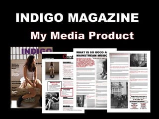
- 2. How I used, developed or challenged the forms and conventions of real media products Clothes Challenging conventions because purple is considered a Real media products feminine colour use the same forms and conventions Magazine aimed at both Typical of the music genders genre as Font- connotes youth considered to be and is suitable to both challenging what is genders seen to be the Setting- underground “norm” Developed conventions of real which connotes media products- tend to use exclusivity of the studios or open space rather product than underground
- 3. Articles connote a hedonistic lifestyle Convention of a teenager- seen to be heavy drinkers and smokers, going to clubs and music gigs Two column layout- convention of a magazine layout Added two boxes that Challenges the obstruct the 2 column conventions of a normal layout magazine layout
- 4. Clothes Real media products use the same forms and conventions Two column layout- convention of a magazine layout Typical of the Extracts from text music genre as considered to be challenging what Convention of the media is seen to be the product- makes the page “norm” more interesting