Youth Farm Brand Style Guide
•
0 likes•262 views

This is the Youth Farm Brand Style Guide EPIC created through the 8-week creative rally.

Recommended
More Related Content
Viewers also liked
Viewers also liked (12)
Similar to Youth Farm Brand Style Guide
Similar to Youth Farm Brand Style Guide (20)
Recently uploaded
Recently uploaded (20)
Youth Farm Brand Style Guide
- 1. WHERE LEADERSHIP GROWS CREATIVE CENTER APRIL 2013
- 2. YOUTH FARM | CREATIVE CENTER | APRIL 2013 PAGE 3 Table of Contents Strategic Foundation 4 Typography 6 Color 8 Voice and Tone 10 Manifesto 12 Storytelling 14 Identity 18 Iconography 26 Photography 30 Applications 36
- 3. YOUTH FARM | CREATIVE YOUTH FARM | CREATIVE CENTER | APRIL 2013 PAGE 4 CENTER | APRIL 2013 PAGE 5 Strategic Foundation These guidelines are about providing a visual/ verbal representation of Youth Farm that helps participating youth, families, employees and others tell the organization’s story simply and become advocates for the brand. This creative center illustrates how Youth Farm can capitalize on the distinct opportunity to distinguish itself from others in the industry through the cohesive and consistent use of branding—using a common visual language and voice to build credibility and brand equity. The following is our guide to the next generation of Youth Farm look, tone and feel—the generation of growing leaders. From the principles that guide us, to the ways it can and should be expressed, both visually and verbally, this document should serve as our road map for creative execution and translation for all audiences. By presenting a future state of brand and marketing communications, we can better define exactly how the brand should be expressed. This document is flexible—designed to eventually adapt to all of Youth Farm’s marketing and communications vehicles. It tells the story of Youth Farm, through words and pictures, in a distinctive and authentic manner.
- 4. YOUTH FARM | CREATIVE CENTER | APRIL 2013 PAGE 6 YOUTH FARM | CREATIVE CENTER | APRIL 2013 PAGE 7 Avenir was selected as the primary typeface because it is a legible font that offers a variety of weights and is web-friendly. The medium weight should be used for headlines and the book weight for body copy. Other weights should be used sparingly and to create distinction in special circumstances. Typography Aa abcdefghijklmnop qrstuvwxyzABCDE FGHIJKLMNOPQ RSTUVWXYZ0123 4567<?@#$%&*
- 5. YOUTH FARM | CREATIVE CENTER | APRIL 2013 PAGE 8 YOUTH FARM | CREATIVE CENTER | APRIL 2013 PAGE 9 PANTONE WARM GRAY 5 C=11 R=174 M=13 G=167 Y=14 B=159 K=26 HX=AEA79F The Youth Farm color palette represents the spirit and vibrancy of youth, food and community— blending a few, subtle neutrals with a variety of rich and brilliant colors that can be found in the field, in the grocery store and on the dinner table. Monochromatic and primary colors should be used as the primary representation of the brand. Accent colors may be used to further define secondary elements. Color ACCENTS MONOCHROMATIC PRIMARY PANTONE COOL GRAY 10 C=38 R=97 M=29 G=99 Y=20 B=101 K=58 HX=616365 PANTONE BLACK C=0 R=30 M=0 G=30 Y=0 B=30 K=100 HX=1E1E1E PANTONE 469 C=21 R=96 M=70 G=53 Y=92 B=29 K=70 HX=60351D PANTONE 369 C=67 R=88 M=0 G=166 Y=98 B=24 K=5 HX=58A618 PANTONE 485 C=0 R=213 M=93 G=43 Y=95 B=30 K=0 HX=D52B1E PANTONE 226 C=0 R=207 M=100 G=0 Y=2 B=114 K=0 HX=CF0072 PANTONE 583 C=25 R=168 M=3 G=180 Y=100 B=0 K=14 HX=A8B400 PANTONE 717 C=0 R=217 M=60 G=94 Y=100 B=0 K=3 HX=D95E00 PANTONE 124 C=0 R=234 M=27 G=171 Y=100 B=0 K=0 HX=EAAB00 PANTONE 7512 C=6 R=160 M=53 G=92 Y=100 B=15 K=31 HX=A05C0F PANTONE 2915 C=61 R=94 M=7 G=182 Y=0 B=228 K=0 HX=5EB6E4 PANTONE 221 C=8 R=145 M=100 G=0 Y=24 B=75 K=35 HX=91004B PANTONE 654 C=100 R=0 M=73 G=44 Y=10 B=95 K=48 HX=002C5F
- 6. YOUTH FARM | CREATIVE CENTER | APRIL 2013 PAGE 10 YOUTH FARM | CREATIVE CENTER | APRIL 2013 PAGE 11 Youth Farm must speak with one voicethat is clear, succinct and recognizable within the industry and among the audiences they serve. Voice and Tone Honest Playful Positive Knowledgeable
- 7. YOUTH FARM | CREATIVE CENTER | APRIL 2013 PAGE 12 YOUTH FARM | CREATIVE CENTER | APRIL 2013 PAGE 13 Cultivating youth is the essence of what Youth Farm does and it seems appropriate that this public declaration is penned in the voice of those they aim to serve. Manifesto We farm to grow. We farm to play. We farm to give. We harvest relationships along side rhubarb. We sow confidence with carrots. We nurture leaders like the seeds we plant. We gather peapods along with knowledge. We tend to cabbage and in turn the community. We work the land and let it transform us. We farm to learn. We farm to feed. We farm to grow. Youth Farm Where leadership grows.
- 8. YOUTH FARM | CREATIVE CENTER | APRIL 2013 PAGE 14 YOUTH FARM | CREATIVE CENTER | APRIL 2013 PAGE 15 Youth Farms’ stories should be succinct, graphic, fun and interesting, and should be told from a collective point of view. We not I. Together not separate. There will be exceptions where it’s important to get specific points of view, but the organization is about the connection and the impact youth can have when they work together. Writing is knowledgeable, not know it all and should be inclusive not exclusive. Stories should be purpose driven and connect back to the idea of Youth Farm being a place where leadership grows. Youth are the primary story, and food is the process in which Youth Farm tells their stories. Storytelling MISSION We grow leaders. We provide year-round programs for youth ages 9 to 24. We farm to educate and train through gardens and greenhouses. We cultivate leadership through planting, growing, preparing, and selling the food we grow. We grow food. From raspberries to radishes we seed, plant, grow and harvest our food and bring it to our communities’ forks. We feed families through our CSA, community dinners and other neighborhood events. We grow community. We live in and work in vibrant and diverse Minneapolis neighborhoods of Lyndale, Powderhorn and Hawthorne as well as Frogtown and the West Side neighborhoods of St. Paul. We grow progress. Since 1995 we’ve created and implemented a development model that grows with our youth to challenge them where they’re at with projects and leadership opportunities tailored to a variety of ages and abilities.
- 9. YOUTH FARM | CREATIVE YOUTH FARM | CREATIVE CENTER | APRIL 2013 PAGE 16 CENTER | APRIL 2013 PAGE 17 Storytelling PHILOSOPHY We farm to build youth of character. Our youth develop into responsible, essential and wholehearted members of their own communities. We farm to serve our community. Our program is meant to serve the vibrant, diverse and unique communities in which we are present and active. We farm to create meaningful connections. Positive relationships with food, peers, families, communities and most importantly themselves create the best and most impactful youth development. We farm to sustain. Through the cycle of growing, distributing, cooking and eating we create a complete approach to a healthy self and a healthy community. We farm to be a good neighbor. Creating stronger communities, more engaged citizens and happier neighborhoods by focusing on local leadership, partnership and development opportunities.
- 10. YOUTH FARM | CREATIVE CENTER | APRIL 2013 PAGE 18 YOUTH FARM | CREATIVE CENTER | APRIL 2013 PAGE 19 Identity The Youth Farm identity was created to feel modern, yet approachable and have a bit of personality that can be skewed from serious to playful depending on audience and/or application. Two primary lockups are provided here; logotype only and logotype with tagline. PRIMARY LOCKUPS
- 11. YOUTH FARM | CREATIVE CENTER | APRIL 2013 PAGE 20 YOUTH FARM | CREATIVE CENTER | APRIL 2013 PAGE 21 In order to preserve the integrity of the logo and the brand, guidelines were developed to maintain cohesion and consistency among use. No adjustments should be made unless explicitly outlined here. Identity LOGO MAY BE USED IN ANY OF THE MONOCHROMATIC COLORS VERTICAL FORMAT CENTERED (AS NEEDED) HORIZONTAL FORMAT LOGO SHOULD REVERSE OUT OF A SOLID COLORED BACKGROUND LOGO SHOULD REVERSE OUT OF A HEAVILY COLORED PHOTOGRAPH VERTICAL FORMAT LEFT (OR RIGHT) JUSTIFIED IS PREFERRED LOGO DOS THE “U” SYMBOL MAY BE HIGHLIGHTED WITH A COLOR FROM THE PRIMARY PALETTE WHEN USING BLACK OR COOL GRAY 10 FOR THE LOGOTYPE HORIZONTAL FORMAT
- 12. YOUTH FARM | CREATIVE CENTER | APRIL 2013 PAGE 22 YOUTH FARM | CREATIVE CENTER | APRIL 2013 PAGE 23 In order to preserve the integrity of the logo and the brand, the logo should not be adjusted in any way other than proportional scale and color. Identity NEVER USE MULTIPLE COLORS (OTHER THAN HIGHLIGHTING THE “U”) NEVER ALTER THE VERTICAL OR HORIZONTAL SCALE NEVER HIGHLIGHT THE “U” WHEN REVERSING THE LOGO OUT OF A SOLID COLOR NEVER ALTER THE WEIGHT OF THE LOGO NEVER SKEW THE LOGO IN ANY WAY LOGO DON’TS NEVER EMPHASIZE ONE WORD OVER THE OTHER (IN COLOR AND/OR SCALE)
- 13. YOUTH FARM | CREATIVE CENTER | APRIL 2013 PAGE 24 YOUTH FARM | CREATIVE CENTER | APRIL 2013 PAGE 25 The unique treatment of the “u” was designed to be a symbol for more playful communication pieces such as packaging and apparel items. The similarities to a smiley face are intentional and remind the audience that programming is not only meaningful, but enjoyable as well. Please note that this symbol should always be used in conjunction with the full identity and never alone, unless the audience is familiar with the brand and within the context of other branding materials. Identity
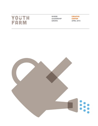
- 14. YOUTH FARM | CREATIVE CENTER | APRIL 2013 PAGE 26 YOUTH FARM | CREATIVE CENTER | APRIL 2013 PAGE 27 A collection of icons were created to help give a visual voice to Youth Farm that is modern and fun, but more importantly, to differentiate them from others who operate within this unique industry and category. Icons can be used to highlight specific activities and programs as well as representation for produce, tools and outcomes. Iconography
- 15. YOUTH FARM | CREATIVE CENTER | APRIL 2013 PAGE 28 YOUTH FARM | CREATIVE CENTER | APRIL 2013 PAGE 29 Here is the entire library of icons created for Youth Farm. Other icons may need to be developed as the brand evolves. New icons should follow the visual precedent and style set forth in the executions shown below.
- 16. YOUTH FARM | CREATIVE CENTER | APRIL 2013 PAGE 30 YOUTH FARM | CREATIVE CENTER | APRIL 2013 PAGE 31 STYLE. Portraits should capture the subjects as they are, authentic to their character and personality. Happy and playful, rather than staged and serious. COLOR. Photographs should be vivid in color and maintain high contrast. Soft, direct light should be used to minimize harsh shadows. FOCUS/CROP. Photos should be tack sharp, should offer a range of crops (from full-body to waist-up), and vary in pose and angle. WARDROBE. Direct subjects to wear clothing that is representative of their own style, but push bright colors as well as solids and simple patterns. Photography: Portrait
- 17. YOUTH FARM | CREATIVE CENTER | APRIL 2013 PAGE 32 YOUTH FARM | CREATIVE CENTER | APRIL 2013 PAGE 33 STYLE. Photographs should feel editorial and not posed, and attempt to capture a moment in time. If subject faces camera, it should feel like a brief pause. COLOR. Photos should be vivid in color, and maintain high contrast between highlights and shadows. FOCUS. To draw the audience into these photographs, tack sharp focus should be maintained on items/ people of key importance while allowing the surroundings (or edges) to go soft. The exception would be shooting a larger group or scenario with little depth of field. Photography: Editorial
- 18. YOUTH FARM | CREATIVE CENTER | APRIL 2013 PAGE 34 YOUTH FARM | CREATIVE CENTER | APRIL 2013 PAGE 35 The following are instructions for preparing photographs to be shared on Youth Farm’s social media outlets. For ease, photos should be shot using your camera phone and may be captured through either your phone’s existing camera app or the Instagram app. Regardless, make sure that your subject fills the frame when capturing your image. If using your camera’s existing app, you will want to import the photo into Instagram by pressing the button next to the camera icon that accesses your existing photo library. Once imported, follow the instructions listed. Photography: Headshots and Snapshots Once an image has been selected, you will be able to scale and crop. You should be able to move the image to a desirable square crop, and can enlarge or shrink the photo with your fingers. Tap the green crop button when complete. You will now be able to edit your photograph. The first step in the editing process is to choose the correct filter. Scroll through the selections along the bottom and select the filter named X-Pro II. Simply tap to apply the filter. Additional editing tools are located above the row of filters. First, select the contrast tool (sun) to add overall contrast to the photograph. Second, select the blur tool (teardrop) and manipulate the effect with your fingers—larger or smaller based on preference. Tap next. Now the photograph is ready to be shared or posted. Write a caption, if desired, and select your method of sharing or posting and tap the green share button.
- 19. YOUTH FARM | CREATIVE CENTER | APRIL 2013 PAGE 36 YOUTH FARM | CREATIVE CENTER | APRIL 2013 PAGE 37 The following pages illustrate how the varying branding elements can be utilized to bring the Youth Farm brand to life. Applications Business System
- 20. YOUTH FARM | CREATIVE YOUTH FARM | CREATIVE CENTER | APRIL 2013 PAGE 38 CENTER | APRIL 2013 PAGE 39 Brochure Case Study E-cards
- 21. YOUTH FARM | CREATIVE CENTER | APRIL 2013 PAGE 40 YOUTH FARM | CREATIVE CENTER | APRIL 2013 PAGE 41 FEATURED VIDEO LATEST BLOG OUTCOMES / AT-A-GLANCE GET INVOLVED 10,000 Meals served annually through YF programming. ABOUT YF PROCESS Youth Leadership Neighborhood Development OUR TEAM Community Partners Staff/Volunteers Board of Directors CONNECT Volunteer Donate Calendar of Events BLOG CONTACT US TERMS OF SERVICE SEARCH Leader Retreat Update Website Banners We harvest relationships along side peapods. We sow confidence with carrots. We nurture leaders like the seeds we plant. Where leadership grows.
- 22. YOUTH FARM | CREATIVE CENTER | APRIL 2013 PAGE 42 YOUTH FARM | CREATIVE CENTER | APRIL 2013 PAGE 43 Packaging Packaging Tape & Fruit Stickers
- 23. YOUTH FARM | CREATIVE CENTER | APRIL 2013 PAGE 44 YOUTH FARM | CREATIVE CENTER | APRIL 2013 PAGE 45 Apparel & Branded Goods from FARM TO FORK
- 24. YOUTH FARM | CREATIVE CENTER | APRIL 2013 PAGE 46 If you want your brand to benefit from word of mouth, you’d better give consumers something worth talking about. KEN PETERS
- 25. WHO TO CONTACT If you have any questions related to the Creative Center or Youth Farm branding in general, please contact: Gunnar Liden Executive Director gunnar@youthfarmmn.org 612.872.4226 128 West 33rd Street, Suite 2 Minneapolis, MN 55408 612.872.4226 | youthfarmmn.org