Dublin: A Breath of Fresh Air
•
5 likes•819 views

A logo and ad campaign to promote Dublin as a holiday destination, highlighting the city's lesser-known charms.

Recommended
More Related Content
What's hot
What's hot (18)
Viewers also liked
Viewers also liked (20)
Similar to Dublin: A Breath of Fresh Air
Similar to Dublin: A Breath of Fresh Air (20)
Recently uploaded
Recently uploaded (20)
Dublin: A Breath of Fresh Air
- 2. Think & Son is the name exclusively used when Annie Atkins and Eoghan Nolan come together to work on special projects.
- 3. Eoghan is an award-winning copywriter and creative director known for his work with Brand Artillery and as CD of several major ad agencies.
- 4. Annie works as a graphic designer in film and, among other things, is known for her work with Wes Anderson (Grand Budapest Hotel) and Steven Spielberg (Bridge of Spies).
- 5. In 2015, Think & Son won the project to design a new logo & line for Dublin. The client was Fáilte Ireland, the National tourism development authority.
- 6. Dublin has long been known as a friendly, party town associated with history, pubs and books, music, fun and story-tellers. Yet for those considering a city-break in Europe, there are some things about Dublin that are less well known. Some Background _
- 7. Like the fact that Dublin is on a bay and surrounded by mountains, so you can get from O’Connell Street, the capital’s central thoroughfare, to the seaside or the hills in under 30 minutes. Some Background _
- 8. Our task was to convey all that wonderful prospect in a single line and logo. Some Background _
- 9. The line came first. We wanted something colloquial rather than forced, a form of words conversational rather than corporate. It should work on more than one level, yet be easily understood.
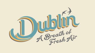
- 10. That’s how we arrived at: Dublin. A Breath of Fresh Air.
- 11. We sought a visual representation of the line that reflected its meaning.
- 12. We looked at early Celtic letterforms, and as Dublin is famous for its Georgian Squares, we also drew from 18th and 19th century calligraphy.
- 14. As Dublin remains a city more artisanal than industrial, it was important to us to use hand-drawn letters for the word ‘Dublin’ rather than a standard font.
- 15. The Swift is a bird that is a regular summer visitor to Dublin, so we added two for movement and life. The arc of their flight is mirrored in the swoop of the ‘D’.
- 18. The colours we chose represent a little nostalgia as well as some seaside-y innocence. The logo should look like a holiday.
- 20. Next, we were asked to create a tone-of-voice for language around the logo. Like Dublin, it needed to be irreverent, playful and subversive. We defined it as Colloquial, Distinctive, Contemporary and Upbeat.
- 21. From that we developed an advertising campaign that ran in London and is tabled for use overseas. It also appeared in Dublin so that Dubliners could see our messages to potential visitors.
- 30. Luas ads _
- 31. 2015 and 2016 saw an all-time high in the numbers of tourists visiting Ireland and Dublin in particular. “The Irish tourism industry has contributed significantly to the national economic recovery”. Some Results _
- 32. If you haven’t visited Dublin yet, please do. You’ll be very welcome.
- 33. Think & Son is a trading name of Brand Artillery Ltd. If you’d like to talk to Brand Artillery about a project, you can contact Eoghan Nolan at eoghan@theartilleries.com or by phone at +353 872655288 Meanwhile, why not follow @brandartillery on Twitter? More Brand Artillery work in this SlideShare © Brand Artillery 2016 © Brand Artillery 2017 © Think & Son 2016 © Think & Son 2017 brandartillery.comthinkandson.com