Independent Escorts Lucknow 8923113531 WhatsApp luxurious locale in your city...
Contents Compare
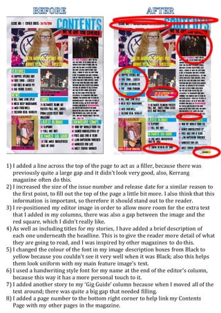
1. 1) I added a line across the top of the page to act as a filler, because there was
previously quite a large gap and it didn’t look very good, also, Kerrang
magazine often do this.
2) I increased the size of the issue number and release date for a similar reason to
the first point, to fill out the top of the page a little bit more. I also think that this
information is important, so therefore it should stand out to the reader.
3) I re-positioned my editor image in order to allow more room for the extra text
that I added in my columns, there was also a gap between the image and the
red square, which I didn’t really like.
4) As well as including titles for my stories, I have added a brief description of
each one underneath the headline. This is to give the reader more detail of what
they are going to read, and I was inspired by other magazines to do this.
5) I changed the colour of the font in my image description boxes from Black to
yellow because you couldn’t see it very well when it was Black; also this helps
them look uniform with my main feature image’s text.
6) I used a handwriting style font for my name at the end of the editor’s column,
because this way it has a more personal touch to it.
7) I added another story to my ‘Gig Guide’ column because when I moved all of the
text around; there was quite a big gap that needed filling.
8) I added a page number to the bottom right corner to help link my Contents
Page with my other pages in the magazine.