
Recommended
More Related Content
What's hot
What's hot (20)
Similar to Advert Analysis
Similar to Advert Analysis (20)
Advert Analysis
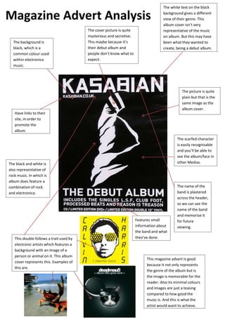
- 1. Magazine Advert Analysis The background is black, which is a common colour used within electronica music. The cover picture is quite mysterious and secretive. This maybe because it’s their debut album and people don’t know what to expect. The white text on the black background gives a different view of their genre. This album cover isn’t very representative of the music on album. But this may have been what they wanted to create, being a debut album. The picture is quite plain but that is the same image as the album cover. Have links to their site, in order to promote the album The scarfed character is easily recognisable and you’ll be able to see the album/face in other Medias. The black and white is also representative of rock music. In which is album does feature a combination of rock and electronica. This double follows a trait used by electronic artists which features a background with an image of a person or animal on it. This album cover represents this. Examples of this are. Features small information about the band and what they’ve done. The name of the band is plastered across the header, so we can see the name of the band and memorise it for future viewing. This magazine advert is good because it not only represents the genre of the album but is the image is memorable for the reader. Also its minimal colours and images are just a teasing compared to how good the music is. And this is what the artist would want to achieve.