CISummit 2013: Pete DeWarn, Brigham Hyde, Mark Degatano, Breakthrough KOLs Panel: Quantifying Network Structure and Contextual Expertise
•Download as PPTX, PDF•
1 like•608 views


Recommended
More Related Content
What's hot
What's hot (20)
Similar to CISummit 2013: Pete DeWarn, Brigham Hyde, Mark Degatano, Breakthrough KOLs Panel: Quantifying Network Structure and Contextual Expertise
Similar to CISummit 2013: Pete DeWarn, Brigham Hyde, Mark Degatano, Breakthrough KOLs Panel: Quantifying Network Structure and Contextual Expertise (20)
More from Steven Wardell
More from Steven Wardell (20)
Recently uploaded
Recently uploaded (20)
CISummit 2013: Pete DeWarn, Brigham Hyde, Mark Degatano, Breakthrough KOLs Panel: Quantifying Network Structure and Contextual Expertise
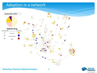
- 1. Adoption in a network September 2010 November 2011 December 2009 February October January August March April June May July Workshop: Physician Network Analysis 1
- 2. Finding networks with surveys • Survey physician population • Find “Thought Leaders” • Sample can be incomplete as long as it is reasonably representative Workshop: Physician Network Analysis 2
- 3. Finding networks with claims data • Use commercially available claims data • Link through shared patients • Much more complete network Workshop: Physician Network Analysis 3
- 4. Patient flow network Generalist Specialist Edge thickness represents number of patients Workshop: Physician Network Analysis 4
- 5. Finding key relationships One Physician’s Relationships One Physician’s Relationships Workshop: Physician Network Analysis 5
- 6. Backboning method Serrano, Boguna & Vespignani, 2009. Workshop: Physician Network Analysis 6
- 7. Bladder control in Boston Urologist– 98 total, 3% of all ties Generalist – 1434 total, 56.7% of all ties Other Specialist – 1364 total, 40.3% 2896 Physicians – 4706 Ties Workshop: Physician Network Analysis 7
- 8. Smoking cessation in Boston Psychiatrist – 251 total, 7% of all ties Cardiologist – 165 total, 5.4% of ties Generalist – 1364 total, 58.8% of ties Other Specialist – 875 total, 28.7% of all ties 2655 Physicians – 4264 Ties Workshop: Physician Network Analysis 8
- 9. Passing information through a network High Betweenness Centrality • Examples of simple contagion – Transmission of disease, ideas, or physical objects/materials • Effect can spread with a single contact • Centrality becomes analytically important High Closeness Centrality Workshop: Physician Network Analysis 9
- 10. This is how we do it here • Examples of complex contagion – Changes in health habits, social behaviors, cultural behaviors Unclustered • Spread of complex contagion usually requires sustained interaction with multiple carriers Maintain Behavior • Clustering becomes analytically important Workshop: Physician Network Analysis Clustered 10 Change Behavior
- 11. Finding communities of practice Community A • Community members are more likely to tie with each other than with outsiders • Our methods employ new iterative maximizing algorithms which dramatically increase efficiency • Porter, Onnela & Mucha, 2009 Community B Community C Workshop: Physician Network Analysis 11
- 12. Geographic layout of communities Workshop: Physician Network Analysis 12
- 13. Examining diabetes in Raleigh-Durham Selective Targeting •Multiple practices highly interconnected Cluster of non-users •Why target all these high prescribers? •Family Practice & Internal Medicine •Not group practice •Most likely target central to cluster High Influence Locations •Cynthia M. Goodwin, medium prescriber Pediatrics Cluster Not group practice Bridge Dr. Debra Baskett Connects cluster of 10 with 50% users to cluster of 9 non-users Green – Adopters Red – Non-Users Pediatrics Cluster Group practice Workshop: Physician Network Analysis 13
- 14. Network predictive power in a launch Januvia in Raleigh-Durham Impact of having alters at geodesic distance one who have previously prescribed Instantaneous Hazard Cumulative Hazard Unconnected Unconnected Connected Connected 0.25 0.008 0.2 % Adoption 0.3 .01 % Adoption 0.012 0.006 0.15 0.004 0.1 0.002 0.05 0 0 1 3 5 7 9 11 13 15 17 19 21 23 25 1 Months Workshop: Physician Network Analysis 3 5 7 9 11 13 15 Months 14 17 19 21 23 25
- 15. Lipitor use in Raleigh-Durham Resistant Clusters Top – Group of Family Practitioners Bottom – Cardiologists, Family Practice, Internal Medicine Change Cluster Multiple Specialties: Cardiology, Family Medicine Mostly on different floors of same building Red – Decreasing use Yellow – Stable use Green – Increasing use Key Relationship Change Cluster Dr. Thomas Nelson – Family Practitioner increasing use Group practice – Family Medicine Dr. Soon Kwark – Family Practitioner decreasing use Workshop: Physician Network Analysis 15
- 16. Predictive power for an inline product Maintain Prescribing Level Difference model Decrease Prescribing Level Predict change in proportion Lipitor of Lipitor & Simvastatin prescriptions Unclustered Control for cash, Medicaid, Medicare prescribing Control for secular decline in Lipitor usage Control for number of dyslipidemia initiations Clustered Mean switching among alters at distance 1. . . . 0.08 (4.4) at distance 2 . . . . 0.04 (12.3) at distance 3 . . . 0.02 (0.8) Community switching . . . 0.15 (24.2) Workshop: Physician Network Analysis 16
- 17. Introducing a priority score Similar Positions James Brown decile 7 Key Bridge Paula Smith , decile 2 Chris Cole Connects five generalists to key high prescribing cardiologists Seth Murphy & Colin Jones Highly Influential Position Jean Mills Cardiologist 232 Physicians – 320 Ties Endocrinologist Nephrologist Generalist Other Specialist Workshop: Physician Network Analysis 17 Node size represents physician decile Large: 8-10 Medium: 2-7 Small: 0-1
- 18. Components of the influence index • Influence Index is a weighted measure which uses: • • • • • • • The physician’s own target value The target values of the physician’s distance one ties The target values of the physician’s distance two ties The target values of the physician’s distance three ties The target values of the physician’s community Uniqueness of influence position Treatment directionality Community 1st Degree Physician of Interest 2nd Degree Workshop: Physician Network Analysis 18 3rd Degree
- 19. Bladder control – community in Boston Urologist Generalist Other Specialist Node size represents Physician decile Large: 8-10 Medium: 2-7 Small: 0-1 1024 Physicians – 255 Ties Workshop: Physician Network Analysis 19
- 20. Are we really measuring influence? 0.2 • Influence – the answer we are all looking for • Other factors Similar patient mix Similar managed care environment Similar promotional environment • Let’s assume half influence/half other factors • We have 0.1 correlation to work with Workshop: Physician Network Analysis 20
- 21. Adoption in a network High Prescribers Influence Index Influence exists, but is unmeasured Relationships measured Potential value measured Target Value Prescribing Workshop: Physician Network Analysis Prescribing + Influence 21
- 22. What can we do with the other half? Promotion Priority = 0.2 Potential Value Prescriptions Written Total Prescribing Correlation 0.1 Workshop: Physician Network Analysis 22 X Receptiveness Access Behavioral Attributes Market Segmentation 0.1
- 23. Adoption in a network Dr. A Dr. B When Dr. A adopts Januvia, what do we know about Dr. B? Likely to be influenced Likely to have similar individual characteristics that led Dr. A to adopt Likely to be subject to similar confounding variables Workshop: Physician Network Analysis 23
- 24. Adoption in a network Initially targeted High Influence/ High Prescriber/ Early Adopter Second wave More receptive Third wave Increasing acceptance Workshop: Physician Network Analysis Measuring susceptibility Promotion is more effective 24
- 25. A simulation using contagion marketing • Actual network from Chicago, actual network derived correlations • Target 5% of diabetes prescribers for promotion • Apply same promotional resources to both strategies Three strategies No Promotion – What would have happened absent any effort High Prescriber – Promote to the highest prescriber not yet adopting Network-based – Promote to highest promotion priority Potential (with influence) times receptiveness Workshop: Physician Network Analysis 25
- 26. Network-based significantly outperforms Simulated Januvia Adoption in Chicago 30% Percent Adoption 25% Network-Based, 25% High Prescribers, 21% 20% No Intervention, 17% 15% 10% 5% 0% 1 2 3 4 5 6 7 8 9 10 11 12 Months since launch Workshop: Physician Network Analysis 26 13 14 15 16 17 18
- 27. A controlled trial Choose targets based on network influence Choose targets based on prescribing volume Both methods have the same: Marketing message Sales reps. Number of targets Time period Targeted Physicians are those who occupy influential network positions Workshop: Physician Network Analysis Targeted Physicians are those who have a high prescribing volume 27
- 28. The results 3 Months 5 Months 3 Months Pre-test measurement Detailing Post-test measurement Market share capture is 50% greater in city A due to network targeting Workshop: Physician Network Analysis 28
- 29. Appendix Workshop: Physician Network Analysis 29
- 30. Januvia Details Workshop: Physician Network Analysis 30 30
- 31. Adoption in a network Januvia 2nd or 3rd line prescription in diabetes therapeutic area Cox Proportional Hazards Model (first use, time in months) Typical – Washington, D.C., tested in 9 other regions Every variable set up as Individual measure, Alter mean at distances one to three Community measure Lagged and current time period Controlled for diabetes prescribing (strongly significant effect, some combination of opportunity to prescribe and detailing effort) Workshop: Physician Network Analysis 31
- 32. Details from survival model Relative to baseline – Increase in probability of Januvia adoption during month (All coefficients significant at 0.01 level) 2% Probability of Adoption Being an endocrinologist Any new adopter at distance one * Ten percent more adopters at distance one * Ten percent increase in community adoption Endocrinologist as network neighbor Endocrinologist adopting at distance one * 47% * Also significant at distances two and three 1% Cox Proportional Hazards Model Estimation of Baseline Hazard 10 20 Notes All social variables are time-lagged Diabetes initiations, other products, payment method controlled for 30 Months since Launch Workshop: Physician Network Analysis 32 40 65% 27% 4% 5% 7%
- 33. Simulated Results Workshop: Physician Network Analysis 33
- 34. Simulation by volume • Assumed that prescribers would match average Januvia proportion of patients • Sum of approximately 70K scripts over 18 months Prescriptions per Month (based on claims data) 60000 Scripts/Month 50000 40000 No Intervention High Prescribers 30000 Network Based 20000 10000 0 1 2 3 4 5 6 7 8 9 10 11 12 Months since launch Workshop: Physician Network Analysis 34 13 14 15 16 17 18
- 35. Another launch Simulated Pristiq Adoption 0.3 0.25 % Adoption 0.2 0.15 0.1 0.05 0 1 2 3 4 5 6 7 8 9 10 11 12 13 Months since launch High Prescriber Workshop: Physician Network Analysis MedNetworks Targeting Network targeting 35 14 15 16 17 18
- 36. Inline targeting by percentage Increase in Abilify prescribing with network targeting 0.16 0.14 % Increase in Scrips 0.12 0.1 0.08 0.06 0.04 0.02 0 1 2 3 4 5 Quarter Workshop: Physician Network Analysis 36 6 7 8
Editor's Notes
- Serrano, Boguñá & Vespignani, 2009 wrote a paper which Nicholas introduced me too. A representation of the problem they are trying to solve is to show a meaningful map of the US air traffic system. Counting flights will not give a useful map, because a few airports, O’Hare, DFW, etc., will take over the map. Other thresholding methods will not keep all the airports or show their most important ties. They figured a method, called the “backbone” method, which takes only the most important relationships for each node. In other words, there is a separate threshold for each airport which takes account of its particular air traffic, rather than a universal threshold applied across all of them. I implemented this method early on.
- Community boundaries are not the same as geographic boundaries.
- This one slide now covers two points-In mode one before the animation build we are showing for the first time in this deck, a social network map and can discuss value of understanding structure, influence, etc then using the animation , we can discuss specific examples of how to leverage knowing doctors, community, location and influence
- Initially, we can provide a lot of value in thinking better about the potential value of a target. Once the project is underway and we can see initial patterns of adoption, we can also provide information about receptiveness of a target.
- We have some studies in the field, but do not yet have results that we can show. However, we can show a simulation. The social network is the actual one from Chicago, and the correlations used are the actual ones from the first eighteen months of Januvia adoption in Chicago. The primary assumption is the effect of promotion, which we cannot adequately measure retrospectively, especially since promotion was actually done in Chicago. However, because each scenario uses the exact same promotional resources, the relative ranking of the approaches should be robust under a wide variety of conditions. The exact difference would depend on the actual promotion resources used and their effectiveness. To give a baseline for the assumptions we used, we also included a simulation without any promotion. To the extent that the difference between “No Promotion” and “High Prescriber” seems realistic, the improvement from “Network-Based” targeting should follow.
- This chart shows the total percentage of prescribers who have adopted Januvia at each month since launch in our simulation. The physicians included are all those who had at least five diabetes prescriptions in a three year lookback. This does not show the adoption rates for the targeted physicians – those would be substantially higher – but instead shows what happens in the entire population of diabetes prescribers when different promotional strategies are used. Again, because the promotional effectiveness is the same in both scenarios, the relative ranking of these curves would not change, although the absolute distance between them likely would.
- This slide shows some of the coefficients from a hazard model predicting Januvia adoption in Chicago. The baseline hazard shows the adoption rate through time with all variables controlled for. During the first month, approximately one percent of physicians will use Januvia for the first time. This percentage rises and then enters a long decline as time passes since the introduction. The coefficients for each variable show how much more likely a physician is to prescribe than the baseline when the characteristic is true. For example, an endocrinologist is 65% more likely than a non-endocrinologist, while having a network neighbor adopt is associated with a 27% increase in probability.
- This simulation shows the total number of prescriptions made in each scenario. As with the adoption rates, the actual numbers are subject to assumptions about promotional resources, but the relative rankings are robust to this. When measuring in total prescriptions, the difference between promotion and non-promotion is more pronounced, because failure to target high prescribers leads to a disproportionate loss of total market share. We had to assume that each physician would use Januvia on the average proportion of their patients as seen in the real data, which is likely a conservative assumption. As well, since this is base on claims data, it does not represent the entire market. Although we are unable to tell exactly, previous experience suggests that commercial claims data represents about 20 – 40 % of the entire market, so the absolute numbers should be multiplied by some 3-5x to better reflect the real world.