1. Technologies & and Techniques
30240 minutes ago (3 weeks) were set to work on a task to create a bag for the high street
store hmv.To create my HMV bag I used Photoshop to modify the design, and scale it to fit a
specific size. Although Google isn’t a program,it was the main source for
my photos and logosand has made my bag what it is today.
Tools that I used:
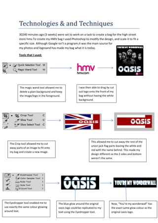
The magic wand tool allowed me to I was then able to drag by cut
delete a plain background and keep out logo onto the front of my
the image/logo in the foreground. bag without having the white
background.
This allowed me to cut away the rest of the
The Crop tool allowed me to cut
union jack flag parts leaving the white and
away parts of an image to fit onto
red with the name behind. This made my
my bag and create a new image.
design different so the 2 sides and bottom
weren’t the same.
The Eyedropper tool enabled me to The blue glow around the original Now, “You’re my wonderwall” has
use exactly the same colour glowing oasis logo could be replicated to my the exact same glow colour as the
around text. text using the Eyedropper tool. original oasis logo.
2. Skills that I have learnt
Photoshop was a brand new program to me. I
received much help from my colleagues and
teachers. All the skills and tools were new and it just
required practice to get used to them. Obviously
tools like “cut” and the “eraser” were simple and
self-explanatory but the layer” styles” and “magic
wand” needed practice and patience to master.
The layer styles helped me to change the colour,
texture and inner and outer glow of my text. All
these required a lot of playing about to get some
experience in using the tools. But in time I learnt to use contrasting colours but blend them
together and not make them look too over the top so that they fit in with the surrounding
pictures and colours.
The “magic wand” tool was the most important tool for making my bag look professional.
The tool was only affective when the image I was using a white or plain coloured
background. The “magic wand” tool meant that I could remove the background and keep
the foreground. This allowed everything to blend together and sit on front or behind one
another without having a different colour or misshaped background.
Evaluation
My Bag
I believe the main strength of my bag was the album artwork and Oasis logos. Without the
album artwork there wouldn’t be the colours and eye catching pictures, and without the
logosthe bag wouldn’t be as recognizable and unique. The second strength is that most of
the sides are scaled to fit each side of the bag and none of the pictures are blurred or out of
focus.The construction side of the design was good with all sides fitting together neatly with
no overhanging parts.
On the other hand, the weaknesses of my bag would be that the sides that aren’t scaled to
the right size. The hmv logo is cut off and only reads “hm”. The lyrics written on the front
cover have the first and last letter cut off. Perhaps, the photos could have been a bit clearer
but they were the only images available for the design I wanted and they are clear enough
3. to symbolise the Oasis band. The only negative side to the construction would be the tabs of
the bottom face are stuck over the outside not hidden away on the inside.
Was I pleased?
Overall, I was pleased with the outcome of my bag. It required a lot of learning and
concentration, combined with patience and skill, but from the first stages of designing to
the cutting and sticking, my final finished product was a success and I am proud of it.
What would I change?
To be honest, I don’t know what I would change. I could choose a different artist with more
artistic album artwork and perhaps use some more advanced Photoshop techniques.