Poster Presentation
•Download as PPTX, PDF•
3 likes•1,523 views

1. A scientific poster should communicate research findings visually and concisely. It should highlight key findings and attract viewers from a distance. 2. Effective posters use a clear layout with sections arranged from top left to bottom right. Text should be brief and graphics should support the message. Less than 30% of the poster should be text. 3. Important elements include the title, author names, introduction/abstract, objectives, methods, results, conclusions, and references. Font sizes should be large enough to read from 3 feet away.

Recommended
More Related Content
What's hot
What's hot (20)
Similar to Poster Presentation
Similar to Poster Presentation (20)
Recently uploaded
Recently uploaded (15)
Poster Presentation
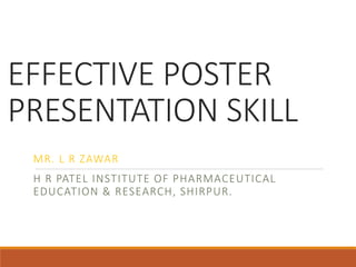
- 1. EFFECTIVE POSTER PRESENTATION SKILL MR. L R ZAWAR H R PATEL INSTITUTE OF PHARMACEUTICAL EDUCATION & RESEARCH, SHIRPUR.
- 2. What is a Scientific Poster? It is: A visual means for communicating a summary of research. Typically created for an academic or professional community. Should highlight the most important research findings in an aesthetically pleasing manner.
- 3. Purpose of Poster Presentation Rapid, concise and visual communication is the purpose of a scientific poster presentation. 1. Rapid : Convey your research / project quickly and clearly. 2. Concise : express your findings succinctly. 3. Visual Communication : Draw the audience with appealing design, figures, graphs and illustrations when possible.
- 4. Planning The Poster Decide concept or question. Determine poster size (1 m × 1 m) Choose from PowerPoint, Latex, Frame maker… Choose poster orientation ◦ Portrait ◦ Landscape Make it easy to read Make it easy to understand People have only few minutes per poster
- 5. Poster Layout Typically, use 3 to 5 columns Arrange material vertically from top left corner to bottom right corner Determine logical sequence of material Organize material into section Arrange material into column
- 6. Title & Authors Designing the Poster Left to Right, Top to Bottom Flow
- 7. Title & Authors Part 1 Part 2 Part 3
- 8. Centered Image & Peripheral ExplanationsTitle & Authors
- 9. Centered Explanation, Peripheral Images Title & Authors
- 10. Horizontal Symmetry Horizontal + Vertical Symmetry Diagonal Symmetry Asymmetry
- 11. 1.Title 2. Author Name/Affiliation 3.Intro or Abstract ____________________ ____________________ ____________________ ____________________ ____________________ 4. Objectives/Goals/Major Problems ____________________ ____________________ ____________________ ____________________ ____________________ ____________________ 5. Methods __________________ __________________ __________________ __________ 6. Results/Findings ____________________ ____________________ ____________________ 7. Conclusions ____________________ ____________________ ____________________ ____________________ 8. References ____________________ ____________________ 9.
- 12. Content of the Poster 1. Title 2. Abstract 3. Objective / Goal / Major Problem 4. Material and Method 5. Results / Findings 6. Conclusion 7. References 8. Acknowledgement
- 13. Text size Matters.(….font and alignment, too.)
- 14. Poster Text Keep it short and simple Remove all non essential information Attract visual attention : Use graphics Remember LESS IS MORE Try For : ◦ 30 % Text ◦ 40 % Graphics ◦ 30 % Empty Space
- 15. Suggested Font Size Title : 90 Authors : 72 Section Heading : 54 - 60 Text : 32 – 40. Left align text Double space Pick one font and stick to it Use larger/colored font for emphasis Use bulleted points rather than paragraphs
- 16. Poster Title Make it interesting! You want to lure people from a distance Should be easy to read from 15 feet If title is too long, shorten it ◦ Don’t reduce the font size
- 17. Authors Include first names ◦ omit middle initials and titles Include academic affiliation ◦ omit city and province
- 18. Don’t use these colors together. Don’t use these colors together. Don’t use these colors together. Don’t use these colors together. Color matters.
- 19. Color One background color to unify poster Stick to muted colors Avoid red/green combinations ◦ red/green color blindness is common Don’t overuse color Be consistent
- 20. Graphics Make large enough for viewing from at least 3 feet away Text should support graphics, not vice versa Use heavier lines in tables and graphs for easier viewing
- 21. Poster Editing Proofread Spell check Get feedback before printing Get feedback in time to make changes
- 22. Sample Posters
- 26. What makes a bad poster?
- 27. What is wrong with this poster?
- 28. What is Wrong With This Poster?
- 29. The three-legged stool of presentations.
- 30. 1. Message. The three-legged stool of presentations.
- 31. 1. Message. 2. Visuals. The three-legged stool of presentations.
- 32. 1. Message. 2. Visuals. 3. Delivery. The three-legged stool of presentations.