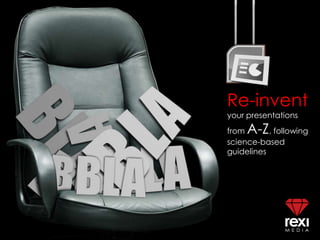
The science of memorable presentations
•
250 likes•61,093 views

This presentation includes science-based principles on how to attract an audience's attention, sustain it, and convert a presentation into memorable content.

Recommended
More Related Content
What's hot
What's hot (20)
Viewers also liked
Viewers also liked (19)
Similar to The science of memorable presentations
Similar to The science of memorable presentations (20)
Recently uploaded
Recently uploaded (20)
The science of memorable presentations
- 3. ANTICIPATION Agenda items presented right in the beginning often kill the anticipation of what comes next. You can set the agenda, but also announce a few surprises that will occur through the presentation. This will heighten the audience’s curiosity and increase attention span.
- 5. BOLD Attention – which is often mandatory for memory – depends on a clash between an object and its environment. If you want to draw attention to a specific item in your presentation, make it deviate from the pattern.
- 7. COLOR Colors can lead to memorable content because they impact mood, evoke emotion, organize information (e.g., mind maps and associations), or draw attention to a specific object. Warm colors such as red, yellow, or orange can make content memorable because they are more stimulating.
- 9. DIAGRAMS Just because diagrams and charts and stats have been abused in slides, it does not mean they should be excluded completely. Be careful of over-simplifying presentations. Charts, numbers, and diagrams bring substance to Zen presentations. People remember more from presentations that elaborate on content, and diagrams or charts help you elaborate. Elaboration works because it leads to more connections in the brain and therefore more memory traces formed for a particular concept.
- 11. EMPTINESS Mix dense slides with simple slides to provide the brain a breather and refresh attention. Do not feel that too much empty space on a slide leads to sterile design. There can be reverence in emptiness. A single brush stroke can communicate a great deal.
- 12. F is for fresh
- 13. FRESH Sometimes not having a template and starting from a clean slate can lead to a more creative presentation. Imagine if you did not have any “shells” to fill up. Imagine if there were no precedent to what you were trying to do. What would you do differently in your presentations right now if you were freed from constraints?
- 14. G is for genuine
- 15. GENUINE Much of the language in corporate presentations is clichéd, vague, and pretentious. To connect with an audience better, choose words you would use at the dinner table with friends. Because these phrases are likely to be more genuine and simpler, they will be remembered better.
- 16. H is for human
- 17. HUMAN We buy from people, not from slides. You can list all the facts and features of your product or idea, but it’s ultimately the human side of your truth that is remembered more and becomes persuasive.
- 19. INTENTIONAL Beginners place elements on slides arbitrarily. Advanced presenters place images, text, lines, and shapes with the intent of leading the eyes around the design. This means you control where the eyes go, which means you control the audience’s focus and attention.
- 21. JUXTAPOSE The brain needs contrast to make decisions faster and easier. Consider presenting your products or ideas in contrast with other products or ideas. Anchor your thoughts by establishing a benchmark (e.g., “Microsoft does it this way, and our organization does it the other way”). Include “before and afters” of your ideas so the audience can appreciate your proposal and act on it faster.
- 23. KNOW-IT-ALL There are few absolute truths. This means your audience will have great contributions to your materials... if you let them. Avoid the “know-it-all” approach. The more you invite them to participate, the more memorable the content, because they will remember content over which they have ownership.
- 24. L is for length
- 25. LENGTH Imagine your presentation like a skirt: short enough to be interesting and long enough to cover the subject. Attention drops significantly after the first 10 minutes of a presentation; if your presentation is longer, you must vary the pace and format to re-set this starting point.
- 26. M is for meaning
- 27. MEANING Ultimately, the audience will forgive you for sub-optimal design if you offer relevant content that means something to them. People will forget slides but they will remember the meaning of what you said, if you made it clear.
- 29. NON-LINEAR The structure of your presentation does not always have to be linear. As long as you have a clear beginning, ending, and a solid main point, you can afford to deviate to address participants’ needs and questions. If you are too attached to a linear script, you may miss the chance to allow the audience to take you in a direction that favors them. People remember content better if they contribute to it in some way.
- 30. O is for one
- 31. ONE A mistake business presenters often make is addressing two, three, or more main ideas. Focus on one main point only. Substantiate it with no more than four items or objectives.
- 32. P is for point
- 33. POINT ...their point. Present from where they are, not where you are. Anytime you link your content to concepts such as personal development, improved appearance, comfort, leisure, competence, money, efficiency, freedom, self-confidence, health, or time savings, you will have the audience’s close attention. Link any of these concepts to the ONE main idea and you will have a memorable presentation.
- 34. Q is for quirky
- 35. QUIRKS Robotic presentations that follow a predictable pattern lose the audience’s attention quickly. Consider bringing one of your unique qualities into your design. What makes you uniquely you? Let that show.
- 36. R is for rhythm
- 37. RHYTHM The style of the images, text, shapes, and lines – all these elements, when repeated, add consistency and professionalism to any presentation. The brain needs a rhythm, a routine, a pattern before it can notice anything that deviates.
- 39. SCRIPTED? The best presenters appear relaxed, natural, and spontaneous. They react quickly and easily to anything that happens during a presentation. They speak as if they were talking to a friend: nothing seems scripted. This type of speaking builds an immediate connection with the audience and sustains attention.
- 41. TRANSITIONS If you aspire toward memorable presentations, you must practice transitions from concept to concept, from slide to slide. Memory is based on associations, and the better you link each slide to the next, the stronger the retention of your content.
- 43. UNNECESSARY? Modern audiences are overwhelmed by information. Very few complain of too short of a presentation. Consider starting with absence in mind: how much of the intended content can you safely eliminate so you focus more on essentials and less on excess?
- 44. V is for vivid
- 45. VIVID {images} Memory of your content is based on strong visuals. The more vibrant (and sometimes unusual) the images you include, the stronger the memory for that content.
- 46. W is for why
- 47. WHY Any content becomes stronger when you present it through a framework. Consider presenting the “why” first, then the “how.” Return to the “why” at the end of the presentation to leave the audience on a higher ground. People often remember the end of a presentation, so if the “why” is clear, they will endure any “how.”
- 49. XANTHONE? Some presenters speak in such abstract, obscure words that it is difficult to understand them. Worse, it is difficult to remember them. Help the audience see what you’re saying. Paint a mental picture by using action words and colorful adjectives. Notice how easy it is to picture “a plush white leather interior with lustrous cherry wood fittings.”
- 50. Y is for you
- 51. YOU ...are the most important part of any presentation. Beyond fonts, stock photography, slides, and projectors, the audience will seek to connect with you. How do you bring your magic?
- 53. ZEIGARNIK Zeigarnik was a psychologist in the ’40s who researched the concept of closure. She noticed that we tend to remember unfinished things more than finished things. A great presentation leaves the audience craving more. Promise them that in a future presentation, you will solve an additional problem or provide additional useful information. People will be inclined to return to something that has not been solved completely.
- 54. TO BE CONTINUED… More to come on science-based guidelines for presentations. Meanwhile, for help on how to apply these principles in your own presentations, contact Rexi Media at info@reximedia.com.
Editor's Notes
- Colors evoke emotions. They help you communicate ideas, generate interest, and improve the audience’s retention of your materials.
- Be carefulof over-simplifyingpresentations. Charts, numbers, anddiagramsbringsubstanceto Zen presentations. A balance betweensimplicittyandcomplexitywill lead to more attentionandretention.
- Do not feel that too much white or empty space on a slide leads to sterile design. There can be reverence in emptiness. A single brush stroke can communicate a great deal.
- Beginner presenters place elements on slides arbitrarily. Advanced presenters place images, text, lines, and shapes with the intent of leading the eyes around the design and helping understanding.
- AudiencesA simple sentence like “He didn’t close the sale that day” can have many meanings depending on what words you choose to emphasize.
- The structure of your presentation does not always have to be linear. As long as you have a clear beginning, ending, and a solid main point, you can afford to deviate to address participants’ needs and questions. If you are too attached to a linear script and a set of bullet points, you may miss the opportunity to be spontaneous, and allow the audience to take you in a direction that favors them.
- One mistake business presenters make is addressing two, three, or more main ideas. Focus on one main point only. Substantiate it with no more than 4 points.
- The best presenters appear relaxed, natural, and spontaneous. They react quickly and easily to anything that happens during a presentation. They speak as if they were talking to a friend: nothing seems scripted. This type of speaking builds an immediate connection with the audience and sustains attention.
- Some presenters speak in such abstract words that is is difficult to understand them. Worse, it is difficult to remember them later. Help the audience see what you’re saying. Paint a mental picture by using action words and colorful adjectives. Notice how easy it is to picture “a plush white leather interior with lustrous cherry wood fittings.”