
Recommended
More Related Content
What's hot
What's hot (19)
Similar to Short Film Research and Analysis
Similar to Short Film Research and Analysis (20)
Recently uploaded
Recently uploaded (20)
Short Film Research and Analysis
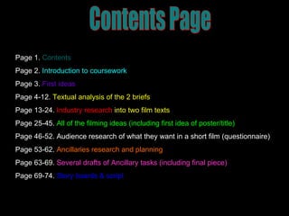
- 1. Contents Page Page 1. Contents Page 2. Introduction to coursework Page 3. First ideas Page 4-12. Textual analysis of the 2 briefs Page 13-24. Industry research into two film texts Page 25-45. All of the filming ideas (including first idea of poster/title) Page 46-52. Audience research of what they want in a short film (questionnaire) Page 53-62. Ancillaries research and planning Page 63-69. Several drafts of Ancillary tasks (including final piece) Page 69-74. Story boards & script
- 2. Research and planning A2 Coursework Josh King
- 4. Research into brief 1 Documentary
- 8. Research into brief 2 – Short film
- 25. My film - First Ideas
- 34. Locations
- 35. Locations
- 38. Title/logo
- 40. Film poster (first draft) Bridge The obsessed girl The girl with the date The boy she cant have
- 41. Characters The boy she cant have The girl with the date Obsessed girl
- 48. 3. Male or Female I did an even sample as I wanted both male and female views, this makes my questionnaire reliable and non bias.
- 49. 7. Do you enjoy twists in a film? Or just like the straight narrative? I wanted to see what my audience would want, so I could use it in my film and not go for the wrong option. This graph is close but clearly shows my audience would like a twist more .
- 50. 12. Have you ever watched any short films before? (5 minutes) This shows that these types of films are not well known, and I can expand on what I want to do, as my audience do not no what to expect, this also means that i can challenge the typical short film, of not a strong narrative.
- 51. 13. If so what was the genre? From this question I can see what sort of genre my audience wanted to have. I can also see what least likely they wanted it to be, so I can stay well away from this.
- 52. 14. Do you think short films need to cut straight to the point? Short film lasting (5 minutes) My audience think that the film should not drag on as it is very short. I don’t agree with this as I think it makes it exciting as just below 50% of the people I asked agree. This goes against my hypothesis, but maybe they decided to take the middle option as it is the most ‘safe’.
- 53. Ancillary Task Research And Planning
- 54. Front P oster Research The poster shown on the right, is a film which was in the cinema, but the film was based on a short film and it just got developed. This is the type of quality which my film will just not be able to have, as I am having no costs, and I don’t have the money, time or equipment to make such a detailed poster as this one. Also it is animated which my film is not, so the detail will just not be there, I would need something such as CGI (computer graphic imagery) to pull off such a detailed poster like this.
- 55. This poster here shows the mid-shot of what I want the couple in my film to be like, although I don’t want them kissing, just his arm round her back. I like the way its very up close and gets to the point, i don’t want mine to be like that as I want the couple to more of the right of the poster, and in the background the psychopath with the knife. Front Poster Research
- 56. Props I might include in my poster Dead roses in the title, to show dreams crushed. Type of clothing I wish the girls to wear, in the my film, nice night life behind. Want to impact the hatred, distortion from the tight grip of the knife. I want a bridge lighted up with them holding each other.
- 57. Colours I want to show For my poster, I want to use a ‘dusk’ look, where as you can see in the picture (left) it is a sun down, orangey look where you will get the image of romance, but also as it is not light, my audience may also be able to pick up the thriller element of the film.
- 58. Colours I want to show This is another type of mood, colour, type of light I may include instead in my poster. This is because it goes well with what the characters are doing at the time, makes it more romantic, but also goes against the usual connotation of bright lights being all bright, happy as the knife scene would work well round the night time.
- 59. Magazine companies I might use This is a picture taken from the empire website, I will be copying magazine reviews but this gives you an idea of what I am aiming mine to look like. This is an review taking from the magazine, TV and internet company E! entertainment. This is obviously set out different than the magazine review but it gives you the main idea.
- 60. What I wish mine to look like As you can see in this piece of text, the picture is very big with a caption on top, I wish for my title to be on top and have the writing underneath with the production information, ratings etc. I wish to use the magazine of Empire to do this as I believe it is very formal but also very creative.
- 63. Ancillary Task - Several Drafts
- 64. Ancillary Task First Draft As you can see from this, it looks a bit bare, I thought I needed to add a bit more to the poster to make it more interesting, I really liked the font so I decided to keep this, although I did really want to roses in the text. The problem was that it didn’t really seem to work that well. The lighting was also way to dark, and you can barely see anything, this was something I really needed to sort out .
- 65. Ancillary Task First Draft This is what I first created when I did my film review, I looked very closely at the empire magazines, and saw this type of layout which I very much liked. So I decided to go with this and just edit it, to make it glossy as you would see in a top magazine. Everything here was done by scratch, I even made the logo of ‘in cinemas’ just the same as they do in the empire magazines. There was a lot of erasing and starting over on certain parts, especially the border as I needed it to fit perfectly.
- 66. Ancillary Task - Second Draft This was my second draft of the poster, I added a billing block into my poster, to make it look like a real film poster. I thought this was the main thing which I had to do, but after finishing the billing block I still thought it looked a little bit bare. I lightened the text slightly so the picture comes out better, but on this document it still looks the same. I needed to think about what I had to do to make mine feel like a real poster.
- 67. Ancillary Task - Second Draft This is my second draft which is near enough complete, I added in my review, which I believed it made it look a lot more real. I want to change the wording of my plot, as I think it does not grab the audiences attention that much. I believe the font I chose went well with the layout of the review, its bold and clear, giving it a nice edge.
- 68. Ancillary Task - Finished This is my final poster for my ancillary task, I added a comment from ‘The Times’ as I believe it made it look more entertaining and realistic for the audience. It used up the space well which was needed as it looked a little bland before. I also added to my billing block, so it looks like it has more depth to it and like all others. Where it tells you pretty much everyone who worked in the production of the film and I also have the distributors.
- 69. Ancillary Task – Final Review This is my film review completed, I only added small touches to this as believed that it was pretty much complete on my second draft. I changed the font of my plot slightly and the plot itself. I think it looked more professional with how I have written it this time. Also I changed the name at the bottom from Josh King as I wouldn’t be writing about my own film for empire…
- 70. Story Board & Script
- 71. 3 Seconds High angle/establishing shot Non - Diagetic Music Audience hear the alarm Also hear him get up and talk 2 Seconds Over the shoulder / side view Non – Diagetic Music Tries to turn off alarm (so you hear alarm) Also hear him muttering to himself
- 72. 2 Seconds Over shoulder/maybe point of view Non – Diagetic music Making the shot more interesting, putting the audience into his shoes 2 Seconds Mid/long shot Non – Diagetic music Showing the audience what the room looks like, making them guess where he is.
- 73. 1 second Point of view shot him rushing to draws Slow beat kicks in Showing audience his point of view 3 seconds P.O.V of him looking through draws Same small toned music
- 74. First minute of script Alarm – beep beep beep beep beep beep Chris – o shit. (Throw’s ipod onto bed) Chris – “where did I put my phone” Split screen to Holly – Shows her looking at her phone with a ‘sending’ icon Text – “Where are you?! I leave first thing tomorrow” Switches back to Chris on his own Chris (reply) – Sorry I’m coming and do you really think your leaving without me? Chris – Runs in and out of room, finding jacket etc. Holly – Picks out what sort of Jewellery to wear. Chris – Grabs passport, bag. Shoves some clothes in and leaves.