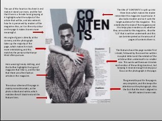
The colour schemeof the page in
mainly monochromatic, as the
photo is black and white, which
matches the all black text and the
feature lines.
His angle of gaze is directly at the
camera, and the photograph
takes up the majority of the
page, which makes him look
more intimidating, and this
matches the persona that Kanye
West often pursues.
The features have the page number first
in bold, followed by the coverline written
in capital letters and then details of the
article written underneath in a smaller
size. This works well because it makes
each section of the writing stand out, but
keeping it neutral enough to keep your
focus on the photograph in the page.
The use of the heart on his chest in red
makes it stand out more, and the fact
that there is a female hand grasping at
it highlights what the subject of the
article that will be, and also extends
how he is perceived by readers of the
magazine. Also, as it as the only colour
on the page it makes it seem more
meaningful.
The title of ‘CONTENTS’ is split up into
three lines which makes the reader
remember this magazine in particular. It
also looks modern and so it suits the
target audience for this magazine. This
establishes the style of the magazine and
this helps place readers as to whether
they are suited to this magazine., Also the
‘1/3’ that is written underneath and this
can be interpreted as the amount of
pages of contents there is.
He is wearing trendy clothing, and
this further highlights the type of
magazine that Vibe is, and the fact
that there are often fashion
articles in the magazine.
The general layout for the page is
very simplistic, and this keeps the
attention on the photograph. Also
the fact that the text is aligned to
the left makes it seem neat.
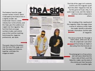
3.
The title ofthe page isn't contents,
and this sets the magazine apart
from the other magazines that are
for this genre of music. Also, it is
quite large in size, and this makes it
stand out when compared to
others.
The colour scheme for the page is
mainly black, white and red, as
they all compliment each other
without being to bright or
distracting from the features on
the page.
The including of the masthead of
the magazine helps the pages show
a sense of cohesion, which helps
the reader identify similarities
between themselves and the style
of magazine.
The photograph is of two artists,
and each pose describes the
music style of them, and this
helps the reader see the style of
the articles and their favourite
artists in another light.
The quote helps tie the photo
into the rest of the page, as it
links the pages and features
together, and helps the
magazine match.
The features have the page
number written in bold, which
is followed by the feature line in
a slightly smaller size.
Underneath there is a brief
introduction to the articles, and
this helps give the audience an
insight into the magazine. The
fact that there are page
numbers makes each article
easy to find and the matching
fonts keeps the magazine
professional, and sleek.