3. In what ways does your media product use, develop or challenge forms and conventions of real media products? House style fits genre Typical persuasive convention Main image Bold headline Dominant eye contact Unusual title Celebrity endorsement Suspicious facial expression Challenged the different fonts Main celebrity name Typical convention of the barcode One of the media conventions I have challenged
4. Typical convention of the issue number and date Challenged the different fonts Bold headline Stuck to a softer house style Full image that makes it stand out Typical conventions of the different features inside the magazine Typical page numbers-
5. How does your media product represent particular social groups? Mysterious Unique Seductive
6. How does your media product represent particular social groups? Hand gesture Perception of my model Mysterious Confident Fierce More respectful Influential Quirky Unique Softer pose Quirky smile Quirky, confident pose Significant hand gesture
7. What kind of media institution might distribute your media product and why? Billboard Prometheus Global Media 16,327 sold weekly
8. Who would be the audience for your media product?
9. How did you attract/address your audience? Bold text Big image Different colours Buzz words
10. What have you learnt about technologies from the process of constructing this product? What have I learnt? Adjusted the Brightness & contrast 1.Editing images Red eye Added hair
11. What have I learnt? Editing images Importing texts from an external website www.dafont.com
12. What have I learnt? Editing images Importing texts from an external website Putting the documents onto a blog
13. Looking back at your preliminary task, what do you feel you have learnt in the progression from it to the full product?
As you can see I have linked the style of my magazine to the style of the already famous music magazine ‘Q’. You can see the different conventions I have used that make it easy to sell a magazine. Firstly both magazines have the top border which consists of the selling line. The selling line grabs the readers attention and should make them want to read more about it. It normally consists of persuasive language and inside information. Another convention in which both magazines have is the title of the magazine. They are both bold and stand out and they are also both on the top left hand side. This is where the readers eyes tend to go to first. Both images are similar as they are both a medium close up shot. This means that you can see the facial expression in the image yet you tend to normally see a little glimpse of what they are wearing. Also another main point in the image is the eye contact. It is very important that the image connects with the reader and it almost gives off what they are about. Another convention in which both magazines have is the first third being used for what the magazine consists. This is one of the media conventions with magazines, it is said that the reader generally tends to go to the first left third. This is used to pack as much persuasive language and conventions in like celebrity endorsement so that the reader will buy the magazine.
With the front cover of the magazine I used the typical conventions of making the image big and on the right side of the cover. The eye contact in this image is very dominant and that should catch the audiences’ eye as it is directly looking to the camera. The image can be very demeaning as she is half smiling which is quite suspicious and will make the reader want to know more. Another typical convention that I have used on the magazine is the selling line on the border of the magazine. This hopefully will catch the readers eye and make them want to buy it with the persuasive language.This is one part of the magazine that I haven’t seen been used on any other magazine that I researched. I have used the famous celebrities that are being used in the magazine. I have done this because I want to persuade the readers with top artists name so they know that it is a well known magazine that use well known singers. Also, the names I have used suit the genre of the magazine. This is one part of the magazine that I haven’t seen been used on any other magazine that I researched. I have used the famous celebrities that are being used in the magazine. I have done this because I want to persuade the readers with top artists name so they know that it is a well known magazine that use well known singers. Also, the names I have used suit the genre of the magazine. This is one part of the magazine that I haven’t seen been used on any other magazine that I researched. I have used the famous celebrities that are being used in the magazine. I have done this because I want to persuade the readers with top artists name so they know that it is a well known magazine that use well known singers. Also, the names I have used suit the genre of the magazine. This is one part of the magazine that I haven’t seen been used on any other magazine that I researched. I have used the famous celebrities that are being used in the magazine. I have done this because I want to persuade the readers with top artists name so they know that it is a well known magazine that use well known singers. Also, the names I have used suit the genre of the magazine. The celebrities that I have used throughout the magazine have been celebrities that fit my genre of magazine.
The first typical convention I have used is the issue number and the date of the magazine. This makes the magazine look professional and as of there has been previous issues of the magazine. The issue of the magazine keeps it up to date and uses typical conventions of media. I have kept the header of the magazine to the colour of the house style so that it doesn’t confuse the reader. One of the media conventions that I have challenged is the different fonts that I have used on the front cover and on the contents. With the front cover I have used a ‘eroded’ style of font that is quite unique and stands out. With the contents I have used an almost typewriter effect for the font. It is completely black and bold and will catch the attention of the reader immediately. Another typical convention that I have used is the titling of the different sections of the magazine. I have made sure that the text is bold and stands out and it is simple for the reader to see. I have also made sure I have numbered each page.One of the main things I have challenged with the contents page is the image. I have used a full body image to make the whole page stand out.
The stereotypical representations of the models on most music magazines are firstly, quite seductive. Either if it’s the way they are dressed which portrays this or even there facial expression. As you can see by both the Q magazines featuring Cheryl Cole and Lady GaGa. Lady Gaga’s posture and her dress code would give off the impression that she is being quite seductive and by the way she is holding her pants. With the Cheryl Cole magazine the way she is almost pulling her lip and having her tongue out shows that she is portraying this ‘sexual’ pose with seductive colour of it being red.With the two other magazines featuring Madonna and Florence, there poses would almost insinuate this kind of mysterious story behind there image. This makes the reader want to know more about the way they are being portrayed as normally there is a story behind the facial expression.With the Lilly allen magazine cover and the NME magazine cover these poses are quite unique. By this i mean that they have either got there own unique style in which they are portraying in the image, such as the NME magazine. However sometimes you can portray this by props, such as the Lilly Allen cover, she has used animals which makes the reader want to find out why she has done this.
Now onto the perception of my model and how the images portray different messages to the reader.With the front cover I think the image is quite deceiving. I think the eye contact is vital to connect to the reader. The quirky half smile that the model kind of has makes it interesting and perceives the model to have this background story behind her facial expression. The hand gesture of the model is also quite unique and quirky and as she is symbolizing Cheryl Cole the famous tattoo of Cheryl is on her hand.I think the pose of the model is quite respectful and confident. I say this because unlike other cover images which are quite seductive with the genre of the magazine I have kept it quite bold and structured.With the contents, the full image model is the same as the front cover image. I have kept the same hand movement so that the reader recognizes it and then knows that it is the same person. The colour of the jacket links into the house style and the pose of the model is quite unique and quirky.
I chose the company Bill board Magazine as the company that would distribute my style of magazine. I chose this magazine because they promote the magazines that fit the genre of my magazine. With my magazine being distributed by this particular company it will do well as they sell a weekly gross of 16,327 magazines a week. This just shows how well the magazine company does and as it is obviously popular well known and well discovered company.
By the images I have used in my magazine and the house style and the text that I have used portray and reach out to my target audience. I think my main target audience is older teenagers say from 16 to the older group of about 21. I picked this audience because i think this is the main group age that are more interested in music and would actually go out to buy a music magazine. I would say mainly girls would benefit from my magazine because I personally think girls are more music orientated and prefer to know about artists and there lifestyle not just there music.
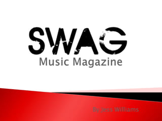
Firstly, I attracted my audience by the big bold text of the name of the magazine ‘SWAG’.. I did this in bold capitals because it is then out there for to catch the audience’s eyes straight away and therefore attract the audience to the rest of the magazine. I used bold powerful colours such as red so that it would stick to the house colour of the magazine and so it would relate to the genre of the magazine.