
Recommended
More Related Content
What's hot
What's hot (17)
Viewers also liked
Viewers also liked (13)
Similar to Film Magazine Front Cover Development
Similar to Film Magazine Front Cover Development (20)
More from hayat123
Recently uploaded
Recently uploaded (20)
Film Magazine Front Cover Development
- 1. Film Magazine Front Cover
- 2. These are some images I considered using at first for the magazine front cover.
- 3. I thought of using an urban setting as it seemed more fitting from what I’d seen on existing magazine front covers. I cropped the image to become the correct size as well as using the content-aware tool to get rid of objects that were in the way i.e. the signs/building seen at the centre. When I placed the image onto the background, it didn’t really work so I looked for other possible images to use.
- 4. The main image I decided to use was a mid shot of the protagonist in costume with a serious expression - looking directly at the camera. This image didn't come out fully in focus however, it was the most suitable. I edited the image to make it look clearer.
- 5. I decided to test out the image on various backgrounds. I also tried out different fonts for the masthead. I was looking for a blueprint effect however, through further existing film magazine research, I decided to use an urban location as the background.
- 6. I experimented with layering an image of London through the masthead however, this didn’t really make it look like a magazine.
- 7. I got a different background image here of an alleyway which I was happy with. I played around with the colours of the image effects and decided to use the blue (cyanotype) one.
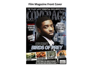
- 8. £3.70 ($9.99 USO) These are some of the features I found and created to use for the conventions of my film magazine cover.
- 9. For all the text, I downloaded fonts from dafont.com and used the text tool however, I modified their look from the ‘character’ section. For the masthead, I used the blending options to create the bevel effect and making it look slightly 3D. I applied conventions such as: the banners, masthead, issue number and date, website, buttons, title/anchorage text, sell lines, barcode and price.