
Recommended
More Related Content
What's hot
What's hot (19)
Similar to Targeting 20-30s Indie Fans
Similar to Targeting 20-30s Indie Fans (20)
Recently uploaded
Recently uploaded (20)
Targeting 20-30s Indie Fans
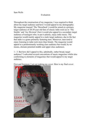
- 1. Sam Wells Evaluation Throughout the construction of my magazine, I was required to think about my target audience and how I would appeal to my demographic. My magazine (named ‘The Throwback’) would be aimed at a primary target audience of 20-30 year old fans of classic indie rock (as in ‘The Smiths’ and ‘Joy Division’) but it would also appeal to a secondary target audience of teenagers who, to put it plainly, enjoy indie music. The magazine would mainly appeal to a male target audience, due to the fact that indie is a genre primarily featuring men. Moreover, men tend to enjoy listening to indie rock more than female. The magazine would appeal to a predominantly working class audience but would, by no means, alienate potential middle and upper class audiences. 1 - 3. But how did I appeal to this, admittedly, rather broad, target audience? I subverted several conventions of music magazines whilst also conforming to elements of magazines that would appeal to my target audience. First and foremost, I set out making my cover. Here is my final cover:
- 2. I had taken pictures of my cover star and I had to manipulate it as to appeal to my target audience. The original image was in colour, but I removed the colour as to maintain the magazine’s nostalgic edge. Moreover, due to the fact there is no colour, it feels as if the reader is being ‘thrown back’ to another era thus appealing to my target audience and remaining consistent with my magazine’s ‘throwback’ theme. Furthermore, due to the fact that there is a direct mode address from my cover star, Liam Oakley, the audience instantly feels more involved thus making them feel more inclined to purchase it. I based the cover on the style that my target audience preferred in my questionnaire, the ‘Q.’ cover that was sparse yet effective. I attempted (and, I feel, succeeded) in creating a simplistic, minimalistic cover style. By creating a sparse cover, it forces the reader to focus on the image thus elevating the image and making it more effective. Furthermore, it means the magazine maintains it classic, nostalgic image as it harks back to a simpler era of indie music. But how did I form this minimalistic cover? I restrained from including cover lines which may obscure the image. I used a basic colour scheme of red, gold and white. Due to the black and white picture, the masthead is more prominent, standing out due to the emboldened red. Red is used for the more important pieces of text, as in the masthead and the main story. As such, the reader’s eyes are instantly drawn towards these aspects of my magazine. I did not use crass, brash colours as not to create a tacky feel. A solitary image is used as several images may transform the magazine into a tacky style, reminiscent of ‘Kerrang!’ and ‘NME!’ which would simply not appeal to my older and more intelligent target audience. The title, ‘The Throwback’, alludes to a bygone era of indie music (as referred to in the tag line) which would appeal to my target audience. The term ‘Throwback’ connotes that, whilst the magazine is clearly modern, it is certainly influenced, if not fashioned, by the 1980’s era of independent music. The tag line is ‘Providing readers with a throwback to a bygone era of indie rock’. This further reiterates the sentiment of the magazine (already referred to in the title, the image and several other elements) in that we are looking back whilst moving forward. The term ‘indie rock’ is a clear signal to the reader of the genre that the magazine focuses on. It also clearly focuses on the term era that we are ‘throwing’ the readers back to – that of the birth of independent music. The price is £3.99; this is in white text (along with the date and issue number) as it is not as important as the gold and red text. The price was
- 3. chosen in the questionnaire, in which they thought £3.01-£4 an appropriate price for a monthly magazine. It is essential to cater to the needs of my target audience and, as such, I followed the questionnaire’s results to a tee. My contents page also uses several conventions to convey the minimalistic, nostalgic sense that I achieved on my front cover. However, I also subverted several current magazine conventions to reference the era I am basing my magazine on. First and foremost - the images, I decided to include some colour as not to make reading the magazine a dirge. However, I retained the nostalgic edge by ‘framing’ the pictures with a Polaroid ‘stuck on’ by sticky tape. This reinforces the independent angle to the magazine, harking back to the days of ‘D.I.Y.’ punk magazines in which sticky tape and Polaroid’s were prominent. This era will resonate with my target audience and, as such, they will be enticed by the familiar images and read on. This ‘D.I.Y.’ sentiment is buttressed by the fact that the images and Polaroid’s are at a skewed angle. A gold frame is used as to highlight the classic style to my magazine. Moreover, a simple colour scheme is once again employed as to retain a minimalistic edge that will become synonymous with ‘The Throwback’.
- 4. The contents title is emboldened as to attract the attention of the readers. The page does however conform to some magazine conventions. This is epitomised by the classic contents style of a large sub-title signalling the name of the section followed by a smaller text, describing the section in further detail. This is the first of my two double page spreads. I, as before, conformed to some conventions of modern day magazines but I also, as before, subverted some conventions. I utilised the convention of including page numbers in the top right of the majority of pages thus informing the reader of my magazine which page they are on. It also makes the magazine easier to navigate as readers can utilise the contents page easier. Moreover, I also included such staples of modern day magazines as the acronym of the magazine and the date of the issue in the top left corner of the majority of pages. As such, the audience becomes engrossed in the magazine as they feel as if, due to the acronym, they are in the ‘TTB’ fan base. The date is an obvious necessity as the reader would want to know the date of the issue.
- 5. There is a lack of colour as before, as to retain the minimalistic, classic style that would appeal to my cultured target audience. It also means that the text is easier to read and as such, the lengthy interview is consumed quicker. The picture is, once again, emphasised due to the lack of a background colour and the size of the picture. Moreover, the lack of text on the left side of the page accentuates the powerful nature of the picture. Liam Oakley’s direct mode of address also enraptures the audience as they feel like they are involved within the magazine. It also retains the sense that we are ‘meeting’ Liam Oakley face to face, both visually and textually. The simple, classy font further conveys a sense of nostalgia that harks back to the era of early indie. I conformed to the interview format of ‘The Word’ and other similarly styled magazines, with the question being asked by the journalist in bold and the answer in normal text. This similarity is due to the fact that ‘the Word’ and ‘Rolling Stone’ have similar target audiences to ‘The Throwback’, as discovered in the research stage of my project. This similarity between the magazines would continue as they both feature similarly sparse styles, simple but classic font and a similar deficiency in pictures. Once again, I used the aforementioned ‘stuck-down’ Polaroid, a recurring theme, to hark back to the days of ‘DIY’ punk magazines. The lead of the article is featured in red as to emphasise that this is not a part of the article but a paragraph to introduce the purpose of the article. The large ‘T’ that begins the article is also a convention of the music magazine genre but it can also be construed as reflecting the ‘T’ in the title of ‘The Throwback’ thus familiarising the potential new fans with ‘The Throwback’. The black and white picture featured in the Polaroid picture also refers to the nostalgic edge of the magazine. This is the second, and final, double page spread, focusing on the second most favoured article type in my questionnaire – reviews:
- 6. As not to bore the readers with the persistent use of Polaroid’s to frame images, I decided to implement a different style of picture with my second article. I included pictures along the bottom as to make him look natural. The picture is Beatles-esque thus forcing one to infer that the article is, as always, in the vein of the magazine and nostalgic. The pictures were stylised (using poster edges) and removed of colour as to give the picture a classic feel, ensuring that the pictures remain in the vein of the magazine as a whole. I made certain that the pictures would not obscure the text and tried to avoid clutter on the page as to maintain the minimalistic style. As to maintain a sense of consistency in my magazine, I included the customary page number, magazine name and date. The title of the section, ‘Reviews’ was emboldened as to draw the reader’s attention to the name of the section and thus, the article. The reviews are in columns as to maintain a newspaper style appearance hence insinuating to the reader that the information is factual. I decided that, unlike ‘NME’ and ‘Kerrang!’, I would not include a rating or stars as this would convey the magazine as tacky and would endorse laziness. ‘The Word’ also employs this policy and they boast a similar
- 7. target audience to my magazine. I have however included “3 tracks to download” thus implying that despite the fact that ‘The Throwback’ contains roots in the ‘80s, they are always moving forward (due to the modern nature of downloading). 4. My magazine represents youths as the next generation of indie rock. This is most notable in my articles in which I hail ‘Costa Nostra’ and ‘The Tendency’ as great new, young bands. This connotes that youths are the future of indie rock thus inspiring youngsters to join the music industry. The emphasis on youth is epitomised by this quote from the double page spread based on Liam Oakley: “The Tendency claim to be subversive, anarchic and generally different. And who can deny them of their youth?” One could infer from this quote that youths have delusions of anarchy but it also holds connotations that the youth have, and always will be dreamers, dreaming that they can make a difference. My magazine doesn’t represent females due to the fact that it is predominantly aimed at males. As such, I realise females would be less likely to buy my magazine but due to their indifference towards the genre, the loss is insignificant. Males are represented as strong and dominant; all the bands featured in the magazine are fronted by males and, as such, males are being championed as the future (and possibly present) of indie rock. Race issues are not being represented, although that, perhaps, is the issue. There are no races other than white being portrayed in the magazine which could be construed as racism in itself. On the other hand, the inclusion of one (admittedly, white) South African