
Recommended
More Related Content
Viewers also liked
Viewers also liked (6)
Recently uploaded
Recently uploaded (20)
Evaluation - codes and conventions
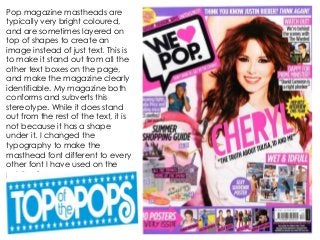
- 1. Pop magazine mastheads are typically very bright coloured, and are sometimes layered on top of shapes to create an image instead of just text. This is to make it stand out from all the other text boxes on the page, and make the magazine clearly identifiable. My magazine both conforms and subverts this stereotype. While it does stand out from the rest of the text, it is not because it has a shape under it. I changed the typography to make the masthead font different to every other font I have used on the publication.
- 2. The cover lines on pop magazine typically all use bright vibrant colours (that will either match the house style of the magazine, or the house style of that particular edition). They also use different sizes to emphasise names or certain words which piece together with the smaller text, creating a “jigsaw” effect. This is done to make the cover lines more visually appealing instead of just being block text. I too have used this in my magazine, both with the colours and the jigsaw text. There is also normally just one main image of the person/feature from the main story within the publication. As we can see in this example, they have used a large picture of Justin Bieber next to his headline. I have emulated this in my own designs.
- 3. Even though the picture is not the clearest, you can still identify that there is a clear colour scheme across the front cover (black, white and yellow). Billboard magazine change their colours every edition, and have a weekly house style instead of just one standard one in terms of colour. Interestingly, this colour scheme matches the celebrity used (yellow to mirror Taylor Swift’s blonde hair, white in her dress). I have not done this in my magazine, but I do have one clear colour scheme that is reflected and used all the way through the designs. I had chosen my colours because they were bright, and selected as the preferred colour scheme from the audience questionnaire’s.
- 4. The headline here is very simple, and only actually uses the name of the artist featured. In most magazines, they might include more than just this information, but it will still be very limited and restricted so as not to give too much away without reading the article. I conformed to this with mine, as it is only the title of the article, which doesn’t give much away about the text in the main story.
- 5. For my music magazine, it was important that I both conformed and subverted different conventions. I had to conform to a lot of stereotypical conventions, so that it attracted my target audience. I found from my research that they were more comfortable sticking with things they know instead of challenging them. However, I did want to change some conventions, so that my magazine stands out on its own instead of being the same as every other magazine currently out there. Progressing from my college magazine, I think that I learnt more about the codes and conventions of music videos, simply due to the availability of music magazines on the internet to look at as case studies. I think this really helped me produce a more professional magazine after looking at different brands of pop music magazine, instead of just having 1/2 college magazines to study for inspiration and analyze.