Designing Great Mobile Apps
•Download as PPTX, PDF•
27 likes•1,966 views

This document provides tips for designing great mobile apps. It discusses that building mobile apps requires considering limited attention, time, pixels, processing power, and connectivity on mobile. The document explores different navigation patterns like flat cards, tabs, lists, and dashboards and their pros and cons. It emphasizes making buttons and elements large enough for fingers and considering pixels per inch for different devices. Overall, the document stresses the importance of streamlining the user experience and standout design for mobile apps.

Recommended
Recommended
More Related Content
What's hot
What's hot (20)
Viewers also liked
Viewers also liked (20)
Similar to Designing Great Mobile Apps
Similar to Designing Great Mobile Apps (20)
More from Chris Griffith
More from Chris Griffith (20)
Recently uploaded
Recently uploaded (20)
Designing Great Mobile Apps
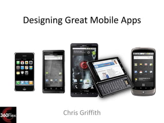
- 1. Designing Great Mobile Apps Chris Griffith
- 2. Disclaimer These opinions and thoughts are my own, and may or may not reflect the opinions of the company that I work for.
- 5. My Mobile App Portfolio
- 8. We need a mobile APP!NOW!
- 9. Building Mobile Apps is hard work.
- 12. Bored Users
- 13. Fickle Users
- 15. It begins with a simple touch…
- 16. Gestures can be a mystery
- 23. There’s Not an App for that!
- 24. But is it mobile?
- 25. Mobile Mindsets… I’m here! I’m bored! I’m working!
- 26. I’m working
- 28. I’m Here
- 30. I’m bored
- 33. What Makes Your App Special?
- 34. Building the User Experience
- 35. An effortless experience requires streamlined choices of features limited attention limited time limited pixels limited processing power limited connectivity
- 36. What is your app’s quest?
- 38. What wrong a web app/site?
- 39. Designing for the tiny
- 40. Rule of Thumbs The average fingertip is 3x larger than the hand cursor Make your buttons 3x larger Then make them even larger
- 41. With fingers, come hands…
- 44. Pixels Per Inch (PPI) Data based on respective products published technical specifications
- 49. Flat Card Pattern Pros Quick Focused Content Varied Content Layout Low Chrome Cons Traversing from start to end of the stack Issues of scaling the number of cards Tiny page dots
- 52. Tab/Nav Bar Pattern Pros Easy access to main sections Easy overview of the features and the context Navigation marker Cons Limited number of tabs Tab always on screen
- 55. List/Tree Pattern Pros Scales past 5 items Direct interaction Limited UI chrome Cons User must remember their navigation path Must travel to top node to access another branch Scroll risk
- 58. Dashboard Pattern Pros Reveals capabilities Offers shortcuts to key sections Can be colorful and engaging Cons Falling out of favor Return Navigation mystery Hub-Spoke navigation
- 61. Be careful of your navigation path
- 64. Put something on device
- 66. Stand Out from the Crowd
- 67. What’s your style Business Sleek and cool Gritty Hipster Fun and playful Glittery?
- 69. People judge an app by it’s cover App Icon Start Screen Overall Look
- 70. Your App Icon == Your Brand
- 73. It’s not a guessing game… http://glyphish.com/
- 74. Give Feedback Did I touch it? Is it working? Is there a signal?
- 75. Design Tips for the Developer
- 81. Now go build something!
- 82. Thanks! chris.griffith@gmail.com @chrisgriffith http://chrisgriffith.wordpress.com/
Editor's Notes
- UI prototyper 15 yrsMgr SDFUGACPFC Community Manager
- Who has built apps for iOS? Android? Playbook? Other? None?
- Building mobile apps are hard
- Mobile devices are not the same as a desktopAbout the same CPU power as a desktop computer of 7 years ago and about 1/3 of the screenComputerBig ScreenPower SupplyConsistent NetworkKeyboardMouseChairDeskMobileSmall ScreenBatteryInconsistent NetworkFingersSensors
- Context
- IF you don’t get it right in your first outing, most will NOT be back
- Careless !=Dumd
- People want simplicity and ease
- Play
- Learn
- Communicate
- 4,000 patents on file for mousetraps
- Your goal is find the missing mousetrap OR find a way to build a new and better mousetrap
- Need to make the most of the user’s time and attention.
- What’s around me? What can I do, Where can I go?
- Quick learning curveCan be be used in short burstsKey component to many successful mobile apps.
- Focused on the micro task of logging your run and routes.
- An effortless experience requires streamlined choices of features-limited attention-limited time-limited pixels-limited processing power-limited connectivity
- In Badge BookletsWhat’s My Schedule?Surprises!This session is not right for me, what can I go see?
- Browser chromeSellingCan’t access all of the deviceBut can have a wider reach
- iPhone – 15/16th of inch
- Don’t crowd me inGive your UI some room to breatheYour UI needs to viewable from a distance
- This pattern breaks you app into focused sub-tasksEarly Android UI patterns had the tab bar at the top of the screen, but can anyone tell me the issue with that location?
- Paper Prototype
- UI template files available for both iOS and AndroidBuild only want you need
- Your App icon is your welcome mat.Design your icons for all the devices supported size: 29px, 36px, 48px, 57px, 72px, 512px
- Focus on start up time.iOS does a great job of hiding this with their start screensBut this is not the time to recreate a Skip Intro UXOnce they are there, welcome them, show them around
- Remember: users want quick easy access to your app, not to play an icon guessing game
- Hidden elements
- Hidden elements
- Hidden elements