1. In what ways does your media product use, develop or use forms and conventions
of real media products?
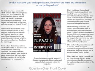
My front cover has a house style I have positioned the masthead
which consists of the following three behind the main image, this is very
colours: red, black and white. My regularly used and is a typical
reason for this is because limited convention used on a magazine front
colour use makes it look more cover. Furthermore, the masthead is
fashionable and professional. I have unique and original so it’ll be easy for
focused my house style on the main consumers to recognise that the
and reoccurring font style of ‘Stencil’. magazine belongs to ‘Diversity’.
The main image uses direct eye
These subsidiary coverlines have a contact which means the artist is
limited amount of words so that addressing the audience/consumer,
they give little away which leaves this is a typical convention that’s used
the consumer wanting to know because it gives the magazine a warm
more. More importantly, they are and welcoming feeling. In addition,
situated around the image which is the image is the main focus and takes
the main focus, therefore they frame up the majority of the front cover
the main image. which is the main attraction.
This is where the price and issue date
This is where the main coverline is
is situated, which is a typical
situated, the font is an increased size
convention and professional in order
compared to the subsidiary
to make the magazine realistic and it
coverlines. The reason for this is
also informs the reader further.
because it anchors my main image as
it’s the artists name and gives away
I have used and placed a barcode on
that there’s an interview which the
This strip/banner across the bottom of my cover because this is a typical
consumer may be persuaded by.
the page contains added information and convention used and it emphasises
topics of what’s included within the the realism and professionalism of the
magazine. magazine.
Question One: Front Cover
2. In what ways does your media product use, develop or use forms and conventions
of real media products?
This is the magazine logo/masthead
from the front cover to ensure the The word contents is situated at the
reader it belongs to Diversity, top right of my page, this is to
alongside the issue number giving reassure and inform the reader that
the reader that little extra they’re on the contents page.
information.
-The page is laid out into three
In the left third it contains the top conventional columns also known as
ten singles, automatically feeding the rule of thirds which gives it a
the audience with information they professional and easily readable
want to know within a music layout.
magazine so therefore it can be
classed as a typical convention, The three subsidiary images are
however, unique, being situated located in the rule of thirds so that it
with this magazine. contains the professionalism as well
as separating the text so that it
This is a pull quote from within doesn’t look to full of writing.
the magazine which gives the Additionally, in the image with page
consumer a direct statement number 35, the student (artist) is
from an artist which makes it holding a microphone which
personal making it a typical automatically has connotations of the
convention. music industry,
The editors note is based in the The house style stays consistent as I
bottom left third as it’s not as have kept the colour scheme the
important or necessary as the other These page number anchor the text as it
tells the reader what each particular same three colours: red, black and
conventions on the page. However, white as well as the font style of
I still chose to include this as it’s a page is based on. Furthermore, the page
numbers used on the images are there to ‘stencil’ which keeps it looking
typical convention used on professional and matches the cover
magazine contents pages as it anchor the image and give the reader an
incite to what artist is on what page. of this particular issue.
informs the reader directly what is
Question One: Contents Page
included in the issue.
3. In what ways does your media product use, develop or use forms and conventions
of real media products?
I have used a pull quote An extremely typical
here from the interview convention used within an
on the right page, due article/interview, is the use
to the fact it is a typical of drop cap at the
convention and that it beginning of the first word
catches the readers eye. (first letter), drawing the
readers attention.
The main image takes
I have used the rule of
up the entire left page
thirds for my layout of the
which is a typical
interview as it’s a typical
convention for a
convention to use and
double page spread
makes it easily readable
on an artist,
and to follow as well as
furthermore, it links
making keeping it looking
to the music theme as
professional.
she is holding a mic.
I made sure all the
I included the page questions stood out more
number which is than the answers by
clearly visual so that altering the text and
the reader can find making it bold and a
this page easily from I have made sure I have continued to use the slightly bigger font size.
the contents page. same house style of the colours and font of:
white, red, black and Stencil font. I chose red I have included a subsidiary image to show a
because it shows connotations of urgency and different pose and possibly side to the artist
lust which could link to fashion as well as the which would entice the reader making it a
urgency of the information. In addition, I typical convention. Also I have included who
chose white because it connotes the idea of the words and photos are by, being as certain
something new or fresh which reinforces the readers may have an interest in certain
music. photographers or interviewers.
Question One: Double Page Spread