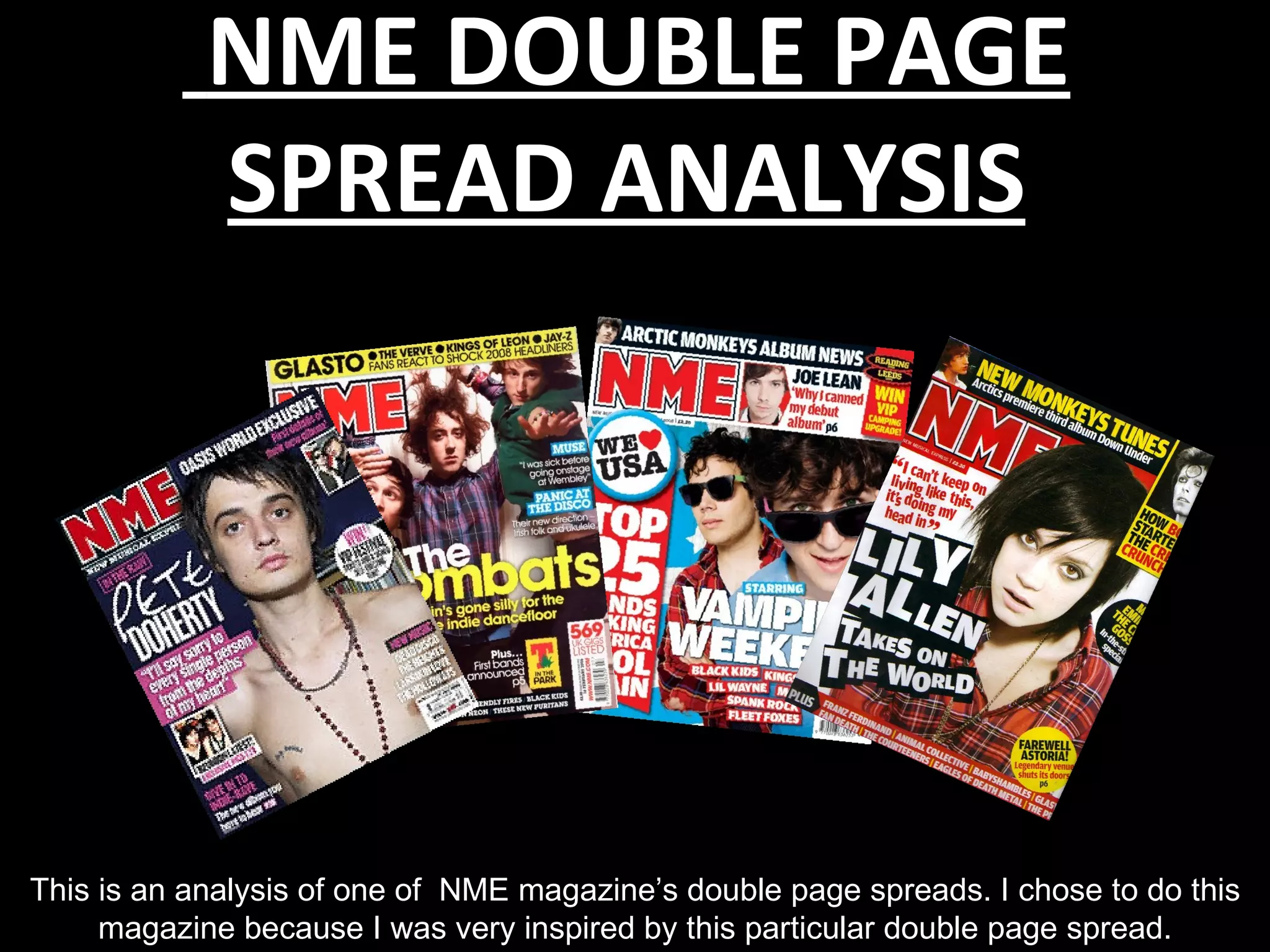
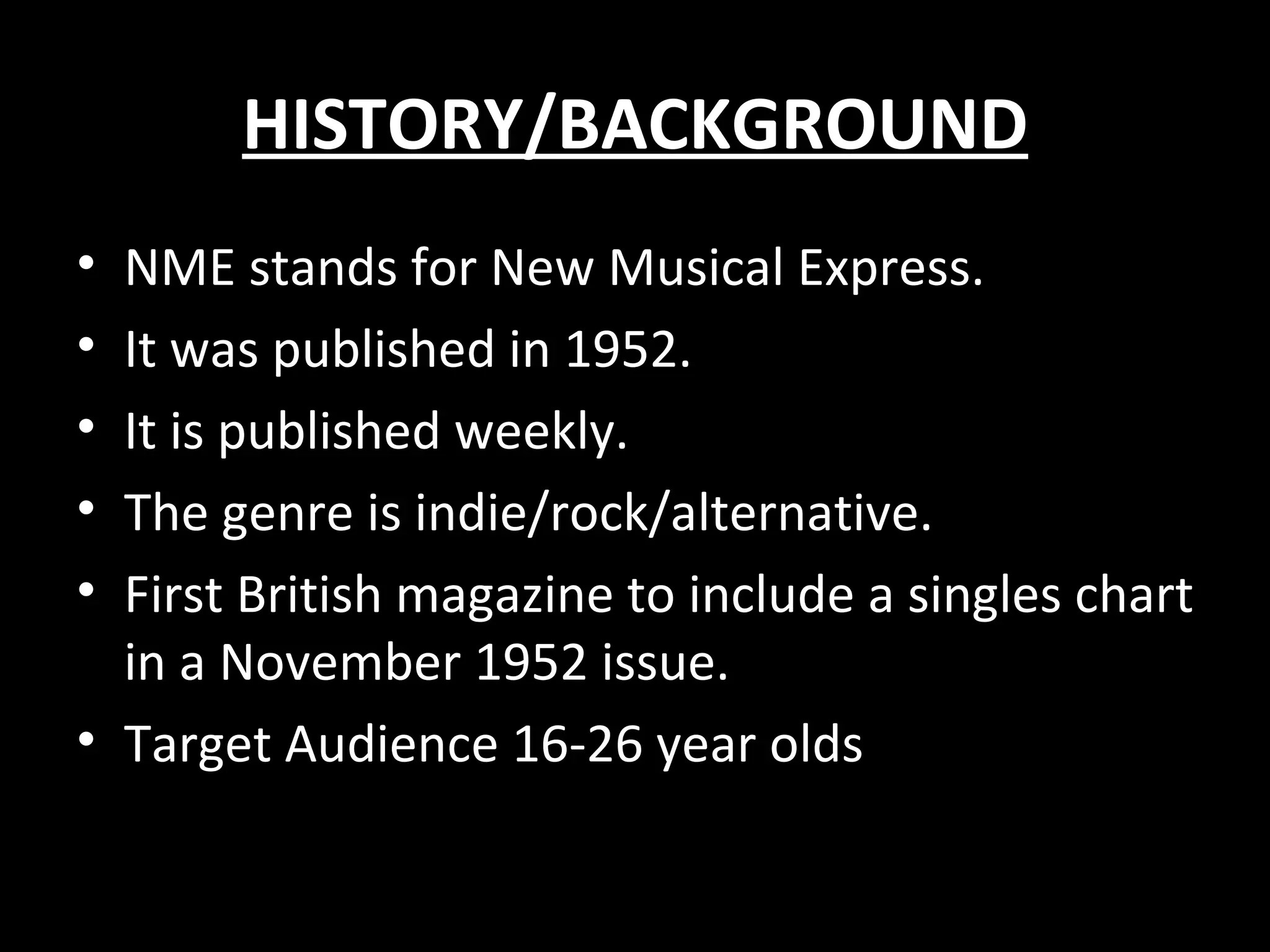
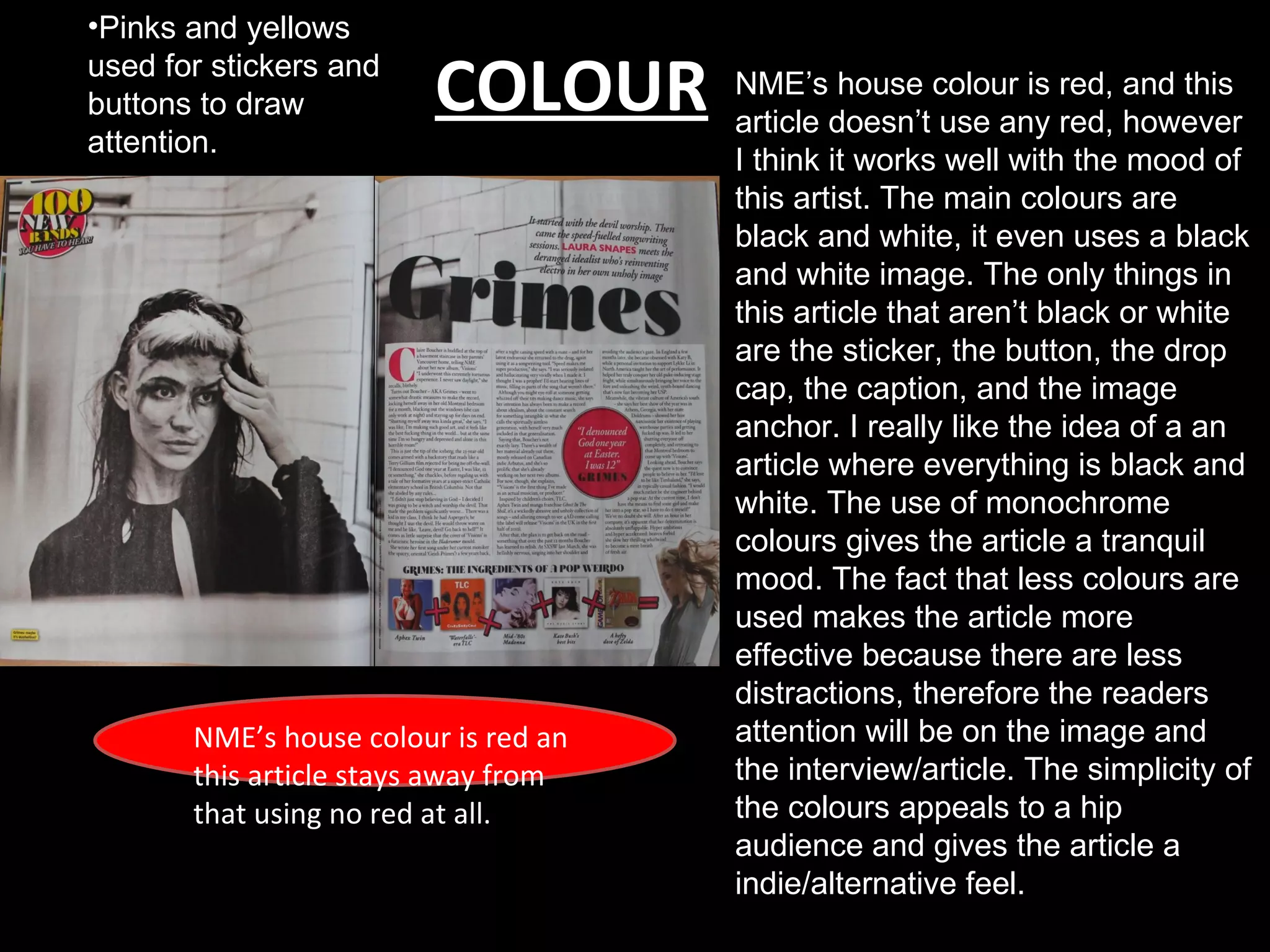
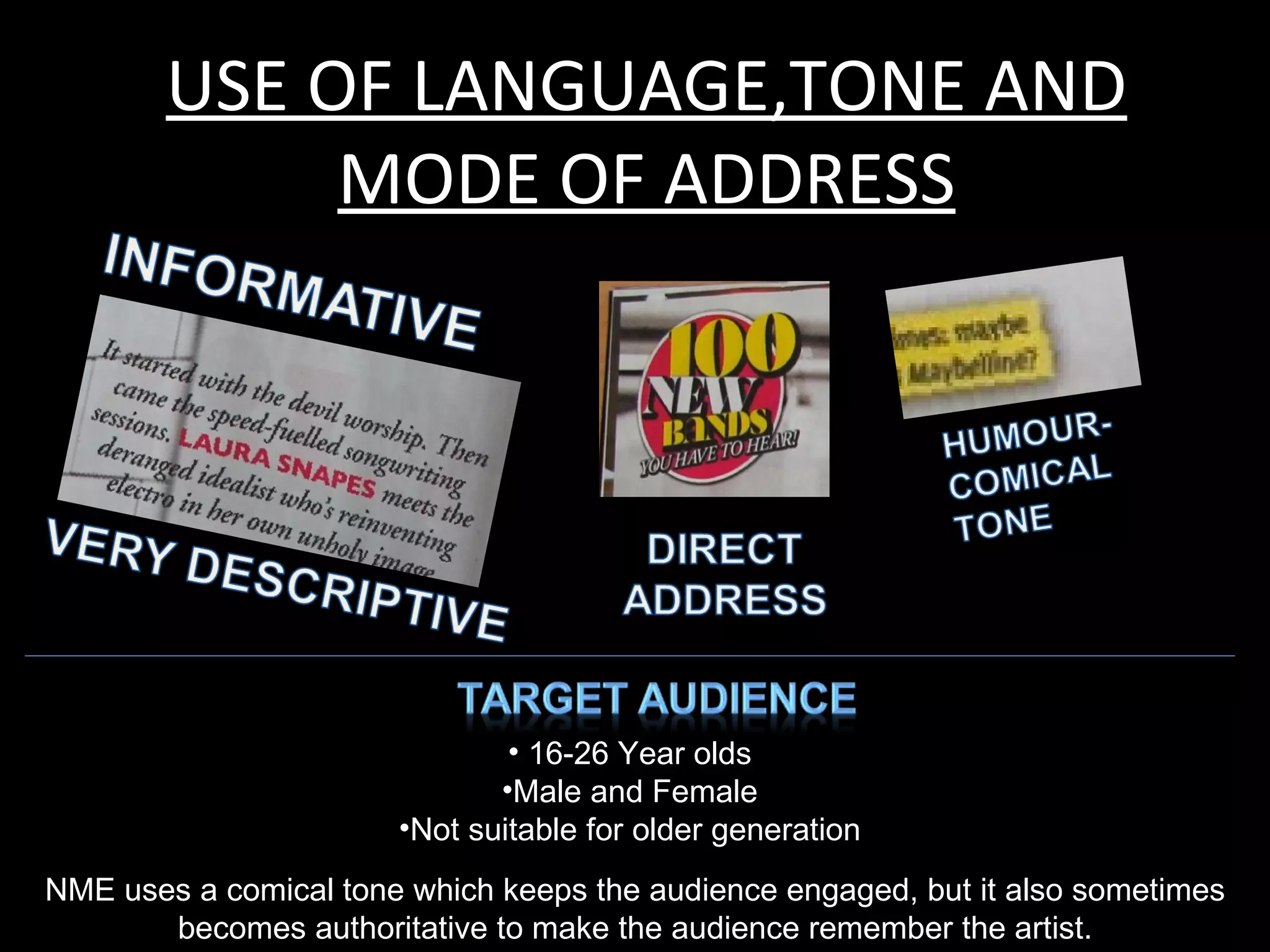
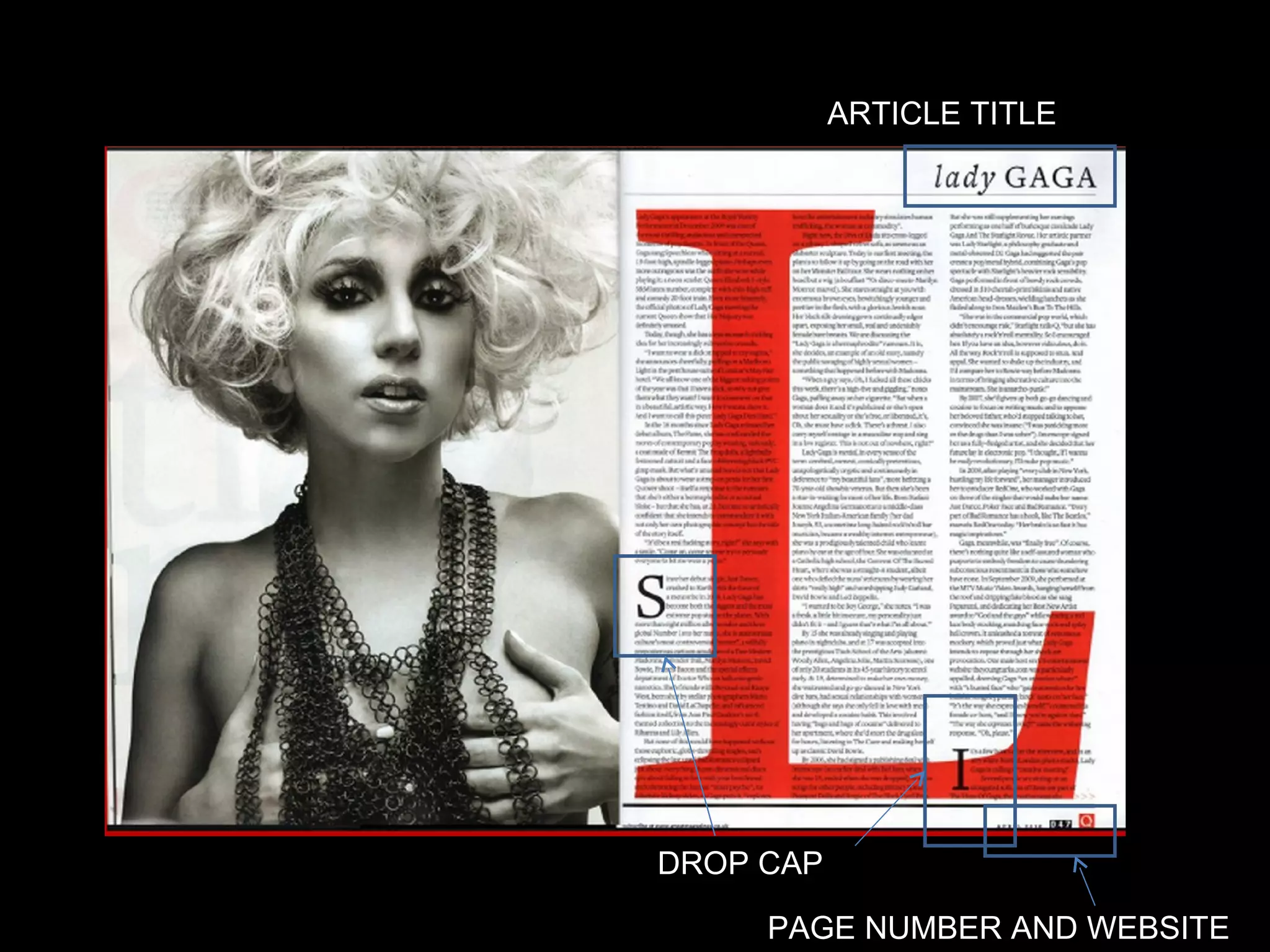
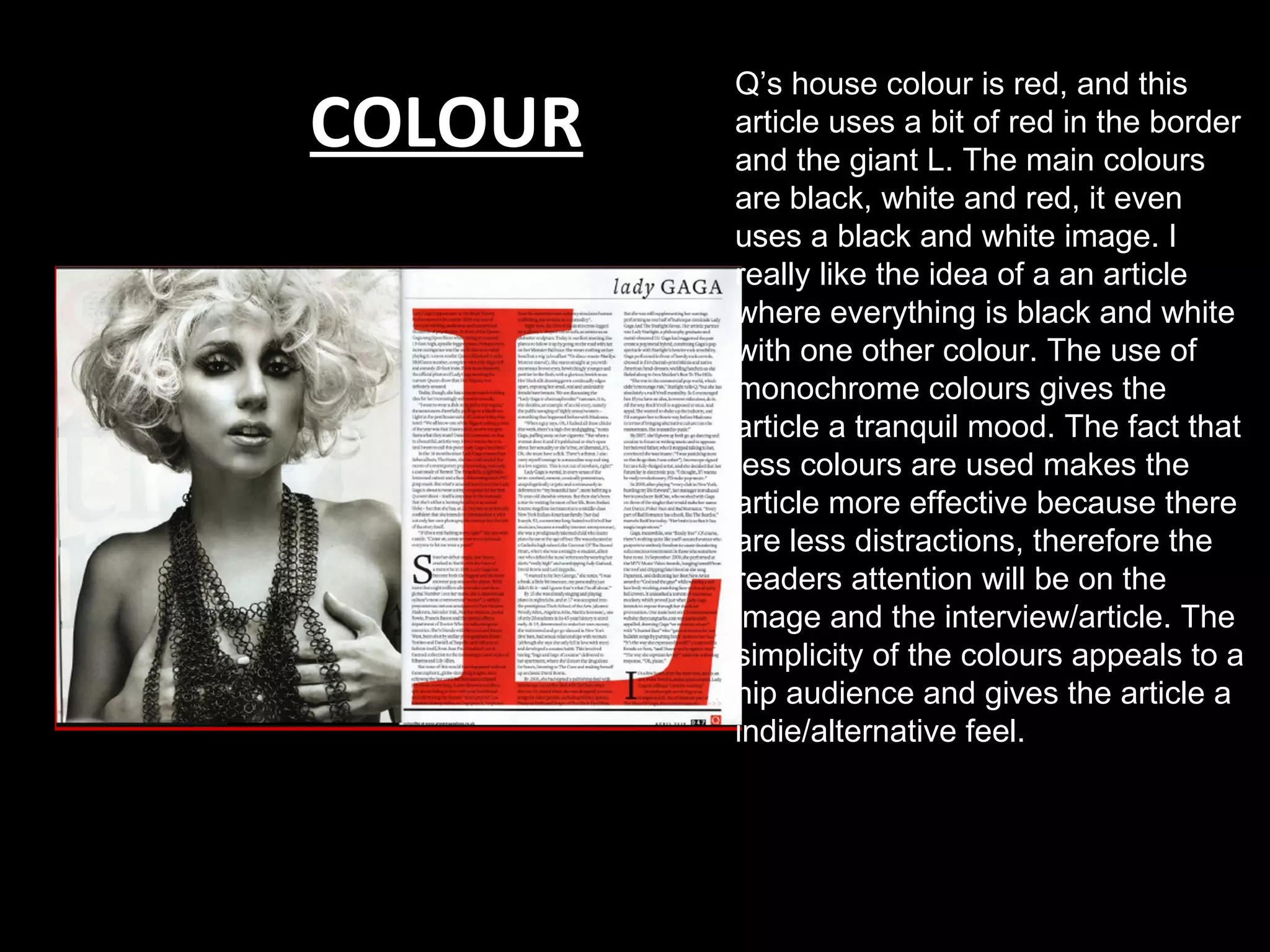
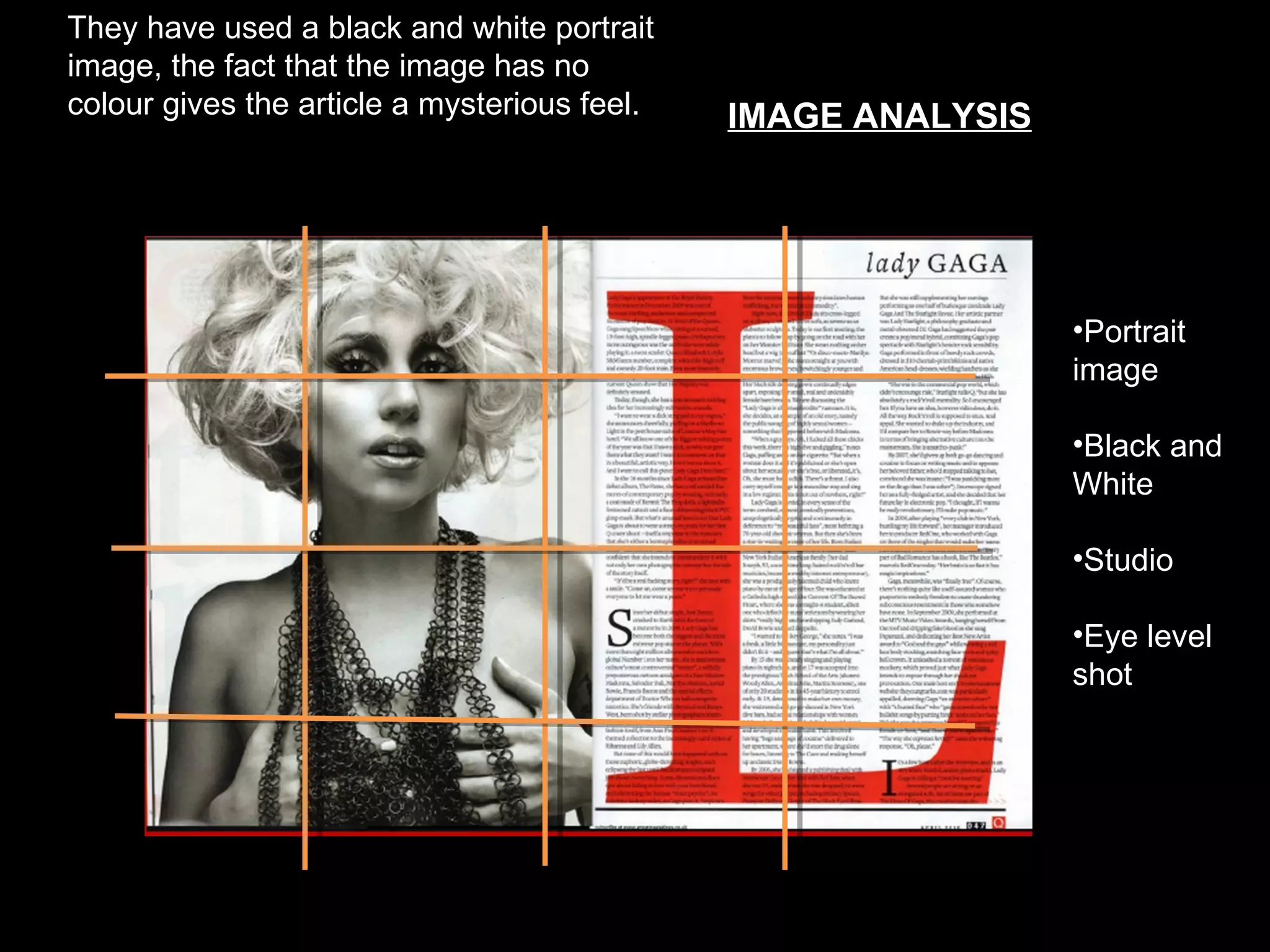
NME DOUBLE PAGE
            SPREAD ANALYSIS


This is an analysis of one of NME magazine’s double page spreads. I chose to do this
     magazine because I was very inspired by this particular double page spread.
HISTORY/BACKGROUND
• NME stands for New Musical Express.
• It was published in 1952.
• It is published weekly.
• The genre is indie/rock/alternative.
• First British magazine to include a singles chart
  in a November 1952 issue.
• Target Audience 16-26 year olds
•Pinks and yellows
used for stickers and
buttons to draw          COLOUR       NME’s house colour is red, and this
                                      article doesn’t use any red, however
attention.
                                      I think it works well with the mood of
                                      this artist. The main colours are
                                      black and white, it even uses a black
                                      and white image. The only things in
                                      this article that aren’t black or white
                                      are the sticker, the button, the drop
                                      cap, the caption, and the image
                                      anchor. I really like the idea of a an
                                      article where everything is black and
                                      white. The use of monochrome
                                      colours gives the article a tranquil
                                      mood. The fact that less colours are
                                      used makes the article more
                                      effective because there are less
                                      distractions, therefore the readers
       NME’s house colour is red an   attention will be on the image and
       this article stays away from   the interview/article. The simplicity of
       that using no red at all.      the colours appeals to a hip
                                      audience and gives the article a
                                      indie/alternative feel.
USE OF LANGUAGE,TONE AND
             MODE OF ADDRESS


                               • 16-26 Year olds
                              •Male and Female
                       •Not suitable for older generation
NME uses a comical tone which keeps the audience engaged, but it also sometimes
       becomes authoritative to make the audience remember the artist.
Sticker


                           Article
Drop Cap
                           Ttitle


                          Button/
                          Pull quote


 Caption


           Image Anchor
They have used a black and white
landscape image, the fact that the image
has no colour gives the article a mysterious      IMAGE ANALYSIS
feel. The image is taken of the artist’s
reflection in the mirror.
                                               On this page


                                                                   •Rule of
                                                                   thirds

                                                                   •Landscape
                                                                   image

                                                                   •Black and
                                                                   White

                                                                   •Indoors

                                                                   •Eye level
                                                                   shot
Q MAGAZINE
HISTORY/BACKGROUND
• Q stands for Quinten the maker of the
  magazine.
• It was published in 1986.
• It is published monthly.
• Target Audience 25-40 year olds
ARTICLE TITLE


DROP CAP

     PAGE NUMBER AND WEBSITE
Q’s house colour is red, and this
COLOUR   article uses a bit of red in the border
         and the giant L. The main colours
         are black, white and red, it even
         uses a black and white image. I
         really like the idea of a an article
         where everything is black and white
         with one other colour. The use of
         monochrome colours gives the
         article a tranquil mood. The fact that
         less colours are used makes the
         article more effective because there
         are less distractions, therefore the
         readers attention will be on the
         image and the interview/article. The
         simplicity of the colours appeals to a
         hip audience and gives the article a
         indie/alternative feel.
USE OF LANGUAGE,TONE AND
           MODE OF ADDRESS


                              • 25-40 Year olds
                             •Male and Female
                    •Not suitable for younger generation
Q sometimes becomes authoritative to make the audience remember the artist.
They have used a black and white portrait
image, the fact that the image has no
colour gives the article a mysterious feel.      IMAGE ANALYSIS

                                              On this page


                                                                  •Portrait
                                                                  image

                                                                  •Black and
                                                                  White

                                                                  •Studio

                                                                  •Eye level
                                                                  shot

Double page spread analysis (1)

  • 1.
    NME DOUBLE PAGE SPREAD ANALYSIS This is an analysis of one of NME magazine’s double page spreads. I chose to do this magazine because I was very inspired by this particular double page spread.
  • 2.
    HISTORY/BACKGROUND • NME standsfor New Musical Express. • It was published in 1952. • It is published weekly. • The genre is indie/rock/alternative. • First British magazine to include a singles chart in a November 1952 issue. • Target Audience 16-26 year olds
  • 3.
    •Pinks and yellows usedfor stickers and buttons to draw COLOUR NME’s house colour is red, and this article doesn’t use any red, however attention. I think it works well with the mood of this artist. The main colours are black and white, it even uses a black and white image. The only things in this article that aren’t black or white are the sticker, the button, the drop cap, the caption, and the image anchor. I really like the idea of a an article where everything is black and white. The use of monochrome colours gives the article a tranquil mood. The fact that less colours are used makes the article more effective because there are less distractions, therefore the readers NME’s house colour is red an attention will be on the image and this article stays away from the interview/article. The simplicity of that using no red at all. the colours appeals to a hip audience and gives the article a indie/alternative feel.
  • 4.
    USE OF LANGUAGE,TONEAND MODE OF ADDRESS • 16-26 Year olds •Male and Female •Not suitable for older generation NME uses a comical tone which keeps the audience engaged, but it also sometimes becomes authoritative to make the audience remember the artist.
  • 5.
    Sticker Article Drop Cap Ttitle Button/ Pull quote Caption Image Anchor
  • 6.
    They have useda black and white landscape image, the fact that the image has no colour gives the article a mysterious IMAGE ANALYSIS feel. The image is taken of the artist’s reflection in the mirror. On this page •Rule of thirds •Landscape image •Black and White •Indoors •Eye level shot
  • 7.
  • 8.
    HISTORY/BACKGROUND • Q standsfor Quinten the maker of the magazine. • It was published in 1986. • It is published monthly. • Target Audience 25-40 year olds
  • 9.
    ARTICLE TITLE DROP CAP PAGE NUMBER AND WEBSITE
  • 10.
    Q’s house colouris red, and this COLOUR article uses a bit of red in the border and the giant L. The main colours are black, white and red, it even uses a black and white image. I really like the idea of a an article where everything is black and white with one other colour. The use of monochrome colours gives the article a tranquil mood. The fact that less colours are used makes the article more effective because there are less distractions, therefore the readers attention will be on the image and the interview/article. The simplicity of the colours appeals to a hip audience and gives the article a indie/alternative feel.
  • 11.
    USE OF LANGUAGE,TONEAND MODE OF ADDRESS • 25-40 Year olds •Male and Female •Not suitable for younger generation Q sometimes becomes authoritative to make the audience remember the artist.
  • 12.
    They have useda black and white portrait image, the fact that the image has no colour gives the article a mysterious feel. IMAGE ANALYSIS On this page •Portrait image •Black and White •Studio •Eye level shot