The process of developing a brand for Tinybop.
•
1 like•1,236 views

The document outlines plans for developing a brand identity for Tinybop, including logos, icons, colors, typography, tones of voice, and product illustrations. It discusses establishing three toy product series under the Tinybop brand focused on toys for tomorrow. Examples are also provided of different typefaces including Memphis Light, Memphis Bold, Futura Book and Futura Bold that could potentially be used as part of the brand identity.

Recommended
More Related Content
What's hot
What's hot (18)
Similar to The process of developing a brand for Tinybop.
Similar to The process of developing a brand for Tinybop. (20)
Recently uploaded
Recently uploaded (20)
The process of developing a brand for Tinybop.
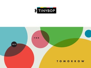
- 1. T O M O R R O W T O Y S F O R
- 3. The process of developing a brand for Tinybop.
- 4. T I N Y B O P Toys for tomorrow.
- 6. Set of 108 British natural history books, containing topics relevant to the British Isles. Published since 1945. T H E N E W N A T U R A L I S T
- 7. P R O D U C T S E R I E S A P R O D U C T S E R I E S B P R O D U C T S E R I E S C
- 8. P R O D U C T S E R I E S A P R O D U C T S E R I E S B P R O D U C T S E R I E S C
- 10. L O G O I C O N S C O L O R S T Y P O G R A P H Y P A T T E R N S T O N E O F V O I C E S O U N D / M U S I C A P P I C O N S P R O D U C T T I T L I N G C O L O R S U I I L L U S T R A T I O N
- 13. T O M O R R O W F O R T O Y S TOYSFORTOMORROW TOYS FOR T O M O R R OW • T O M O R R O W F O R T O Y S TOYSFORT O M ORR O W T O Y S F O R T O M O R R O W
- 14. [Date] [Recipient Name] [Recipient’s Company] [Recipient’s Address] [Recipient’s Address] Dear [Recipient Name]: [Content] The body of the letter should be preceded by one line break. Three line breaks precede the salutaiton. Lorem ipsum dolor sit amet, consectetur adipisicing elit, sed do eiusmod tempor incididunt ut labore et dolore magna aliqua. Ut enim ad minim veniam, quis nostrud exercitation ullamco laboris nisi ut aliquip ex ea commodo consequat. Paragraphs are not indented, and are also preceded by one line break. Insert two line breaks before the closing salutation. Leave four lines breaks before your name and title and remember to add your signature to this space. Duis aute irure dolor in reprehenderit in voluptate velit esse cillum dolore eu fugiat nulla pariatur. Excepteur sint occaecat cupidatat non proident, sunt in culpa qui officia deserunt mollit anim id est laborum. [CLOSING (Sincerely, Respectfully, Regards, etc.)], [Sender’s Name] [Sender’s Title] 10 JAY STRE ET, SUITE 418 BROOKLYN NY 112 01 T I NYBOP.COM @ T I NYBOP
- 20. REJECTED
- 21. 1 2 3
- 26. CAN WE INSERT VIDEO OF LOGO ANIMATION?
- 31. H A N D B O O K MAN U E L POU R L E CORPS HUMAIN 身体 手册 N
- 32. H A N D B O O K H A N D B O O K H A N D B O O K
- 33. L O G O I C O N S C O L O R S T Y P O G R A P H Y P A T T E R N S T O N E O F V O I C E S O U N D / M U S I C A P P I C O N S P R O D U C T T I T L I N G C O L O R S U I I L L U S T R A T I O N
- 36. This is Memphis Light. Memphis was designed by Dr. Rudolf Wolf in 1929 for the Stempel foundry. It is a geometric slab serif that is smart and stylish, all at the same time. This is Memphis Bold. This is Futura Book. Futura was first developed out of the Bauhaus movement in Germany and followed the philosophy of form follows function. In 1927, Paul Renner sketched the original drawings that were loosely based on the forms of the circle, triangle and square. He worked to develop a versatile sans serif that has proven to be timelessly modern. This is Futura Bold. 0123456789!?