Evaluation 3 - A2 Media Studies
•Download as PPTX, PDF•
0 likes•198 views

The third evaluation question I have answered, for my A2 Media task.

Recommended
More Related Content
What's hot
What's hot (20)
Similar to Evaluation 3 - A2 Media Studies
Similar to Evaluation 3 - A2 Media Studies (20)
More from Matt Goring
Recently uploaded
Recently uploaded (20)
Evaluation 3 - A2 Media Studies
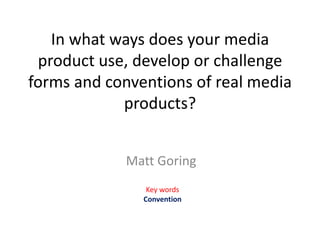
- 1. In what ways does your media product use, develop or challenge forms and conventions of real media products? Matt Goring Key words Convention
- 2. Evaluation – Trailer Our trailer generally accepts and uses common conventions seen in movie trailers. This allows us to create a product that will fit the genres we had decided to use for our trailer, action/crime/thriller, as well as present something that will engage and interest an audience so that they will see the full product when released. Another convention that trailer follows is the length of time it uses. From my research I found that trailers are generally one and a half to two minutes long, which is just enough time to create and reveal different scenes that will happen in the film. Below is a print screen of our trailer from YouTube and shows the length of our trailer. Our trailer follows the convention of using the film production logos in the trailer. The production logo is used to boost a companies reputation, as well as to inform the audience to who has created the piece they are watching. Similarly to other trailers, our trailer obeys to convention for using the film title in the trailer. It is also generally seen at the end of the trailer before the production credits are displayed. “Vendetta” follows this as seen below in the print screens. I have also compared it to another product within the same genres as our trailer to show how they both use this convention.
- 3. Evaluation – Trailer Additionally, our trailer follows conventional editing. Film trailers use fast paced cuts for the most part to show as many clips as possible in order to revel a section of the narrative to the audience. Our trailer also uses a slow build up which then moves into a much faster action sequence because it build up tension throughout leads the trailer to a climax. A product that uses a similar layout is the Raid Redemption and this product some what inspired the construction of our piece. A convention that our trailer does not follow is using dramatic fast paced music in the second part of the trailer. Instead we use a slower paced and more relaxed track that is unconventionally seen in action, crime thriller trailers. We believe this works very well with it and it still leads up to the conventional climax seen at the end of trailers within this genre. An example of dramatic fast paced music in the fast paced section of the trailer can be seen in a range of existing products including the Bourne Legacy and the Raid Redemption. A more simplistic convention that our product follows is the use of the Release date within the sequence. The release date is usually seen at end of the credits, like the title, because it grabs the audiences attention and then presents them with the information and facts they need too find out more about the film. The image furthest right is an extract from our trailer “Vendetta”. To show that the release date is conventionally at the end of the trailer I have left in the timings from the actual videos, from YouTube. It is clearly visible that the release date is one of the last, if not the last thing to be displayed.
- 4. Evaluation – Trailer A modern convention of film trailers that has only very recently became popular, is the involvement of social networking within the trailer. It may take many different forms ranging from hash tags used to link people together on websites like Twitter to actual website links that take you to a site made specifically for the film. We obey to this convention because it encourages our audience to be active and actually search for more information on the product and can increase the popularity of the product. Our group has only used one form of social media which is the stereotypical amount for films within the genre. All films have an age rating at the beginning of the trailer but the style varies from country to country. Our production is British so uses the BBFC title screen instead of the MPAA rating screen. Film trailers stereotypically open with a age certification screen because it shows the audience what age is required to watch the trailer and whether the content inside will be appropriate for them. We have used this convention because it allows for us to start by classifying how our trailer has been laid out and what is expected to be seen within it. Below are three age classification screens, tow from existing products and one from our trailer. Our trailer also clearly states the age which is isn’t as visible on the other existing products.
- 5. Evaluation – Trailer Character Introduction is conventionally seen in all movie trailers. It allows the audience to connect with and find out more about the actors before the release of film. Since we are using an indie actor – the audience will more than likely not know who our actor is and the introduction of the character will give them time to research and find out what this actor is like. Our product also uses the stereotypical genders for characters in the production. Action, crime thrillers conventionally feature men as the main characters because they are seen as strong and dominant. This can be seen in real life products similar to ours like “Welcome to the Punch” and “The Raid Redemption.” Below are examples of this convention from our trailer “Vendetta” on the left and existing products are on the right. The final convention that our trailer follows is the how long each of the shots are in the trailer. Clips in trailers can range in length but they are never longer than about 5 seconds. Our shorter shots are there to show action sequences within the film and the longer shots are there to develop the storyline. This is conventional in action crime thriller trailers because they normally have a section of build up with longer clips and then a more dramatic action sequence that uses much shorter faster paced clips. On the right in an extract from our trailer showing how the clip length varies throughout the trailer. For instance the clips above are from a longer storyline based clip at the beginning of the trailer and the scene lasts 3 seconds.
- 6. Evaluation – Trailer - Conclusion In conclusion I would say that our trailer adopts and uses a wide variety of conventions used in existing real life products, as well as challenging a couple to make our trailer feel individual. This is because we want our product to reflect the existing products so that it can target a large audience. Although we have been using indie actors the general structure and layout of clips is conventional and thus is like real life products. We have also used a range of different editing conventions including cutting clips to make sure that they are an appropriate length and don’t run on to long. Stereotypically trailers have long clips for building up the narrative and shorter clips to show action and fight sequences. We have kept to this and have used the traditional layout that starts off with a build in narrative which leads up to a faster paced action sequence and finally cuts off at a climax or a cliff-hanger. In terms of sound we have actually challenged the convention. Most action crime thrillers have a fast paced non-diegetic soundtrack for the fast paced action sequence, however we have chosen to use a more chilled piece, that builds up tension as trailer progresses. It fits the clips equally as well and helps with story progression. Finally we have included a range of conventional title screens and production logos that can be seen in all existing products. We have created a custom production logo for a company we created specifically for the product and this is placed in a standardised location within the trailer. We also have included a custom BBFC title screen that displays our product name and age rating that is appropriate for the sequences within the trailer.
- 7. Evaluation – Ancillary - Poster My poster (featured bottom left) follows a range of conventions that film posters use. It was also primarily inspired by “The Bourne Legacy” poster which is featured on the bottom right and throughout I be referencing to sections that I have used for my own poster. To begin with posters within the action crime thriller genre use a san serif font for the titles and text as it appears clean and modern. I have used a couple of different fonts on my posters – “Equa Sans” for the general text, “Bebas Neue” is used for the “Vendetta” title that is used across all of our media products and “Steel Tongs” is used for the production credits. As you can see below, the real life product only uses 3 different fonts on it’s poster which is the same as ours. There isn’t much need for text on the posters the key images do the majority of talking and this will sell the product to the audience. Another convention within the text which is applied to my poster is the use of colour to highlight keywords and pieces of information. A bright and clear colour is stereotypically used and it generally stands out from the quite dull and lifeless colours used on the rest of the poster. This is because the genres are quite dark and gritty and they don’t want them to be presented as light and cheery.
- 8. Evaluation – Ancillary - Poster Another convention my poster follows is how the key image is presented in the composition of the poster. From the posters I have researched, which are inside the action crime thriller genre, I have found that the key image does not have to take up the entire page. It should be split up and a solid colour like black or grey should be placed behind the image. Since my poster design was inspired by “The Bourne Legacy” poster I have used a very similar layout too it. The image takes up approximately two thirds of the page and the rest is empty space. As you can see below “The Bourne Legacy” poster just leaves majority of the space blank but I have adapted it too fit an establishing shot of the location in. I Have also found that a modern trend in film posters is to crop the up to make it look like there are sections missing/ missing information. This can be seen in both the “Welcome to the Punch” trailers as well as “The Bourne Legacy” posters. I have adopted and used this convention with my piece which is visible – bottom left. A convention that is used more frequently in the genre is the use of dull de-saturated or black and white image. This style is applied to the image because it represents the dark gritty sequences that are present in most action crime thrillers.
- 9. Evaluation – Ancillary – Magazine Cover For my magazine cover I first researched the conventions and layout of existing magazines like Total Film, so that I had a basic understanding of how they are supposed to be composed. I also relied on my knowledge and understanding that I had picked up from the music magazine in the foundation portfolio. The ideas are the same but it just has to be adapted to fit a film/ actor instead of a musician. On the left is my piece compared to an existing Total Film magazine cover. I have used pieces that are genre appropriate because they reflect the same house style that I have used for my products. As you can see they are very similar and because of that it shows that I have stuck to conventional structure, instead of developing or challenging them. My magazine is also a combination of a range of covers not just the one featured top left. My magazine cover uses the stereotypical alignment for the mast head. It is conventionally placed at the top of the page so that it is the first thing the audience see when looking at the magazine. All the magazines I researched had this placed at the top and I followed them with this. My magazine cover also features the conventional puff which is used to display prizes or special products that can be received with the magazine. Both my and the existing product uses a puff.
- 10. Evaluation – Ancillary – Magazine Cover Another convention which my magazine cover uses, is the incorporation of a cover line and where it is positioned on the page. It is also accompanied by a sub line that adds context to the title. The top title is an extract from my magazine cover and the bottom is from a genre appropriate “Total Film,” cover. My magazine cover has a range of text on it but specifically it features Buzz words. Buzz words are used to attract attention to a section of the magazine and help highlight important pieces of text that the audience should look at. They range in colours but are generally all big and stand out from surrounding text. Strokes are also used if the colour is clear but needs to stand out more. A stroke should not exceed about 1pt in width otherwise it can dominant the text. These are words are used on all media products because they entice the audience in. The “Vendetta” magazine cover uses a barcode like most other products because it allows for a product to be tracked and sold. It also records the numbers of that product sold showing how popular it is. This therefore means that the use of the barcode is conventional. The final convention I am going to talk about is the main image. It stereotypically features one person that is surrounded text. The image sometimes has the mast head placed over the top of image and sometimes its behind. There is also depth of field used which can add more detail to the main image.