John Yesko - 7 User Experience Principles for Online Self-Service

Walgreens has been in the business of selling medications for over 100 years. Along the way, many service-oriented innovations have emerged—including some that we now take for granted, such as the drive-through pharmacy window. Fast forward to today, where online tools empower our customers to help themselves at an unprecedented level. Functionality like mobile refill-by-scan and Web access to medical records bring home interactions that used to require a trip to the pharmacy and/or doctor’s office. As our User Experience team conceptualizes and designs these tools, our job is to make them at the same time powerful and simple to use. In order to succeed, our solutions need to be better than the existing off-line model. This presentation focuses on seven core fundamentals that we live by when designing interactive experiences. They address issues like: ■Balancing the user’s primary task completion with up-sell ■Communicating transparently with customers—even when it’s bad news ■The critical importance of words—in labeling, instructive text, and marketing ■How brick-and-mortar and online experiences impact each other ■and a lot more! The presentation is richly illustrated with visual UX design examples, as well as data from real customers—their own words, behaviors, and outcomes. We’ll talk about how we monitor and measure the customer experience—through customer satisfaction tools, clickstream analysis, and user research—and how that insight translates to design.
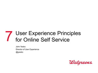
![Why we do it
Our customers inspire us
I have complained about this for a long time now.
1. Quit screwing with the website. Every time I log on, I have to look someplace
else to locate how to refill my prescriptions. Once there, I have to hunt
through ANOTHER new screen to order my scripts. Your website is a pain in
the ass to use. You have no idea how frustrating your site is.
2. Find a solution to changing all this stuff on your site. It is not rocket science.
If I am going to order my scripts, I want it simple and easy.
3. I don't have time to do all this. However, if I don't take the time to type my
frustration out to you, then surely NOTHING will get done.
4. I HATE using your website. It takes so much energy to order
prescriptions, that sometimes I just call the pharmacy instead of taking time
to order them online.
5. Have I said your website is a real pain in the ass to use?
6. My web designer for my 4 businesses uses your website to understand what
I want our websites to look NOTHING like. Love, [Name].](data:image/gif;base64,R0lGODlhAQABAIAAAAAAAP///yH5BAEAAAAALAAAAAABAAEAAAIBRAA7)
Recommended
More Related Content
Viewers also liked
Viewers also liked (16)
More from Healthcare Experience Design Conference
More from Healthcare Experience Design Conference (11)
Recently uploaded
Recently uploaded (20)
John Yesko - 7 User Experience Principles for Online Self-Service
- 1. 7 User Experience Principles for Online Self Service John Yesko Director of User Experience @jyesko
- 2. Why we do it Our customers inspire us I have complained about this for a long time now. 1. Quit screwing with the website. Every time I log on, I have to look someplace else to locate how to refill my prescriptions. Once there, I have to hunt through ANOTHER new screen to order my scripts. Your website is a pain in the ass to use. You have no idea how frustrating your site is. 2. Find a solution to changing all this stuff on your site. It is not rocket science. If I am going to order my scripts, I want it simple and easy. 3. I don't have time to do all this. However, if I don't take the time to type my frustration out to you, then surely NOTHING will get done. 4. I HATE using your website. It takes so much energy to order prescriptions, that sometimes I just call the pharmacy instead of taking time to order them online. 5. Have I said your website is a real pain in the ass to use? 6. My web designer for my 4 businesses uses your website to understand what I want our websites to look NOTHING like. Love, [Name].
- 3. To succeed, the online experience has to be better than the alternative 3
- 4. Online > alternative How is it better? Because you keep a history of my orders and it is just danged easy. And I like the staff in the pharmacy. I only went online to order a product that I know you sell, but it is seldom available in the store. This is an item for my Mother-in-law and she needs it Walgreen reminded me about every 2 months. I will keep that prescription was due buying it through your website as it is for refill. very convenient. A few clicks and I am done. Fast and easy! Ordering via telephone is much Because I am disabled and can't more time consuming and I have to drive and shipping them to my home juggle Rx bottles to enter the correct is a hole lot easier for me plus I like Rx numbers. the free shipping. That sure helps. I truly appreciated that it took less than 3 I don't like waiting in minutes to order the prescription, faster than lines at the store. ordering by phone! The people are not Convenience, love my people. 24-hour service for ordering, also pickup at my store is 24 hours. 4
- 5. Online > alternative Prescription refills Call Pick up in store 5
- 6. Online > alternative Refill online Email Pick up reminder in store (sometimes) 6
- 7. Online > alternative Refill by text reply Opt-in Reminder Ready 7
- 8. Online > alternative Refill by email reply No login Never leave the email program (eliminates ―I‘ll do this later‖) 8
- 9. Online > alternative Video removed. See it at: http://www.youtube.com/watch?v=POc2MQYHYjc 9
- 10. Online > alternative Refill by scan 10
- 11. Online > alternative Refill by scan 11
- 12. Online > alternative Web Pickup Great idea, but how is it better? 12
- 13. Online > alternative Web Pickup Video removed. See it at: http://www.youtube.com/watch?v=4UnDAIYTawE 13
- 14. Online > alternative Is it better than the current model? Usable and useful aren‘t the same thing 14
- 15. Trouble at any point in a multi-channel experience reflects poorly on the online portion 15
- 17. Multi-channel trouble The customer may not know or care which link of the chain broke …always hoping "this" time it will be effortless. The pharmacy rarely, NEVER, has the prescription on time as stated. The last four or five months we have had nothing but difficulty getting one of our prescriptions....of course it is insurance fault???? Not buying that excuse since the pharmacy has a bad track record with us. Very much considering switching to Safeway pharmacy. So, to be specific... you should know that the pharmacy is not on the "same page" when it comes to getting the orders done as promised. 17
- 18. Task completion is the top priority 18
- 19. Task completion Top tasks ~70% of Clicks 19
- 20. Task completion Rx refill purchase funnel No-distraction zone Prescription Order Cart Checkout refill(s) confirmation In-context In-context upsell OK cross-sell OK 20
- 21. In-context up-sell 21
- 22. Task completion Rx refill purchase funnel No-distraction zone Prescription Order Cart Checkout refill(s) confirmation In-context In-context upsell OK cross-sell OK 22
- 23. In-context cross-sell 23
- 24. Task completion Top tasks 24
- 25. 25
- 26. 26
- 27. Task completion A book ―I gave it to my boss. He read it– because it‘s short–and finally ‗got‘ what I‘ve been trying to tell him for years about usability. Then he bought copies for our whole team.‖ 27
- 28. Communicate proactively with customers—even bad news 28
- 29. Communicate proactively Something went wrong 29
- 30. Communicate proactively Something went wrong 30
- 31. Communicate proactively Something went wrong 31
- 32. Communicate proactively Another book • Improved error messages • Understandable instructions • Politeness online (not blaming) • Better forms • Customized "Page Not Found" errors • Easy-to-use help content • Human fallback plan • Answer emails quickly • …and much more 32
- 34. 34
- 35. Words are very important 35
- 36. Words Ambiguity 36
- 37. Words Transfer where? 37
- 38. Words Product taxonomy Before After 38
- 39. Words Subtle messaging 39
- 41. Words What did I do wrong? 41
- 42. Words What did I do wrong? 42
- 43. Words Copy guidelines—incomplete list • Clarity trumps cuteness • Refer to things consistently throughout the site—and across channels • Use the customer‘s language, not ours • ―Click here‖ is banned 43
- 44. Data is our friend 44
- 45. Data Two big buckets of data collection • Clickstream measurement Observe and measure • Business intelligence the customer • Customer experience monitoring experience • Consumer research • Customer satisfaction measurement • Usability testing Proactively solicit • Contextual inquiry customer feedback • Participatory design • Online surveys 45
- 46. Data Tools for observation and measurement What What customers do customers say Consumer Business Customer Clickstream Customer Research Intelligence Experience Measurement Satisfaction Monitoring Measurement 46
- 47. Data User research Qualitative research tactics meant to understand and advocate for our online customers. Methods Responsibilities Outputs • Usability testing • Advocacy for the • Customer pain points (Web, mobile, kiosk) end-user and unmet needs • Directional concept • Knowledge • Customer testing management and context, attitudes, and distribution of insights drivers • In-context and ethnographic methods • Collaborative research • Quotes, anecdotes with Customer and video clips • Surveys Intelligence and • Implications and • Focus Market Research recommendations for groups, diads, and • Facilitating design and experience triads engagement between improvement • Card sorting end-users and business partners 47
- 48. Data In-house usability lab ―3D‖ card sorting Usability testing Concept validation 48
- 49. There usually is not a single right answer 49
- 50. No single right answer Finding the balance User Business Needs Goals Technical Constraints 50
- 51. ―As consumers we are incredibly discerning. We sense where there has been great care in the design, and when there is cynicism and greed.‖ Jonathan Ive SVP Industrial Design Apple 51
- 52. Thank you! John Yesko www.yesko.com Twitter: @jyesko 52
Editor's Notes
- These are some principles that we try to follow in our work at WalgreensThe principles are fairly high-level, but I’ll give you some specific examplesThese practices are all inspired by our customers
- Unfortunately, we don’t have it 100% figured out.These kinds of comments can be more valuable—if they’re specific. (More on that later)
- As we design online experiences, we have a general idea that they’re better.But how?
- These are quotes from real customers, which fall into a number of general categories.Hard to find products; can’t or don’t want to leave home; automation; time savings.Surely there are other reasons, but this is a good start.
- Prescription refill is the top task on our website.Pre-Web, this was the typical method.It’s not that hard, but can it be better?
- Here’s what it looks like online. You log into the site.Your available prescriptions are listed; you check them off; checkout; and usually still pick them up in store(although we have mail service too).As one of the customers mentioned, you can go back to your history, print records, etc. And you don’t have to talk to anyone.The website itself is fairly passive—customers have to find their way there. So we also send them email reminders, linking to the site.
- The next level is text reminders, which we started a year or two ago.We know that people don’t always remember to refill when they’re at a computer, so mobile is a great medium for this.Obviously we make money, but it also helps with adherence (a big problem).Some privacy issues though—we can’t show the medication name or Rx number.
- We’ve just begun to pilot a program with email.The customer simply replies to an email to refill.Compared to text, we can put a bit more info in an email.So what’s next…here’s a commercial.
- We have transfer by scan now too.
- Another service aimed at convenience is Web Pickup. It’s being piloted in a couple cities now.Marketed as a time saver and convenience play.
- That commercial shows a specific niche, but is that enough to sustain the service? Probably not.But that’s why we test things. So far, it’s been popular with busy moms.
- “Better than the alternative” is in the eye of the beholder.
- We track cSat separately for ordering and fulfillment.In a new service like Web Pickup, it could mean the program succeeding or failing—even if it has nothing to do with the online portion.
- This is actually pretty rare—that the customer is trying to assign the blame accurately.
- Even though our site does A LOT of things, our philosophy is that we don’t get in the way of what our customers came to do.
- How do we know what they came to do? We watch. On this busy home page, most people are focused on a pretty small number of tasks.There’s a strong temptation to get our customers to use all of our products and services.Because we do a lot of things, there’s a temptation to upsell and cross-sell our customers.As long as they’re here to fill a script, why not sell them some toothpaste.But we’ve learned that doesn’t work—it’s just a distraction.
- Upsell.
- Web Pickup promo after Rx flow.
- Customers don’t always use your site the way you intended.Since we know a lot of people are coming for prescription refills, we have multiple ways to get into the service.We were getting feedback that customers couldn’t find the path to refill.After some digging, we learned that many customers were going straight for the login feature.
- When they did, here’s what they found.Way down at the bottom right is a link to the Pharmacy.So, we moved this section up. It helped, but it still wasn’t good enough.
- So when we re-designed this area, we put it front and center. Our pure information architecture minds didn’t quite like it because prescription refills aren’t part of the Account area, but we had to acknowledge the customer behavior.
- Sometimes, the system goes down. This message doesn’t give much information.We are evaluated on customer satisfaction scores. Shockingly, this kind of thing leads to poor scores.As experience designers, we can’t do a lot about the service being down—but we can affect how it’s communicated.
- This one looks a little nicer, and the copy is decent. But, it doesn’t really tell you what to do.
- This page actually gives you some options of alternative things you can do.Ironically, all three of these options are hosted externally—so the site being down doesn’t affect them.The down-side is that if you aren’t interested in any of these areas, it’s not too helpful.Also we’ve found out that this page doesn’t only come up when we’re doing maintenance—and people know that.We’ve gotten customer comments about it recently—”maintenance at 2:00 on a Tuesday afternoon?”
- We promote the heck out of free shipping.
- But sometimes it’s not free.
- With all the advances in the Web and talk of interactivity, words still drive most interactions online.So the way we use them has a big impact on our customers.
- I usually just stretch before I make a burrito.
- Diabolical new feature to transfer prescriptions from another pharmacy to Walgreens.Early results have been good…except some 30% of transfers were already Walgreens prescriptions.
- This is the taxonomy we inherited. All the category names sound decent, but where’s the aspirin? The band-aids? What’s a “shop” online?After some pretty extensive user research, we came up with a new structure, and it’s performing much better.As you can see, we broke down the vague categories more finely, added keyword-rich label, and jammed more in.
- Here’s an example where we used language very proactively to help our customers (and ourselves).One of the metrics most e-commerce operations track is abandonment during checkout.This page didn’t have too high abandonment, so we thought we could do better. We found out that some customers simply though they were already done with checkout. Then they’d wonder where their order was.We made a change that had essentially zero development effort, and it made a significant difference.
- It’s not always just the actual words we use either—how we present them is important too.
- Here, we’re trying to communicated that the customer is about to change their prescription refill schedule, but might not realize it.However, the way it’s presented looks a little scary and confusing—with the red color and somewhat complicated language.
- So we’re trying to make it a little more friendly and conversational.(This is still in development)
- As I hope you’ve noticed, almost everything we’ve discussed so far depends on us having a lot of insight into our customers.So let’s talk a little bit about where that insight comes from
- They’re all important, but the last two probably have the most direct impact on the design work we do.
- If you work with a user experience professional, you’ve probably learned that we pretty much always think we’re right.But we try to take the approach that there usually isn’t a right answer.
- Rather, it’s about finding the balance among these three areas.When we can do that, everyone’s happy.
- Here are various ways to get ahold of me.If you enjoyed this presentation, please shop at these sites.