
Recommended
More Related Content
Similar to Graphic and Exhibition Design Portfolio
Similar to Graphic and Exhibition Design Portfolio (20)
Recently uploaded
Recently uploaded (20)
Graphic and Exhibition Design Portfolio
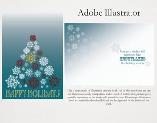
- 1. Adobe Illustrator This is an example of Illustrator drawing work. All of the snowflakes are vector illustrations, easily manipulated and re-sized. A multi-color gradient gives metallic dimension to the single gold snowflake, and Photoshop effects were used to created the dissolved look of the background of the inside of the card.
- 2. This is a vector I created as an assignment, we were tasked with making a vector based on an existing JPEG drawing, the image can now be easily re-sized or colored without becoming pixelated.
- 3. Misti & John June 28, 2014 The above image of a yellow owl is a jpeg, and the green owl is a vector created in Illustrator based on the jpeg, but able to be rendered in any color. The image on the right was also created in Illustrator. This image was designed to be a hanging tag that would be looped around a small bottle of champagne as a wedding favor. The bride wanted shades of seafoam green with a hint of gold. The champagne glasses and bubbles are vector drawings. the Bubbly and C op eleb P rate s! wit h U
- 4. Adobe Photoshop This image was crafted entirely in Photoshop, using only Filter effects. Some effects used were Difference clouds to create the planets, Polar Coordinates to manipulate the shapes, Lighting Effects to created directed shadowing, Twirl to create galaxies, Layer Dissolve to create stars, and the airbrush to highlight points in the background.
- 5. This above image is a painting from the 12th century Genji Monogatari Emaki. This scroll has obviously deteriorated in the years since it was painted, leaving the casual viewer entirely unaware of the original vibrant colors, particular those of the Junihitoe robe, the elaborate 12 layer robe. These images were an attempt to use a few different Photoshop techniques to re-create the bright colors of these robes. Above left is the original image, and above left has been manipulated to make it brighter and more vibrant, but the robes still lack in vibrancy. This image with the textiles overlaid in Photoshop uses layers and shading to create a semblance of the original robes appearance. The image below using specific hue manipulation to alter the image itself to make it more vibrant rather than overlaying textures.
- 6. These are the before and after of two family photos from the 1920’s that I was able to restore in Photoshop. In addition to adjusting the color, I used a number of tools. The clone stamp was used to smooth out imperfections and the healing brush fixed damage. The patch tool was also used, most notably in the lower image, where the “Zeta Nu” text was fully restored on the rightmost white swimsuit after in had completely eroded with time. Now the photos can be seen far more clearly.
- 7. Just a few fun Photoshop images showing a number of different techniques. The image above of the bowls with large roosters on them in a sculpture in from of the Central Plaza Mall in Lampang, Thailand. I used image adjustments and a few different artistic filters to give it the appearance of a detailed, brush stroked painting. The two fantastical animals were created using Layer Masking techniques, I seamlessly blended two images into one, with the goal of making the original image difficult to separate from the addition.
- 8. Adobe InDesign janelle monae is: album release party september 6, 2013 doors open at 10 This front and back of a direct mail-type postcard was created in InDesign using a number of Photoshop effects. The photo was layered with a translucent design and overlaid with text. machine 1254 boylston st boston THE ELECTRIC LADY first 25 guests will recieve a free copy of janelle monae’s new hit album! This above image was manipulated in Photoshop to give it a translucent greyscale effect. Drink Specials all Night machine 1254 boylston st boston ma
- 9. Embodying The Sacred in Yoruba Art The Newark Museum June 4 - August 25th, 2008 Embodying the Sacred in Yoruba Art is co-curated by Christa Clarke, Newark Museum’s Curator of Africa, the Americas and the Pacific, and Carol Thompson, the Fred and Rita Richman Curator of African Art at the High Museum of Art in Atlanta. The accompanying catalogue includes a comprehensive essay by Dr. Babatunde Lawal, Professor of Art History at Virginia Commonwealth University and one of the foremost experts on Yoruba art, who served as exhibition consultant. Embodying the Sacred in Yoruba Art Ceremonial Sword and Sheath (Udamalore) Yoruba, 19th-20th century Who are the Yoruba? Across cultures and throughout time, great works of art have been inspired by spiritual beliefs. For the Yoruba, one of Africa’s oldest and most influential cultures, art and spirituality are often intertwined. Works of art give visual form to the divine and inspire religious devotion. In turn, they are made powerful by spiritual forces. Aesthetics play an important role in the manifestation of the sacred. As the Yoruba say, art has the power to fa ajú móra (magnetize the eyes), becoming àwòwò–tún–wò (that which compells repeated gaze). Embodying the Sacred in Yoruba Art, co-organized by the Newark Museum and the High Museum of Art, explores the relationship between art and the spiritual world in Yoruba culture. The exhibition presents nearly seventy works of art in diverse media, including recent gifts to the organizing institutions from the collection of Bernard and Patricia Wagner as well as works from the Museums’ own collections. Although a diverse culture, the Yoruba are united by religious beliefs, language and a common tradition of origin rooted in the institution of divine kingship. The city of Ilè–Ifè, the ancient capital where the king’s palace is still located today, was urbanized as early as the eighth century and became a major center of artistic production by the eleventh century. The Yoruba today make up one of Africa’s largest ethnic groups with more than twenty-five million living in Nigeria, as well as in the neighboring countries of the Republic in Benin and Togo. In the United States, an estimated one-sixth of all African Americans are of Yoruba ancestry. Onà: The Poetics of Art in Yoruba Cultures The exhibition begins by addressing the creation and appreciation of art in the Yoruba world. At the entrance, visitors will encounter an impressive Epa headdress that embodies the concept of onà, a Yoruba word meaning “design,” “unique form,” or “embodiment of creative skill.” Epa headdress are created and worn to celebrate cultural achievement in annual or biennial performances. This headress, sculpted from a single block of wood, has an elaborate composition featuring a leopard pouncing on an antelope, while a rooster perches on the leopard. An astonishing artistic achievement in terms of form, the composition dramatizes the tension of warfare while hinting at the delicate interplay of forces in the Yoruba cosmos. The Newark Museum June 4 - August 25th, 2008 The Newark Museum is one of the nation’s leading repositories of Yoruba art, thanks to a pledged gift of more than thirty outstanding African art works from New Jersey collectors Bernard and Patricia Wagner. The majority of the pieces donated are Yoruba sculpture and will enrich an existing collection of approximately one hundred and twenty-five works of Yoruba art. Oríladé: The Head is a Crown Amì Òrìsà: Sacred Symbols The first section of the exhibition focuses upon art that glorifies the head, valued in Yoruba culture as a seat of intelligence and the site of perception. Both the theological and political importance of the head in Yoruba art is emphasized. The head is to the individual what Olodumare (the supreme being) is to the cosmos—a crown and a source of power. The Yoruba word oríladé—the head is a crown—is a metaphor for this relationship. According to Yoruba religious belief, the head has two aspects: the outer refers to the physical head or that which is visible, while the inner aspect refers to one’s spiritual core. The spiritual conception of the head is given visual form through the creation of a range of art works, including shrines dedicated to an individual’s “inner head” as well as beaded crowns and other royal regalia worn by leaders. The second section, the largest of the exhibition, provides an introduction to and overview of the realm of Yoruba deities. Yoruba traditional religion recognizes more than four hundred gods and goddesses, known as òrìsà, and a supreme creator, Olòdúmarè. It is to the orisa that shrines are built and sacrifices offered. Worship normally begins with songs and oríkì (head praise), inviting the “inner head” of an òrìsà to descend on an altar. The “inner head” of a deity is signified by a natural object or nonfigurative work (àmì), empowered with rituals and charms and placed on an altar. Often these powerful signifiers are kept in a container, buried in the ground, or hidden. Their ritual power is enhanced aesthetically by the addition of ornamented pottery, liturgical implements, and sculptures on an altar. Odúndé, Odúnjo: Masquerade Festivals In a dramatic visual crescendo to the exhibition, the final section features a variety of Yoruba masquerade genres. The Yoruba hold many annual festivals which include masquerade performances to give form to the sacred and to project wishes and ideals vital to the social and spiritual well–being of the community. The expression Odúnde, Odúnjo! sums up the enthusiasm with which the general public looks forward to the annual masquerade celebrations such as Egúngún, Epa or Eléfòn, and Gèlèdé. Masking reflects the belief that the human body is a work of art that makes the spirit visible in the physical world. This brochure was created using InDesign. It is an example of a mailer that could have been sent out for the “Embodying the Sacred in Yoruba Art” exhibition that was staged at the Newark Museum in 2008 while I was working there as an intern. I used photos of objects from that exhibition to create this example of a bright and vibrant direct mail brochure. All of the text is from the original exhibition materials. I wanted to create something that would instantly catch the eye if seen among a pile of mail, while still effectively communication the content of the exhibition. The front image is a beaded Yoruba sword sheath, and the back is an image of three Egungun dancers, allowing the reader to see these objects in their traditional setting. The center pages are a number of images of objects overlaid on a patterned Yoruba textile background. An image of the actual exhibition is also included inside as a small preview for a reader who would receive this in the mail.
- 10. Tempting Tarts I needed this text from InDesign to have a white backing, so I used Illustrator to make an object out of the text, create a white background, and group the objects. I then imported the text into InDesign to apply it to the image. In order to place text on this image, I had to remove the pie server from the above image. I used Photoshop to create the image on the right by removing the pie server and filling in the empty space with woodgrain. 101 Recipes to Tempt and T antalize Your Taste Buds!
- 11. 3-D Drawing in SketchUp These are some examples of my 3-D drafting in Google SketchUp. I created an exterior model of a home and then drafted a model of an interior room with wall details, windows, and furniture.
- 12. These are some example of my drafting in AutoCAD. These images were drafted as CAD drawings and then converted to PDF drawings to be easily viewed. The image on the left is a floor plan for a bedroom with an attached bathroom. The bathroom features a built-in tub that is included in the construction plan for the building of this room. The image below is a structural image of the bottom of a large column that would be bolted to an existing floor. BATHTUB BEDROOM BATHROOM E:FloorPlan.dwg, 12/17/2013 1:56:47 PM, DWG To PDF.pc3 Drafting in AutoCAD E:ColumnPlan.dwg, 12/17/2013 1:58:32 PM, DWG To PDF.pc3
- 13. Related Design Work and Artwork This sari garment was designed for the character of Titania and created by me as a class assignment. I used fabric and appliqué to create a rich, three dimensional look to the costume. In a class I was tasked with creating a costume from a production of A Midsummer Night’s Dream set in any time period we chose. I made the decision to set my production in British-occupied India circa 1860, with the fairies having a design look inspired by Hindu gods and goddesses. This image of Puck on the left is inspired by images of Krishna, a classic mischievous figure in the Hindu pantheon of Gods, much like Puck. This before-and-after image of the character Bottom utilizes classic imagery of Hindu demons to manifest his transformation from man into the hideous creature Tatania will fall in love with.
- 14. These are a few images from a production of Into The Woods I designed for Greasepaint Productions, a student theater group at Bryn Mawr College. I had a small budget and a director who wanted to move the production to a more modern setting than the normal fairy-tale world of the show, so I centered the design around bright jewel tones and a whimsical combination of 1950’s flared dresses and over the top 80’s vibrant colors. I did not want the show to feel centered in any specific time period, but rather feel as if it was an environment of magical realism. The set was set was very minimalist and monochrome, so the costumes had the majority of the burden on them to set the tone of the show. The above two yellow and blue gowns I designed specifically for this show. I chose the fabric and sewed them by hand. I also did a few character sketches for the director, like the above sketch of the Narrator/Mysterious Man character. In addition to the garments I made, a large number of the other garments were pulled from stock or purchased by me. I also worked on the design of the set and props, as seen in the next set of images.
- 15. In addition to creating the costumes for Into The Woods, I also worked on the set and props. The entire show, including the set, was designed to be very “selfaware” and involved breaking the fourth wall at a number of moments, so the set was designed and painted to evoke the image of a forest, and to give a simple monochrome atmosphere to serve as a backdrop to the bright costumes. Black twisting branches were painted on large hanging panels that were up or backlit with various colors depending on the scene. The wolf mask above was created by me out of Sculpey clay. The show required that the actor playing the wolf change into and out of his costume very quickly, so a mask that could easily slip on and off was needed in this case. It was also important that the audience still be able to recognize that the actor was the same one that had been playing the prince in the scene before.
- 16. Costume Design at the McCarter Theater These two costumes were a collaborative effort between myself, my direct superior, and the designer Anita Yavich. Anita made the sketch shown above for the play Phaedra Backwards at the McCarter Theater in Fall 2011. The play was set in an ancient Grecian world with modern stylistic influences. The shop worked with her to chose the fabric and create the pleating. My draper and I then worked together to set up the fabric for the two garments. I then took over the project and did all of the stitching and small details. After the garments were fitted, I worked with the designer and actors to create necessary alterations.
- 17. This costume is from a play called “The Convert”, which was performed at McCarter Theater. The play, which is set in Zimbabwe in 1890, features an actress dressed in the native garments of the Shona people. The drawing on the left by the designer Paul Tazewell was based on extensive historical research. I helped my draper to create the leather skirt based on the drawing, and then took over the rest of the costume. I completed the beaded embroidery on the leather skirt. I also consulted with the designer to choose beads, and then strung the beads for the waistbands. I also did extensive work on the wristbands. Traditionally, these wristbands are worn by the Shona people for life, they are hammered gold bands that cannot be taken off the wrist or ankles. Obviously, heavy, loudly clanging gold bangles would not have worked well on stage, so working in conjunction with the costume shop I helped conceptualize and create wristbands out of plastic piping that were wound around leather cuffs. They could be easily snapped off and on, and they allowed the actors ease of movement while still giving off an authentic appearance. I also did all of the painting and sewing work on the wristbands, layering golds and copper tones.
- 18. The Convert also involved a large amount of garment distressing, in order to make the garments feel well worn and dirtied by the dry, dusty soil and air in the surrounding environment of the play. This was very important, as the only set piece used was the inside of a living room - the costumes and their red clay tones were the only link for the audience as to the appearance of the world these characters inhabited. It also helped to highlight the class levels of the characters - those seen as “lower-class” were easily recognizable by an audience member. One of my main jobs during the convert was distressing a majority of the costumes using a number of techniques- dip dying, painting, using powered dyes, and even using red clay and dirt. This is another costume from The Convert that I helped to conceptualized and distress. My draper made the muslin mock up of the garment, but I cut and sewed the entire final garment.
- 19. Craftworks This slide is an example of a few sculpture-based projects that I took on during my undergraduate years. The images to the right are “magic wands” created for an original musical being performed for a theater’s major’s graduate thesis. I used wrapped paper and hot glue to make the body and raised designs on the wand. My goal was to make an object that appeared to be carved from wood, but one that was light, easy to handle, that could not be easily broken, since the wands were thrown around quite a bit during the show. I then painted them with acrylics. These small polymer clay robots were created as set dressing. I used Super Sculpey to sculpt them and then baked them so they would hold their shape. I then painted them silver and sealed the paint with a glossy finishing spray. I then added the eyes and small items they each hold. I tried to work individual personality into each figurine.
- 20. I created these two garments in conjunction with my draper for the McCarter Theater’s performance of Travesties, the play by Tom Stoppard. The plaid skirt features hand sewn pockets and a detailed waistband, and the charcoal skirt has a number of small, hand placed tucks to add detail. The work on both jackets and skirts, shown here about halfway finished, shows precision and attention to detail in every stage of their creation. I also worked on the creation of this large decorative hat with the first hand, who also served as our milliner. We carefully chose and attached a number of outlandish details to it to help shape the audience’s perception of a more outrageous female character. Kathleen Scalera