
Recommended
More Related Content
More from FTutty1
Recently uploaded
Recently uploaded (20)
Little mix 'salute' album cover
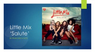
- 1. Little Mix ‘Salute’ BY FRANCESCA TUTTY
- 2. Analysis There is a logo at the top right of the album which will help the audience to recognise it as Little Mix, this is a convention of their Album covers and featured in all of them. The name of the band ‘Little Mix’ is in a red lipstick effect text that is found in some of their other album covers. The red makes it pop and the lipstick style highlights how they female artists and their music/identity is very girly. The background adds colour whilst giving the album an outdoor feel perhaps symbolic of the commonly used theme of young people going out and having fun. As Little Mix is a relatively new band this could also imply that they have the world in front of them. All of the members are positioned on the prop of a red chair which is simple and suggests that they are ordinary girls however the background/location suggests that they are extraordinary also. Perhaps ordinary girls doing extraordinary things?
- 3. Analysis Continued… All of the members are giving direct eye contact as they want to connect to their audience, this shows their dominance making them powerful. As they are also positioned in the centre of the cover this shows their importance. The clothes that they are wearing are simple in colour being black and white, the props including the clothes are affordable and high-street fashion. This appeals to both their target audience of young adults/ teens and also emphasises the idea that they are average girls.
- 4. Back Cover The back cover to Little Mix’s ‘Salute’ Album carries on the theme from the front with the same sky giving it a simple but peaceful atmosphere. The text is again red, clear and bold listing the titles of the song. They are the most important on the back cover and so they have decided not to include an image of themselves. This draws the attention just to the soundtrack list. For all back covers there is the bar code which is clearly placed although it is usually found in a bottom corner however as all the text is centred they have chosen to place it at the top in the centre to keep it balanced. The logos of the production company and copyright etc are all found here in a smaller font or size as to not take the attention away from the listings. The font is also less interesting getting the information across and nothing else.