
Recommended
More Related Content
What's hot
What's hot (20)
Viewers also liked
Similar to Evaluation of first draft
Similar to Evaluation of first draft (20)
Recently uploaded
Recently uploaded (20)
Evaluation of first draft
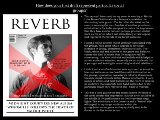
- 1. How does your first draft represent particular social groups? • The person I have used on my cover is wearing a ‘Martin Luke Brown’ t-shirt who is a famous icon within the alternative/indie genre. The fact that the artist on the cover is wearing the merchandise of another prominent artist attracts the indie group as it creates the impression that they have connections or perhaps produce similar work as the artist which will immediately create appeal and represent the trends of my target audience. • I used a colour scheme that it generally associated with the grunge/rock genre which appeals to my target audience of young, alternative/indie music fans. The black, white and red adheres to the genre and helps to convey the kind of music that the magazine will be showcasing. It is also bold and outlandish which helps to attract audience attention, especially for an audience that is younger and looking for something loud and rebellious. • I didn’t put a lot of information onto my cover so as not to bore my audience or overload them with information as the younger generation nowadays tend to be drawn more towards visual elements rather than a lot of words. I used names of artists and brief features on the cover to draw in an audience that associate with band names due to the particular image they represent and want to recreate. • The way I have placed the red beams across the front of the cover creates the impression that the artist could be in the middle of the performance as they represent stage lights. The whole idea of live concerts and a ‘festival vibe’ will appeal to my target audience within the grunge/alternative genre as they typically tend to be drawn to the live music scene.
- 2. How does your first draft represent particular social groups? • I have kept to the same colour scheme as the cover to create a lasting mood throughout the magazine which revolves around boldness and a sense of loudness. This will appeal my target social group of indie/alternative music fans as the social group is all about remaining unconventional and speaking out both in and against societies conventions. The loudness and boldness of the colour red against the greyscale background communicates this. • The person I have used in my cover looks slightly oppressed or as though he is in deep thought. The stereotype of the alternative/grunge/indie person is that they are always in deep and are typically seen as low and pessimistic. The black and white image along with the way my artist is stood communicates and therefore represents the stereotype of the typical social group my magazine is aimed at. • I have also put a quote from the artist over one of the images in order to draw attention to it and generate interest as the grunge/alternative group like to know more about the bands as well as the music and genre as a whole. • In the special offers section, I have included offers for tickets to Download festival 2016 which is a popular festival which accommodates for many different subgenres
- 3. How does your first draft represent particular social groups? • The artist I have used looks young and is wearing clothes that communicate that he is trendy but not in an obvious way as the brand he is sporting is an underground artist that barely anyone knows. • He is looking at the camera in a way that makes him look slightly hopeful but without showing too much emotion which matches the quote across the photo which speaks of aspiration and revolution – aspects of ‘niche alts’ (my target audience). • The colour scheme again is consistent and simple which is a convention of both the genre of the target audience who like to go for the ‘simple but effective’ look. • The mise en scene is simple and natural which makes the magazine and the artist look more relatable to the audience as the photo hasn’t been shot professionally in a studio with fancy lights, hair and makeup. It has been taken in a raw, real environment which makes brings the artist closer to the audience. ‘niche alts’ prefer more hipster/unknown artists who they can meet after their underground concerts. Unlike mainstream artists.
- 4. Who would be the intended audience for your product? • The intended audience for my product are ‘niche alts’ (alternatives). ‘Niche alts’ prefer to go against popular conventions and like to use social media sites such as Tumblr to explore 90’s nostalgia and subvert to the mainstream fashions of the time. • The grunge era is relevant to the idea of the ‘90’s nostalgia’ that niche alts like to associate themselves with which then brings in the trends of older, more underground bands like Nirvana and Pearl Jam. The fashions of the time also follow. Overall they like to conform to the hipster trend whilst keeping up with the mainstream trends so that they can subvert it and compare it to the 90’s nostalgia. • The age group for my intended audience ranges from 15-25 which allows for the young alts who desperately want to steer away from the mainstream/trendy image that is associated with their age to differentiate themselves from the crowd by wearing vintage band t-shirts of bands that no one else their age has heard of. It also allows for the generation that actually grew up in the 90’s who are fans of the grunge era to follow the grunge revival due to the hipster revolution of everything vintage.
- 5. How did you attract/address your audience? • I attracted my audience by using a picture of an artist that was young, looked relatable (not too perfect or studio edited) who wore the band t-shirt of an underground, not very well-known artist. Not is he promoting himself as a new/underground artist, but he is also promoting another artist of the same circumstances. • I used a colour scheme that was simple but effective with the simplicity of the red against the black and white. The images aren’t very bold either, but they are bold enough to draw attention. Not too much as to take the attention away from the text. The colour red has connotations of rebellion and standing out against the crowd which is exactly what my target audience stands for: Being different. • My article was an interview with the featured new artists which attracted my target audience as they want to feel as though they can get up close and personal with the artists. The interview was effective as they are hearing directly from the artists who are discussing a new album, therefore creating a hype and demand to know more about them. • I mentioned bands that are already famous in the contents page as their fame will draw audience attention and imply that the rest of the magazine will be showcasing news and exclusive information about the bands that the fans if the genre look up to.
- 6. What have you learnt about technologies from the process of constructing this product? • I have learnt that I can experiment with layers so that I can intergrade elements such as pictures and text more to make the page look more ‘together’ and consistent. • By experimenting with the contrast and brightness, I can make my images look older and more vintage by making them look more washed out and in some cases, black and white. This also helped me to make my text stand out against the background. • I found that it was more difficult to have layers of text over an image as elements of the image have the same colours in them which then blank out and blend with parts of the text. From this, I learned that it was easier to have the image in the background in black and white so that the text had more of a chance at standing out against the background. • The positioning of the text columns in the double page spread was difficult to manage as the text boxes all had to be the same width which was difficult to measure on Photoshop as the dimensions were harder to measure digitally. • Also in the text, it was harder to get the same shade of red on all of the questions on my double page spread as I had to manually select a shade from the colour palette each time I wanted to change it to red. • Given the fact that the dimensions for my double page spread are bigger than usual, it was difficult to centralise the image on the left hand page as there was then too much space around it. There was too much space around it because I enlarged the image then the image would have swamped the text and completely blanked it out as well looking disproportionate against the size of the text in the article. It was hard to visualise these issues on Photoshop as the piece isn’t too scale.