
Recommended
More Related Content
What's hot
What's hot (20)
Viewers also liked
Viewers also liked (20)
Similar to Monginis sdp case study
Similar to Monginis sdp case study (20)
More from Desmania_Design
More from Desmania_Design (11)
Recently uploaded
Recently uploaded (20)
Monginis sdp case study
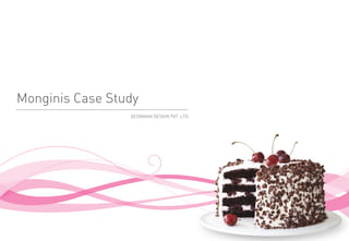
- 1. Monginis Case Study DESMANIA DESIGN PVT. LTD.
- 2. Introduction Monginis is a number 1 cake brand in India and has a very extensive network of more than 500 exclusive cake shops spread across 12 major cities in India, in additional to extensive coverage of over 15,000 retailers selling Monginis branded products. It became a truly international brand in the year 1991, when it entered Egypt. Today it is one of the leading bakery brands in Egypt and has a presence in Cairo and Alexandria with over 35 exclusive shops in addition to a number of retailers selling Monginis branded products on non-exclusive basis. A specialist in making Cakes begins right from selecting right quality ingredients in precise quantities, blending them together to the best of knowledge and baking to the level of perfection. The soft and moist sponge so made is then sumptuously layered and coated with cream flavoured with dark chocolate or milk chocolate or with various fruit flavours. These flavours are used either alone or in various combinations to give the best possible mouth feel to the cake. The lovely birthday cakes can even be delivered anywhere in 12 prominent cities in India where Monginis has presence. World is increasingly buying “online” and today one can order virtually anything from within the comforts of his or her home or office. Monginis has successfully married a concept of buying the cakes online with its core strengths of making yummy cakes and delivering them promptly to the places wherever required. One can order cakes of one's choice by logging on its website www.monginis.net .
- 3. Current Market Conditions • Monginis has threat from its competitors such as Birdy‟s, Brownie Point, Ribbons & Balloons, Denish, Croissants etc. • Cadburys and McDonalds are also a threat to it because they are also positioning their products on the lines of celebration. • The biggest competitor for Monginis in Kirana stores and Modern Retail Format Stores is Britannia & Sunfeast Brands as they have a wide range of Bar cakes, cookies and snacks. These brands have a consistent packaging and graphics across their range of products. • Monginis could not offer variety on their products as their competitors did. The youth class were shifting towards the new range of products which the competitors offered. • For many years now Monginis hasn't changed the visual identity of there product range which has made them look outdated compared to their competitors products. • Another major problem faced during the manufacturing process of the cakes were the amount of wastage which was massive & needed to be looked into. When a cake is designed & cut into to a particular shape, most of the unwanted loaf would be wasted. .
- 5. Design Research & Insights
- 6. Research Objective: To understand the market scenario of Monginis, looking at it through the eyes of the users (primary, secondary and tertiary) and arriving at a set of conclusions in order to design and strategize upgrading the Monginis brand. Method Qualitative & Quantitative research of the product‟s production, transport, storage and use ecosystem using Ethnographic and Psychometric research methods over the four areas indicated below. • User • Task • Product • Environment Design Strategy: Redesigned packaging and Brand Identity for a new look and feel. .
- 7. User Insights • A heart tugging tagline on the lines of dairy milks " A gift for someone you love" could help, especially as the survey indicated many people give cakes as gifts. Wrapping paper and cards at the billing counter could encourage impulse purchase. • The Uniform at present is more appropriate in a pharmacy than a cake shop. The employees could wear aprons conjuring up images of baking .Caps and gloves may give a sense of hygiene. • There should be some campaign or a range of products that target the weight conscious, low calorie cakes or highlight the health benefits of some product. • Like cocktails have umbrellas or slices of melon, there could be a custom insert ( sort of a flag) on the cakes bearing the Mongini's logo. • Since the customers do not pick up the products themselves and rely on the shop staff there is no need for large quantities of product to be displayed ( especially the packaged products) , reducing visual clutter will ensure that the customer sees more and maybe resultantly purchases more. .
- 9. Idea Generation Objective: • To provide the consumers with innovative and creative designs keeping in mind the international standards and competition in the F&B market. • To redesign the brand with new and unique style. Redesigning the packaging and Brand Identity for a new look and feel. The Brainstorming: • The following things were taken into consideration during the brainstorming session...The Monginis Brand Identity, The SBU-I & SBU-II Range including the brand communication collaterals. The Logo was the first to be redesigned along with the brand collaterals followed by the new design for the SBU-I and SBU-II packaging. .
- 10. Idea Generation The Key Words: • Soft, Devine, Appetizing, Tempting, Goey, Toothsome, Scrumptious, Spongy, Heavenly, Mouth watering, Delicious. Elements: • Monginis being in the market for so long needed to have some element which conveys its business. An illustration of a cake solved the purpose. Colours: • The idea of using the brand colours i.e. Blue & Magenta, for the cake boxes was a biggest task as the colour blue is not considered to be a food colour. .
- 11. Direction 01 | Illustration Based • Illustration based designs, is a new trend in international as well as in Indian market. • Its advantage is that it has not been explored much in food packaging, so using illustrations will give a unique look to the packaging. • The product will also stand out from others in malls and small stores. • On the other hand printing cost will be comparatively low. • As we found in the survey that attractive and bright colours in packaging attracts customer. • The logo element would carry „Celebration‟ & „Did you know‟ messages. .
- 12. Direction 01 | Illustration Based .
- 13. Direction . | Icon Based • Use of an Icon gives an individuality to the brand. • It brings uniformity in case of packaging as well as promotional media. • Icon will help Monginis create a very distinct and unique identity compared to their competitors as nobody has used icons so far. • As the research findings showed that transparency is preferred in packaging by consumer • This design can be used as special gift boxes which consumers can choose .
- 14. Direction . | Icon Based .
- 15. Direction 03 | Typography Based • A direction totally based on typography & colours • Monginis has a wide range of products and it was not easy to work on all the design simultaneously. • To avoid delays & to meet the timelines for the SBU-I & SBU-II product pack design a list was prepared to prioritize the categories. THE QUICK BROWN FOX THE QUICK JUMPS OVER BROWN FOX THE QUICK THE LAZY JUMPS OVER BROWN FOX DOG THE LAZY JUMPS OVER DOG THE LAZY DOG .
- 17. Logo Refinement According to survey, a new design language was developed for Monginis. This new design language has been adopted in packaging as well as other collaterals. LOGO: The logo was the first to be reworked. The key words for the logo were fresh, new age, youthful,trendy, happy, consumer oriented, fun & celebration... The New logo transformation• The elements which were in the old logo have been removed. • The logo has a smiley on the top which symbolizes the keywords mentioned above. • The Logo has been placed on a Blue circle element which is further surrounded with three white circles which depicts the idea of Celebration, Happiness & Fun. • The position size of the cap and the trumpet have been changed. • The tag line has been changed. .
- 18. Logo Refinement | Old Logo .
- 19. Logo Refinement | New Logo .
- 20. Brand Interface Design The Brand interface design consists of the following: • Dealers Visiting Card • Employee Visiting Card • Shop Opening Invitation Card • Envelope • Greeting Card • Shop Opening Banner • Menu Card • Brochure • Online Recipe books • In store creative • Shutter Creative • Corporate Brochure Design .
- 21. Visiting Card Dealers Visiting Card Employee Visiting Card .
- 22. Invitation Card Invitation Card Invitation Card Envelope .
- 24. Shop Opening Banner Shop Opening Banner .
- 26. Brochure .
- 28. Online Recipe book Bread & Cookies Online Recipe Book Pages .
- 29. Online Recipe book Cake Online Recipe Book Pages .
- 30. Online Recipe book Brownies & Muffins Online Recipe Book Pages .
- 33. Store Signage .
- 34. Store Locator .
- 36. Diwali Creative Catalogue Front Catalogue inner .
- 38. Product & Packaging Design
- 39. Product Design | Cake Design PROCESS Other Options .
- 40. Packaging Design | Cake Box Regular Cake Box Tatkal Cake Box .
- 41. Packaging Design | Bar Cake Pure Veg Bar Cakes .
- 42. Packaging Design | Bar Cake Regular Bar Cakes .
- 43. Packaging Design | Dream Cake Veg Dream Cakes Regular Dream Cakes .
- 44. Packaging Design | Plum Cake Veg Plum Cake Regular Plum Cake .
- 45. Packaging Design | Muffin Muffins 6 Pack Labels .
- 46. Packaging Design | Stripe Tease Stripe tease Labels .
- 47. Packaging Design | Dessert Cake .
- 48. Packaging Design | Brownie .
- 49. Packaging Design | Assorted Chocolates .
- 50. Packaging Design | Toast & Khari .
- 51. Packaging Design | Diwali Range Chocolate cookies Assorted cookie box Kesar cookies .
- 52. Packaging Design | Diwali Range Chocolate Sleeve .
- 53. Packaging Design | Christmas Range Rich Plum Cake .
- 54. Packaging Design | Christmas Range Date & Nut .
- 55. Packaging Design | Christmas Range Almond Cherry Cake .
- 56. Kiosk Design
- 59. Kiosk Pune Railway Station Kiosk .
- 61. Vehicle Graphics
- 62. Vehicle Graphics | Initial Design .
- 63. Vehicle Graphics | New Design Regular Vans .
- 64. Vehicle Graphics | New Design Air Condition Vans .
- 66. Monginis transformation | Old .
- 67. Monginis transformation | Old .
- 68. Monginis transformation | Old .
- 69. Monginis transformation | Old .
- 70. Monginis transformation | New .
- 71. Monginis transformation | New .
- 72. Monginis transformation | New .
- 73. Thank you DESMANIA DESIGN PVT. LTD.