1. In what ways does your media product use, develop or
challenge form and convention of real media products?
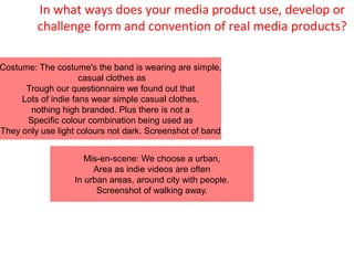
Costume: The costume's the band is wearing are simple,
casual clothes as
Trough our questionnaire we found out that
Lots of indie fans wear simple casual clothes,
nothing high branded. Plus there is not a
Specific colour combination being used as
They only use light colours not dark. Screenshot of band
Mis-en-scene: We choose a urban,
Area as indie videos are often
In urban areas, around city with people.
Screenshot of walking away.
2. Digipak
For the Digipak we used one with six panels as it would have plenty of space
For photos of the band members and to have some other images relating
To the indie genre. Such as shots of nature scenery etc.
At the back of the Digipak however we decided to use a simple image of nature
Which creates a nice effect but also is not distracting as we will be writing
Song titles of the album at the back of it.
Additionally we will be making a pocket bag for the to be put in which
May also have some nature scenery on Digipak it.c
On the front cover of the digipak, we are using a wolve, dark blue
Background. This idea came from the name zulu winter as we decided to take
The winter name and the wolf, and dark colours refer to winter.
3. Poster
While designing the poster there were a few points to consider, that it had to be tightly
Framed. For the reason that if a Fan, or an audience member looks at the poster,
focuses on the Band and the information on it, there shouldn't be anything distracting.
Additionally the font of the writing had to be something which tells
Something more about the group. The size of the name of the name
Was very large right at the top of the poster to make sure that the
Name stood out and is eye catching. The font is not very fancy style
But not too plain either which was useful to represent the simple but
nice style of the indie genre.
The colour scheme was again related toward the indie
Genre we decided to use the colour blue as it
Would refer to the band title 'zulu wolves” the blue refers
To 'wolve, which is a dark winter time.
Dssf
5. Q2: How effective is the combination of your main product and ancillary
texts?
Use of colour: in all three products we have a dark blue available. This idea
came from the original singer of our songs “zulu winter” we decided to give the
band name “zulu wolves”and the word “winter” refers to darkness therefore
dark blue colour which also gives it a cold style and with the wolf on the on the
digipak front cover refers as well to winter.
Motif: a motif used in the music video is how all band members are wearing a
hat, referring to be a special part of the costume.
Font style: for the poster we chose a font which should look simple but not too
boring so it has to be adequate. Therefore the font we chose is a plain but still
in a different shape than a usual plain one. Which refers to the Indie style,
simple and casual but still nice.
For the digipak: each individual photo of the band member includes a striking
colour background, referring to the light mood which indie music usually
creates.
Mis en scene: for the music video the mis en scene location is urban
area which is a commonly used in indie videos, Including the costume
the main artist is just wearing simple, plain clothes. Through our
questionnaire we found out that a lot of indie fans buy clothes from
jobs which are urbans referring that it will promote the album.
Style of photography: for digipak we used close ups for the individual
photos so the faces tell something about the band member, it is
similar to do with the background colour of each band members
photo. Mood . atmosphere.