SlideShare a Scribd company logo
1 of 3
Black and Gold are the two main colours used on this poster. They              In reference to the Golden Spiral rule,
               compliment each other well and make the artist appear                          the first thing that catches the viewers
               sophisticated and up-market. These striking colours make her poster            eye is the main image which is a
               stand out; despite the black make-up and hair, she has such an                 photograph Jessie J, then the eye moves
               iconic look that her audience would instantly recognise her.                   to her name because the font and colour
                                                                                              is so distinctive. Finally the viewer reads
Jessie J has used the same image for her                                                      the information given at the bottom as
album poster as she did on her album                                                          this does not stand out as much.
cover (branding). This is so that the
consumer recognises it and will make the
link between the two. The image is very
strong as the colour black is very                                                            Beneath the image of the artist, is
dominating and is used as the main colour                                                     information about the album and
here. The artist has direct eye contact                                                       featured tracks that the audience will be
with the camera; her eyes pierce through                                                      familiar with. The track names are
the camera lens and attract the attention                                                     written in white which contrast with the
of the audience as they feel drawn in.                                                        black background colour and catch your
                                                                                              attention from the other text. The
The artist name is written in a unique font                                                   ownership and producer logos are in the
which is gold in colour. This gives the                                                       bottom corners; they are not something
artist an identity and creates branding as                                                    that the viewer are interested in looking
it hasn’t used a standard, common font.                                                       at and do not, in effect, ‘sell’ the album
The album name is written slightly                                                            yet have to be included to copyright and
underneath, much smaller, implying that                                                       possession purposes.
it is mainly the artist; she is what’s selling
the album.


 Her make-up is very bold and endearing, surprisingly, the black lipstick with parted lips works in attracting the male gaze (a theory
 presented by Laura Mulvey). The gold pattern in her lips also attracts your attention and adds to her striking look. The artists costume
 follows the black theme, she is wearing a mesh-styled top which conveys a rebellious image of her. Generally black is used to present
 anger and rock music however Jessie J’s music conveys messages to young people therefore she is challenging conventions presented
 towards this genre of music.
The colours that have been used make the artist look vintage and I think the colours work well together and
                            compliment each other. Red and green are ‘warm’ colours and give the impression that the artist is very
                            down-to-Earth and grounded which is what she is trying to portray herself as. As far as an album poster, it
                            might not stand out as much as others with a more powerful image and colour scheme however it is a
                            realistic representation of her music style that her audience would pick up on. On the other hand, the fact
                            that other artists wouldn’t use such washed-out colours to advertise their albums could help make hers
                            stand out more.
                                                                                            Birdy uses the same image on her poster
                                                                                            as she did on her album; this is to create
The text giving other information is in a                                                   branding and allows audiences to
bold white font. This lifts it from the                                                     recognise her product through the link.
background to encourage the viewer to                                                       The image of her makes her appear
read it rather than disregard it. The font                                                  genuine and relatable which makes her
is quite generic rather than unique                                                         more appealing to her audience as she
which could link to the idea that her                                                       doesn’t come across as ‘fake’. In contrast
album is simple. The colour white could                                                     to her album cover, her name has been
be used to represent innocence and                                                          enlarged and has become a main feature
vulnerability which is the image Birdy is                                                   to the poster whereas before it was
trying to portray herself as having. Her                                                    hidden away in the corner. The artist
name is a tainted-white which could                                                         name has been shadowed and as a result
infer that she is trying to do something                                                    doesn’t not seem flat; it also prevents
different rather than follow the                                                            her name from becoming lost in the
expected conventions.                                                                       background.


On her album cover, she is positioned in the centre however, on this poster, she is positioned off to the right; this has been done to
encourage the viewer to read the information that is being given to advertise the artist and her album. In reference to the Golden
Spiral Rule, Birdy is the main centre of attention; she is what your eye is drawn to when you look at the poster. Her costume stands
out significantly more to everything else; the other colours that are used are very washed-out and aren’t particularly attention-
grabbing.
The use of the primary colours on this album implies that         The album that this poster is advertising is
                          it is an upbeat album. There are no dark colours so we            called ‘Circus’; hence why it appears very
                          wouldn’t expect to find any slow, sad songs in the track          much like a circus advertisement. It
                          listing. A red border surrounds the poster. The colour            maintains continuity from the album since
                          ‘Red’ has connotations of danger and passion therefore it         both are circus themed (her album is, in
                          could be expressing the genre style.                              fact, called ‘Circus’) and in retaining this
                                                                                            theme, the audience can make links
                                                                                            between the poster and the album. The use
                                                                                            of the stars around the album release date
                                                                                            gives the impression that the ‘circus
  The single that has already been                                                          performance’ has been rated by critics.
  released from the album is written
  at the bottom of the poster in a
  different font to make it stand out
                                                                                              The ownership and record label logos
  from the rest of the text. Displaying
                                                                                              are in the top corners, this puts them
  a track title that people will already
                                                                                              out of the way since they are not what
  know and are familiar with on the
                                                                                              helps to sell the poster. The audience
  poster will encourage them to buy
                                                                                              should barely notice them because they
  the poster because they will
                                                                                              aren’t what will make them want to
  recognise that track and then want
                                                                                              own the album. Also written in a small
  to buy the album to see if the
                                                                                              font in the bottom left hand corner of
  other songs are as good.
                                                                                              the poster are the web addresses that
                                                                                              fans can access to find out more about
                                                                                              the artist.


No image has been used on this poster, this is because Britney Spears is very well-known and people instantly know who she is by just
reading her name. She doesn’t need to use an image to sell her album, it sells itself because of the artist. Her name is written with a
yellow background shadow which gives it a 3D look and appears to jump off the page. The sharp contrast between red and yellow also
draws your attention to the artist name. In contrast to this, the actual album name ‘Circus’ written below has no effects behind it and
looks flat on the page, this is perhaps to avoid any attention being taken away from the star who is being advertised.

More Related Content

What's hot

the conventions of music genres.
the conventions of music genres.the conventions of music genres.
the conventions of music genres.natashahodges
 
Digipak and Album cover analysis
Digipak and Album cover analysisDigipak and Album cover analysis
Digipak and Album cover analysisbavickery
 
Research analysis into mediums of ancillary texts
Research analysis into mediums of ancillary textsResearch analysis into mediums of ancillary texts
Research analysis into mediums of ancillary textstrupti_123
 
Analysing magazine adverts
Analysing magazine advertsAnalysing magazine adverts
Analysing magazine advertsfreddy1football
 
Magazine Advertisement Research
Magazine Advertisement ResearchMagazine Advertisement Research
Magazine Advertisement ResearchAmyBoardman
 
Question Two: How effective is the combination of your main product and ancil...
Question Two: How effective is the combination of your main product and ancil...Question Two: How effective is the combination of your main product and ancil...
Question Two: How effective is the combination of your main product and ancil...Betty10
 
Analysis of previous students a2 work
Analysis of previous students a2 workAnalysis of previous students a2 work
Analysis of previous students a2 workmedialauren
 
Dizzie rascal
Dizzie rascalDizzie rascal
Dizzie rascalpreverm1
 
Analysis of CD digipack & magazine advert promoting band
Analysis of CD digipack & magazine advert promoting bandAnalysis of CD digipack & magazine advert promoting band
Analysis of CD digipack & magazine advert promoting bandDannyclayton93
 
Analysis of Music Posters
Analysis of Music PostersAnalysis of Music Posters
Analysis of Music Postersamybruce
 
A2 Media Powerpoint - Shearwater road, Juliette Stewart
A2 Media Powerpoint - Shearwater road, Juliette Stewart A2 Media Powerpoint - Shearwater road, Juliette Stewart
A2 Media Powerpoint - Shearwater road, Juliette Stewart Juliette92
 

What's hot (18)

the conventions of music genres.
the conventions of music genres.the conventions of music genres.
the conventions of music genres.
 
Digipak and Album cover analysis
Digipak and Album cover analysisDigipak and Album cover analysis
Digipak and Album cover analysis
 
Research analysis into mediums of ancillary texts
Research analysis into mediums of ancillary textsResearch analysis into mediums of ancillary texts
Research analysis into mediums of ancillary texts
 
Analysing magazine adverts
Analysing magazine advertsAnalysing magazine adverts
Analysing magazine adverts
 
Magazine Advertisement Research
Magazine Advertisement ResearchMagazine Advertisement Research
Magazine Advertisement Research
 
Digipak adverts
Digipak advertsDigipak adverts
Digipak adverts
 
Presentation1 wiz kalifa
Presentation1 wiz kalifaPresentation1 wiz kalifa
Presentation1 wiz kalifa
 
Question Two: How effective is the combination of your main product and ancil...
Question Two: How effective is the combination of your main product and ancil...Question Two: How effective is the combination of your main product and ancil...
Question Two: How effective is the combination of your main product and ancil...
 
Q3
Q3Q3
Q3
 
Analysis of previous students a2 work
Analysis of previous students a2 workAnalysis of previous students a2 work
Analysis of previous students a2 work
 
Dizzie rascal
Dizzie rascalDizzie rascal
Dizzie rascal
 
Florence digipak.docx 2
Florence digipak.docx 2Florence digipak.docx 2
Florence digipak.docx 2
 
Cd cover anaylsis
Cd cover anaylsisCd cover anaylsis
Cd cover anaylsis
 
Analysis of CD digipack & magazine advert promoting band
Analysis of CD digipack & magazine advert promoting bandAnalysis of CD digipack & magazine advert promoting band
Analysis of CD digipack & magazine advert promoting band
 
Evaluation q2
Evaluation q2Evaluation q2
Evaluation q2
 
Analysis of Music Posters
Analysis of Music PostersAnalysis of Music Posters
Analysis of Music Posters
 
A2 Media Powerpoint - Shearwater road, Juliette Stewart
A2 Media Powerpoint - Shearwater road, Juliette Stewart A2 Media Powerpoint - Shearwater road, Juliette Stewart
A2 Media Powerpoint - Shearwater road, Juliette Stewart
 
Digipack deconstruction pink
Digipack deconstruction pinkDigipack deconstruction pink
Digipack deconstruction pink
 

Similar to Poster analysis

Album Cover and Magazine Adverts for Album Release Analysis
Album Cover and Magazine Adverts for Album Release AnalysisAlbum Cover and Magazine Adverts for Album Release Analysis
Album Cover and Magazine Adverts for Album Release Analysislelicordell
 
Analysis of CD covers
Analysis of CD coversAnalysis of CD covers
Analysis of CD coversWells06
 
CD COVERS: DIGIPAK DESIGNS
CD COVERS: DIGIPAK DESIGNSCD COVERS: DIGIPAK DESIGNS
CD COVERS: DIGIPAK DESIGNSjawgeenahh
 
CD Covers: Digipak Design
CD Covers: Digipak DesignCD Covers: Digipak Design
CD Covers: Digipak Designjawgeenahh
 
Analysis of cd covers(New)
Analysis of cd covers(New)Analysis of cd covers(New)
Analysis of cd covers(New)Wells06
 
Analysis of cd covers
Analysis of cd coversAnalysis of cd covers
Analysis of cd coversWells06
 
Jack Penate Digipak Analysis
Jack Penate Digipak AnalysisJack Penate Digipak Analysis
Jack Penate Digipak Analysis3701
 
Digipak research
Digipak researchDigipak research
Digipak researchlauraraxten
 
Analysing cd covers
Analysing cd coversAnalysing cd covers
Analysing cd coversMevanson
 
CD Cover Digipak Designs
CD Cover Digipak DesignsCD Cover Digipak Designs
CD Cover Digipak Designsjawgeenahh
 
Paloma faith digipak analysis
Paloma faith digipak analysisPaloma faith digipak analysis
Paloma faith digipak analysisEmilyJohnson97
 
Research and planning cd covers
Research and planning cd coversResearch and planning cd covers
Research and planning cd coversNicky Campbell
 
Album cover powerpoint
Album cover powerpointAlbum cover powerpoint
Album cover powerpointTaraJennings
 

Similar to Poster analysis (20)

Album Cover and Magazine Adverts for Album Release Analysis
Album Cover and Magazine Adverts for Album Release AnalysisAlbum Cover and Magazine Adverts for Album Release Analysis
Album Cover and Magazine Adverts for Album Release Analysis
 
CD covers
CD coversCD covers
CD covers
 
Poster analysis
Poster analysisPoster analysis
Poster analysis
 
Analysis of CD covers
Analysis of CD coversAnalysis of CD covers
Analysis of CD covers
 
Ladyhawke
LadyhawkeLadyhawke
Ladyhawke
 
CD COVERS: DIGIPAK DESIGNS
CD COVERS: DIGIPAK DESIGNSCD COVERS: DIGIPAK DESIGNS
CD COVERS: DIGIPAK DESIGNS
 
CD Covers: Digipak Design
CD Covers: Digipak DesignCD Covers: Digipak Design
CD Covers: Digipak Design
 
Analysis of cd covers(New)
Analysis of cd covers(New)Analysis of cd covers(New)
Analysis of cd covers(New)
 
Analysis of cd covers
Analysis of cd coversAnalysis of cd covers
Analysis of cd covers
 
Jack Penate Digipak Analysis
Jack Penate Digipak AnalysisJack Penate Digipak Analysis
Jack Penate Digipak Analysis
 
Digipak research
Digipak researchDigipak research
Digipak research
 
Florence digipak.docx 2
Florence digipak.docx 2Florence digipak.docx 2
Florence digipak.docx 2
 
Analysing cd covers
Analysing cd coversAnalysing cd covers
Analysing cd covers
 
CD Cover Digipak Designs
CD Cover Digipak DesignsCD Cover Digipak Designs
CD Cover Digipak Designs
 
Cd cover
Cd coverCd cover
Cd cover
 
Paloma faith digipak analysis
Paloma faith digipak analysisPaloma faith digipak analysis
Paloma faith digipak analysis
 
Research and planning cd covers
Research and planning cd coversResearch and planning cd covers
Research and planning cd covers
 
Album cover powerpoint
Album cover powerpointAlbum cover powerpoint
Album cover powerpoint
 
Digi pack analysis
Digi pack analysisDigi pack analysis
Digi pack analysis
 
Digipak analysis 2
Digipak analysis 2Digipak analysis 2
Digipak analysis 2
 

Poster analysis

  • 1. Black and Gold are the two main colours used on this poster. They In reference to the Golden Spiral rule, compliment each other well and make the artist appear the first thing that catches the viewers sophisticated and up-market. These striking colours make her poster eye is the main image which is a stand out; despite the black make-up and hair, she has such an photograph Jessie J, then the eye moves iconic look that her audience would instantly recognise her. to her name because the font and colour is so distinctive. Finally the viewer reads Jessie J has used the same image for her the information given at the bottom as album poster as she did on her album this does not stand out as much. cover (branding). This is so that the consumer recognises it and will make the link between the two. The image is very strong as the colour black is very Beneath the image of the artist, is dominating and is used as the main colour information about the album and here. The artist has direct eye contact featured tracks that the audience will be with the camera; her eyes pierce through familiar with. The track names are the camera lens and attract the attention written in white which contrast with the of the audience as they feel drawn in. black background colour and catch your attention from the other text. The The artist name is written in a unique font ownership and producer logos are in the which is gold in colour. This gives the bottom corners; they are not something artist an identity and creates branding as that the viewer are interested in looking it hasn’t used a standard, common font. at and do not, in effect, ‘sell’ the album The album name is written slightly yet have to be included to copyright and underneath, much smaller, implying that possession purposes. it is mainly the artist; she is what’s selling the album. Her make-up is very bold and endearing, surprisingly, the black lipstick with parted lips works in attracting the male gaze (a theory presented by Laura Mulvey). The gold pattern in her lips also attracts your attention and adds to her striking look. The artists costume follows the black theme, she is wearing a mesh-styled top which conveys a rebellious image of her. Generally black is used to present anger and rock music however Jessie J’s music conveys messages to young people therefore she is challenging conventions presented towards this genre of music.
  • 2. The colours that have been used make the artist look vintage and I think the colours work well together and compliment each other. Red and green are ‘warm’ colours and give the impression that the artist is very down-to-Earth and grounded which is what she is trying to portray herself as. As far as an album poster, it might not stand out as much as others with a more powerful image and colour scheme however it is a realistic representation of her music style that her audience would pick up on. On the other hand, the fact that other artists wouldn’t use such washed-out colours to advertise their albums could help make hers stand out more. Birdy uses the same image on her poster as she did on her album; this is to create The text giving other information is in a branding and allows audiences to bold white font. This lifts it from the recognise her product through the link. background to encourage the viewer to The image of her makes her appear read it rather than disregard it. The font genuine and relatable which makes her is quite generic rather than unique more appealing to her audience as she which could link to the idea that her doesn’t come across as ‘fake’. In contrast album is simple. The colour white could to her album cover, her name has been be used to represent innocence and enlarged and has become a main feature vulnerability which is the image Birdy is to the poster whereas before it was trying to portray herself as having. Her hidden away in the corner. The artist name is a tainted-white which could name has been shadowed and as a result infer that she is trying to do something doesn’t not seem flat; it also prevents different rather than follow the her name from becoming lost in the expected conventions. background. On her album cover, she is positioned in the centre however, on this poster, she is positioned off to the right; this has been done to encourage the viewer to read the information that is being given to advertise the artist and her album. In reference to the Golden Spiral Rule, Birdy is the main centre of attention; she is what your eye is drawn to when you look at the poster. Her costume stands out significantly more to everything else; the other colours that are used are very washed-out and aren’t particularly attention- grabbing.
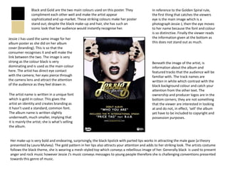
  • 3. The use of the primary colours on this album implies that The album that this poster is advertising is it is an upbeat album. There are no dark colours so we called ‘Circus’; hence why it appears very wouldn’t expect to find any slow, sad songs in the track much like a circus advertisement. It listing. A red border surrounds the poster. The colour maintains continuity from the album since ‘Red’ has connotations of danger and passion therefore it both are circus themed (her album is, in could be expressing the genre style. fact, called ‘Circus’) and in retaining this theme, the audience can make links between the poster and the album. The use of the stars around the album release date gives the impression that the ‘circus The single that has already been performance’ has been rated by critics. released from the album is written at the bottom of the poster in a different font to make it stand out The ownership and record label logos from the rest of the text. Displaying are in the top corners, this puts them a track title that people will already out of the way since they are not what know and are familiar with on the helps to sell the poster. The audience poster will encourage them to buy should barely notice them because they the poster because they will aren’t what will make them want to recognise that track and then want own the album. Also written in a small to buy the album to see if the font in the bottom left hand corner of other songs are as good. the poster are the web addresses that fans can access to find out more about the artist. No image has been used on this poster, this is because Britney Spears is very well-known and people instantly know who she is by just reading her name. She doesn’t need to use an image to sell her album, it sells itself because of the artist. Her name is written with a yellow background shadow which gives it a 3D look and appears to jump off the page. The sharp contrast between red and yellow also draws your attention to the artist name. In contrast to this, the actual album name ‘Circus’ written below has no effects behind it and looks flat on the page, this is perhaps to avoid any attention being taken away from the star who is being advertised.