Download as PDF, PPTX


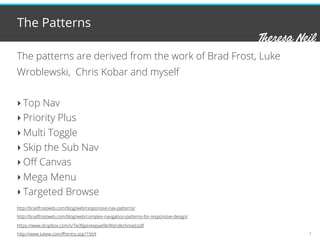


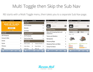


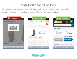


The document discusses navigation patterns for mobile optimized retail sites. It summarizes navigation patterns found on over 30 top retail sites, including top nav, priority plus, multi-toggle, skip sub nav, off canvas, mega menu, and targeted browse. It notes that some responsive design patterns can apply to mobile navigation but responsive design may not be the best strategy for retail mobile sites compared to mobile optimized sites or native apps. Examples are provided of popular navigation patterns implemented on sites like Ikea, Gilt, Lowe's, REI, and Sony. The document also outlines some additional mobile retail patterns like streamlined checkout, recommendations, and warns against anti-patterns like paging and modal dialogs.