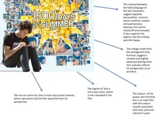
Contrasting body language and personalities in film posters
1. The contrast between
the body language of
the two characters,
suggest opposite
personalities. Summer
seems carefree, relaxed
and spontaneous
whereas Tom seems
closed off and secluded.
It also supports the
tagline, that the ending
wont be happy.
The collage made from
the protagonists face,
Summer, suggest a
creative and slightly
obsessive feelings from
Tom and also reflects
his background, as an
architect.
The tagline of ‘this is
not a love story’, which
The colours of the
The mis-en-scene has Tom in more focus than Summer, is also repeated in the
poster also hint that
which represents that the film would be from his film,
this is an indie film.,
perspective.
with the colours
usually associated
with love; pink and
red aren’t used.
2. Both posters here, conform to the stereotypes of a romance film, with the fonts
being pink and blue, representing the typical boy-girl relationship and pink which is
also associated to love, romance and females. Both films target audience were
female, as they could be classified as ‘chic-flics’.
3. The print styles used on ‘The Lake house’ is
white, which is not a stereotypical colour
associated with love, suggesting that the
relationship between the two protagonist, is
something more real and serious. The colour
white connotes purity and innocence,
suggesting their relationship is the ‘real deal’.
The contrast between the two characters, with
Sandra Bullock being in lighter colours and Keanu
Reeves in black and white suggests, Reeves
character is a memory or someone from the past
to Bullocks character. However the tagline
suggests that the contrast between the two
characters is because they haven't actually met.
The female protagonists colours of white and
pastel colurs suggests that she is pure and
angelic, suggesting why Reeves fell in love with
her or that the audience is meant to sympathise
with her story more.
4. ›
The dark colours are subversion of
those typically used in romance films
and suggests this ale of love will not
have a happy ending.
The serious expression and posture of
the male leads also supports the use of
dark colours, being associated with
serious, glum and melancholy
emotions.
The fact the woman is leaning and looking towards to the
man, suggests she is more open with her emotions and
the contrast between their postures also hints at the
balance of power in their relationship.
The font styles reflect the time period that the film is
set, the 1940’s and the white colour font reflects the
professionalism of Anthony Hopkins character.