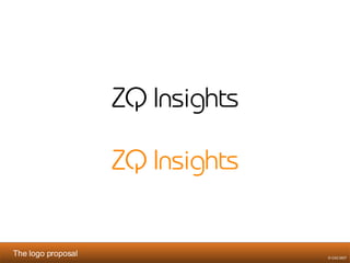
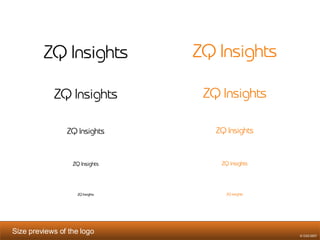
ZQ Insights logo proposal
Proposal Phylosophy   Briefing elements taken into consideration in our proposal: Technological side of Web Analytics. Point of view of Avinash: Organic & human through the round corners of the letter type. Clean and sober. Color choices (mainly orange and black used in presentations; orange and white in the blog). No particular illustrations for the logo. The target audience is business oriented (not too informal). The main identity of the logo has to be convey through the 2 letters (ZQ). These two letters are afterwards declined into an icon.  This icon can have multiple graphical uses. The icon is presented by a slash that represents the upwards trend seek by the use of Web Analytics  and the Q represents the power/technological side of Web Analytics. On an ergonomic point of view, the logo is readable in small sizes (often used on the Internet). © OX2 2007
The logo proposal © OX2 2007
Size previews of the logo   © OX2 2007
Background and logo color studies   © OX2 2007
The Icon declined from the logo   © OX2 2007
Background and icon color studies   © OX2 2007
Some examples of use of the icon and logo © OX2 2007


ZQ Insights Brand Identity

  • 1.
  • 2.
    Proposal Phylosophy Briefing elements taken into consideration in our proposal: Technological side of Web Analytics. Point of view of Avinash: Organic & human through the round corners of the letter type. Clean and sober. Color choices (mainly orange and black used in presentations; orange and white in the blog). No particular illustrations for the logo. The target audience is business oriented (not too informal). The main identity of the logo has to be convey through the 2 letters (ZQ). These two letters are afterwards declined into an icon. This icon can have multiple graphical uses. The icon is presented by a slash that represents the upwards trend seek by the use of Web Analytics and the Q represents the power/technological side of Web Analytics. On an ergonomic point of view, the logo is readable in small sizes (often used on the Internet). © OX2 2007
  • 3.
    The logo proposal© OX2 2007
  • 4.
    Size previews ofthe logo © OX2 2007
  • 5.
    Background and logocolor studies © OX2 2007
  • 6.
    Background and logocolor studies © OX2 2007
  • 7.
    The Icon declinedfrom the logo © OX2 2007
  • 8.
    Background and iconcolor studies © OX2 2007
  • 9.
    Background and iconcolor studies © OX2 2007
  • 10.
    Some examples ofuse of the icon and logo © OX2 2007
  • 11.
  • 12.
  • 13.
  • 14.
  • 15.
  • 16.