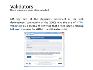
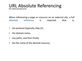
The document provides an overview of HTML including:
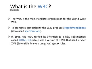
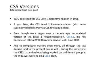
1) A brief history of HTML from its origins in the 1960s through its standardization by the W3C in the late 1990s.
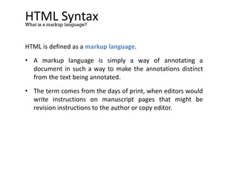
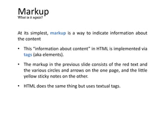
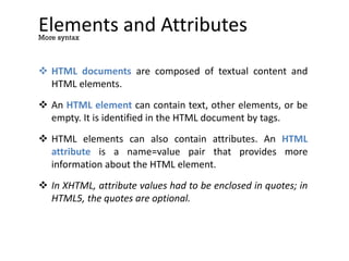
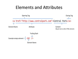
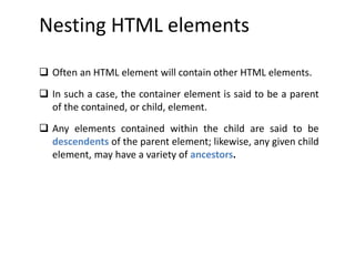
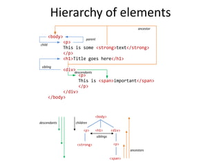
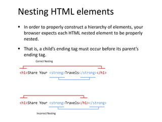
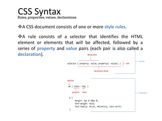
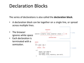
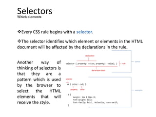
2) An explanation of HTML syntax including tags, elements, attributes, and nesting.
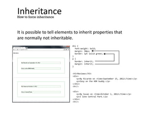
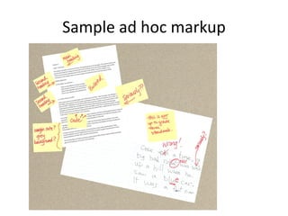
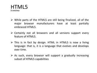
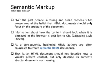
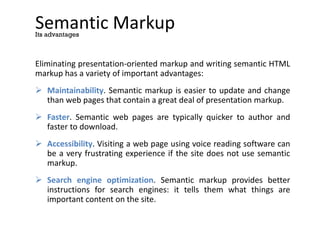
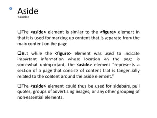
3) A discussion of semantic markup and its advantages over presentation-oriented markup.
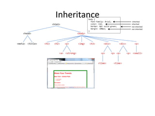
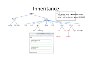
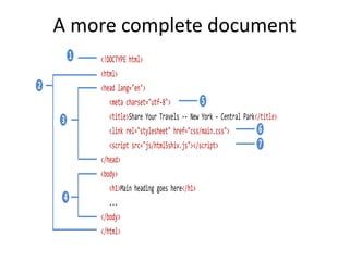
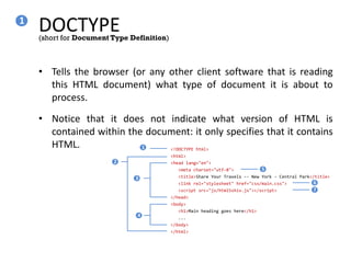
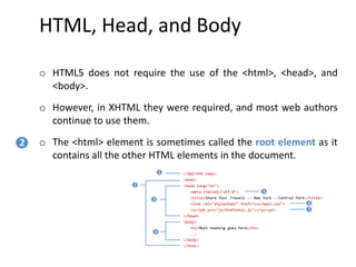
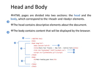
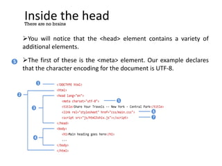
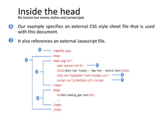
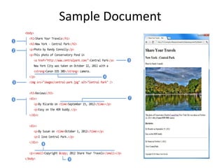
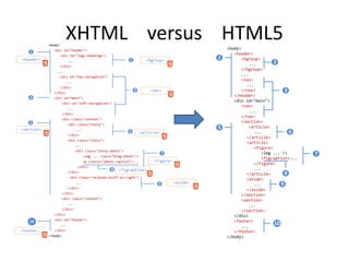
4) A description of the basic structure of an HTML document including the DOCTYPE, html, head, and body elements.
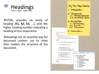
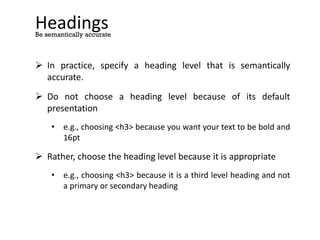
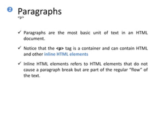
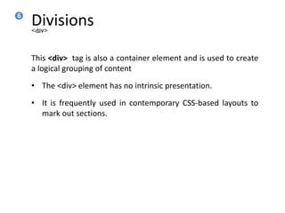
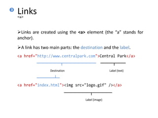
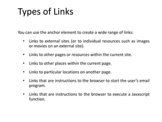
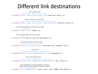
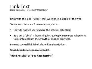
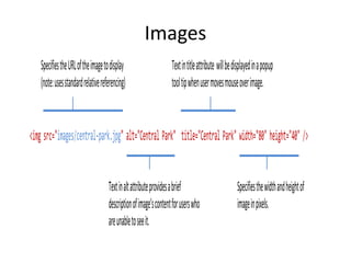
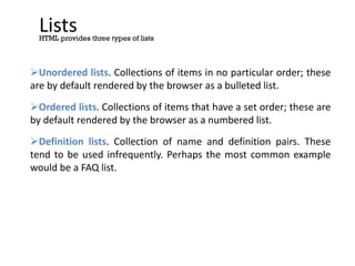
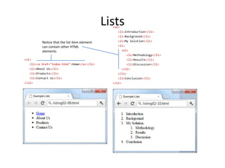
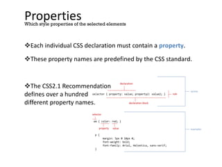
5) A quick tour of common HTML elements like headings, paragraphs, links, and divisions.


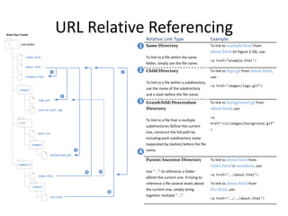


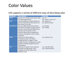
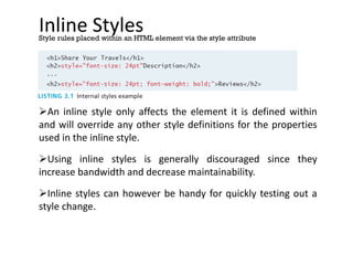
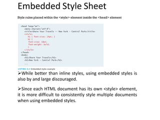
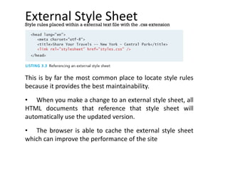

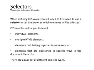

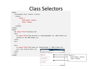
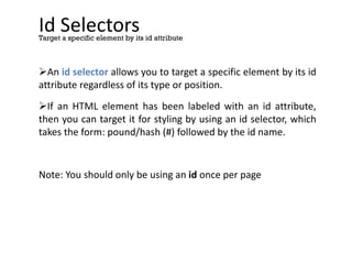
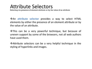
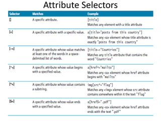
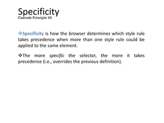
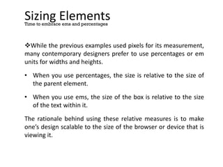
![Attribute Selectors
<head lang="en">
<meta charset="utf-8">
<title>Share Your Travels</title>
<style>
[title] {
cursor: help;
padding-bottom: 3px;
border-bottom: 2px dotted blue;
text-decoration: none;
}
</style>
</head>
<body>
<div>
<img src="images/flags/CA.png" title="Canada Flag" />
<h2><a href="countries.php?id=CA" title="see posts from Canada">
Canada</a>
</h2>
<p>Canada is a North American country consisting of … </p>
<div>
<img src="images/square/6114907897.jpg" title="At top of Sulpher
Mountain">
<img src="images/square/6592317633.jpg" title="Grace Presbyterian
Church">
<img src="images/square/6592914823.jpg" title="Calgary Downtown">
</div>
</div>
</body>
[title] {
cursor: help;
padding-bottom: 3px;
border-bottom: 2px dotted blue;
text-decoration: none;
}](https://image.slidesharecdn.com/wtmodule-1-230918132559-d244f71f/85/WT-Module-1-pdf-115-320.jpg)