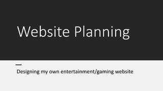
2. My title has taken inspiration from
common conventions across most
gaming websites with it being:
- Framed In the centre-top of the
website to be the first thing visitors
see.
- Follows the same house style as my
magazine with the same font and a
consistent two tone balck and white
colour scheme with a complimentary
colour.
My menu has taken inspiration from a
multitude of sources and some originality:
- The layout is similar to most websites
with the home button being first and
contact being last however my menu also
has a reviews and latest news section.
- The formatting follows a common, centre-
top framing with it being pinned across all
pages in this position just below the title.
3. My homepage incorporates a variety of
conventions across a plethora of example
gaming sites such as, 'Gematsu', 'PC Gamer',
and 'Niche Gamer'.
These include:
- The social media links at the forefront of the
page. This is done as the video game industry
is a rapidly changing, fast paced industry with
a demographic of avid users of online social
platforms.
- The heavy image to text ratio with a
subheading and anchoring text being the
only text needed on the homepage,
alongside some headings such as 'Trending'
and 'Reviews'.
- The idea of having a newsfeed down the
right side of the website is a common feature
across a couple websites, in particular 'Niche
gamer', however the content and layout is
unique and original to my website as I feel it
is fresh but also follows codes and
conventions that make it easy to understand
as with most news feeds.
4. HOMEPAGE (with
images added)
The images that were added were taken and framed so that they
could align very well with that, that was planned in the previous
slides. Th eonly change can be seen in the main images at the top of
the Homepage, with it instead being double side by side images that
are of the same subject matter that was planned in the previous
slides. Other changes that don't concern formatting include the
subject matter changes, for example, the 'Setup' image and caption
was changed from 'Guide'.
5. 'Reviews' Page
Following on from my research into the
content of 'Reviews' pages I have decided
to use the following:
- I have opted for a list style formatting of
my reviews page so that it is easily
navigable, and all information is available
on one page.
- For the reviews I have also decided to go
for a rating system in which you can look
at the rating that is given out of ten as a
symbol in each review. This allows for a
quick and easy rating of each article.
- Each topic has an accompanying image
framed in a similar manner
- There is still the trending tab on the
right-hand side of the website as this is a
common feature throughout the website
and most other entertainment website.
- The theme is consistent with the rest of
the website with the colour scheme,
typography and formatting all being
similar.
6. Reviews page (with
images added)
• Nothing much changed about this
page as the formatting of the plan
previous aligned itself very well
with the photos that were used in
the articles.
• The only noteworthy change that
is consistent across all pages is
that the trending tab has been
updated to include the photos
that were taken by me for use in
the 'Latest News' tab
7. 'News' Page
Following on from my research into
the content of 'News' pages I
have decided to use the following:
- This page also utilises a list style
formatting as is conventional for
gaming and entertainment websites
- There is a main image framed
toward the top of the page that is
formatted slightly differently to make
it unique and stand out
- Each topic has an
accompanying image framed in a
similar manner
- There is still the trending tab on
the right-hand side of the website as
this is a common feature throughout
the website and most other
entertainment website.
- The theme is consistent with the
rest of the website with the colour
scheme, typography and formatting
all being similar.
8. 'Latest News'
(with pictures
added)
• Again there aren't many
noteworthy changes to this page
with formatting as the plan was
done quite well and it fit the
image that I had taken very well.
• The only noteworthy change
would be that the headlining
image that has had the format
shifted slightly so that the wording
is on the right of the image to
better encompass the proportions
of the portrait photo that was
taken.
9. 'About' Page
The 'about' page is something that is
common across a plethora of
websites however it is not usually
labeled as such and will typically be a
little introduction to what the
company or product is. Mine
includes:
- The trending tab which his common
across all of the pages in the website
- The title/heading is framed towards
the middle of the frame which allows
it to stand out on the page.
- The main image is accompanying
the article and shows the main
'editor' of the magazine and website.
- It also has the social media links at
the top of the page which is also at
the top of every page in the website.
10. 'About' page (with
images added)
• The 'About' page did not have any
changes at all made when it came
to formatting except the 'Trending'
tab changes that were made
across the whole website as it is a
live feed. The images fit the
planning of the page very well as it
was a simple inclusion of the
company logo as is fitting with the
content of the page.