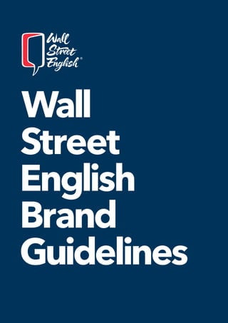
Wall Street English Brand Guidelines v.10.5
•
0 likes•296 views

The document provides branding guidelines for Wall Street English. It outlines the proper use of the brand name, logo, color palette, typeface, icons, and tone of voice. The brand name must never be abbreviated and the official logo consists of a blue and red design with a speech bubble. The tone of voice aims to be confident yet approachable, educational yet not overly institutional. Graphics, marketing materials, and all external communication must adhere to these guidelines to maintain a consistent global brand identity.

Recommended
More Related Content
What's hot
What's hot (20)
Similar to Wall Street English Brand Guidelines v.10.5
Similar to Wall Street English Brand Guidelines v.10.5 (20)
Recently uploaded
Recently uploaded (20)
Wall Street English Brand Guidelines v.10.5
- 2. 4.0 ———————————— 5.0 ———————————— 6.0 ———————————— 7.0 ———————————— 8.0 ———————————— 9.0 ———————————— 1.0 ———————————— 2.0 ———————————— 3.0 ———————————— Contents / AllguidelinescontainedintheWallStreetEnglishBrandGuidelinesmanualmustbefollowed.Atnotimecanthefilesthatarefeatured in this book be altered. At no time can the Wall Street English logo be altered from what is presented in these Brand Guidelines. ComplyingwiththebrandbookguidelinesisanessentialaspectofourbusinessandofbeingpartoftheWallStreetEnglishnetwork. A global brand 1.1 A global brand 6 1.2 Brand identity 10 Tone of voice 2.1 Definition 14 2.2 Objective 16 2.3 Personality 18 2.4 Do's 20 2.5 Dont's 22 Brand name, logo and application 3.1 Brand name 26 3.2 Master Logo 28 3.3 Master Logo / Positive 30 3.4 Master Logo / Monochrome 32 3.5 Master Logo / B&W 34 3.6 Secondary Logo 36 3.7 Arabic logos 38 3.8 Proportion & exclusion zones / Master logo 40 3.9 Logo misuse / Master logo 44 3.10 Logo minimum size 46 3.11 Logo legibility 48 3.12 Logomania 52 Color 4.1 Color palette 60 4.2 Pantone coated and uncoated 62 4.3 Color proportions 64 Typeface 5.1 Typography introduction 68 5.2 Standard font for internal communication and emails 69 5.3 Wall Street English typeface 70 5.4 Typeface weights 72 5.5 Typographic layout 74 Brand identity application 6.1 Brand identity application 78 Product marketing & communication 7.1 Key graphics & icons 94 7.2 Stationery 102 7.3 Digital signature 117 7.4 Merchandise 118 Wall Street English in partnerships 8.1 Wall Street English in partnerships 128 Annex - Product Brand Family 132 3 2 QM-1-D1-V10.5 Index Wall Street English Brand Guidelines Index Wall Street English Brand Guidelines QM-1-D1-V10.5
- 3. 1.0 A global brand 1.1 A global brand 1.2 Brand identity Contents / 5 4 1.0 A global brand Wall Street English Brand Guidelines A global brand 1.0 Wall Street English Brand Guidelines QM-1-D1-V10.5 QM-1-D1-V10.5
- 4. 1.1 A global brand A global brand 1.1 A global brand Being a global brand means being consistently recognized throughout the world. Our brand is an inspired, innovative and universal vision. It is a change in style that draws strength and meaning from our history and our vision of the future. For over 45 years, Wall Street English has been on the leading edge of language education and has helped people around the world learn English. — TheseguidelinesoutlineourbrandDNAand personalidentity.Theyareasetofprinciples tohelpuspresentourselvesclearly, consistently,andwithavividsenseofour personalityandpurpose. — A global brand has a strong identity and a strong voice that set it apart from the competition. It requires unique look feel that carries the same message across all channels and territories in the world. 7 A global brand 1.0 Wall Street English Brand Guidelines QM-1-D1-V10.5 6 1.0 A global brand Wall Street English Brand Guidelines QM-1-D1-V10.5
- 5. The Wall Street English identity has been designed to represent the way we interact with our students. It offers a human touch, and can be tailored to reach different audiences around the world. — Our look feel expresses our leadership, which is conveyed through strong visuals and strong messages. It allows us to give a creative, meaningful and above all consistent treatment to all types of communications and materials. — All communication materials must adapt fluidly to all new media and be equally effective on all devices. — There are seven key elements that make up the new Wall Street English brand identity: name, logo, color palette, typeface, icons, logomania and tone of voice. 1.2 Brand identity 1.2 Brand identity Brand identity 9 A global brand 1.0 Wall Street English Brand Guidelines QM-1-D1-V10.5 8 1.0 A global brand Wall Street English Brand Guidelines QM-1-D1-V10.5
- 6. 1.2 Brand identity Logomania (please see page 56 for more details) Logos (please see page 28 for more details) Name (please see page 26 for more details) Wall Street English Color palette (please see page 64 for more details) 1.2 Brand identity Icon style (please see page 98 for more details) Typography (please see page 72 for more details) Avenir Next a. b. c. 11 10 1.0 A global brand Wall Street English Brand Guidelines A global brand 1.0 Wall Street English Brand Guidelines QM-1-D1-V10.5 QM-1-D1-V10.5
- 7. 2.0 Tone of voice 2.1 Definition 2.2 Objective 2.3 Personality 2.3 Do's 2.4 Don'ts Contents / 13 12 2.0 Tone of voice Wall Street English Brand Guidelines Tone of voice 2.0 Wall Street English Brand Guidelines QM-1-D1-V10.5 QM-1-D1-V10.5
- 8. 2.1 Definition When it comes to presenting ourselves to the outside world, we need to express who we are as a brand to our customer and prospects. — We do this in two ways: through our visual identity – our logo, colors and campaign images – and through our verbal identity, in the way we talk to people through our various communication materials. And when it comes to talking, it’s not just about what we say, but the way we say it. This is our tone of voice. Tone of voice definition: noun a particular quality, way of sounding, modulation, or intonation of the voice as expressive of some meaning, feeling, spirit, etc. “In the English language, it all comes down to this: Twenty-six letters, when combined correctly, can create magic.” John Grogan Journalist and writer 2.1 Definition 15 14 2.0 Tone of voice Wall Street English Brand Guidelines Tone of voice 2.0 Wall Street English Brand Guidelines QM-1-D1-V10.5 QM-1-D1-V10.5
- 9. 2.2 Objective 2.2 Objective Communicating in the Wall Street English tone of voice is not optional. It is mandatory. It’s no good claiming, for example, that we’re approachable if our language is not. — If we are to succeed in our goal to establish Wall Street English as the world’s leading brand in English language learning, then it is essential that we share a recognizable tone of voice. By writing, or speaking, in a particular way, what we say becomes more convincing, and more engaging. The more consistent we are, the more likely that people will understand what makes our brand unique. “The tone we use illustrates we care.” Nina Purdey Director of Franchise Services Wall Street English International Whenever we communicate on behalf of Wall Street English it should be in the Wall Street English tone of voice. Tone of voice is an attitude, a personality, not just vocabulary; therefore it should be flexible for the wide range of audiences we speak to. — Of course, the messages will change depending on the campaign and the target audience – obviously we do not speak to government officials in the same way that we speak to our students – but the personality behind those messages should be consistent throughout all communication, touchpoints, and materials. Think about how we as individuals adapt the way we speak, depending on whether we are speaking to friends and colleagues, or the bank manager – we may use different language; we may also have a different emotion; but we cannot change our personality. 17 16 2.0 Tone of voice Wall Street English Brand Guidelines Tone of voice 2.0 Wall Street English Brand Guidelines QM-1-D1-V10.5 QM-1-D1-V10.5
- 10. When thinking about the best way to talk to someone, it can be helpful to start by thinking about who we are. If Wall Street English was a person, what sort of person would we be, and how might this shape the way we speak? — Confident – but not domineering. We are experts in the field of English language learning. We are intelligent with the authority and credibility to inspire. We can take pride in the things we achieve and celebrate our students’ successes. We know what we are talking about. But we are not arrogant, domineering, or patronizing. — Approachable – but not overly familiar. We are personal, accessible, friendly, and inclusive. We are warm and welcoming to everyone who comes to us for help to succeed with their English language goals. 2.3 Personality But we are not so relaxed that we are perceived as unprofessional. — Educational – but not overly institutional. We are a modern, international campus of learning. And, underpinning our learning syllabus, we want our students to treat us as a hub from which they can develop life experiences and personal relationships. But we are not a stuffy old university. — Proud of our heritage – but not stuck in the past. We are proud of over 45 years’ experience of delivering trusted English language education. But we do not dwell on past achievements – we are always looking to what we can help our students achieve now, and how we can help those students who are yet to walk through our door. 2.3 Personality 19 18 2.0 Tone of voice Wall Street English Brand Guidelines Tone of voice 2.0 Wall Street English Brand Guidelines QM-1-D1-V10.5 QM-1-D1-V10.5
- 11. 2.4 Do's Our writing style should reflect our brand personality. We must speak and write clearly so that our language is as easy as possible to understand. DO… Use the first person, and address your audience directly, wherever possible, e.g. ‘we’ or ‘you’ rather than ‘the organization’ or ‘students’. — Use short sentences that are simple and easy to understand. Every word should have a purpose. If it doesn’t, then it’s just padding. — Read out loud everything that you write. It should be a conversation between two people. 2.4 Do's Consider who you are talking to. At Wall Street English we talk to a variety of audiences, both external and internal, from students and prospects to partners in PR, Media organizations and government. Different audiences will require different messages, but it is important to use the same tone of voice. This will ensure we stay consistent in our personality and appear credible and authentic. — Explain the benefits of our courses, rather than just describe our services. — Pay careful attention to correct spelling and punctuation (crucial for an English language organization). 21 20 2.0 Tone of voice Wall Street English Brand Guidelines Tone of voice 2.0 Wall Street English Brand Guidelines QM-1-D1-V10.5 QM-1-D1-V10.5
- 12. 2.5 Don'ts It is tempting to use complicated language as a shortcut to sounding intelligent, or to use corporate jargon because we think other business people will take us more seriously if we do. We want to break down barriers of language, not build them up. Because if people cannot understand us, why would they trust us to help them be understood? “I notice that you use plain, simple language, short words and brief sentences. That is the way to write English – it is the modern way and the best way.” Mark Twain Writer 2.5 Dont's DON’T… Use long formal words unless absolutely necessary for the audience. — Use business jargon (this is not to say we cannot use business-related terminology, which may help reassure our professional customers of our expertise), e.g. we contact people, we don’t ‘touch base’ with them. — Use acronyms without explaining what the acronym means when you first use it. 23 22 2.0 Tone of voice Wall Street English Brand Guidelines Tone of voice 2.0 Wall Street English Brand Guidelines QM-1-D1-V10.5 QM-1-D1-V10.5
- 13. 3.0 Brand name and logo application 3.1 Brand name 3.2 Master Logo 3.3 Master Logo / Positive and negative 3.4 Master Logo / Monochrome 3.5 Master Logo / BW 3.6 Secondary Logo 3.7 Arabic logos 3.8 Proportion exclusion zones 3.9 Logo misuse 3.10 Logo minimum size 3.11 Logo legibility 3.12 Logomania Contents / 3.0 Brand name, logo and application Wall Street English Brand Guidelines Brand name, logo and application 3.0 Wall Street English Brand Guidelines 25 24 QM-1-D1-V10.5 QM-1-D1-V10.5
- 14. WSE Wall St. Eng. WallSE W.S.E. Wall Street WSEnglish Our brand name – Wall Street English – is the key building block in our DNA. — When we abbreviate our name, we do not only dilute our brand, we also lose our key category descriptor – English, and this is unacceptable. — We do not support use of the brand name abbreviation or an acronym. Any unapproved* application will be considered a violation of the Wall Street English brand guidelines. *Some exceptions might apply in case of a character limitation in the digital space. However, each case needs to be consulted with the brand team. 3.1 Brand name 3.1 Brand name Do not use the acronym Do not abbreviate parts of the brand name Do not abbreviate parts of the brand name Do not remove parts of the brand name Do not abbreviate parts of the brand name Do not use the acronym Brand name, logo and application 3.0 Wall Street English Brand Guidelines 27 QM-1-D1-V10.5 3.0 Brand name, logo and application Wall Street English Brand Guidelines 26 QM-1-D1-V10.5
- 15. The logo is made up of two blocks: logo and lettering. The pen strokes are fresh, rounded and geometrically imperfect to give the logo a human feel. The colors recall the Union Jack and therefore the English language. When presented with a speech bubble that opens in perspective to form a door to the world, you can't help but think about the opportunities offered by the English language – about the doors that are opened and the possibilities to connect with the different cultures. — Wall Street English opens the door to the world and unifies it under a single language. 3.2 Master Logo 3.2 Master Logo The Master logo is the official Wall Street English logo. It appears on a WHITE background in the positive version and on a BLUE background in the negative version. This is the standard and preferred logo to be used. Only in specific cases is it possible to use the Monochrome logo (please see page 32 for more details) or the BW logo (please see page 34 for more details). Brand name, logo and application 3.0 Wall Street English Brand Guidelines 29 QM-1-D1-V10.5 3.0 Brand name, logo and application Wall Street English Brand Guidelines 28 QM-1-D1-V10.5
- 16. 3.3 Master Logo / Positive You are advised to always use the positive version of the Master logo on a WHITE background in order to leave the contrast between the marks unchanged. Only in exceptional cases, and only with pre—approval from our International Marketing Team, can the logo be positioned on a differently colored background. 03 Door WHITE 02 Door gap RED 01 Outline BLUE 01 02 03 3.3 Master Logo / Negative You are advised always to use the negative version of the Master logo on a BLUE background in order to leave the contrast between the marks unchanged. Only in exceptional cases, and only with pre—approval from our International Marketing Team, can the logo be positioned on a differently colored background. 03 Door BLUE 02 Door gap RED 01 Outline WHITE 01 02 03 Brand name, logo and application 3.0 Wall Street English Brand Guidelines 31 QM-1-D1-V10.5 3.0 Brand name, logo and application Wall Street English Brand Guidelines 30 QM-1-D1-V10.5
- 17. 3.4 Master Logo / Monochrome This is an outline version of the Master logo. As this version has only one color, it is suitable for use with the entire Wall Street English color palette and also in exceptional cases when the background does not use one of our range of colors. You are advised to use the BLUE outline when the background color is light and the WHITE outline when the background color is dark. In some cases the background color may permit either the BLUE or the WHITE outline, as shown on the next page. 03 Door TRANSPARENT 02 Door gap TRANSPARENT 01 Outline BLUE 01 02 03 CYAN LIGHT BLUE PEACH SKIN RED 3.4 Master Logo / Monochrome / Color suggestions Brand name, logo and application 3.0 Wall Street English Brand Guidelines 33 QM-1-D1-V10.5 3.0 Brand name, logo and application Wall Street English Brand Guidelines 32 QM-1-D1-V10.5
- 18. This is a black and white version of the Master logo in which the colors have been converted into grey scale, with BLUE becoming 100% black and RED 50% black. This version has been created for fax sheets and black white print–outs. 03 Door WHITE 02 Door gap 50% BLACK 01 Outline 100% BLACK 3.5 Master Logo / BW 01 02 03 The BW Wall Street English logo can only be used for facsimiles and BW printers. 3.5 Master Logo / BW Brand name, logo and application 3.0 Wall Street English Brand Guidelines 35 3.0 Brand name, logo and application Wall Street English Brand Guidelines 34 QM-1-D1-V10.5 QM-1-D1-V10.5
- 19. 3.6 Secondary Logo The Secondary logo is the alternative version of the Master logo. The general guidelines also apply to the Secondary logo. 3.6 Secondary Logo Please always look to use our Master logo first as Secondary logo has been designed specifically for those exceptional moments, when the use of Master logo is technically impossible due to space restriction. — Please refer to the center guidelines for the regulated use of the secondary logo in centre signage. Brand name, logo and application 3.0 Wall Street English Brand Guidelines 37 QM-1-D1-V10.5 3.0 Brand name, logo and application Wall Street English Brand Guidelines 36 QM-1-D1-V10.5
- 20. 3.7 Arabic logos Arabic Master Secondary logos These logos are for Middle East countries. The general guidelines also apply to the Arabic logo. 3.7 Arabic logos Y ou are advised always to use the negative versions of the logo on BLUE colored backgrounds. Brand dimension 3.0 Wall Street English Brand Guidelines 39 3.0 Brand name, logo and application Wall Street English Brand Guidelines 38 QM-1-D1-V10.5 QM-1-D1-V10.5
- 21. 3.8 Proportion exclusion zones / Master logo The logo has been designed to present a clear relationship between all elements. The reference measurement, X, is the width of the Door. The lettering and exclusion zone are based on X. It is important to keep these proportions correct because they give a sense of consistency to the logo as a whole. It is absolutely prohibited to modify the proportions of the logo. Master logo 1.5 X 1/2 X 2/3 X 1/2 X X 1/2 X 1.5 X 1.5 X 1/2 X 2/3 X 2.5 X 1/2 X X 1/2 X 3.8 Proportion exclusion zones / Secondary logo Exclusion zone To ensure that the Wall Street English logo is always clear and unobstructed, it is important to provide an area of clear space around it. The minimum exclusion zone is shown here. The exclusion zone cannot be reduced but can be increased. No other object should appear within the exclusion zone at any time. This will maintain consistency across communications as well as preventing any cropping errors when items are printed. Secondary logo 6 X 1/2 X X 1/2 X X 1/2 X 1/2 X 6 X 1/2 X 2/3 X 1.5 X 2/3 X 1.5 X 1/2 X 3.0 Brand name, logo and application Wall Street English Brand Guidelines Brand name, logo and application 3.0 Wall Street English Brand Guidelines 41 40 QM-1-D1-V10.5 QM-1-D1-V10.5
- 22. 3.9 Logo misuse / Master logo Do not add effects Do not tilt Do not resize any individual elements Do not rotate Do not crop the logo Do not add text or image on the Door 3.9 Logo misuse / Master logo Do not change any colors or invert the color on the Door Do not change the typography Do not use mirror images of the Door Do not distort the logo Do not move individual parts Do not add transparency 3.0 Brand name, logo and application Wall Street English Brand Guidelines Brand name, logo and application 3.0 Wall Street English Brand Guidelines 43 42 QM-1-D1-V10.5 QM-1-D1-V10.5
- 23. 3.9 Logo misuse / Secondary logo Do not add effects Do not tilt Do not resize any individual elements Do not rotate Do not crop the logo Do not add text or image on the Door 3.9 Logo misuse / Secondary logo Do not change any colors or invert the color on the Door Do not change the typography Do not use mirror images of the Door Do not distort the logo Do not move individual parts Do not add transparency 3.0 Brand name, logo and application Wall Street English Brand Guidelines Brand name, logo and application 3.0 Wall Street English Brand Guidelines 45 44 QM-1-D1-V10.5 QM-1-D1-V10.5
- 24. The Wall Street English logoshould always be legible and must never lose its shape when reduced to a small size. 3.10 Logo minimum size Master logo Reproduces down to 65 pixels Secondary logo Reproduces down to 45 pixels Master logo Prints no smaller than 15 mm Print based Screen based Secondary logo Prints no smaller than 27 mm Print based The Master logo should always be legible and must never lose its shape when reduced to a smaller size. In print, the logo can be used with a minimum width of 15 mm. The Secondary logo can be reduced to a minimum width of 27 mm. Screen based For use on websites and screen–based reproduction, the Master logo should not be smaller than 65 pixels wide. The Secondary logo should not be smaller than 128 pixels. For minimum size of the digital logo please refer to the internal digital guidelines. 15 mm 128 px 27 mm 65 px 3.10 Logo minimum size Brand name, logo and application 3.0 Wall Street English Brand Guidelines 47 3.0 Brand name, logo and application Wall Street English Brand Guidelines 46 QM-1-D1-V10.5 QM-1-D1-V10.5
- 25. When using photography it’s important to consider the legibility of the logo. The image should always provide enough background contrast so that the logo is clearly visible. BLUE monochrome logo + light background If the background is light, the BLUE version of the Master outline logo will provide the best contrast. 3.11 Logo legibility WHITE monochrome logo + dark background We recommend using the WHITE outline version of the Master Logo against dark backgrounds. Positive logo + WHITE background The use of the positive version of our Master logo is acceptable on a WHITE or very close to WHITE background. Negative logo + BLUE background When photography has a uniform BLUE background or it has been retouched to do so, the negative version of our Master logo should be used. 3.11 Logo legibility 3.0 Brand name, logo and application Wall Street English Brand Guidelines Brand name, logo and application 3.0 Wall Street English Brand Guidelines 49 48 QM-1-D1-V10.5 QM-1-D1-V10.5
- 26. 3.11 Logo legibility BLUE monochrome logo + brightened background If the logo legibility is poor, the image can be brightened if the general tonality of the image allows it. WHITE monochrome logo + darkened background The image can be darkened to provide better contrast next to the WHITE outline version of the Master logo. 3.11 Logo legibility Don’t use the logo in a way that makes it illegible Do not use the logo on colors that will hide or clash with the colors of the logo — e.g. BLUE logo on a dark background, WHITE logo on a light background. Don’t use the logo in a way that makes it illegible Do not use the logo over busy backgrounds. 3.0 Brand name, logo and application Wall Street English Brand Guidelines Brand name, logo and application 3.0 Wall Street English Brand Guidelines 51 50 QM-1-D1-V10.5 QM-1-D1-V10.5
- 27. Positive version The Wall Street English logomania is an element that forms part of the brand identity and is used for promotional materials, give–aways, events and other brand communications. It has a modular quadratic structure with the words Wall Street English and can be used on all types of surfaces. The monochrome versions are recommended to be used on transparent surfaces. 3.12 Logomania Positive color version Positive monochrome version Negative version The negative version should be used when the background is BLUE. In contrast to the positive version, BLUE becomes WHITE. 3.12 Logomania Negative color version Negative monochrome version Brand name, logo and application 3.0 Wall Street English Brand Guidelines 53 QM-1-D1-V10.5 3.0 Brand name, logo and application Wall Street English Brand Guidelines 52 QM-1-D1-V10.5 QM-1-D1-V10.5 QM-1-D1-V10.5
- 30. 4.0 Colors 4.1 Color palette 4.2 Pantone Coated and Uncoated 4.3 Color proportions Contents / 4.0 Colors Wall Street English Brand Guidelines Colors 4.0 Wall Street English Brand Guidelines 59 58 QM-1-D1-V10.5 QM-1-D1-V10.5
- 31. 4.1 Color palette The colors chosen to communicate our brand reflect a tone which gives our communications a “human touch” that is simple but engaging. They represent a fresh, relaxing chromatic mood that is uplifting and full of optimism. In selecting our corporate colors, we began with those of the British flag and then chose multiple variants and incorporated other Pantone colors that draw from similar shades. BLUE PANTONE® 540 C C 100 M 84 Y 38 K 31 HEX #003359 HEX #f12c3e HEX #64cfe9 R 0 G 51 B 89 BLUE 75% C 81 M 56 Y 32 K 9 R 64 G 102 B 131 BLUE 35% C 36 M 20 Y 15 K 0 R 166 G 184 B 197 RED PANTONE® Red 032 C CYAN PANTONE® 305 C C 0 M 91 Y 69 K 0 R 241 G 44 B 62 RED 75% C 0 M 78 Y 47 K 0 R 245 G 97 B 110 RED 35% C 0 M 36 Y 13 K 0 R 250 G 181 B 188 C 54 M 0 Y 8 K 0 R 100 G 207 B 233 CYAN 75% C 41 M 0 Y 9 K 0 R 139 G 219 B 239 CYAN 35% C 19 M 0 Y 4 K 0 R 201 G 238 B 247 Primary colors Extended palette HEX #406683 HEX #f5616e HEX #8bdbef HEX #a6b8c5 HEX #fab5bc HEX #c9eef7 4.1 Color palette HEX #0082a9 HEX #ff8e7e HEX #ffc3a4 Secondary colors Extended palette LIGHT BLUE PANTONE® 314 C C 100 M 5 Y 14 K 17 R 0 G 130 B 169 C 75 M 0 Y 15 K 8 R 64 G 161 B 191 LIGHT BLUE 75% LIGHT BLUE 35% C 35 M 0 Y 7 K 3 R 166 G 211 B 225 PEACH PANTONE® 170 C C 0 M 56 Y 45 K 0 R 255 G 142 B 126 PEACH 75% C 0 M 41 Y 31 K 0 R 255 G 170 B 158 PEACH 35% C 0 M 18 Y 11 K 0 R 255 G 216 B 210 SKIN PANTONE® 162 C C 0 M 27 Y 34 K 0 R 255 G 195 B 164 SKIN 75% C 0 M 20 Y 24 K 0 R 255 G 210 B 187 SKIN 35% C 0 M 9 Y 10 K 0 R 255 G 234 B 223 HEX #40a1bf HEX #ffaa9e HEX #ffd2bb HEX #a6d3e1 HEX #ffd8d2 HEX #ffeadf HEX #f1f1f1 GREY PANTONE® 663 C C 4 M 3 Y 3 K 0 R 241 G 241 B 241 QM-1-D1-V10.5 Additional background color This grey has been specifically selected as a subdued supportive color used for background. This is a functional color. 4.0 Colors Wall Street English Brand Guidelines Colors 4.0 Wall Street English Brand Guidelines 61 60 QM-1-D1-V10.5 QM-1-D1-V10.5
- 32. 4.2 Pantone coated and uncoated Pantone colors are divided into coated and uncoated categories, depending on the paper they will be printed on. Coated and uncoated colors are used on coated and uncoated paper respectively. The appearance of colors with the same code may vary slightly according to the type of paper. Creating an exact four–color equivalent of a Pantone color is not always possible. The main reason for this is that four colors may not be enough to reproduce the Pantone color perfectly, but also because numerous variables are involved in four– color printing (printer used, paper used, type of toner). 4.2 Pantone coated and uncoated We have nevertheless identified the four–color combination that is the best possible equivalent of both coated and uncoated Pantone colors. However, it must be remembered that, for the reasons already described, results may vary depending on the specific printing machine used. In order to preserve the consistency throughout your visual materials, please use the Pantone Coated (C) colors, which can be found in the color libraries of your Graphic Software. 4.0 Colors Wall Street English Brand Guidelines Colors 4.0 Wall Street English Brand Guidelines 63 62 QM-1-D1-V10.5 QM-1-D1-V10.5
- 33. For each piece of communication that needs to be developed, a selection of colors from the primary and the secondary brand palette can be made. — The choice of colors from this palette will then form the basis for all communication and branding. — You are advised not to use any color outside this range for graphic elements in any communication materials. This is important for brand recognition and consistency. — When building a graphical layout, whether for a web or a print page, it is necessary to take account of this graphic element and use these colors, while trying to maintain the same proportions. 4.3 Color proportions PANTONE® 540 C P A N T O N E ® R e d 0 3 2 C P A N T O N E ® 3 0 5 C P A N T O N E ® 3 1 4 C P A N TO NE® 170 C PANTONE® 162 C S E C O N D A R Y C O L O R S PRIMARY COLORS 4.3 Color proportions The graphic below gives some guidance as to the proportion of each color that should be used. The color proportion can be flexible and it is useful to give a general idea of what the final chromatic result should be. Feel free to be creative in using the colors but please keep in mind at all times to the readability / usability. Colors 4.0 Wall Street English Brand Guidelines 65 QM-1-D1-V10.5 4.0 Colors Wall Street English Brand Guidelines 64 QM-1-D1-V10.5
- 34. 5.0 Typogra— phy 5.1 Typography introduction 5.2 Standard font for internal communication and emails 5.3 Wall Street English typeface 5.4 Typeface weights 5.5 Typographic layout Contents / 5.0 Typography Wall Street English Brand Guidelines Typography 5.0 Wall Street English Brand Guidelines 67 66 QM-1-D1-V10.5 QM-1-D1-V10.5 QM-1-D1-V10.5 QM-1-D1-V10.5
- 35. 5.1 Typography introduction Aa Aa 5.2 Standard font for internal communication and emails Avenir Next Bold / 150 pt Arial Bold / 150 pt Avenir Next Avenir Next is our chosen font for professionally produced online and offline designedmaterialssuchasbrochures,marketing collateral, advertising materials, etc. This font is only available through license. Arial Arial is our chosen font for internal communications and everyday documents generated through Word, PowerPoint, Excel, etc. Even if you have the license for Avenir Next, please use Arial in order to make sure that people can read the sent documents properly. Why Avenir Next? The choice of Avenir Next wasn’t accidental. It is the font that best represents our brand’s philosophy and mission. It ties our brand together. The word “Avenir” in French means future. The font, both the design and the name, is perfectly aligned with the spirit of Wall Street English, our vision, and our goal of helping students change their future. Avenir Next is a font with a lighter, more human and more organic visual impact. It reveals a brand attitude and has brand characteristics that reflect who we are as an organization and how we want our students to perceive us. Avenir Next supports up to 127 different languages. These include all the languages that use Latin and Cyrillic characters, Arabic, Hebrew and Thai. The font family is available for licensing at the website of the creators — Linotype Foundry and other official fonts distributors such as Fontshop. Alternative fonts For countries whose language is not supported in Avenir Next (Chinese, Korean, Malay and Indonesian) we recommend using Noto Sans. It is a Sans Serif fonts with the small stroke contrast and a geometric aspect. Noto Sans is a Google Font and can be downloaded for free here: https://www.google.com/get/noto/ Typography layout The different versions of the font (medium, regular, bold) can be used as preferred, but please make sure to maintain consistency. You can check a few examples from page 78. 5.0 Typography Wall Street English Brand Guidelines Typography 5.0 Wall Street English Brand Guidelines 69 68 QM-1-D1-V10.5 QM-1-D1-V10.5 QM-1-D1-V10.5 QM-1-D1-V10.5
- 36. ABCDEFGHIJKLMNOPQRSTUVWXYZ abcdefghijklmnopqrstuvwxyz 1234567890()§@;:!?”/${%}»* Avenir Next Regular / 24 pt 5.3 Wall Street English typeface ABCDEFGHIJKLMNOPQRSTUVWXYZ abcdefghijklmnopqrstuvwxyz 1234567890()§@;:!?”/${%}»* Avenir Next Medium / 24 pt ABCDEFGHIJKLMNOPQRSTUVWXYZ abcdefghijklmnopqrstuvwxyz 1234567890()§@;:!?”/${%}»* Avenir Next Demi / 24 pt ABCDEFGHIJKLMNOPQRSTUVWXYZ abcdefghijklmnopqrstuvwxyz 1234567890()§@;:!?”/${%}»* Avenir Next Bold / 24 pt ABCDEFGHIJKLMNOPQRSTUVWXYZ abcdefghijklmnopqrstuvwxyz 1234567890()§@;:!?”/${%}»* ABCDEFGHIJKLMNOPQRSTUVWXYZ abcdefghijklmnopqrstuvwxyz 1234567890()§@;:!?”/${%}»* ABCDEFGHIJKLMNOPQRSTUVWXYZ abcdefghijklmnopqrstuvwxyz 1234567890()§@;:!?”/${%}»* ABCDEFGHIJKLMNOPQRSTUVWXYZ abcdefghijklmnopqrstuvwxyz 1234567890()§@;:!?”/${%}»* Avenir Next Bold Italic / 24 pt Avenir Next Demi Italic / 24 pt Avenir Next Medium Italic / 24 pt Avenir Next Italic / 24 pt 5.3 Wall Street English typeface 5.0 Typography Wall Street English Brand Guidelines Typography 5.0 Wall Street English Brand Guidelines 71 70 QM-1-D1-V10.5 QM-1-D1-V10.5 QM-1-D1-V10.5 QM-1-D1-V10.5
- 37. Regular Italic Medium Medium Italic Avenir Next Regular / 120 pt Avenir Next Italic / 120 pt Avenir Next Medium / 120 pt Avenir Next Medium Italic / 120 pt 5.4 Typeface weights Demi Demi Italic Bold Bold Italic Avenir Next Bold Italic / 120 pt Avenir Next Demi / 120 pt Avenir Next Demi Italic / 120 pt Avenir Next Bold / 120 pt 5.4 Typeface weights 5.0 Typography Wall Street English Brand Guidelines Typography 5.0 Wall Street English Brand Guidelines 73 72 QM-1-D1-V10.5 QM-1-D1-V10.5 QM-1-D1-V10.5
- 38. Title, subtitles and body copy It is usually sufficient to set the titles in Avenir Next Bold, the subtitles in Avenir Next Demi without changing the size in order to improve readability, and the body in Avenir Next Medium. Title. Subtitle. Hendant velest velique samus et harcili tatur. Vid qui re nonestrum quam inullitiusda quatendus es earum sum esequamus, opta nonecte et lantur ad quate sum dem eumquas simus magnis et rem a voluptassi nos deliatem inulpa nesequi rae posae pe venienes asinven disquo officia voluptium estionem quam simust, cusaepel imaiossum eiumquu ntionsequam quodisquibus dis dolores tibusdae modis atis quaerun tisquaerem. Ullores enihill iberia comnimagnis mo volupissit enditatur? Eveliqui volupit quunda quo estinul labore, abo. Et quam eatus ex et omnime demolup iendipsandit volora ipiendamus mint quatqua temperitat arcideliqui tem re omnis dit veristem que vid et endit eossent emporem poritinciet aut lam, optaspistia di quat exernam auta si apid ut modit, que placcup turibus velibus ma volum aruntis dolorepelest ipsunt. Title Avenir Next Bold / 48 pt / Spacing 29 / Kerning —25 pt Subtitle Avenir Next Demi / 24 pt / Spacing 29 / Kerning —25 pt Body Avenir Next Medium / 12 pt / Spacing 15 / Kerning 0 pt 5.5 Typographic layout Text alignment The page grid organizes columns of text by aligning the right and left margins. Avoid center–aligned text. Left–aligned text is recommended for consistency and readability, because it does not alter the spacing between words. Block layout can be used for more compact text in newsletters and press releases, even though the spacing between words is not consistent. Cum dit vullut verit praestrud diam ver suscilit am quissis nulputpat. 5.5 Typographic layout Example Avenir Next Bold / 48 pt / Spacing 55 / Kerning —25 pt 5.0 Typography Wall Street English Brand Guidelines Typography 5.0 Wall Street English Brand Guidelines 75 74 QM-1-D1-V10.5 QM-1-D1-V10.5 QM-1-D1-V10.5 QM-1-D1-V10.5
- 39. Ese post fugit dolo quam eos doluptae sunt aditem eicat volorrum restrum earum volorum si occum. ¶ Itiur, et doloremporum qui blaut od eos quid mos assumeniment pos ea nus, corroreped escit et omniste non peliciis doluptatur? Am vel moluptus dolo volorru. ¶ Nestius dolor sit quam que debitis prese cullandis core occatia taquodi voluptatiam verchicime volor sit. Paragraphs Paragraphs of text should be separated with an empty line space. If the text consists of many short paragraphs, then you may prefer to begin the next paragraph without an empty line space. You should choose one approach in order to ensure consistency and readability. Example Avenir Next Medium / 24 pt / Spacing 29 / Kerning —25 pt 5.5 Typographic layout • Cum dit vullut verit diam ver suscilit am quissis, consed mincilla feui tet ver ipit iustincing eliquat, qui ex ex eummole ndionsengk. 2 Ex eummole ndionsengk ivolore consed tem alismodit am, vullum ip et, commolore mod te dolore foret gyeuipsum iriu. Inciis aborporis vent aliqui re nobis quid eration nam int essitatem aut eum fugitibust. Highlighted text and numbering Numbers and bullets used to highlight text should preferably be placed to the left of the column, consistently with the text. Alternatively the numbering can be placed on the line above the text, aligned with the left margin. Example Avenir Next Medium / 24 pt / Spacing 29 / Kerning —25 pt 5.5 Typographic layout 5.0 Typography Wall Street English Brand Guidelines Typography 5.0 Wall Street English Brand Guidelines 77 76 QM-1-D1-V10.5 QM-1-D1-V10.5 QM-1-D1-V10.5 QM-1-D1-V10.5
- 40. Cum dit vullut verit praestrud diam ver suscilit am quissis nulputpat. Kerning Letter spacing seems excessive with large font sizes and it is therefore preferable to maintain consistency by reducing the amount of space. Example Avenir Next Bold / 48 pt / Spacing 55 / Kerning —25 pt 5.5 Typographic layout Cum dit vullut verit praestrud diam ver suscilit am quissis nulputpat. Line spacing The use of consistent line spacing, across all forms of corporate communication, facilitates the page layout and improves readability. 5.5 Typographic layout Example Avenir Next Bold / 48 pt / Spacing 55 / Kerning —25 pt 5.0 Typography Wall Street English Brand Guidelines Typography 5.0 Wall Street English Brand Guidelines 79 78 QM-1-D1-V10.5 QM-1-D1-V10.5
- 41. 6.0 Brand identity application 6.1 Brand identity application Contents / 81 80 6.0 Format for advertising Wall Street English Brand Guidelines QM-1-D1-V10.5 Format for advertising 6.0 Wall Street English Brand Guidelines QM-1-D1-V10.5
- 42. The format is structured to adapt to the text content. Always left–align text without justification. It is important always to respect the logo proportions and exclusion zone. 01 Headline area For the headline, left–aligned Avenir Next Bold is recommended. 02 Information area The area beneath the headline is reserved for Wall Street English product information. Avenir Next Medium is the recommended font, in half the size used for the headline where possible. 03 Contacts area The area at the bottom is reserved for contacts. Avenir Next Bold is the recommended font, in half the size used for the headline where possible. 04 Logo box The logo box proportions must not be changed. 6.1 Brand identity application Eceperum de quatus solum vitatem rehenihit dolut et eatur. • Nemfacerunt a dolorib usanistiodisqua ecatiscius nus quirese. • Aximiliquia doloraturmoluptatquinicoriut im voluptamlaboriosae. • Nationserooditin ea cumquaemodionsernat lacestibuscitatvolorionsequi. • Accumquam, officaes volorporesusam simaperrovolorep. www.wallstreetenglish.com 02 03 01 Fixed proportion Changeable Length 6.1 Brand identity application The format is flexible. The logo block can be moved to adapt better to the space available, but must always be in accordance with the proportion box and exclusion zone. The text container may be enlarged if there is a lot of information, or in web and outdoor applications where the font size must be increased. www.wallstreetenglish.com Eceperum de quatus solum vitatem rehenihit dolut et eatur. • Nemfaceruntadoloribusanistiodisquaecatisciusnusquirese. • Aximiliquiadoloraturmoluptatquinicoriutimvoluptamlaboriosae. • Nationserooditineacumquaemodionsernatlacestibuscitatvolorionsequi. • Accumquam,officaesvolorporesusamsimaperrovolorep. Brand identity application 6.0 Wall Street English Brand Guidelines 83 82 6.0 Format for advertising Wall Street English Brand Guidelines QM-1-D1-V10.5 QM-1-D1-V10.5
- 43. Landscape 21 X 7.5 cm. 6.1 Brand identity application Max X Half–page landscape 21 X 14.7 cm. 6.1 Brand identity application ¼ X X 6.0 Brand identity application Wall Street English Brand Guidelines Brand identity application 6.0 Wall Street English Brand Guidelines 85 84 QM-1-D1-V10.5 QM-1-D1-V10.5
- 44. Spread 21 X 29.7 cm. 6.1 Brand identity application 1/8 X X Full page 42 X 29.7 cm. 6.1 Brand identity application 1/8 X X 6.0 Brand identity application Wall Street English Brand Guidelines Brand identity application 6.0 Wall Street English Brand Guidelines 87 86 QM-1-D1-V10.5 QM-1-D1-V10.5
- 45. Outdoor 600 X 300 cm. X 1/4 X 6.1 Brand identity application Outdoor 100 X 140 cm. X 1/4 X 6.1 Brand identity application 6.0 Brand identity application Wall Street English Brand Guidelines Brand identity application 6.0 Wall Street English Brand Guidelines 89 88 QM-1-D1-V10.5 QM-1-D1-V10.5
- 46. Trifold 297 X 210 cm. Centre address insertyoururl.com Centre address insertyoururl.com Centre address insertyoururl.com Centre address insertyoururl.com 6.1 Brand identity application Brochure 210 X 297 cm. 6.1 Brand identity application 6.0 Brand identity application Wall Street English Brand Guidelines Brand identity application 6.0 Wall Street English Brand Guidelines 91 90 QM-1-D1-V10.5 QM-1-D1-V10.5
- 47. 7.0 Product marketing communi— cations 7.1 Key graphics icons 7.2 Stationery 7.3 Digital signature 7.4 Merchandise Contents / 7.0 Product marketing communications Wall Street English Brand Guidelines Product marketing communications 7.0 Wall Street English Brand Guidelines 93 92 QM-1-D1-V10.5 QM-1-D1-V10.5
- 48. 7.1 Key graphics icons The style of the icons, the colors and the names of The Study Cycle, The Blended Learning Method and The Level Chart have been revised to align them with the look feel of the Wall Street English brand identity, giving them a greater sense of being “human” and fresh. — These materials can be downloaded from the Knowledge Hub at hub.wallstreetenglish.com If you have any questions on usage, please contact Natalija Prokopovitsj at natalija.prokopovitsj@wallstreetenglish.com 7.1 Key graphics icons The Level chart Product marketing communications 7.0 Wall Street English Brand Guidelines 95 7.0 Product marketing communications Wall Street English Brand Guidelines 94 QM-1-D1-V10.5 QM-1-D1-V10.5
- 49. 7.1 Key graphics icons The Study Cycle 7.1 Key graphics icons Blended Learning Method PRONOUNCE Practice Confirm Read Write Encounter CLASS Listen Hello, how are you? Hello, how are you? Hello Hello SPEAK Hello, how are you? a. b. c. Hello, how are you? 7.0 Product marketing communications Wall Street English Brand Guidelines Product marketing communications 7.0 Wall Street English Brand Guidelines 97 96 QM-1-D1-V10.5 QM-1-D1-V10.5
- 50. The icons We have developed a number of icons for graphical support and to symbolize visual richness of a conversation. The basic set of icons is outlined here, but as our collection is growing we would encourage you to refer to the Knowledge Hub to find more designs. 7.1 Key graphics icons Student Teacher Write Listen 7.1 Key graphics icons The icons Social Club Speak Student Workbook Skills Hello, how are you? 7.0 Product marketing communications Wall Street English Brand Guidelines Product marketing communications 7.0 Wall Street English Brand Guidelines 99 98 QM-1-D1-V10.5 QM-1-D1-V10.5
- 51. 7.1 Key graphics icons The icons Confirm Interactive Lessons Center Community Global Community a. b. c. 7.1 Key graphics icons The icons Encounter Class Complementary Class These icons can be used / downloaded independently from the Knowledge Hub, but please make sure they are only used for Wall Street English materials. Hello, how are you? Product marketing communications 7.0 Wall Street English Brand Guidelines 101 100 QM-1-D1-V10.5 Index Wall Street English Brand Guidelines QM-1-D1-V10.5
- 52. 7.2 Stationery 7.0 Product marketing communications Wall Street English Brand Guidelines Product marketing communications 7.0 Wall Street English Brand Guidelines 103 102 QM-1-D1-V10.5 QM-1-D1-V10.5
- 53. 7.2 Stationery 01 02 Standard envelope Format 22 X 11 cm. / 8.6 X 4.3 in. Printed 3 + 3 colors Paper Fedrigoni Splendorgel E.W. 140 gsm. 01 Front 02 Back 7.2 Stationery 01 02 Standard envelope with window Format 22 X 11 cm. / 8.6 X 4.3 in. Printed 3 + 3 colors Paper Fedrigoni Splendorgel E.W. 140 gsm. 01 Front 02 Back 7.0 Product marketing communications Wall Street English Brand Guidelines Product marketing communications 7.0 Wall Street English Brand Guidelines 105 104 QM-1-D1-V10.5 QM-1-D1-V10.5
- 54. Wall Steet English / One South Street Suite 1100 — Baltimore, MD 21202 Tel +00 000 000 0000 / Fax +00 000 W 0000 wallstreetenglish.com Avenir Next Medium / 8 pt 01 02 A4 Letterhead Format 21 X 29.7 cm. Printed 3 + 3 colors Paper Fedrigoni Splendorgel E.W. 115 gsm. 01 Front 02 Back 7.2 Stationery Wall Steet English / One South Street Suite 1100 — Baltimore, MD 21202 Tel +00 000 000 0000 / Fax +00 000 000 0000 wallstreetenglish.com Avenir Next Medium / 8 pt 01 02 US Letterhead Format 8.5 X 11 in. Printed 3 + 3 colors Paper Fedrigoni Splendorgel E.W. 115 gsm. 01 Front 02 Back 7.2 Stationery 7.0 Product marketing communications Wall Street English Brand Guidelines Product marketing communications 7.0 Wall Street English Brand Guidelines 107 106 QM-1-D1-V10.5 QM-1-D1-V10.5
- 55. Avenir Next Bold / 9 pt Avenir Next Medium / 9 pt Avenir Next Medium / 6 pt Avenir Next Medium / 6 pt 02 01 03 Standard business card / QR code business card Format 8 X 5 cm. Printed 3 + 3 colors + Protective coating. Paper Fedrigoni Splendorgel E.W. 340 gsm. 01 Front 02 Back 03 Back with QR code Name Surname Position Wall Steet English One South Street Suite 1100 Baltimore, MD 21202 T +00 000 0000000 F +00 000 0000000 M +00 000 0000000 n.surname@wallstreetenglish.com wallstreetenglish.com WallStreetInstitute.Italia @WeLikeEnglish WeLikeEnglishTV 7.2 Stationery Cd envelope Format 12.5 X 12.5 cm. Printed 3 + 3 colors + Protective coating. Paper Fedrigoni Splendorgel E.W. 340 gsm. 01 Cd 02 Front 03 Back wallstreetenglish.com Avenir Next Medium / 8 pt 01 02 03 7.2 Stationery 7.0 Product marketing communications Wall Street English Brand Guidelines Product marketing communications 7.0 Wall Street English Brand Guidelines 109 108 QM-1-D1-V10.5 QM-1-D1-V10.5
- 56. Folder with image Format 22 X 31 cm. (closed) + flaps on inside cover. Printed 3 + 4 colors + Protective coating. Paper Fedrigoni Splendorgel E.W. 340 gsm. 01 Back / Front 02 Inside 01 02 wallstreetenglish.com Avenir Next Medium / 8 pt 7.2 Stationery Folder with logo Format 22 X 31 cm. (closed) + flaps on inside cover. Printed 3 + 3 colors + Protective coating. Paper Fedrigoni Splendorgel E.W. 340 gsm. 01 Back / Front 02 Inside 01 02 wallstreetenglish.com Avenir Next Medium / 8 pt 7.2 Stationery 7.0 Product marketing communications Wall Street English Brand Guidelines Product marketing communications 7.0 Wall Street English Brand Guidelines 111 110 QM-1-D1-V10.5 QM-1-D1-V10.5
- 57. wallstreetenglish.com Avenir Next Medium / 8 pt 01 02 US Folder with image Format 9 X 12 in. (closed) + flaps on inside cover. Printed 3 + 4 colors + Protective coating. Paper Fedrigoni Splendorgel E.W. 340 gsm. 01 Back / Front 02 Inside 7.2 Stationery wallstreetenglish.com Avenir Next Medium / 8 pt 01 02 US Folder logo Format 9 X 12 in. (closed) + flaps on inside cover. Printed 3 + 3 colors + Protective coating. Paper Fedrigoni Splendorgel E.W. 340 gsm. 01 Back / Front 02 Inside 7.2 Stationery 7.0 Product marketing communications Wall Street English Brand Guidelines Product marketing communications 7.0 Wall Street English Brand Guidelines 113 112 QM-1-D1-V10.5 QM-1-D1-V10.5
- 58. Big envelope Format 25 X 35 cm. Printed 3 + 3 colors. Paper Fedrigoni Splendorgel E.W. 140 gsm. 01 Front 02 Back Wall Steet English One South Street Suite 1100 Baltimore, MD 21202 Tel +00 000 000 0000 Fax +00 000 000 0000 wallstreetenglish.com 01 02 Avenir Next Medium / 8 pt 7.2 Stationery Paper range Splendorgel Extra White long grain. Uncoated papers and boards with a velvety surface, FSC certified. Code Packed Packed Code Size cm 71 X 100 Size cm 64 x 88 45 x 64 Packed Extra White 10671472 10671472 10671476 10671476 10671476 10671476 10671474 10671474 10671478 10671478 Extra White 10671452 10671396 10671406 10671394 10671408 10671473 / 10671404 10671392 10671402 g/m2 85 100 115 140 160 190 230 270 300 340 g/m2 85 100 / 85 100 115 230 270 300 340 Sheets x packet 250 250 200 200 200 125 125 125 100 75 Sheets x packet 500 250 / 500 250 250 125 125 100 100 Sheets x pallet 12.250 12.250 9.500 8.200 7.200 6.500 5.250 4.500 4.200 3.600 Sheets x pallet 13.500 10.500 / 24.000 21.000 19.000 10.500 9.000 8.000 7.000 kg x 1000 sheets 60.4 71 81.7 99.4 113.6 134.9 163.3 191.7 213 241.4 kg x 1000 sheets 47.9 56.3 / 24.4 28.8 33.1 66.2 77.7 86.4 97.9 kg x pallet 739 745.5 775.6 815 817.9 877 857.3 862.6 895 869 kg x pallet 646 591.3 / 587.5 604.8 629.2 695.5 699.8 691.2 685.4 7.2 Stationery 7.0 Product marketing communications Wall Street English Brand Guidelines Product marketing communications 7.0 Wall Street English Brand Guidelines 115 114 QM-1-D1-V10.5 QM-1-D1-V10.5
- 59. 7.2 Stationery / poster with logo Name Surname Position Wall Street English One South Street Suite 1100 Baltimore, MD 21202 T +00 000 0000000 F +00 000 0000000 M +00 000 0000000 Skype skype name n.surname@wallstreetenglish.com insertcountryurl.com 7.3 Digital signature Available in the Knowledge Hub. 7.0 Product marketing communications Wall Street English Brand Guidelines Product marketing communications 7.0 Wall Street English Brand Guidelines 117 116 QM-1-D1-V10.5 QM-1-D1-V10.5
- 60. 7.4 - Merchandise Female t–shirt / Front This is an example of the logomania application. 7.4 - Merchandise Female t–shirt / Back 7.0 Product marketing communications Wall Street English Brand Guidelines Product marketing communications 7.0 Wall Street English Brand Guidelines 119 118 QM-1-D1-V10.5 QM-1-D1-V10.5
- 61. 7.4 - Merchandise Male t–shirt / Front This is an example of the logomania application. 7.4 - Merchandise Male t–shirt / Back 7.0 Product marketing communications Wall Street English Brand Guidelines Product marketing communications 7.0 Wall Street English Brand Guidelines 121 120 QM-1-D1-V10.5 QM-1-D1-V10.5
- 62. 7.4 - Merchandise Pencil This is an example of the logomania application. 7.4 - Merchandise Bag This is an example of the logomania application. 7.0 Product marketing communications Wall Street English Brand Guidelines Product marketing communications 7.0 Wall Street English Brand Guidelines 123 122 QM-1-D1-V10.5 QM-1-D1-V10.5
- 63. 7.4 - Merchandise Cup This is an example of the logomania application. Product marketing communications 7.0 Wall Street English Brand Guidelines 125 QM-1-D1-V10.5 7.0 Product marketing communications Wall Street English Brand Guidelines 124 QM-1-D1-V10.5
- 64. 8.0 Wall Street English in partner— ships 8.1 Wall Street English in partnerships Contents / 8.0 Wall Street English in partnerships Wall Street English Brand Guidelines 127 126 QM-1-D1-V10.5 QM-1-D1-V10.5 Wall Street English co—branding and partnerships 8.0 Wall Street English Brand Guidelines
- 65. 8.1 Wall Street English in partnerships When we are sponsoring or collaborating with a partner, please consider the following guidelines: when using our logo on the creative material of the partner, and with the background color other than our brand colors, please make sure to use the monochromatic version of the logo and insure that there is no color change or other illustrations in the background. Always ensure that all logos appear equal in stature. Never place the partner logo closer than the minimum exclusion zone to the Wall Street English logo. Use of our logo and brand image in partnerships needs to be always approved by the international marketing team, please write to Natalija Prokopovitsj at natalija.prokopovitsj@wallstreetenglish.com Partner Logo Partner Logo Partner Logo 8.1 Wall Street English in partnerships / Correct use Our Logo + Partner logo on WHITE background If the logos are on a WHITE background, we advise using the positive color version of the Master Logo. Our Logo + Partner logo on BLUE background If the logos are on a BLUE background, we advise using the negative color version of the Master Logo. Our Logo + Partner logo on other color background If the logos are on a background in a color that departs chromatically from the Wall Street English palette, we advise using the monochrome version of the Master Logo. Use the positive monochrome version of the Master Logo if the background is light in color or the negative version if it is dark. Partner Logo Partner Logo Partner Logo 8.0 Wall Street English in partnerships Wall Street English Brand Guidelines 129 128 QM-1-D1-V10.5 QM-1-D1-V10.5 Wall Street English co—branding and partnerships 8.0 Wall Street English Brand Guidelines
- 66. 8.1 Wall Street English in partnerships / Misuse Do not allow the partner logos to enter the Wall Street English logo exclusion zone. Keep the partner logos the same size as the Wall Street English logo. Do not include more than one partner logo inside the special box. If there are several partner logos, add more boxes. Partner Logo Partner Logo Partner Logo Partner Logo 8.1 Wall Street English in partnerships / Misuse The Wall Street English logo should always sit to the left of the partner logo(s). On a background color that departs chro- matically from the Wall Street English palette, do not use the color version of the Wall Street English logo. Partner Logo Partner Logo 8.0 Wall Street English in partnerships Wall Street English Brand Guidelines 131 130 QM-1-D1-V10.5 QM-1-D1-V10.5 Wall Street English co—branding and partnerships 8.0 Wall Street English Brand Guidelines
- 67. Contents 9.1 Reasoning 9.2 Important information 9.3 Brand family 9.4 Proportions and exclusion zones 9.5 Logo minimum size 9.6 Product brand family application 9.0 Annex - Product Brand Family 133 132 QM-1-D1-V10.5 QM-1-D1-V10.5 Annex - Product Brand Family 9.0 Wall Street English Brand Guidelines 9.0 Annex - Product Brand Family Wall Street English Brand Guidelines
- 68. 9.1 Reasoning 9.2 Important information Usage We do not use the product logos for general communications. These are only to be used for specific content. Monochrome version Only use the monochrome version shared in blue or white, without any extra colour. General Brand Guidelines considerations Be aware that all the color, legibility, and font section, that not appear in this document and are related to our Master logo, also applies for these logos. We want to communicate consistently about our different products that complement our core offer. Aligning them to our core brand allows us: — Showcase all our products under the same brand guidelines . Each product benefits from brand halo while allowing for more targeted adoption to new audiences Higher brand awareness through a wider target audience 135 QM-1-D1-V10.5 134 QM-1-D1-V10.5 9.0 Annex - Product Brand Family Wall Street English Brand Guidelines Annex - Product Brand Family 9.0 Wall Street English Brand Guidelines
- 69. Wall Street English Teens 9.3 Brand family Wall Street English Enterprise Wall Street English Business These are the only correct representation of the logos. Any other representation that presents any visual modification of any element that build the logo is incorrect and it's absolutely prohibited to use it as a logo under any circumstances. 9.3 Brand family 137 QM-1-D1-V10.5 136 QM-1-D1-V10.5 Wall Street English Brand Guidelines Wall Street English Brand Guidelines Annex - Product Brand Family 9.0 9.0 Annex - Product Brand Family
- 70. 9.4 Proportion exclusion zones The logos have been designed to present a clear relationship between all elements. The reference measurement, X, is the width of the Door. The lettering and exclusion zone are based on X. It is important to keep these proportions correct because they give a sense of consistency to the logos as a whole. It is absolutely prohibited to modify the proportions of the logos. Wall Street English Business Wall Street English Teens Wall Street English Enterprise 1/2 X 1/2 X 1/2 X X 1/2 X 1/2 X 1/2 X X 1/2 X 1/2 X 1/2 X X 9.5 Logo minimum size The logos should always be legible and must never lose its shape when reduced to a smaller size. For minimum size of the digital logos please refer to the internal digital guidelines. Wall Street English Teens No smaller than 65 pixels Wall Street English Teens Prints no smaller than 15 mm Wall Street English Business No smaller than 75 pixels Wall Street English Business Prints no smaller than 17 mm Wall Street English Enterprise No smaller than 75 pixels Wall Street English Enterprise Prints no smaller than 19 mm Print based Screen based 65 px 15 mm 75 px 17 mm 84 px 19 mm 139 138 QM-1-D1-V10.5 QM-1-D1-V10.5 Wall Street English Brand Guidelines Wall Street English Brand Guidelines Wall Street English Brand Guidelines QM-1-D1-V10.5 QM-1-D1-V10.5 Annex - Product Brand Family 9.0 9.0 Annex - Product Brand Family
- 71. 9.6 Product family brand application Trifold 297 X 210 cm. Centre address insertyoururl.com Centre address insertyoururl.com Centre address insertyoururl.com Centre address insertyoururl.com 9.6 Product family brand application Brochure 210 X 297 cm. 141 140 QM-1-D1-V10.5 QM-1-D1-V10.5 Wall Street English Brand Guidelines Wall Street English Brand Guidelines Annex - Product Brand Family 9.0 9.0 Annex - Product Brand Family
- 72. 9.6 Product family brand application Presentations Widescreen. Now is the Right Time to Invest Now is the Right Time to Invest 9.6 Product family brand application Roll-up 85 X 200 cm. 143 142 QM-1-D1-V10.5 QM-1-D1-V10.5 Wall Street English Brand Guidelines Wall Street English Brand Guidelines Annex - Product Brand Family 9.0 9.0 Annex - Product Brand Family
- 73. © 2023 by WSE Hong Kong Limited All rights reserved. No part of this manual may be reproduced, translated, amended, stored in a retrieval system, or transmitted in any form or by any means, electronic, mechanical, photocopying, recording or otherwise without the permission of the rights holder, or as expressly permitted by law. This manual is provided solely to be used in connection with Wall Street English centers. This manual contains confidential information proprietary to WSE Hong Kong Limited. Wall Street English policies procedures may be reviewed and changed from time to time without prior notice. Please contact Natalija Prokopovitsj at natalija.prokopovitsj@wallstreetenglish.com for any request for permission or other questions on this notice. Wall Street English Brand Guidelines 145 QM-1-D1-V10.5 144 QM-1-D1-V10.5