Vis comm - elastic mind site review
•
0 likes•466 views

This website review summarizes an interactive exhibition on the Museum of Modern Art website about design and the elastic mind. The website aims to present all information with equal importance to allow viewers to choose their own path. It uses consistent typography and random illustrations to avoid directing viewers. However, the large amount of information can feel overwhelming and difficult to read, and the lack of clear navigation makes the interface confusing at times. Overall, the site encourages exploration but may benefit from simplifying the information presentation and interface.
Report
Share
Report
Share

Recommended
how to make your own website - Website design
here are some important tips and fundamentals regarding creating a website and how to design it. It will help you guys to make your own website without needing any external help and save money and create your own contacts by using your own websites.
like if you feel it good and COMMENTS are needed
Let’s make memories
This document provides eight methods for creating a powerful presentation that audiences will remember:
1. Start with clear, concise text and good preparation. Select easy to read backgrounds and fonts.
2. Choose relevant images, graphics, and effects that help communicate the message without being distracting.
3. Encourage interaction from the audience through polls, quizzes, and real-time feedback to keep them engaged.
Getaway tbc 2013 clickshape
This document provides tips and guidelines for designing travel blogs. It discusses what design is, how it focuses on both aesthetics and usability. The ultimate goal of design is great user experience (UX). When designing, one should consider the intended audience. Basic coding involves HTML for structure, CSS for styling, and JavaScript for interactivity. Nineteen specific steps for blog design are then outlined, such as font size and line height, limited color usage, responsive design, and visual hierarchy. The document emphasizes keeping designs minimal, focused and easy to navigate.
Soloway final presentation
The document summarizes a new video streaming platform called Screens that aims to improve upon existing platforms like YouTube and TV. Screens allows for simultaneous viewing, live chat rooms exclusive to each video, and collaborative playlists crowdsourced from logged-in users. It hopes to be more social than solo online video watching and provide more control over content than traditional TV. The creators want to expand hosting sources, find early adopters, incorporate social networks, create tablet apps, and ultimately disrupt and topple TV.
Papercasting User Experience in Interactive Ebooks - ebookcraft 2016 - John R...
"Papercasting User Experience in Interactive Ebooks" by John Rodzvilla (Emerson College) for ebookcraft 2016, presented by BookNet Canada and eBOUND Canada - March 31, 2016
Fonts and words
The document discusses Noah Waxman's opinions on several typefaces. It notes that Gil Sans is comparable to Helvetica but has an upright O and slightly more stylish a. Silom's x is praised as very nice. For Big Caslon, it finds similarities to Helvetica but with an upright O and slightly more stylish a. Regarding Kokonor, it comments that the N is super strong and the N and n make for nice bookmarks.
Mbl 2
The document discusses considerations for designing interfaces and content for mobile devices in developing countries. It notes that in many areas, most users still have basic "feature phones" with small screens rather than smartphones. As a result, designs must be simple, with large, clear text and images that can be easily viewed and understood on small screens. Interactions also need to be straightforward since users may have low digital literacy. The document emphasizes the importance of using the right fonts scaled appropriately for small screens and maintaining the aspect ratio of visual elements.
Interrupts
The document discusses interrupts in the Intel 8085 microprocessor. There are five hardware interrupts - TRAP, RST 7.5, RST 6.5, RST 5.5, and INTR. TRAP has the highest priority and is a non-maskable, edge-triggered interrupt used for power failures or emergencies. RST 7.5 is the second highest priority interrupt and is maskable and positive edge-triggered. RST 6.5 and RST 5.5 are maskable and level-triggered. INTR has the lowest priority and is maskable and level-triggered. When an interrupt occurs, the program counter is saved on the stack, interrupts are disabled, an interrupt acknowledge
Data Visualisation - An Introduction
An introduction to the art & science of Data Visualisation. A whistle-stop tour, with some bad examples and some good examples. Key lessons and a case study (deep dive).
ui.ppt
This document provides guidance on user interface design principles for websites and applications. It discusses key considerations for interface design such as navigation, page structure, chunking of information, use of color, and graphics optimization. The document emphasizes designing intuitive, easy to use interfaces through consistent navigation, informative page elements, balanced organization of content, and user testing.
Redesigning a Website Using Information Architecture Principals
This document provides an overview of information architecture concepts for redesigning a library website. It discusses key frameworks like accessibility, usability and balancing context, content and users. The importance of understanding the website context, users, tasks, content and politics is emphasized. Structuring content into areas like information, resources and services is suggested. The document also outlines the agenda, which focuses on frameworks, structuring, organizing, labeling and redesigning a website.
Web Navigation Presentation
This document discusses best practices for web navigation. It explains that navigation should guide users to desired content and provide an overview of what's available on a site. Common navigation styles are also outlined, including horizontal and vertical menus, secondary navigation, utility navigation in footers and headers, breadcrumbs, search boxes, and pagination. The document concludes with "golden rules" for navigation, such as keeping it simple, organized, and avoiding assumptions about what users will understand.
Basics of Interaction Design & Strategy - 4/11/15
Basics of Interaction Design & Strategy - As presented by Robert Stribley, SVA Workshop, April 11th, 2015
MODULE 3- WEEK 3- EMP.pptx
The document discusses various strategies for online navigation. Effective navigation aims to guide users to desired content and actions while providing an overview of what's available on a site. Common navigation elements include horizontal and vertical top menus, secondary menus, utility menus, footer links, breadcrumbs, search boxes, and pagination. Key principles for navigation include making it easy for users to find what they want with minimal effort, keeping the design clear and simple, and using natural language to describe sections.
Comm via printed media 07
This document discusses the elements of graphic design. It begins by defining graphic design as a carrier of meaning and the importance of white space. It then outlines the main elements graphic designers work with, including line, tone, shape, texture, size, direction, color, and space. The document details each element and provides examples. It explains the main steps in the design process and how to blend the elements through principles such as balance, proportion, sequence, unity, simplicity, and contrast/emphasis. Different layout styles are presented and the importance of studying design to get ideas is emphasized.
Multimedia phase 1
The document outlines the 6 steps of the planning phase for an interactive multimedia development project:
1) Developing the concept by brainstorming project ideas and goals.
2) Stating the purpose by specifying goals and measurable objectives to direct the team.
3) Identifying the target audience and their demographics, needs, and preferences.
4) Determining the treatment by defining the tone, approach, metaphors, and emphasis of multimedia elements.
5) Developing specifications by detailing each screen's content, functionality, and user interface.
6) Creating a storyboard and navigation scheme to visualize how screens are linked through buttons and pathways.
Principles of Interface Design
The document discusses fundamental principles of interface design, including:
- Color is an important element, and Microsoft Office uses grey and blue to avoid visual distraction and discomfort, while maintaining consistency.
- Interface elements should follow principles of proximity, continuity, symmetry, and similarity to help users perceive relationships and patterns.
- Objects in the interface should have a clear visual hierarchy and not obscure other important elements.
- Simple geometric shapes like cubes are more easily recognizable than complex 3D images.
Capturing and Retaining Users Interest
The document discusses capturing and retaining users' interest through effective home page content management. It provides goals of identifying key variables for engaging home page design, comparing examples of design principles, and demonstrating home page makeovers. Specific design principles discussed include color palette consistency, balancing density and white space, proportional photos and graphics, symmetry, unity, managing "below the fold" content, and thoughtful use of font formatting and teaser wording. Examples and a makeover illustrate these principles in practice.
J105 Web Design
The document provides an overview of key principles of web design including keeping designs simple, prioritizing the user experience, using grids and standard ad sizes, and analyzing site architecture, usability, design, and content. It discusses designing for how people use the web by scanning and being impatient. Readability, findability, and usability are important to consider. The design process involves sketching wireframes and mockups before coding.
Games Design 2 - Lecture 7 - Semiotics and Icons
Part of the Caledonian University course COMU346 which looks at games design through games interfaces.
Design in UI: Visuals and Aesthetics - Swapnil Acharya
This document discusses principles of visual design and aesthetics for user interfaces. It covers Gestalt principles of proximity, similarity, common fate, and closure that help users perceive visual elements as groups. It also discusses elements of design like organization, color, typography, alignment and their roles in conveying look, feel, messages and moods. The document recommends using grids, whitespace, and following guidelines to create intuitive, easy-to-use interfaces.
UI DESIGN - Art of creating perfect products ( Part 1 )
The document discusses principles of user interface design, including Gestalt principles and how they can be applied. Some key points covered include:
- Gestalt principles help explain how humans perceive visual elements and group objects. Principles like emergence, reification, and invariance are discussed.
- The five most useful Gestalt principles for design are identified as similarity, figure-ground relationship, grouping, enclosure and proximity.
- Negative space is an important design tool and can be used to improve comprehension, clarify relationships, and attract attention.
- Content should be chunked or grouped to make it easier for users to process large amounts of information.
- Seven rules for creating gorgeous user interfaces are outlined, including using light and
Basics of Interaction Design & Strategy - 4/9/16
The document provides an overview of a workshop on basics of interaction design and strategy held at the School of Visual Arts. It includes details about the speaker's background and clients, goals and agenda for the workshop, and principles that will be covered including scent of information, progressive disclosure, information clustering and hierarchy, removing paths not taken, the tyranny of consistency, death of the homepage, knowing your audience, grids, and responsive design. The group will work on a project to design a responsive website and mobile app experience for the Museum of Modern Art that utilizes user journeys and personas.
Game Design 2 (2010): Lecture 9 - Semiotics & Icon Design
This document discusses semiotics and icon design for games. It explains that literacy involves interpreting meaning from various media beyond just text, and that each domain like games has its own conventions. Good icon design avoids text, unnecessary details, and ambiguity. Icons can be abstract, representing concepts through shapes and relationships, or realistic, depicting processes and data visually. Understanding semiotics allows game designers to communicate effectively through visual elements and icons without needing to explain them.
Visual Interface Design HCI presentation By Uzair Ahmad
Visual Interface Design in HCI. in this presentation i 've collected all information about visual interface designs and how they work and the most important building blocks of Visual Interface design.
Basics of Interaction Design and Strategy
This presentation covered basics of interaction design and strategy. It began with an introduction to the speaker and his clients. The presentation then reviewed key UX principles like scent of information, progressive disclosure, information clustering and hierarchy. It discussed grids, projects, user journeys, responsive design, and included exercises for teams to design a responsive homepage and mobile app. The goal was for attendees to learn UX principles, responsive design, and practice designing through team exercises.
Basics of Interaction Design & Strategy - 6/12/15
The document provides an overview of an upcoming workshop on basics of interaction design and strategy. It includes an agenda for the workshop that covers topics like UX principles, grids, user journeys, responsive design, and team exercises to design a responsive homepage and mobile app. It also lists client examples for the speaker and provides learning goals and guidelines for a project to design experiences for the Museum of Modern Art that utilize both a responsive website and mobile app.
Design perception-principles
This document discusses basic visual design principles that can help users be more efficient when interacting with user interfaces. It outlines principles like similarity, proximity, closure, contrast, alignment, repetition, visual hierarchy, continuance, and affordance. These principles leverage human visual processing and pattern recognition to help users quickly understand relationships between elements and how to navigate interfaces. The document encourages applying these principles to interface design to provide intuitive, efficient user experiences.
More Related Content
Similar to Vis comm - elastic mind site review
Data Visualisation - An Introduction
An introduction to the art & science of Data Visualisation. A whistle-stop tour, with some bad examples and some good examples. Key lessons and a case study (deep dive).
ui.ppt
This document provides guidance on user interface design principles for websites and applications. It discusses key considerations for interface design such as navigation, page structure, chunking of information, use of color, and graphics optimization. The document emphasizes designing intuitive, easy to use interfaces through consistent navigation, informative page elements, balanced organization of content, and user testing.
Redesigning a Website Using Information Architecture Principals
This document provides an overview of information architecture concepts for redesigning a library website. It discusses key frameworks like accessibility, usability and balancing context, content and users. The importance of understanding the website context, users, tasks, content and politics is emphasized. Structuring content into areas like information, resources and services is suggested. The document also outlines the agenda, which focuses on frameworks, structuring, organizing, labeling and redesigning a website.
Web Navigation Presentation
This document discusses best practices for web navigation. It explains that navigation should guide users to desired content and provide an overview of what's available on a site. Common navigation styles are also outlined, including horizontal and vertical menus, secondary navigation, utility navigation in footers and headers, breadcrumbs, search boxes, and pagination. The document concludes with "golden rules" for navigation, such as keeping it simple, organized, and avoiding assumptions about what users will understand.
Basics of Interaction Design & Strategy - 4/11/15
Basics of Interaction Design & Strategy - As presented by Robert Stribley, SVA Workshop, April 11th, 2015
MODULE 3- WEEK 3- EMP.pptx
The document discusses various strategies for online navigation. Effective navigation aims to guide users to desired content and actions while providing an overview of what's available on a site. Common navigation elements include horizontal and vertical top menus, secondary menus, utility menus, footer links, breadcrumbs, search boxes, and pagination. Key principles for navigation include making it easy for users to find what they want with minimal effort, keeping the design clear and simple, and using natural language to describe sections.
Comm via printed media 07
This document discusses the elements of graphic design. It begins by defining graphic design as a carrier of meaning and the importance of white space. It then outlines the main elements graphic designers work with, including line, tone, shape, texture, size, direction, color, and space. The document details each element and provides examples. It explains the main steps in the design process and how to blend the elements through principles such as balance, proportion, sequence, unity, simplicity, and contrast/emphasis. Different layout styles are presented and the importance of studying design to get ideas is emphasized.
Multimedia phase 1
The document outlines the 6 steps of the planning phase for an interactive multimedia development project:
1) Developing the concept by brainstorming project ideas and goals.
2) Stating the purpose by specifying goals and measurable objectives to direct the team.
3) Identifying the target audience and their demographics, needs, and preferences.
4) Determining the treatment by defining the tone, approach, metaphors, and emphasis of multimedia elements.
5) Developing specifications by detailing each screen's content, functionality, and user interface.
6) Creating a storyboard and navigation scheme to visualize how screens are linked through buttons and pathways.
Principles of Interface Design
The document discusses fundamental principles of interface design, including:
- Color is an important element, and Microsoft Office uses grey and blue to avoid visual distraction and discomfort, while maintaining consistency.
- Interface elements should follow principles of proximity, continuity, symmetry, and similarity to help users perceive relationships and patterns.
- Objects in the interface should have a clear visual hierarchy and not obscure other important elements.
- Simple geometric shapes like cubes are more easily recognizable than complex 3D images.
Capturing and Retaining Users Interest
The document discusses capturing and retaining users' interest through effective home page content management. It provides goals of identifying key variables for engaging home page design, comparing examples of design principles, and demonstrating home page makeovers. Specific design principles discussed include color palette consistency, balancing density and white space, proportional photos and graphics, symmetry, unity, managing "below the fold" content, and thoughtful use of font formatting and teaser wording. Examples and a makeover illustrate these principles in practice.
J105 Web Design
The document provides an overview of key principles of web design including keeping designs simple, prioritizing the user experience, using grids and standard ad sizes, and analyzing site architecture, usability, design, and content. It discusses designing for how people use the web by scanning and being impatient. Readability, findability, and usability are important to consider. The design process involves sketching wireframes and mockups before coding.
Games Design 2 - Lecture 7 - Semiotics and Icons
Part of the Caledonian University course COMU346 which looks at games design through games interfaces.
Design in UI: Visuals and Aesthetics - Swapnil Acharya
This document discusses principles of visual design and aesthetics for user interfaces. It covers Gestalt principles of proximity, similarity, common fate, and closure that help users perceive visual elements as groups. It also discusses elements of design like organization, color, typography, alignment and their roles in conveying look, feel, messages and moods. The document recommends using grids, whitespace, and following guidelines to create intuitive, easy-to-use interfaces.
UI DESIGN - Art of creating perfect products ( Part 1 )
The document discusses principles of user interface design, including Gestalt principles and how they can be applied. Some key points covered include:
- Gestalt principles help explain how humans perceive visual elements and group objects. Principles like emergence, reification, and invariance are discussed.
- The five most useful Gestalt principles for design are identified as similarity, figure-ground relationship, grouping, enclosure and proximity.
- Negative space is an important design tool and can be used to improve comprehension, clarify relationships, and attract attention.
- Content should be chunked or grouped to make it easier for users to process large amounts of information.
- Seven rules for creating gorgeous user interfaces are outlined, including using light and
Basics of Interaction Design & Strategy - 4/9/16
The document provides an overview of a workshop on basics of interaction design and strategy held at the School of Visual Arts. It includes details about the speaker's background and clients, goals and agenda for the workshop, and principles that will be covered including scent of information, progressive disclosure, information clustering and hierarchy, removing paths not taken, the tyranny of consistency, death of the homepage, knowing your audience, grids, and responsive design. The group will work on a project to design a responsive website and mobile app experience for the Museum of Modern Art that utilizes user journeys and personas.
Game Design 2 (2010): Lecture 9 - Semiotics & Icon Design
This document discusses semiotics and icon design for games. It explains that literacy involves interpreting meaning from various media beyond just text, and that each domain like games has its own conventions. Good icon design avoids text, unnecessary details, and ambiguity. Icons can be abstract, representing concepts through shapes and relationships, or realistic, depicting processes and data visually. Understanding semiotics allows game designers to communicate effectively through visual elements and icons without needing to explain them.
Visual Interface Design HCI presentation By Uzair Ahmad
Visual Interface Design in HCI. in this presentation i 've collected all information about visual interface designs and how they work and the most important building blocks of Visual Interface design.
Basics of Interaction Design and Strategy
This presentation covered basics of interaction design and strategy. It began with an introduction to the speaker and his clients. The presentation then reviewed key UX principles like scent of information, progressive disclosure, information clustering and hierarchy. It discussed grids, projects, user journeys, responsive design, and included exercises for teams to design a responsive homepage and mobile app. The goal was for attendees to learn UX principles, responsive design, and practice designing through team exercises.
Basics of Interaction Design & Strategy - 6/12/15
The document provides an overview of an upcoming workshop on basics of interaction design and strategy. It includes an agenda for the workshop that covers topics like UX principles, grids, user journeys, responsive design, and team exercises to design a responsive homepage and mobile app. It also lists client examples for the speaker and provides learning goals and guidelines for a project to design experiences for the Museum of Modern Art that utilize both a responsive website and mobile app.
Design perception-principles
This document discusses basic visual design principles that can help users be more efficient when interacting with user interfaces. It outlines principles like similarity, proximity, closure, contrast, alignment, repetition, visual hierarchy, continuance, and affordance. These principles leverage human visual processing and pattern recognition to help users quickly understand relationships between elements and how to navigate interfaces. The document encourages applying these principles to interface design to provide intuitive, efficient user experiences.
Similar to Vis comm - elastic mind site review (20)
Redesigning a Website Using Information Architecture Principals
Redesigning a Website Using Information Architecture Principals
Design in UI: Visuals and Aesthetics - Swapnil Acharya
Design in UI: Visuals and Aesthetics - Swapnil Acharya
UI DESIGN - Art of creating perfect products ( Part 1 )
UI DESIGN - Art of creating perfect products ( Part 1 )
Game Design 2 (2010): Lecture 9 - Semiotics & Icon Design
Game Design 2 (2010): Lecture 9 - Semiotics & Icon Design
Visual Interface Design HCI presentation By Uzair Ahmad
Visual Interface Design HCI presentation By Uzair Ahmad
Vis comm - elastic mind site review
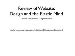
- 1. Review of Website: Design and the Elastic Mind Visual Communications. Assignment Week 1 http://www.moma.org/interactives/exhibitions/2008/elasticmind/index.html
- 3. 1. Idea • The primary idea is to allow all information to present with equal importance and thereby allow viewers to choose their own route through the information
- 4. 2. Support the Idea • All text same color and weight • Random, illustrated highlights show up • Information Overload - Site seems to go on an on in both horizontal and vertical
- 5. 3. Use Only Two Type Families
- 6. 4. Color and Images for a Reason • The mute color palate serves to give all content equal weight -- not directing view • Images pop up from all over the place and even partially off screen encouraging viewer to wander
- 7. 5. Make Negative Space Part of Design • Negative space is seriously lacking • But this serves to enhance the feeling of ‘abundance of Info’
- 9. 6. Communicate -- Tell it Like it Is • In this case I think Less Is Not More
- 10. 7. Establish Hierarchy • Hierarchy is established only by layout -- title at top, individual bits of information at the bottom • Categories do serve as important middle level of information organization • Multiple different tracks to information • categories, pop-ups, connection links
- 11. 8. Justification • Justification is left everywhere. • One mistake is the small arrow icons at top right of each box. They throw justification off, further crowd page and aren’t even links (would be cool if they were collapse buttons)
- 12. 9. Work with Grid
- 13. 10. Make Interface Intuitive • A visit to the site is like a visit to the museum. Meandering is encouraged
- 14. Some Criticism • No horizontal scroll (on-screen buttons not fixed -- confusing) • Information overload -- Users never feel they have seen the whole site • a bit of a strain on the eyes to read the text • pictures are often confusing