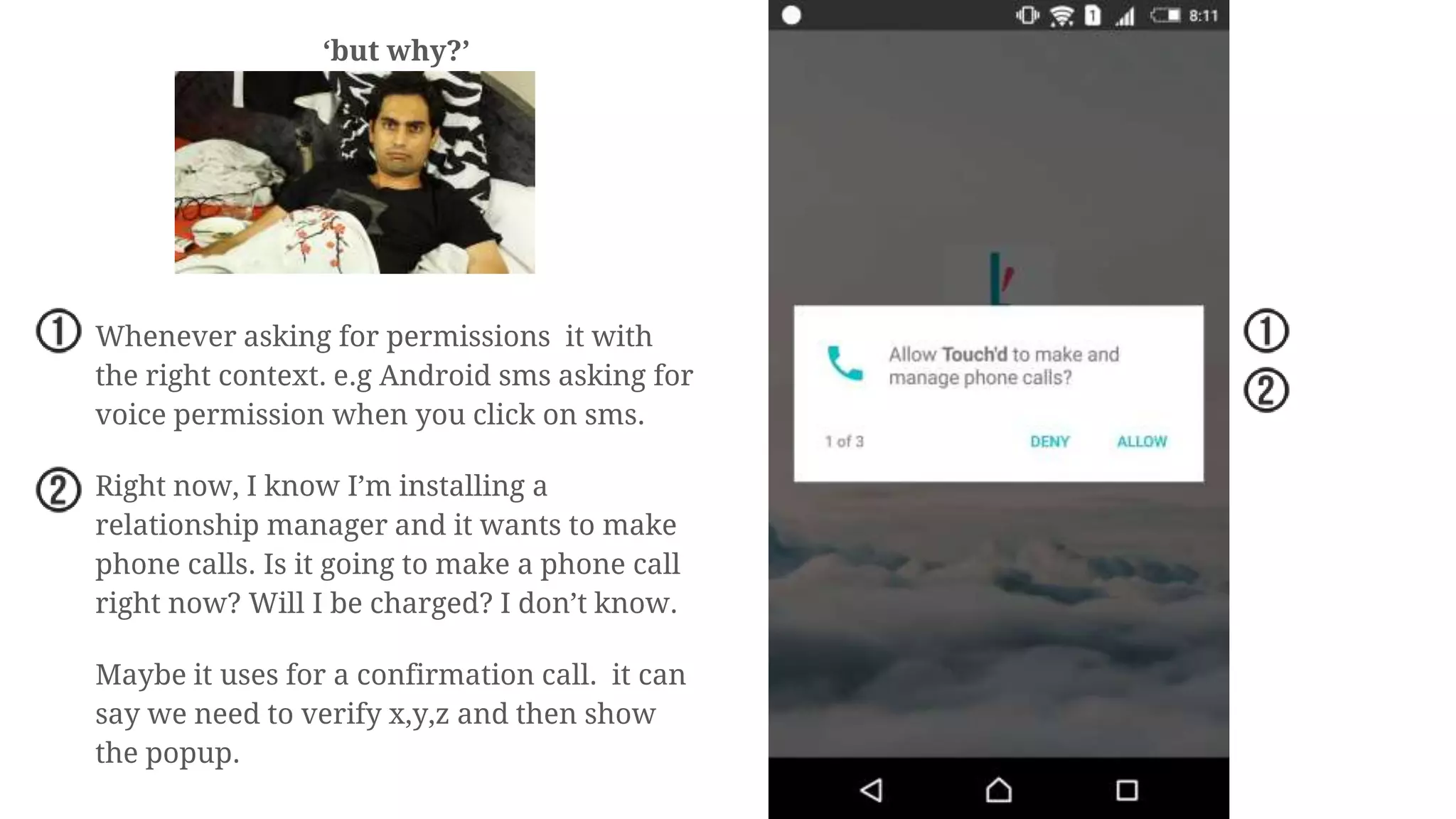
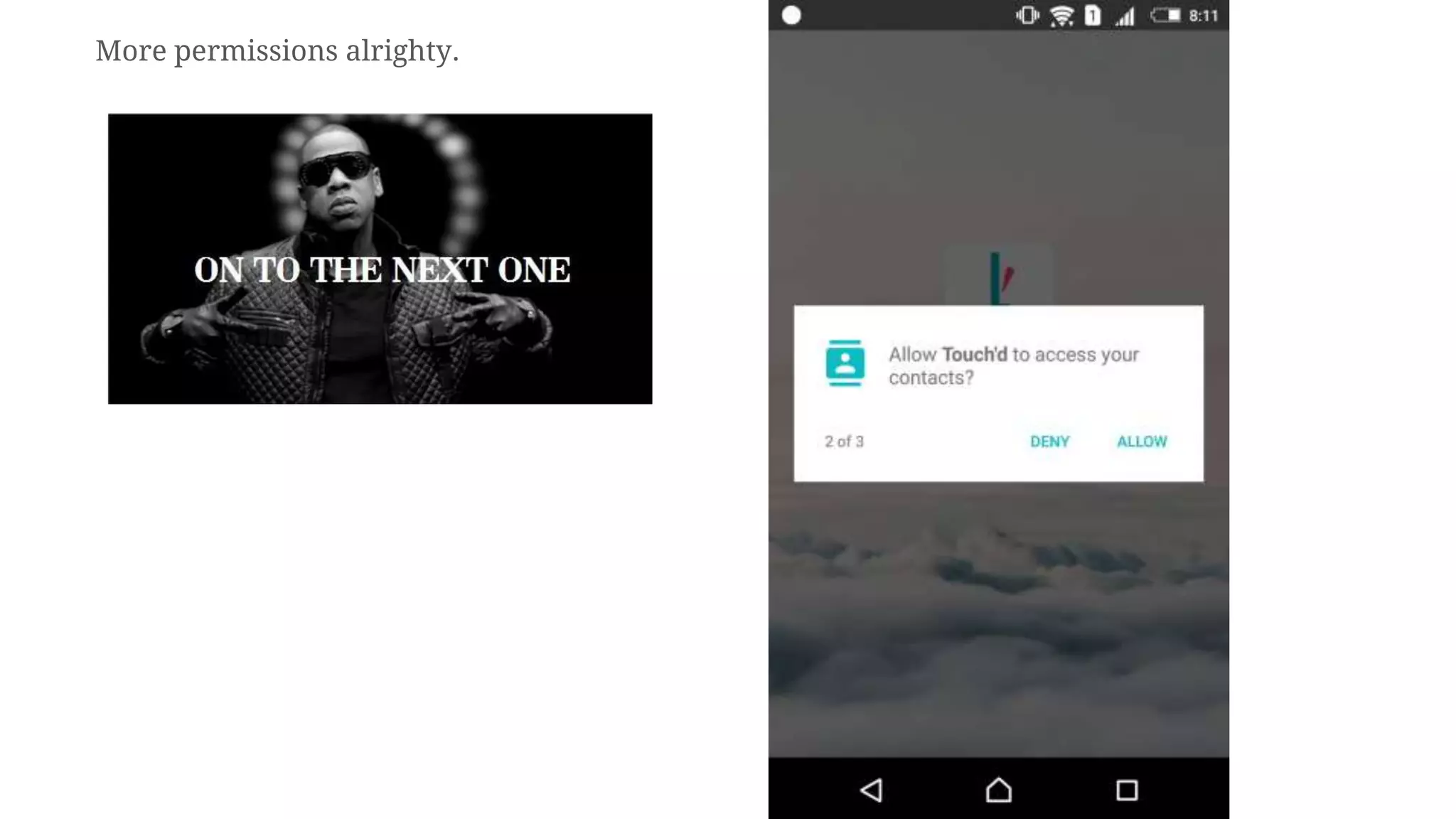
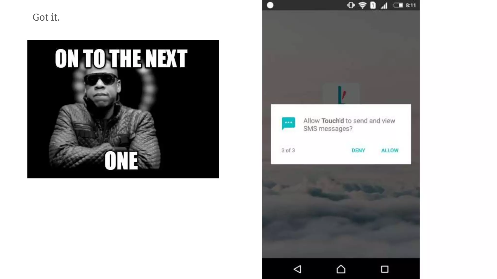
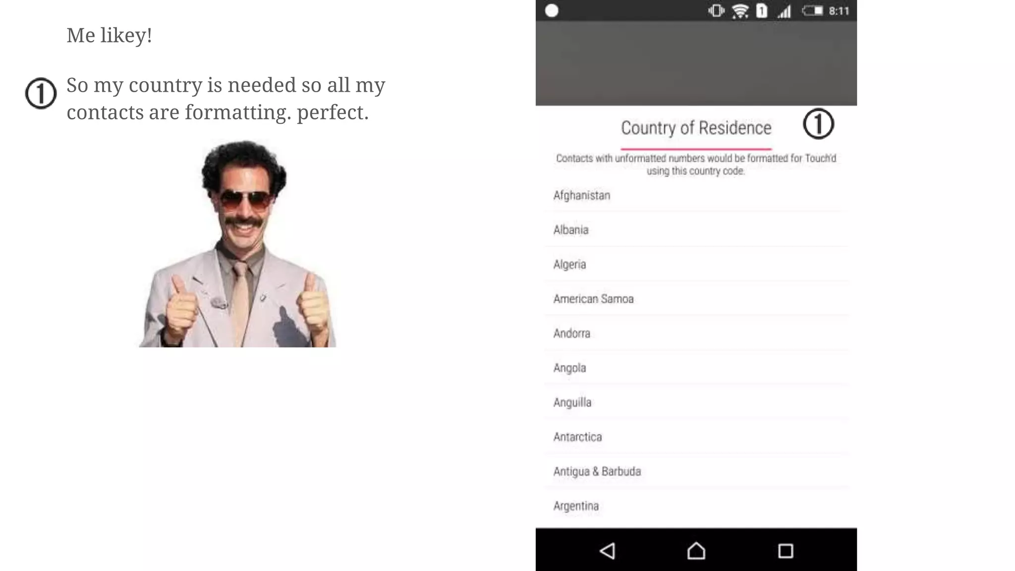
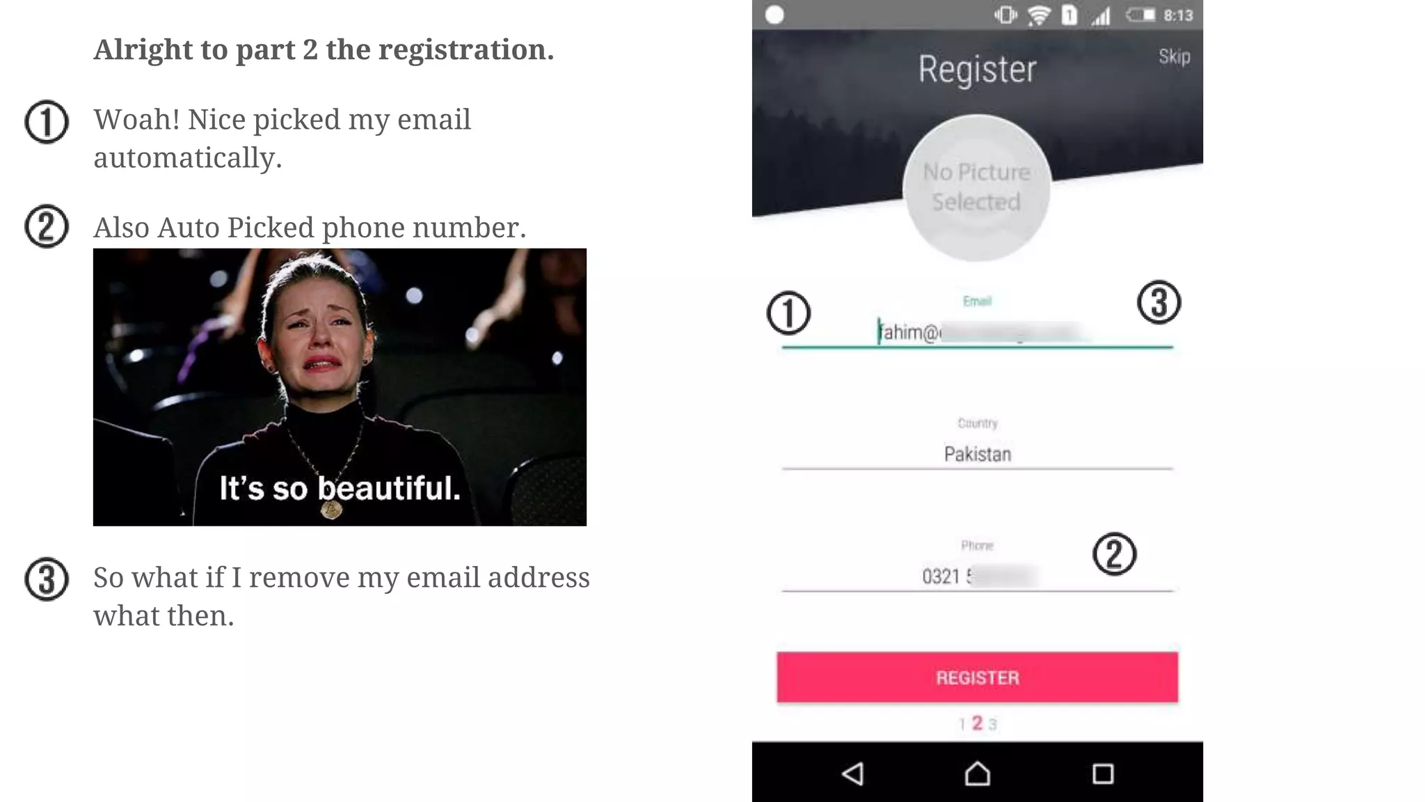
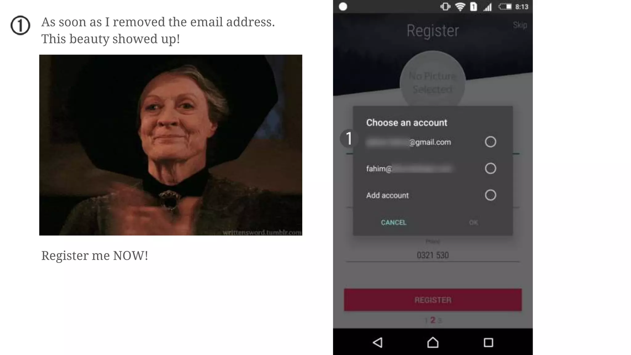
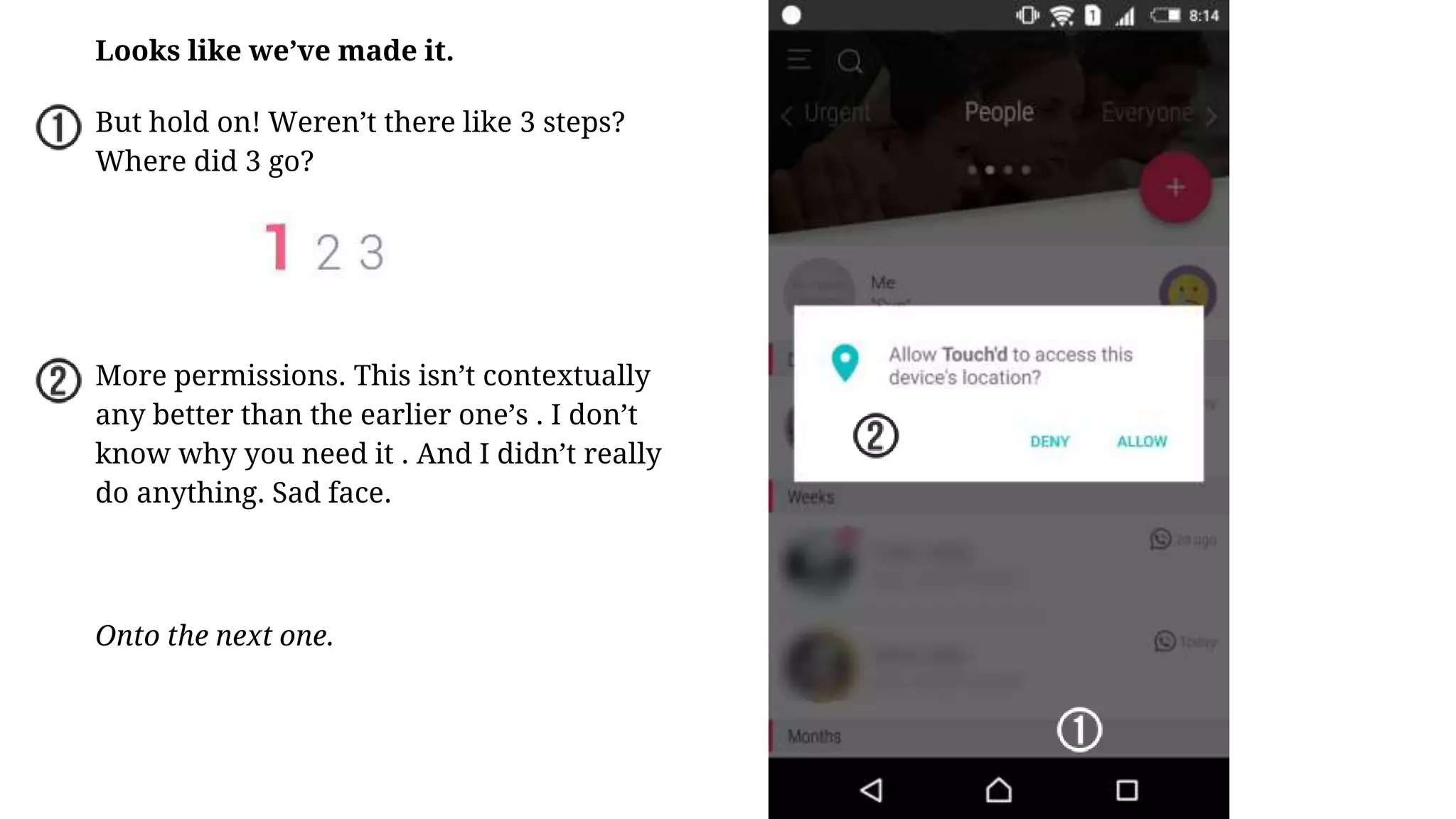
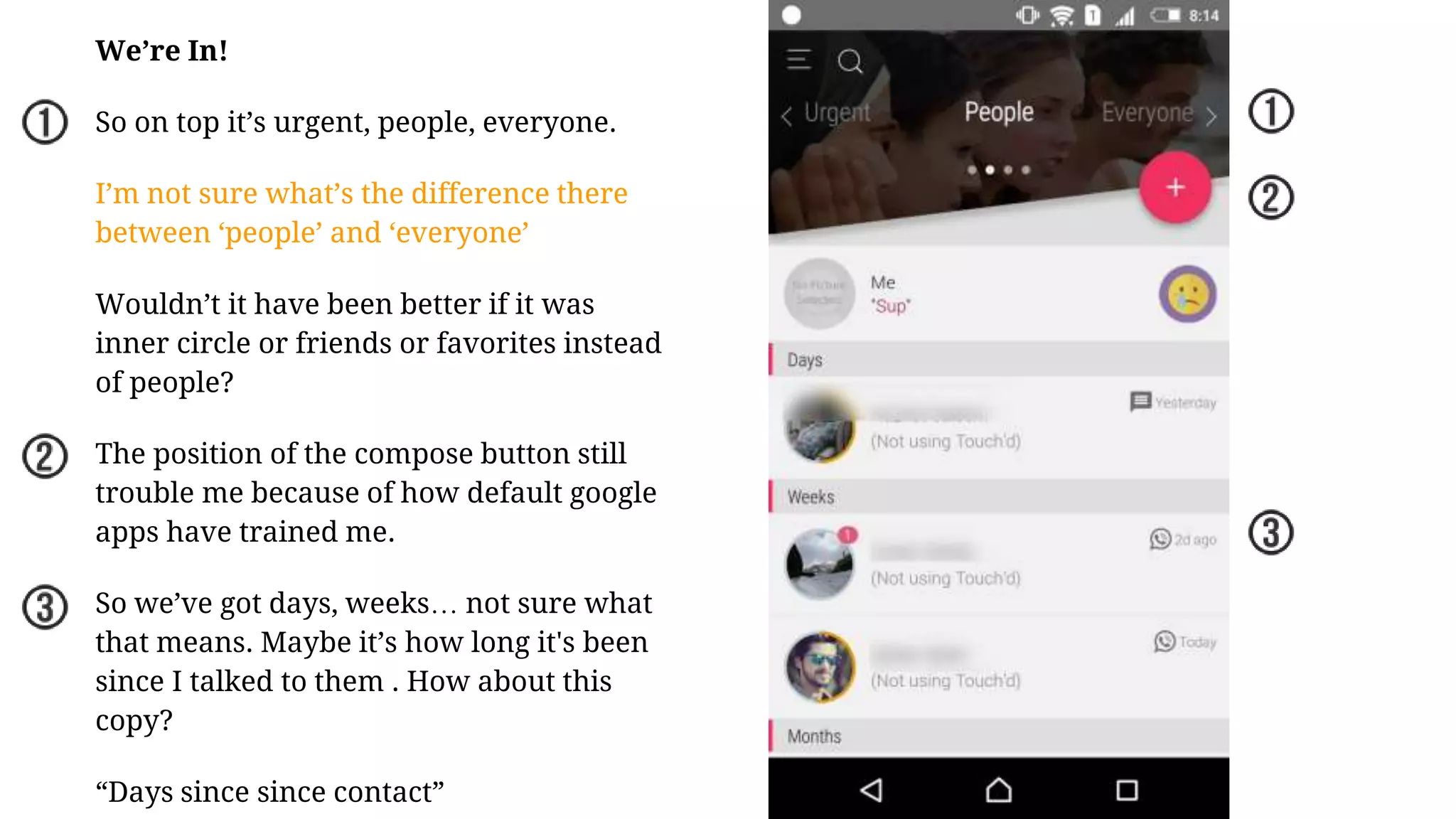
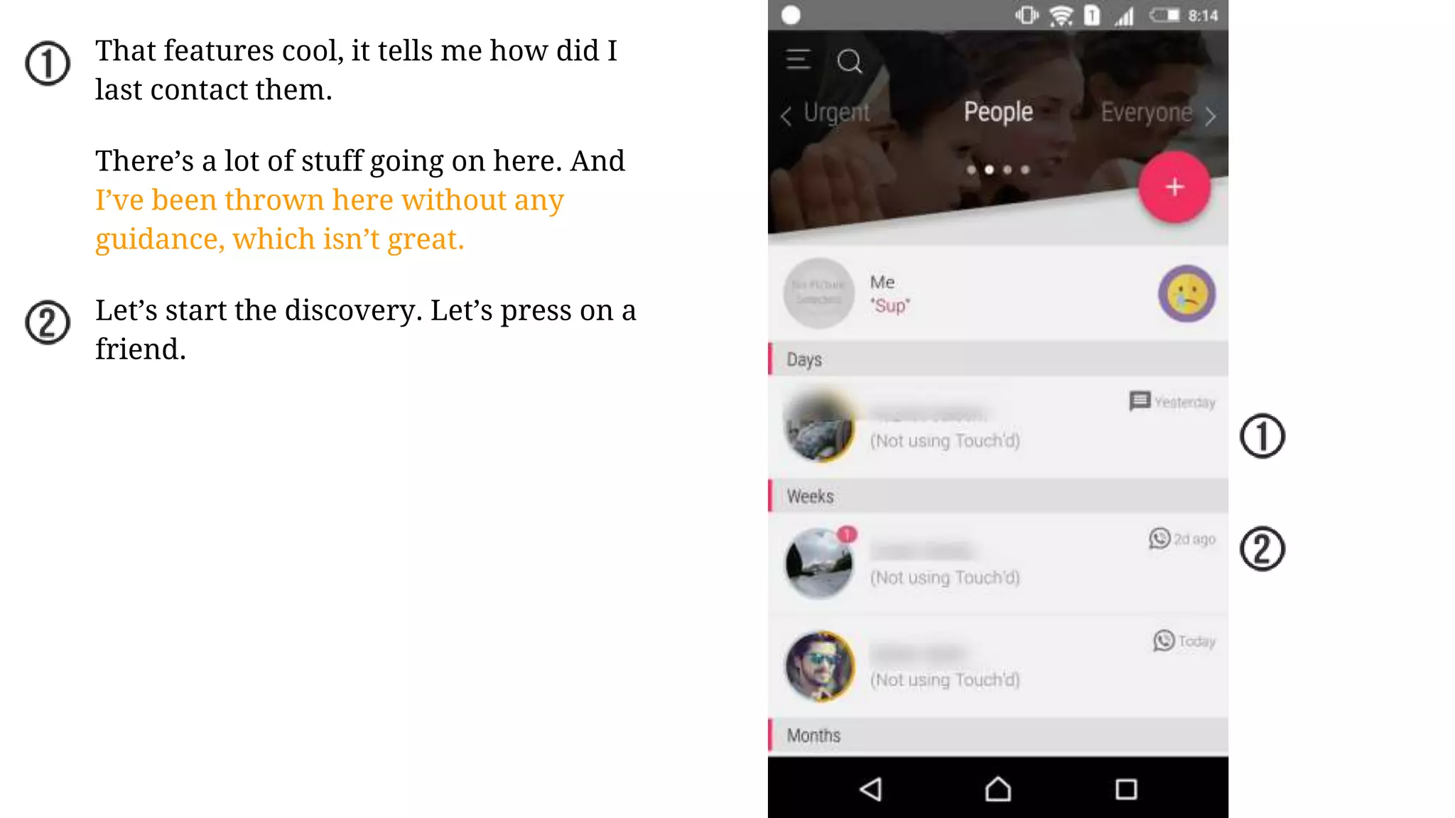
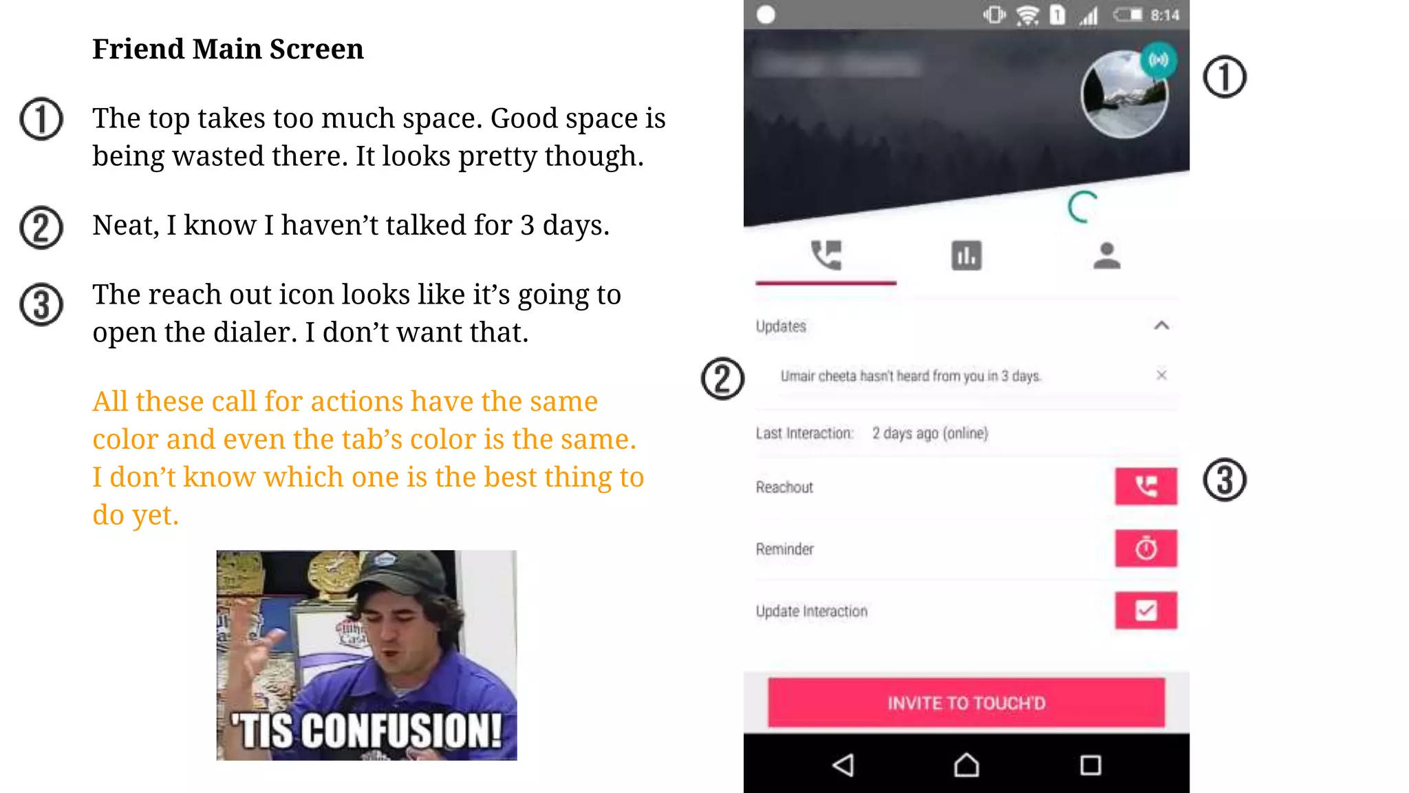
touch’d
USER EXPERIENCE TEARDOWN
Touch’d is a relationship manager. Which helps you stay
connected and improve your relationship with a selected group.
Pakistani Startups user experience series by Fahim Akhter
The teardown is for an older version of touch’d right now they are in the middle of releasing a
wonderful new version with some great usability upgrades.
So let’s boot up...
NOTE TIME!
The clouds move, I love it. And it’s
not jittery that’s a fun intro to have.
Since it takes a little time to boot up.
It would be cool to have a line
telling us about touch’d.
Boom Headshot!
But I thought I was going to go in the app.
What be this?
This is a simple yes/no popup. But the
question is why? Am I going to see some
dirty dirty stuff? Is it because it’s a legal
age somewhere to own a phone?
It’s always good to tell the users why
before proceeding.
‘but why?’
Whenever asking for permissions it with
the right context. e.g Android sms asking for
voice permission when you click on sms.
Right now, I know I’m installing a
relationship manager and it wants to make
phone calls. Is it going to make a phone call
right now? Will I be charged? I don’t know.
Maybe it uses for a confirmation call. it can
say we need to verify x,y,z and then show
the popup.
More permissions alrighty.
Got it.
Me likey!
So my country is needed so all my
contacts are formatting. perfect.
Working and stuff
Happy people everywhere, happy people
everywhere!
Having smiley faces never hurt anyone.
Copy is clear and precise. And I see how
many people are selected.
But I don’t know what’s the limit is it
limitless?
I like the sizes that the third row is a bit
visible so i know I can scroll.
Also my family appears first which is
great design. Since those are the first
relationships everyone should have.
The pagnav what if it were dots or all
sizes. This to me it feels its clickable
which it isn’t
All the folks selected. Let’s do it, let’s build
me some relationships.
But how do I do that?
There are two buttons I could press. But
are the same color. It’s good practice to
keep that one final call to action
highlighted than everything else.
Finally default google apps and material
design has created our bad habit of
having the hover button on the bottom.
And generally the move on button is at
the button. Changing position maybe isn’t
the best choice.
All selected. Moving on.
One of the best loadings I’ve seen.
While you wait you know exactly what’s
going on.
It also tells me that the apps clever
enough to know who I interact with most
based on my previous interactions.
Generally apps start from the day you
install them.
Alright to part 2 the registration.
Woah! Nice picked my email
automatically.
Also Auto Picked phone number.
So what if I remove my email address
what then.
As soon as I removed the email address.
This beauty showed up!
Register me NOW!
Looks like we’ve made it.
But hold on! Weren’t there like 3 steps?
Where did 3 go?
More permissions. This isn’t contextually
any better than the earlier one’s . I don’t
know why you need it . And I didn’t really
do anything. Sad face.
Onto the next one.
We’re In!
So on top it’s urgent, people, everyone.
I’m not sure what’s the difference there
between ‘people’ and ‘everyone’
Wouldn’t it have been better if it was
inner circle or friends or favorites instead
of people?
The position of the compose button still
trouble me because of how default google
apps have trained me.
So we’ve got days, weeks… not sure what
that means. Maybe it’s how long it's been
since I talked to them . How about this
copy?
“Days since since contact”
That features cool, it tells me how did I
last contact them.
There’s a lot of stuff going on here. And
I’ve been thrown here without any
guidance, which isn’t great.
Let’s start the discovery. Let’s press on a
friend.
Friend Main Screen
The top takes too much space. Good space is
being wasted there. It looks pretty though.
Neat, I know I haven’t talked for 3 days.
The reach out icon looks like it’s going to
open the dialer. I don’t want that.
All these call for actions have the same
color and even the tab’s color is the same.
I don’t know which one is the best thing to
do yet.
END OF PART ONE
The touch’d app has quite a few features which need to be explored in
detail. I could not sadly do it in the first session of the app while testing it.
It sign up gets a bit dense. So let’s do it in a separate session.
To be notified when the second part is published, subscribe to the mailing
list by entering your email below the slideshow.

User Experience & Usability Teardown of Touch'd - A Pakistani Startup

  • 1.
    touch’d USER EXPERIENCE TEARDOWN Touch’dis a relationship manager. Which helps you stay connected and improve your relationship with a selected group. Pakistani Startups user experience series by Fahim Akhter
  • 2.
    The teardown isfor an older version of touch’d right now they are in the middle of releasing a wonderful new version with some great usability upgrades. So let’s boot up... NOTE TIME!
  • 3.
    The clouds move,I love it. And it’s not jittery that’s a fun intro to have. Since it takes a little time to boot up. It would be cool to have a line telling us about touch’d.
  • 4.
    Boom Headshot! But Ithought I was going to go in the app. What be this? This is a simple yes/no popup. But the question is why? Am I going to see some dirty dirty stuff? Is it because it’s a legal age somewhere to own a phone? It’s always good to tell the users why before proceeding.
  • 5.
    ‘but why?’ Whenever askingfor permissions it with the right context. e.g Android sms asking for voice permission when you click on sms. Right now, I know I’m installing a relationship manager and it wants to make phone calls. Is it going to make a phone call right now? Will I be charged? I don’t know. Maybe it uses for a confirmation call. it can say we need to verify x,y,z and then show the popup.
  • 6.
  • 7.
  • 8.
    Me likey! So mycountry is needed so all my contacts are formatting. perfect.
  • 9.
  • 10.
    Happy people everywhere,happy people everywhere! Having smiley faces never hurt anyone. Copy is clear and precise. And I see how many people are selected. But I don’t know what’s the limit is it limitless? I like the sizes that the third row is a bit visible so i know I can scroll. Also my family appears first which is great design. Since those are the first relationships everyone should have. The pagnav what if it were dots or all sizes. This to me it feels its clickable which it isn’t
  • 11.
    All the folksselected. Let’s do it, let’s build me some relationships. But how do I do that? There are two buttons I could press. But are the same color. It’s good practice to keep that one final call to action highlighted than everything else. Finally default google apps and material design has created our bad habit of having the hover button on the bottom. And generally the move on button is at the button. Changing position maybe isn’t the best choice.
  • 12.
    All selected. Movingon. One of the best loadings I’ve seen. While you wait you know exactly what’s going on. It also tells me that the apps clever enough to know who I interact with most based on my previous interactions. Generally apps start from the day you install them.
  • 13.
    Alright to part2 the registration. Woah! Nice picked my email automatically. Also Auto Picked phone number. So what if I remove my email address what then.
  • 14.
    As soon asI removed the email address. This beauty showed up! Register me NOW!
  • 15.
    Looks like we’vemade it. But hold on! Weren’t there like 3 steps? Where did 3 go? More permissions. This isn’t contextually any better than the earlier one’s . I don’t know why you need it . And I didn’t really do anything. Sad face. Onto the next one.
  • 16.
    We’re In! So ontop it’s urgent, people, everyone. I’m not sure what’s the difference there between ‘people’ and ‘everyone’ Wouldn’t it have been better if it was inner circle or friends or favorites instead of people? The position of the compose button still trouble me because of how default google apps have trained me. So we’ve got days, weeks… not sure what that means. Maybe it’s how long it's been since I talked to them . How about this copy? “Days since since contact”
  • 17.
    That features cool,it tells me how did I last contact them. There’s a lot of stuff going on here. And I’ve been thrown here without any guidance, which isn’t great. Let’s start the discovery. Let’s press on a friend.
  • 18.
    Friend Main Screen Thetop takes too much space. Good space is being wasted there. It looks pretty though. Neat, I know I haven’t talked for 3 days. The reach out icon looks like it’s going to open the dialer. I don’t want that. All these call for actions have the same color and even the tab’s color is the same. I don’t know which one is the best thing to do yet.
  • 19.
    END OF PARTONE The touch’d app has quite a few features which need to be explored in detail. I could not sadly do it in the first session of the app while testing it. It sign up gets a bit dense. So let’s do it in a separate session. To be notified when the second part is published, subscribe to the mailing list by entering your email below the slideshow.