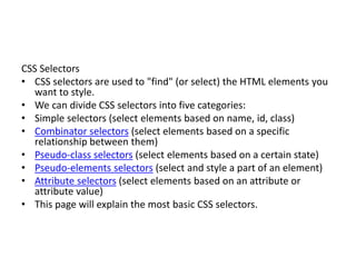
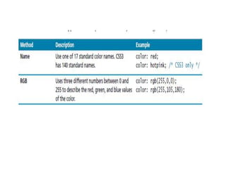
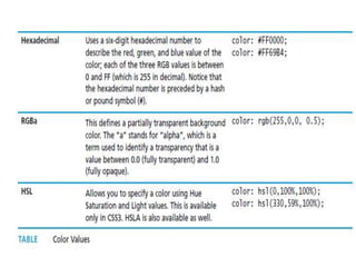
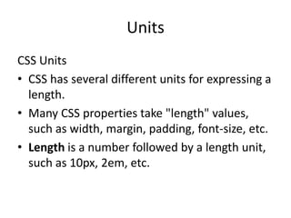
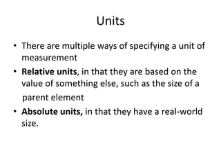
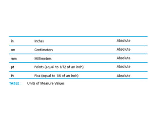
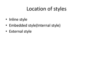
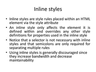
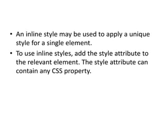
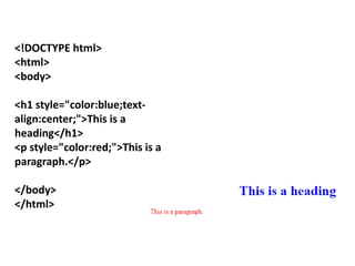
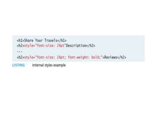
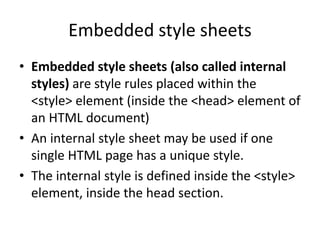
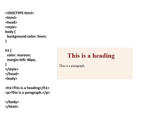
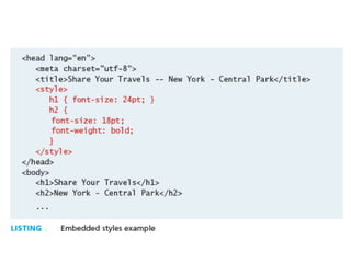
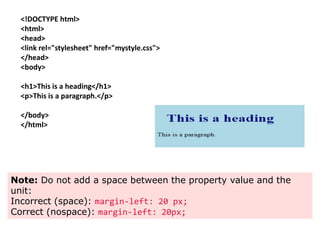
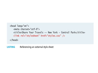
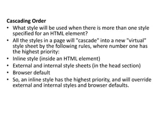
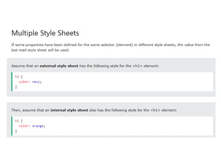
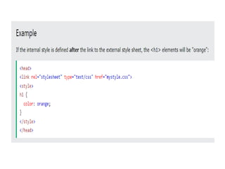
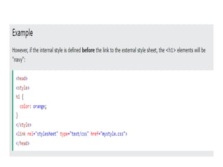
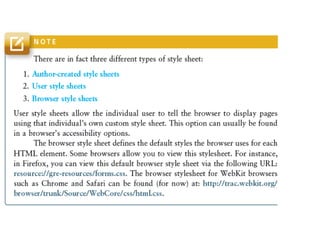
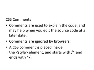
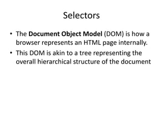
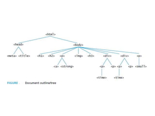
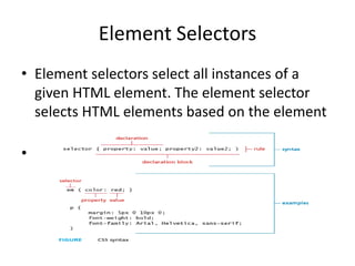
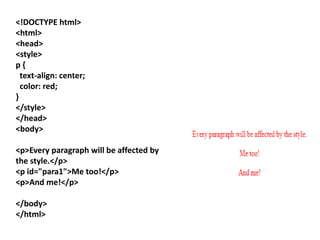
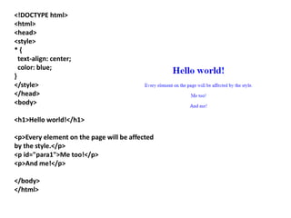
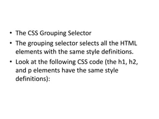
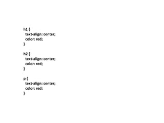
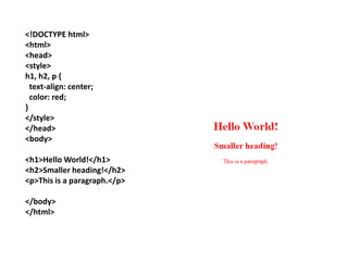
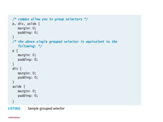
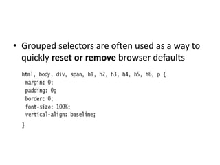
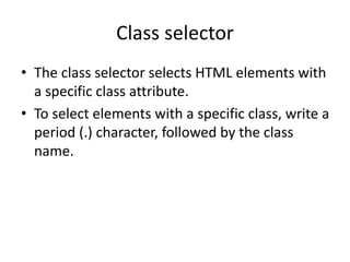
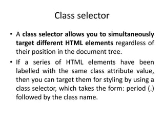
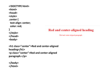
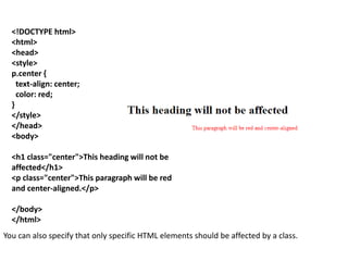
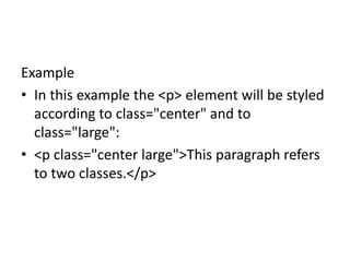
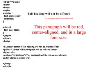
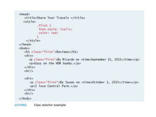
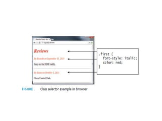
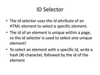
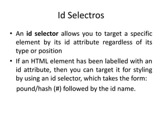
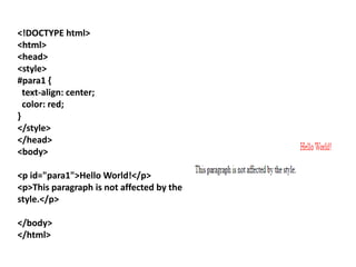
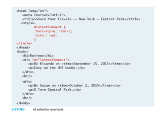
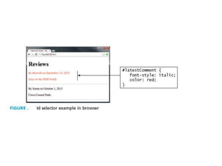
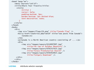
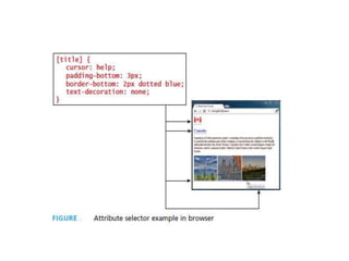
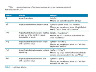
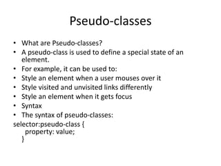
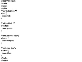
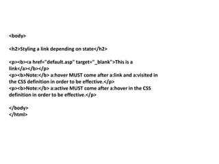
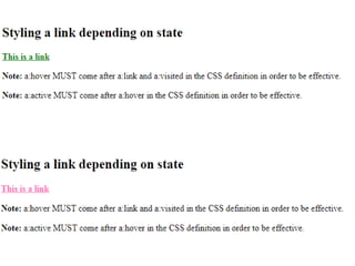
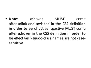
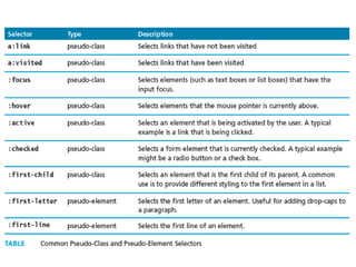
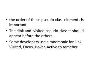
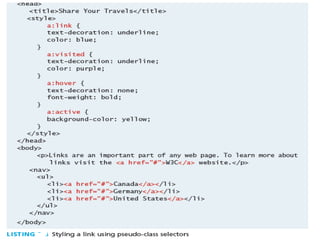
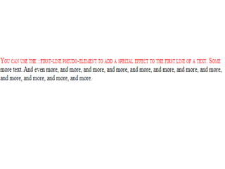
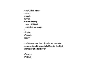
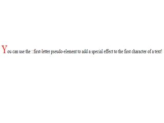
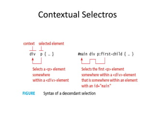
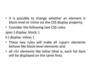
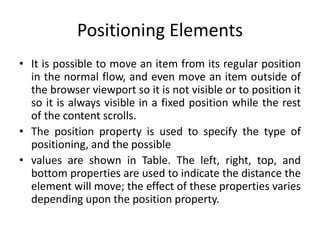
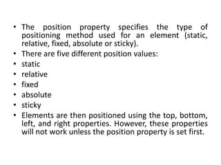
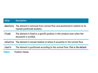
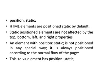
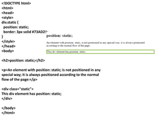
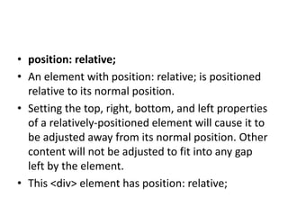
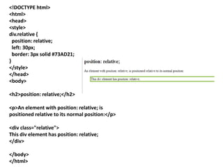
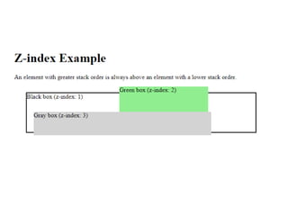
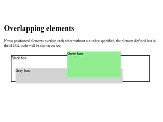
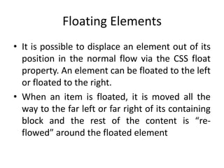
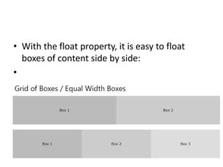
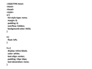
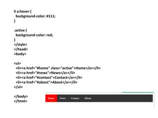
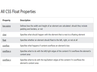
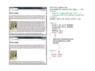
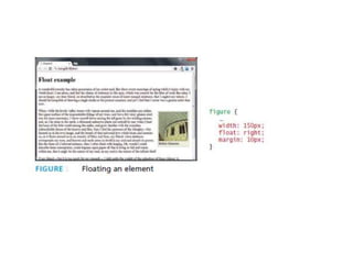
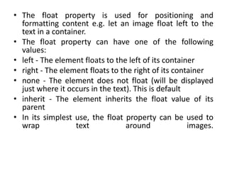
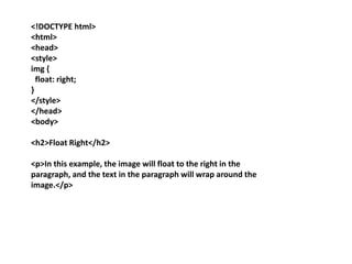
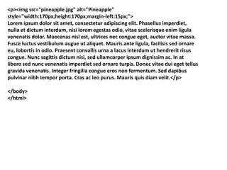
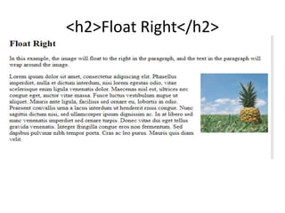
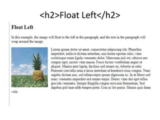
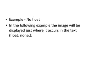
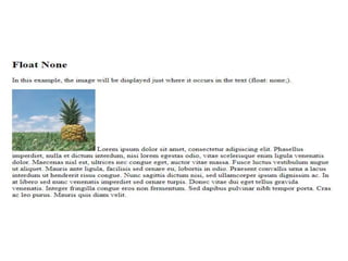
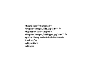
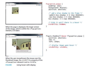
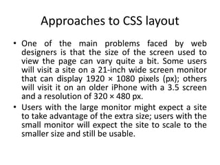
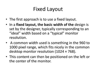
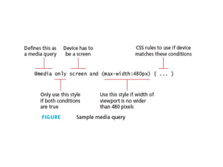
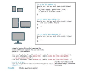
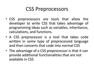
SlideShare a Scribd company logo
CSS
(CSS stands for Cascading Style
Sheets)
• Why Use CSS?
• CSS is used to define styles for your web
pages, including the design, layout and
variations in display for different devices and
screen sizes.
• CSS removed the style formatting from the
HTML page!
•
Presentation task is best performed using
Cascading Style Sheets (CSS)
• CSS is used to define the presentation of
HTML documents.
• With CSS, we can assign font properties,
colors, sizes, borders, background images, and
even position elements on the page
• CSS is the language we use to style an HTML
document.
• CSS describes how HTML elements should be
displayed.
Benefits of CSS
• Improved control over formatting.
The degree of formatting control in CSS is significantly better than
that provided in HTML. CSS gives web authors fine-grained control
over the appearance of their web content.
• ■ Improved site maintainability.
Websites become significantly more maintainable because all
formatting can be centralized into one CSS file, or a small handful of
them. This allows you to make site-wide visual modifications by
changing a single file.
• ■ Improved accessibility.
CSS-driven sites are more accessible. By keeping presentation out
of the HTML, screen readers and other accessibility tools work
better, thereby providing a significantly enriched experience for
those reliant on accessibility tools.
• Improved page download speed.
A site built using a centralized set of CSS files for all
presentation will also be quicker to download because
each individual HTML file will contain less style
information and markup, and thus be smaller.
• Improved output flexibility.
CSS can be used to adopt a page for different output
media. This approach to CSS page design is often
referred to as responsive design. Figure illustrates a
site that responds to different browser and window
sizes.
CSS-based responsive design
• The following CSS3 modules have made it to
official W3C Recommendations:
• CSS Selectors, CSS Namespaces, CSS Media
Queries, and CSS Color.
CSS Syntax
• A CSS document consists of one or more style
rules.
• A rule consists of a selector that identifies the
HTML element or elements that will be affected,
followed by a series of property:value pairs (each
pair is also called a declaration)
• The series of declarations is also called the
declaration block
• A CSS rule consists of a selector and a declaration
block.
• A declaration block can be together on a
single line, or spread across multiple line
• The browser ignores white space (i.e., spaces,
tabs, and returns) between your CSS rules so
you can format the CSS however you want
• Notice that each declaration is terminated
with a semicolon
<!DOCTYPE html>
<html>
<head>
<style>
p {
color: red;
text-align: center;
}
</style>
</head>
<body>
<p>Hello World!</p>
<p>These paragraphs are styled with CSS.</p>
</body>
</html>
Example Explained
• p is a selector in CSS (it points to the HTML
element you want to style: <p>).
• color is a property, and red is the property
value
• text-align is a property, and center is the
property value
<!DOCTYPE html>
<html>
<head>
<style>
body {
background-color: lightblue;
}
h1 {
color: white;
text-align: center;
}
p {
font-family: verdana;
font-size: 20px;
}
</style>
</head>
<body>
<h1>My First CSS Example</h1>
<p>This is a paragraph.</p>
</body>
</html>
Selectors
• Every CSS rule begins with a selector.
The selector identifies which element or
elements in the HTML document will be
affected by the declarations in the rule.
• Another way of thinking of selectors is that
they are a pattern that is used by the browser
to select the HTML elements that will receive
the style
CSS Selectors
• CSS selectors are used to "find" (or select) the HTML elements you
want to style.
• We can divide CSS selectors into five categories:
• Simple selectors (select elements based on name, id, class)
• Combinator selectors (select elements based on a specific
relationship between them)
• Pseudo-class selectors (select elements based on a certain state)
• Pseudo-elements selectors (select and style a part of an element)
• Attribute selectors (select elements based on an attribute or
attribute value)
• This page will explain the most basic CSS selectors.
Properties
• Each individual CSS declaration must contain a
property.
• These property names are predefined by the
CSS standard. The CSS2.1 recommendation
defines over a hundred different property
names, so some type of reference guide,
whether in a book, online, or within your web
development software, can be helpful
Values
• Each CSS declaration also contains a value for
a property.
• The unit of any given value is dependent upon
the property. Some property values are from a
predefined list of keywords. Others are values
such as length measurements, percentages,
numbers without units, color values, and URLs
Units
CSS Units
• CSS has several different units for expressing a
length.
• Many CSS properties take "length" values,
such as width, margin, padding, font-size, etc.
• Length is a number followed by a length unit,
such as 10px, 2em, etc.
Units
• There are multiple ways of specifying a unit of
measurement
• Relative units, in that they are based on the
value of something else, such as the size of a
parent element
• Absolute units, in that they have a real-world
size.
• Note: A whitespace cannot appear between
the number and the unit. However, if the
value is 0, the unit can be omitted.
• For some CSS properties, negative lengths are
allowed.
• There are two types of length
units: absolute and relative.
•
Absolute Lengths
• The absolute length units are fixed and a
length expressed in any of these will appear as
exactly that size.
• Absolute length units are not recommended
for use on screen, because screen sizes vary so
much. However, they can be used if the
output medium is known, such as for print
layout.
Relative Lengths
• Relative length units specify a length relative
to another length property. Relative length
units scale better between different rendering
mediums.
<!DOCTYPE html>
<html>
<head>
<style>
h1 {
font-size: 60px;
}
p {
font-size: 25px;
line-height: 50px;
}
</style>
</head>
<body>
<h1>This is heading 1</h1>
<h2>This is heading 2</h2>
<p>This is a paragraph.</p>
<p>This is another paragraph.</p>
</body>
</html>
Location of styles
• Inline style
• Embedded style(Internal style)
• External style
Inline styles
• Inline styles are style rules placed within an HTML
element via the style attribute
• An inline style only affects the element it is
defined within and overrides any other style
definitions for properties used in the inline style
• Notice that a selector is not necessary with inline
styles and that semicolons are only required for
separating multiple rules
• Using inline styles is generally discouraged since
they increase bandwidth and decrease
maintainability
• An inline style may be used to apply a unique
style for a single element.
• To use inline styles, add the style attribute to
the relevant element. The style attribute can
contain any CSS property.
<!DOCTYPE html>
<html>
<body>
<h1 style="color:blue;text-
align:center;">This is a
heading</h1>
<p style="color:red;">This is a
paragraph.</p>
</body>
</html>
Embedded style sheets
• Embedded style sheets (also called internal
styles) are style rules placed within the
<style> element (inside the <head> element of
an HTML document)
• An internal style sheet may be used if one
single HTML page has a unique style.
• The internal style is defined inside the <style>
element, inside the head section.
<!DOCTYPE html>
<html>
<head>
<style>
body {
background-color: linen;
}
h1 {
color: maroon;
margin-left: 40px;
}
</style>
</head>
<body>
<h1>This is a heading</h1>
<p>This is a paragraph.</p>
</body>
</html>
External style
• With an external style sheet, you can change
the look of an entire website by changing just
one file!
• Each HTML page must include a reference to
the external style sheet file inside the <link>
element, inside the head section.
External style sheet
• External style sheets are style rules placed within a
external text file with the .css extension.
• This is by far the most common place to locate style
rules because it provides the best maintainability.
• When you make a change to an external style sheet,
all HTML documents that reference that style sheet
will automatically use the updated version.
• The browser is able to cache the external style
sheet, which can improve the performance of the
site as well
• To reference an external style sheet, you must
use a <link> element(within the <head>
element.
• You can link to several style sheets at a time;
each linked style sheet will require its own
<link> element.
<!DOCTYPE html>
<html>
<head>
<link rel="stylesheet" href="mystyle.css">
</head>
<body>
<h1>This is a heading</h1>
<p>This is a paragraph.</p>
</body>
</html>
Note: Do not add a space between the property value and the
unit:
Incorrect (space): margin-left: 20 px;
Correct (nospace): margin-left: 20px;
Cascading Order
• What style will be used when there is more than one style
specified for an HTML element?
• All the styles in a page will "cascade" into a new "virtual"
style sheet by the following rules, where number one has
the highest priority:
• Inline style (inside an HTML element)
• External and internal style sheets (in the head section)
• Browser default
• So, an inline style has the highest priority, and will override
external and internal styles and browser defaults.
CSS Comments
• Comments are used to explain the code, and
may help when you edit the source code at a
later date.
• Comments are ignored by browsers.
• A CSS comment is placed inside
the <style> element, and starts with /* and
ends with */:
<!DOCTYPE html>
<html>
<head>
<style>
p {
color: red; /* Set text color to red */
}
</style>
</head>
<body>
<h2>My Heading</h2>
<!-- These paragraphs will be red -->
<p>Hello World!</p>
<p>This paragraph is styled with CSS.</p>
<p>HTML and CSS comments are not shown in the
output.</p>
</body>
</html>
Selectors
• The Document Object Model (DOM) is how a
browser represents an HTML page internally.
• This DOM is akin to a tree representing the
overall hierarchical structure of the document
• When defining CSS rules, you will need to first
use a selector to tell the browser which
elements will be affected by the property
values.
• CSS selectors allow you to select individual or
multiple HTML elements
Element Selectors
• Element selectors select all instances of a
given HTML element. The element selector
selects HTML elements based on the element
name.
•
<!DOCTYPE html>
<html>
<head>
<style>
p {
text-align: center;
color: red;
}
</style>
</head>
<body>
<p>Every paragraph will be affected by
the style.</p>
<p id="para1">Me too!</p>
<p>And me!</p>
</body>
</html>
• You can select all elements by using the
universal element selector, which is the *
(asterisk) character.
• You can select a group of elements by
separating the different element names with
commas. This is a sensible way to reduce the
size and complexity of your CSS files, by
combining multiple identical rules into a single
rule. An example is grouped selector
The CSS Universal Selector
• The universal selector (*) selects all HTML
elements on the page.
•
<!DOCTYPE html>
<html>
<head>
<style>
* {
text-align: center;
color: blue;
}
</style>
</head>
<body>
<h1>Hello world!</h1>
<p>Every element on the page will be affected
by the style.</p>
<p id="para1">Me too!</p>
<p>And me!</p>
</body>
</html>
• The CSS Grouping Selector
• The grouping selector selects all the HTML
elements with the same style definitions.
• Look at the following CSS code (the h1, h2,
and p elements have the same style
definitions):
h1 {
text-align: center;
color: red;
}
h2 {
text-align: center;
color: red;
}
p {
text-align: center;
color: red;
}
<!DOCTYPE html>
<html>
<head>
<style>
h1, h2, p {
text-align: center;
color: red;
}
</style>
</head>
<body>
<h1>Hello World!</h1>
<h2>Smaller heading!</h2>
<p>This is a paragraph.</p>
</body>
</html>
• Grouped selectors are often used as a way to
quickly reset or remove browser defaults
Class selector
• The class selector selects HTML elements with
a specific class attribute.
• To select elements with a specific class, write a
period (.) character, followed by the class
name.
Class selector
• A class selector allows you to simultaneously
target different HTML elements regardless of
their position in the document tree.
• If a series of HTML elements have been
labelled with the same class attribute value,
then you can target them for styling by using a
class selector, which takes the form: period (.)
followed by the class name.
<!DOCTYPE html>
<html>
<head>
<style>
.center {
text-align: center;
color: red;
}
</style>
</head>
<body>
<h1 class="center">Red and center-aligned
heading</h1>
<p class="center">Red and center-aligned
paragraph.</p>
</body>
</html>
<!DOCTYPE html>
<html>
<head>
<style>
p.center {
text-align: center;
color: red;
}
</style>
</head>
<body>
<h1 class="center">This heading will not be
affected</h1>
<p class="center">This paragraph will be red
and center-aligned.</p>
</body>
</html>
You can also specify that only specific HTML elements should be affected by a class.
Example
• In this example the <p> element will be styled
according to class="center" and to
class="large":
• <p class="center large">This paragraph refers
to two classes.</p>
<!DOCTYPE html>
<html>
<head>
<style>
p.center {
text-align: center;
color: red;
}
p.large {
font-size: 300%;
}
</style>
</head>
<body>
<h1 class="center">This heading will not be affected</h1>
<p class="center">This paragraph will be red and center-
aligned.</p>
<p class="center large">This paragraph will be red, center-aligned,
and in a large font-size.</p>
</body>
</html>
ID Selector
• The id selector uses the id attribute of an
HTML element to select a specific element.
• The id of an element is unique within a page,
so the id selector is used to select one unique
element!
• To select an element with a specific id, write a
hash (#) character, followed by the id of the
element
Id Selectros
• An id selector allows you to target a specific
element by its id attribute regardless of its
type or position
• If an HTML element has been labelled with an
id attribute, then you can target it for styling
by using an id selector, which takes the form:
pound/hash (#) followed by the id name.
<!DOCTYPE html>
<html>
<head>
<style>
#para1 {
text-align: center;
color: red;
}
</style>
</head>
<body>
<p id="para1">Hello World!</p>
<p>This paragraph is not affected by the
style.</p>
</body>
</html>
Attribute Selectors
• An attribute selector provides a way to select
HTML elements either by the presence of an
element attribute or by the value of an
attribute
• Attribute selectors can be a very helpful
technique in the styling of hyperlinks and
images
Pseudo-Element and Pseudo-Class
Selectors
• A pseudo-element selector is a way to select
something that does not exist explicitly as an
element in the HTML document tree but which is
still a recognizable selectable object.
• For instance, you can select the first line or first
letter of any HTML element using a pseudo-
element selector.
• A pseudo-class selector does apply to an HTML
element, but targets either a particular state or,
in CSS3, a variety of family relationships.
Pseudo-classes
• What are Pseudo-classes?
• A pseudo-class is used to define a special state of an
element.
• For example, it can be used to:
• Style an element when a user mouses over it
• Style visited and unvisited links differently
• Style an element when it gets focus
• Syntax
• The syntax of pseudo-classes:
selector:pseudo-class {
property: value;
}
<!DOCTYPE html>
<html>
<head>
<style>
/* unvisited link */
a:link {
color: red;
}
/* visited link */
a:visited {
color: green;
}
/* mouse over link */
a:hover {
color: hotpink;
}
/* selected link */
a:active {
color: blue;
}
</style>
</head>
<body>
<h2>Styling a link depending on state</h2>
<p><b><a href="default.asp" target="_blank">This is a
link</a></b></p>
<p><b>Note:</b> a:hover MUST come after a:link and a:visited in
the CSS definition in order to be effective.</p>
<p><b>Note:</b> a:active MUST come after a:hover in the CSS
definition in order to be effective.</p>
</body>
</html>
• Note: a:hover MUST come
after a:link and a:visited in the CSS definition
in order to be effective! a:active MUST come
after a:hover in the CSS definition in order to
be effective! Pseudo-class names are not case-
sensitive.
• the order of these pseudo-class elements is
important.
• The :link and :visited pseudo-classes should
appear before the others.
• Some developers use a mnemonic for Link,
Visited, Focus, Hover, Active to remeber
<!DOCTYPE html>
<html>
<head>
<style>
p {
display: none;
background-color: yellow;
padding: 20px;
}
div:hover p {
display: block;
}
</style>
</head>
<body>
<div>Hover over this div element to show the p element
<p>Tada! Here I am!</p>
</div>
</body>
</html>
Pseudo-Elements
• What are Pseudo-Elements?
• A CSS pseudo-element is used to style specified parts
of an element.
• For example, it can be used to:
• Style the first letter, or line, of an element
• Insert content before, or after, the content of an
element
• The syntax of pseudo-elements:
selector::pseudo-element {
property: value;
}
<!DOCTYPE html>
<html>
<head>
<style>
p::first-line {
color: #ff0000;
font-variant: small-caps;
}
</style>
</head>
<body>
<p>You can use the ::first-line pseudo-
element to add a special effect to the first line
of a text. Some more text. And even more,
and more, and more, and more, and more,
and more, and more, and more.</p>
</body>
</html>
<!DOCTYPE html>
<html>
<head>
<style>
p::first-letter {
color: #ff0000;
font-size: xx-large;
}
</style>
</head>
<body>
<p>You can use the ::first-letter pseudo-
element to add a special effect to the first
character of a text!</p>
</body>
</html>
Contextual Selectros
• A contextual selector (in CSS3 also called
combinators) allows you to select elements
based on their ancestors, descendants, or
siblings.
• That is, it selects elements based on their context
or their relation to other elements in the
document tree.
• While some of these contextual selectors are
used relatively infrequently, almost all web
authors find themselves using descendant
selectors.
• A descendant selector matches all elements
that are contained within another element.
• The character used to indicate descendant
selection is the space character.
• Figure illustrates the syntax and usage of the
syntax of the descendant selector.
Advanced CSS
• To understand CSS positioning and layout, it is
essential that we understand this distinction
as well as the idea of normal flow, which
refers here to how the browser will normally
display block-level elements and inline
elements from left to right and from top to
bottom
Normal Flow
• Block-level elements such as <p>, <div>, <h2>,
<ul>, and <table> are each contained on their
own line.
• Because block-level elements begin with a line
break (that is, they start on a new line), without
styling, two block-level elements can’t exist on
the same line.
• Block-level elements use the normal CSS box
model, in that they have margins, paddings,
background colors, and borders
• Inline elements do not form their own blocks
but instead are displayed within lines. Normal
text in an HTML document is inline, as are
elements such as <em>, <a>, <img>, and
<span>. Inline elements line up next to one
another horizontally from left to right on the
same line;
• when there isn’t enough space left on the
line, the content moves to a new line
• There are actually two types of inline elements:
replaced and nonreplaced.
• Replaced inline elements are elements whose
content and thus appearance is defined by some
external resource, such as <img> and the various
form elements.
• Nonreplaced inline elements are those elements
whose content is defined within the document,
which includes all the other inline elements.
• Replaced inline elements have a width and height
that are defined by the external resource and
thus have the regular CSS box model
• Nonreplaced inline elements, in contrast, have a
constrained box model.
• For instance, because their width is defined by
their content (and by other properties such as
font-size and letter-spacing), the width property
is ignored, as are the margin-top, margin-bottom,
and the height.
• In a document with normal flow, block-level
elements and inline elements work together
as shown in Figure.
• Block-level elements will flow from top to
bottom, while inline elements flow from left
to right within a block.
• If a block contains other blocks, the same
behavior happens: the blocks flow from the
top to the bottom of the block.
• It is possible to change whether an element is
block-level or inline via the CSS display property.
• Consider the following two CSS rules:
span { display: block; }
li { display: inline; }
• These two rules will make all <span> elements
behave like block-level elements and
• all <li> elements like inline (that is, each list item
will be displayed on the same line).
Positioning Elements
• It is possible to move an item from its regular position
in the normal flow, and even move an item outside of
the browser viewport so it is not visible or to position it
so it is always visible in a fixed position while the rest
of the content scrolls.
• The position property is used to specify the type of
positioning, and the possible
• values are shown in Table. The left, right, top, and
bottom properties are used to indicate the distance the
element will move; the effect of these properties varies
depending upon the position property.
• The position property specifies the type of
positioning method used for an element (static,
relative, fixed, absolute or sticky).
• There are five different position values:
• static
• relative
• fixed
• absolute
• sticky
• Elements are then positioned using the top, bottom,
left, and right properties. However, these properties
will not work unless the position property is set first.
• position: static;
• HTML elements are positioned static by default.
• Static positioned elements are not affected by the
top, bottom, left, and right properties.
• An element with position: static; is not positioned
in any special way; it is always positioned
according to the normal flow of the page:
• This <div> element has position: static;
<!DOCTYPE html>
<html>
<head>
<style>
div.static {
position: static;
border: 3px solid #73AD21;
}
</style>
</head>
<body>
<h2>position: static;</h2>
<p>An element with position: static; is not positioned in any
special way; it is always positioned according to the normal
flow of the page:</p>
<div class="static">
This div element has position: static;
</div>
</body>
</html>
• position: relative;
• An element with position: relative; is positioned
relative to its normal position.
• Setting the top, right, bottom, and left properties
of a relatively-positioned element will cause it to
be adjusted away from its normal position. Other
content will not be adjusted to fit into any gap
left by the element.
• This <div> element has position: relative;
<!DOCTYPE html>
<html>
<head>
<style>
div.relative {
position: relative;
left: 30px;
border: 3px solid #73AD21;
}
</style>
</head>
<body>
<h2>position: relative;</h2>
<p>An element with position: relative; is
positioned relative to its normal position:</p>
<div class="relative">
This div element has position: relative;
</div>
</body>
</html>
• position: fixed;
• An element with position: fixed; is positioned
relative to the viewport, which means it always
stays in the same place even if the page is
scrolled. The top, right, bottom, and left
properties are used to position the element.
• A fixed element does not leave a gap in the page
where it would normally have been located.
• The fixed position value is used relatively
infrequently. It is a type of absolute positioning,
except that the positioning values are in relation
to the viewport (i.e., to the browser window).
• Elements with fixed positioning do not move
when the user scrolls up or down the page, as
can be seen in Figure
• The fixed position is most commonly used to
ensure that navigation elements or
advertisements are always visible
<!DOCTYPE html>
<html>
<head>
<style>
div.fixed {
position: fixed;
bottom: 0;
right: 0;
width: 300px;
border: 3px solid #73AD21;
}
</style>
</head>
<body>
<h2>position: fixed;</h2>
<p>An element with position: fixed; is positioned relative to the viewport, which means it
always stays in the same place even if the page is scrolled:</p>
<div class="fixed">
This div element has position: fixed;
</div>
</body>
• position: absolute;
• An element with position: absolute; is positioned
relative to the nearest positioned ancestor
(instead of positioned relative to the viewport,
like fixed).
• However; if an absolute positioned element has
no positioned ancestors, it uses the document
body, and moves along with page scrolling.
• Note: Absolute positioned elements are removed
from the normal flow, and can overlap elements
<!DOCTYPE html>
<html>
<head>
<style>
div.relative {
position: relative;
width: 400px;
height: 200px;
border: 3px solid #73AD21;
}
div.absolute {
position: absolute;
top: 80px;
right: 0;
width: 200px;
height: 100px;
border: 3px solid #73AD21;
}
</style>
</head>
<body>
<h2>position: absolute;</h2>
<p>An element with position: absolute; is positioned relative to the nearest positioned
ancestor (instead of positioned relative to the viewport, like fixed):</p>
<div class="relative">This div element has position: relative;
<div class="absolute">This div element has position: absolute;</div>
</div>
</body>
</html>
• position: sticky;
• An element with position: sticky; is positioned
based on the user's scroll position.
• A sticky element toggles
between relative and fixed, depending on the
scroll position. It is positioned relative until a
given offset position is met in the viewport - then
it "sticks" in place (like position:fixed).
• The sticky element sticks to the top of the page
(top: 0), when you reach its scroll position.
<!DOCTYPE html>
<html>
<head>
<style>
div.sticky {
position: -webkit-sticky;
position: sticky;
top: 0;
padding: 5px;
background-color: #cae8ca;
border: 2px solid #4CAF50;
}
</style>
</head>
<body>
<p>Try to <b>scroll</b> inside this frame to
understand how sticky positioning works.</p>
<div class="sticky">I am sticky!</div>
<div style="padding-bottom:2000px">
<p>In this example, the sticky element sticks to the top of the page (top: 0),
when you reach its scroll position.</p>
<p>Scroll back up to remove the stickyness.</p>
<p>Some text to enable scrolling.. Lorem ipsum dolor sit amet, illum definitiones
no quo, maluisset concludaturque et eum, altera fabulas ut quo. Atqui causae
gloriatur ius te, id agam omnis evertitur eum. Affert laboramus repudiandae nec
et. Inciderint efficiantur his ad. Eum no molestiae voluptatibus.</p>
</div>
</body>
</html>
• The z-index property specifies the stack order of an
element.
• When elements are positioned, they can overlap other
elements.
• The z-index property specifies the stack order of an
element (which element should be placed in front of, or
behind, the others).
• An element can have a positive or negative stack order
• Note: z-index only works on positioned
elements (position: absolute, position: relative, position:
fixed, or position: sticky) and flex items (elements that
are direct children of display: flex elements).
<!DOCTYPE html>
<html>
<head>
<style>
img {
position: absolute;
left: 0px;
top: 0px;
z-index: -1;
}
</style>
</head>
<body>
<h1>This is a heading</h1>
<img src="img_tree.png">
<p>Because the image has a z-index of -1, it
will be placed behind the text.</p>
</body>
</html>
Floating Elements
• It is possible to displace an element out of its
position in the normal flow via the CSS float
property. An element can be floated to the left
or floated to the right.
• When an item is floated, it is moved all the
way to the far left or far right of its containing
block and the rest of the content is “re-
flowed” around the floated element
• With the float property, it is easy to float
boxes of content side by side:
•
<!DOCTYPE html>
<html>
<head>
<style>
* {
box-sizing: border-box;
}
.img-container {
float: left;
width: 33.33%;
padding: 5px;
}
.clearfix::after {
content: "";
clear: both;
display: table;
}
</style>
</head>
<body>
<h2>Images Side by Side</h2>
<p>Float images side by side:</p>
<div class="clearfix">
<div class="img-container">
<img src="img_5terre.jpg" alt="Italy" style="width:100%">
</div>
<div class="img-container">
<img src="img_forest.jpg" alt="Forest" style="width:100%">
</div>
<div class="img-container">
<img src="img_mountains.jpg" alt="Mountains" style="width:100%">
</div>
</div>
<p>Note that we also use the clearfix hack to take care of the layout flow, and that
we add the box-sizing property to make sure that the image container doesn't
break due to extra padding. Try to remove this code to see the effect.</p>
</body>
</html>
<!DOCTYPE html>
<html>
<head>
<style>
ul {
list-style-type: none;
margin: 0;
padding: 0;
overflow: hidden;
background-color: #333;
}
li {
float: left;
}
li a {
display: inline-block;
color: white;
text-align: center;
padding: 14px 16px;
text-decoration: none;
}
li a:hover {
background-color: #111;
}
.active {
background-color: red;
}
</style>
</head>
<body>
<ul>
<li><a href="#home" class="active">Home</a></li>
<li><a href="#news">News</a></li>
<li><a href="#contact">Contact</a></li>
<li><a href="#about">About</a></li>
</ul>
</body>
</html>
• The float property is used for positioning and
formatting content e.g. let an image float left to the
text in a container.
• The float property can have one of the following
values:
• left - The element floats to the left of its container
• right - The element floats to the right of its container
• none - The element does not float (will be displayed
just where it occurs in the text). This is default
• inherit - The element inherits the float value of its
parent
• In its simplest use, the float property can be used to
wrap text around images.
<!DOCTYPE html>
<html>
<head>
<style>
img {
float: right;
}
</style>
</head>
<body>
<h2>Float Right</h2>
<p>In this example, the image will float to the right in the
paragraph, and the text in the paragraph will wrap around the
image.</p>
<p><img src="pineapple.jpg" alt="Pineapple"
style="width:170px;height:170px;margin-left:15px;">
Lorem ipsum dolor sit amet, consectetur adipiscing elit. Phasellus imperdiet,
nulla et dictum interdum, nisi lorem egestas odio, vitae scelerisque enim ligula
venenatis dolor. Maecenas nisl est, ultrices nec congue eget, auctor vitae massa.
Fusce luctus vestibulum augue ut aliquet. Mauris ante ligula, facilisis sed ornare
eu, lobortis in odio. Praesent convallis urna a lacus interdum ut hendrerit risus
congue. Nunc sagittis dictum nisi, sed ullamcorper ipsum dignissim ac. In at
libero sed nunc venenatis imperdiet sed ornare turpis. Donec vitae dui eget tellus
gravida venenatis. Integer fringilla congue eros non fermentum. Sed dapibus
pulvinar nibh tempor porta. Cras ac leo purus. Mauris quis diam velit.</p>
</body>
</html>
<h2>Float Right</h2>
<h2>Float Left</h2>
• Example - No float
• In the following example the image will be
displayed just where it occurs in the text
(float: none;):
<!DOCTYPE html>
<html>
<head>
<style>
div {
float: left;
padding: 15px;
}
.div1 {
background: red;
}
.div2 {
background: yellow;
}
.div3 {
background: green;
}
</style>
</head>
<body>
<h2>Float Next To Each Other</h2>
<p>In this example, the three divs will float
next to each other.</p>
<div class="div1">Div 1</div>
<div class="div2">Div 2</div>
<div class="div3">Div 3</div>
</body>
</html>
Clear property
• Thankfully, you can stop elements from
flowing around a floated element by using the
clear property
• When we use the float property, and we want
the next element below (not on right or left),
we will have to use the clear property.
• The clear property specifies what should
happen with the element that is next to a
floating element.
• The clear property can have one of the following
values:
• none - The element is not pushed below left or right
floated elements. This is default
• left - The element is pushed below left floated
elements
• right - The element is pushed below right floated
elements
• both - The element is pushed below both left and right
floated elements
• inherit - The element inherits the clear value from its
parent
<!DOCTYPE html>
<html>
<head>
<style>
.div1 {
float: left;
padding: 10px;
border: 3px solid #73AD21;
}
.div2 {
padding: 10px;
border: 3px solid red;
}
.div3 {
float: left;
padding: 10px;
border: 3px solid #73AD21;
}
.div4 {
padding: 10px;
border: 3px solid red;
clear: left;
}
</style>
</head>
<body>
<h2>Without clear</h2>
<div class="div1">div1</div>
<div class="div2">div2 - Notice that div2 is after div1 in the HTML
code. However, since div1 floats to the left, the text in div2 flows
around div1.</div>
<br><br>
<h2>With clear</h2>
<div class="div3">div3</div>
<div class="div4">div4 - Here, clear: left; moves div4 down below the
floating div3. The value "left" clears elements floated to the left. You
can also clear "right" and "both".</div>
</body>
</html
• The clearfix Hack
• If a floated element is taller than the
containing element, it will "overflow" outside
of its container. We can then add a clearfix
hack to solve this problem:
<!DOCTYPE html>
<html>
<head>
<style>
div {
border: 3px solid #4CAF50;
padding: 5px;
}
.img1 {
float: right;
}
.img2 {
float: right;
}
.clearfix {
overflow: auto;
}
</style>
</head>
<body>
<h2>Without Clearfix</h2>
<p>This image is floated to the right. It is also taller than the element containing it, so it
overflows outside of its container:</p>
<div>
<img class="img1" src="pineapple.jpg" alt="Pineapple" width="170" height="170">
Lorem ipsum dolor sit amet, consectetur adipiscing elit. Phasellus imperdiet...
</div>
<h2 style="clear:right">With Clearfix</h2>
<p>We can fix this by adding a clearfix class with overflow: auto; to the containing
element:</p>
<div class="clearfix">
<img class="img2" src="pineapple.jpg" alt="Pineapple" width="170" height="170">
Lorem ipsum dolor sit amet, consectetur adipiscing elit. Phasellus imperdiet...
</div>
</body>
</html>
• There are in fact two different ways to hide
elements in CSS: using the display property
and using the visibility property. The display
property takes an item out of the flow: it is as
if the element no longer exists. The visibility
property just hides the element, but the space
for that element remains
<figure>
<img src="images/828.jpg" alt="" />
<figcaption>British Museum</figcaption>
<img src="images/newbanner.png" alt=""
class="overlayed"/>
</figure>
<figure class="thumbnail">
<img src="images/828.jpg" alt="" />
<figcaption class="popup">
<img src="images/828bigger.jpg" alt="" />
<p>The library in the British Museum in
London</p>
</figcaption>
</figure>
Approaches to CSS layout
• One of the main problems faced by web
designers is that the size of the screen used to
view the page can vary quite a bit. Some users
will visit a site on a 21-inch wide screen monitor
that can display 1920 × 1080 pixels (px); others
will visit it on an older iPhone with a 3.5 screen
and a resolution of 320 × 480 px.
• Users with the large monitor might expect a site
to take advantage of the extra size; users with the
small monitor will expect the site to scale to the
smaller size and still be usable.
Fixed Layout
• The first approach is to use a fixed layout.
• In a fixed layout, the basic width of the design is
set by the designer, typically corresponding to an
“ideal” width based on a “typical” monitor
resolution.
• A common width used is something in the 960 to
1000 pixel range, which fits nicely in the common
desktop monitor resolution (1024 × 768).
• This content can then be positioned on the left or
the center of the monitor.
• Fixed layouts are created using pixel units,
typically with the entire content within a <div>
container (often named "container", "main",
or "wrapper") whose width property has been
set to some width
• The advantage of a fixed layout is that it is easier to
produce and generally has a predictable visual result.
• It is also optimized for typical desktop monitors;
however, as more and more user visits are happening
via smaller mobile devices, this advantage might now
seem to some as a disadvantage.
• Fixed layouts have other drawbacks. For larger screens,
there may be an excessive amount of blank space to
the left and/or right of the content.
• Much worse is when the browser window shrinks
below the fixed width; the user will have to
horizontally scroll to see all the content
Liquid Layout
• The second approach to dealing with the problem
of multiple screen sizes is to use a liquid layout
(also called a fluid layout). In this approach,
widths are not specified using pix
• The obvious advantage of a liquid layout is that it
adapts to different browser sizes, so there is
neither wasted white space nor any need for
horizontal scrolling els, but percentage values
• There are several disadvantages however. Liquid
layouts can be more difficult to create because
some elements, such as images, have fixed pixel
sizes.
• Another problem will be noticeable as the screen
grows or shrinks dramatically, in that the line
length (which is an important contributing factor
to readability) may become too long or too short.
• Thus, creating a usable liquid layout is generally
more difficult than creating a fixed layout
Hybrid Layout
• Hybrid layout, in that they combine pixel and
percentage measurements.
• Fixed pixel measurements might make sense for a
sidebar column containing mainly graphic
advertising images that must always be displayed
and which always are the same width.
• But percentages would make more sense for the
main content or navigation areas, with perhaps
min and max size limits in pixels set for the
navigation areas.
Responsive Design
• In the past several years, a lot of attention has been given
to so-called responsive layout designs.
• In a responsive design, the page “responds” to changes in
the browser size that go beyond the width scaling of a
liquid layout.
• One of the problems of a liquid layout is that images and
horizontal navigation elements tend to take up a fixed size,
and when the browser window shrinks to the size of a
mobile browser, liquid layouts can become unusable.
• In a responsive layout, images will be scaled down and
navigation elements will be replaced as the browser shrinks
• There are four key components that make
responsive design work. They are:
• 1. Liquid layouts
• 2. Scaling images to the viewport size
• 3. Setting viewports via the <meta> tag
• 4. Customizing the CSS for different viewports
using media queries
• Responsive designs begin with a liquid layout,
that is, one in which most elements have their
widths specified as percentages. Making
images scale in size is actually quite
straightforward, in that you simply need to
specify the following rule
img {
max-width: 100%;
}
• Of course this does not change th downloaded
size of the image; it only shrinks or expands its
visual display to fit the size of the browser
window, never expanding beyond its actual
dimensions.
• More sophisticated responsive designs will
serve different sized images based on the
viewport size
Setting Viewports
• key technique in creating responsive layouts
makes use of the ability of current mobile
browsers to shrink or grow the web page to fit
the width of the screen.
• By setting the viewport as in this listing, the page
is telling the browser that no scaling is needed,
and to make the viewport as many pixels wide as
the device screen width.
• This means that if the device has a screen that is
320 px wide, the viewport width will be 320 px; if
the screen is 480 px (for instance, in landscape
mode), then the viewport width will be 480 px.
The result will be similar to that shown in Figure
Media Queries
• The other key component of responsive
designs is CSS media queries. A media query
is a way to apply style rules based on the
medium that is displaying the file. You can
• use these queries to look at the capabilities of
the device, and then define CSS rules
• to target that device
• The following illustrates the syntax of a typical
media query. These queries are Boolean
expressions and can be added to your CSS files
or to the <link> element to conditionally use a
different external CSS file based on the
capabilities of the device
CSS Frameworks
• A CSS framework is a precreated set of CSS
classes or other software tools that make it
easier to use and work with CSS.
• They are two main types of CSS framework:
grid systems and CSS preprocessors
• Grid Layout
• The CSS Grid Layout Module offers a grid-
based layout system, with rows and columns,
making it easier to design web pages without
having to use floats and positioning.
•
• Grid systems make it easier to create
multicolumn layouts.
• There are many CSS grid systems; some of the
most popular are Bootstrap
(twitter.github.com/bootstrap),
• Blueprint (www.blueprintcss.org), and 960
(960.gs).
• Most provide somewhat similar capabilities. The
most important of these capabilities is a grid
system
<!DOCTYPE html>
<html>
<head>
<style>
.item1 { grid-area: header; }
.item2 { grid-area: menu; }
.item3 { grid-area: main; }
.item4 { grid-area: right; }
.item5 { grid-area: footer; }
.grid-container {
display: grid;
grid-template-areas:
'header header header header header
header'
'menu main main main right right'
'menu footer footer footer footer footer';
gap: 10px;
background-color: #2196F3;
padding: 10px;
}
.grid-container > div {
background-color: rgba(255, 255, 255, 0.8);
text-align: center;
padding: 20px 0;
font-size: 30px;
}
</style>
</head>
<body>
<h1>Grid Layout</h1>
<p>This grid layout contains six columns and three rows:</p>
<div class="grid-container">
<div class="item1">Header</div>
<div class="item2">Menu</div>
<div class="item3">Main</div>
<div class="item4">Right</div>
<div class="item5">Footer</div>
</div>
</body>
</html>
CSS Preprocessors
• CSS preprocessors are tools that allow the
developer to write CSS that takes advantage of
programming ideas such as variables, inheritance,
calculations, and functions.
• A CSS preprocessor is a tool that takes code
written in some type of preprocessed language
and then converts that code into normal CSS
• The advantage of a CSS preprocessor is that it can
provide additional functionalities that are not
available in CSS
Unit 2 WT-CSS.pptx web technology project

More Related Content

Similar to Unit 2 WT-CSS.pptx web technology project

Web Development - Lecture 5
Web Development - Lecture 5Web Development - Lecture 5
Web Development - Lecture 5
Syed Shahzaib Sohail
 
basic programming language AND HTML CSS JAVApdf
basic programming language AND HTML CSS JAVApdfbasic programming language AND HTML CSS JAVApdf
basic programming language AND HTML CSS JAVApdf
elayelily
 
BITM3730 9-19.pptx
BITM3730 9-19.pptxBITM3730 9-19.pptx
BITM3730 9-19.pptx
MattMarino13
 
Css
CssCss
uptu web technology unit 2 Css
uptu web technology unit 2 Cssuptu web technology unit 2 Css
uptu web technology unit 2 Css
Abhishek Kesharwani
 
BITM3730 9-20.pptx
BITM3730 9-20.pptxBITM3730 9-20.pptx
BITM3730 9-20.pptx
MattMarino13
 
Beginners css tutorial for web designers
Beginners css tutorial for web designersBeginners css tutorial for web designers
Beginners css tutorial for web designers
Singsys Pte Ltd
 
Cascading Styling Sheets(CSS) simple design language intended to transform th...
Cascading Styling Sheets(CSS) simple design language intended to transform th...Cascading Styling Sheets(CSS) simple design language intended to transform th...
Cascading Styling Sheets(CSS) simple design language intended to transform th...
JebaRaj26
 
Complete Lecture on Css presentation
Complete Lecture on Css presentation Complete Lecture on Css presentation
Complete Lecture on Css presentation
Salman Memon
 
DW unit 3.pptx
DW unit 3.pptxDW unit 3.pptx
DW unit 3.pptx
SeethaDinesh
 
Css types internal, external and inline (1)
Css types internal, external and inline (1)Css types internal, external and inline (1)
Css types internal, external and inline (1)
Webtech Learning
 
Css.html
Css.htmlCss.html
Html Styles-CSS
Html Styles-CSSHtml Styles-CSS
Html Styles-CSS
ispkosova
 
Intro to css
Intro to cssIntro to css
Intro to css
Rajashekarkorva
 
Week11 Lecture: CSS
Week11 Lecture: CSSWeek11 Lecture: CSS
css.ppt
css.pptcss.ppt
BITM3730Week4.pptx
BITM3730Week4.pptxBITM3730Week4.pptx
BITM3730Week4.pptx
MattMarino13
 

Similar to Unit 2 WT-CSS.pptx web technology project (20)

Css
CssCss
Css
 
Web Development - Lecture 5
Web Development - Lecture 5Web Development - Lecture 5
Web Development - Lecture 5
 
Css
CssCss
Css
 
basic programming language AND HTML CSS JAVApdf
basic programming language AND HTML CSS JAVApdfbasic programming language AND HTML CSS JAVApdf
basic programming language AND HTML CSS JAVApdf
 
BITM3730 9-19.pptx
BITM3730 9-19.pptxBITM3730 9-19.pptx
BITM3730 9-19.pptx
 
Css
CssCss
Css
 
uptu web technology unit 2 Css
uptu web technology unit 2 Cssuptu web technology unit 2 Css
uptu web technology unit 2 Css
 
BITM3730 9-20.pptx
BITM3730 9-20.pptxBITM3730 9-20.pptx
BITM3730 9-20.pptx
 
Beginners css tutorial for web designers
Beginners css tutorial for web designersBeginners css tutorial for web designers
Beginners css tutorial for web designers
 
CSS Bootstrap.pdf
CSS  Bootstrap.pdfCSS  Bootstrap.pdf
CSS Bootstrap.pdf
 
Cascading Styling Sheets(CSS) simple design language intended to transform th...
Cascading Styling Sheets(CSS) simple design language intended to transform th...Cascading Styling Sheets(CSS) simple design language intended to transform th...
Cascading Styling Sheets(CSS) simple design language intended to transform th...
 
Complete Lecture on Css presentation
Complete Lecture on Css presentation Complete Lecture on Css presentation
Complete Lecture on Css presentation
 
DW unit 3.pptx
DW unit 3.pptxDW unit 3.pptx
DW unit 3.pptx
 
Css types internal, external and inline (1)
Css types internal, external and inline (1)Css types internal, external and inline (1)
Css types internal, external and inline (1)
 
Css.html
Css.htmlCss.html
Css.html
 
Html Styles-CSS
Html Styles-CSSHtml Styles-CSS
Html Styles-CSS
 
Intro to css
Intro to cssIntro to css
Intro to css
 
Week11 Lecture: CSS
Week11 Lecture: CSSWeek11 Lecture: CSS
Week11 Lecture: CSS
 
css.ppt
css.pptcss.ppt
css.ppt
 
BITM3730Week4.pptx
BITM3730Week4.pptxBITM3730Week4.pptx
BITM3730Week4.pptx
 

Recently uploaded

AKS UNIVERSITY Satna Final Year Project By OM Hardaha.pdf
AKS UNIVERSITY Satna Final Year Project By OM Hardaha.pdfAKS UNIVERSITY Satna Final Year Project By OM Hardaha.pdf
AKS UNIVERSITY Satna Final Year Project By OM Hardaha.pdf
SamSarthak3
 
6th International Conference on Machine Learning & Applications (CMLA 2024)
6th International Conference on Machine Learning & Applications (CMLA 2024)6th International Conference on Machine Learning & Applications (CMLA 2024)
6th International Conference on Machine Learning & Applications (CMLA 2024)
ClaraZara1
 
Tutorial for 16S rRNA Gene Analysis with QIIME2.pdf
Tutorial for 16S rRNA Gene Analysis with QIIME2.pdfTutorial for 16S rRNA Gene Analysis with QIIME2.pdf
Tutorial for 16S rRNA Gene Analysis with QIIME2.pdf
aqil azizi
 
Heap Sort (SS).ppt FOR ENGINEERING GRADUATES, BCA, MCA, MTECH, BSC STUDENTS
Heap Sort (SS).ppt FOR ENGINEERING GRADUATES, BCA, MCA, MTECH, BSC STUDENTSHeap Sort (SS).ppt FOR ENGINEERING GRADUATES, BCA, MCA, MTECH, BSC STUDENTS
Heap Sort (SS).ppt FOR ENGINEERING GRADUATES, BCA, MCA, MTECH, BSC STUDENTS
Soumen Santra
 
English lab ppt no titlespecENG PPTt.pdf
English lab ppt no titlespecENG PPTt.pdfEnglish lab ppt no titlespecENG PPTt.pdf
English lab ppt no titlespecENG PPTt.pdf
BrazilAccount1
 
Governing Equations for Fundamental Aerodynamics_Anderson2010.pdf
Governing Equations for Fundamental Aerodynamics_Anderson2010.pdfGoverning Equations for Fundamental Aerodynamics_Anderson2010.pdf
Governing Equations for Fundamental Aerodynamics_Anderson2010.pdf
WENKENLI1
 
Fundamentals of Electric Drives and its applications.pptx
Fundamentals of Electric Drives and its applications.pptxFundamentals of Electric Drives and its applications.pptx
Fundamentals of Electric Drives and its applications.pptx
manasideore6
 
Standard Reomte Control Interface - Neometrix
Standard Reomte Control Interface - NeometrixStandard Reomte Control Interface - Neometrix
Standard Reomte Control Interface - Neometrix
Neometrix_Engineering_Pvt_Ltd
 
Industrial Training at Shahjalal Fertilizer Company Limited (SFCL)
Industrial Training at Shahjalal Fertilizer Company Limited (SFCL)Industrial Training at Shahjalal Fertilizer Company Limited (SFCL)
Industrial Training at Shahjalal Fertilizer Company Limited (SFCL)
MdTanvirMahtab2
 
Water Industry Process Automation and Control Monthly - May 2024.pdf
Water Industry Process Automation and Control Monthly - May 2024.pdfWater Industry Process Automation and Control Monthly - May 2024.pdf
Water Industry Process Automation and Control Monthly - May 2024.pdf
Water Industry Process Automation & Control
 
HYDROPOWER - Hydroelectric power generation
HYDROPOWER - Hydroelectric power generationHYDROPOWER - Hydroelectric power generation
HYDROPOWER - Hydroelectric power generation
Robbie Edward Sayers
 
在线办理(ANU毕业证书)澳洲国立大学毕业证录取通知书一模一样
在线办理(ANU毕业证书)澳洲国立大学毕业证录取通知书一模一样在线办理(ANU毕业证书)澳洲国立大学毕业证录取通知书一模一样
在线办理(ANU毕业证书)澳洲国立大学毕业证录取通知书一模一样
obonagu
 
Investor-Presentation-Q1FY2024 investor presentation document.pptx
Investor-Presentation-Q1FY2024 investor presentation document.pptxInvestor-Presentation-Q1FY2024 investor presentation document.pptx
Investor-Presentation-Q1FY2024 investor presentation document.pptx
AmarGB2
 
Pile Foundation by Venkatesh Taduvai (Sub Geotechnical Engineering II)-conver...
Pile Foundation by Venkatesh Taduvai (Sub Geotechnical Engineering II)-conver...Pile Foundation by Venkatesh Taduvai (Sub Geotechnical Engineering II)-conver...
Pile Foundation by Venkatesh Taduvai (Sub Geotechnical Engineering II)-conver...
AJAYKUMARPUND1
 
road safety engineering r s e unit 3.pdf
road safety engineering  r s e unit 3.pdfroad safety engineering  r s e unit 3.pdf
road safety engineering r s e unit 3.pdf
VENKATESHvenky89705
 
Top 10 Oil and Gas Projects in Saudi Arabia 2024.pdf
Top 10 Oil and Gas Projects in Saudi Arabia 2024.pdfTop 10 Oil and Gas Projects in Saudi Arabia 2024.pdf
Top 10 Oil and Gas Projects in Saudi Arabia 2024.pdf
Teleport Manpower Consultant
 
MCQ Soil mechanics questions (Soil shear strength).pdf
MCQ Soil mechanics questions (Soil shear strength).pdfMCQ Soil mechanics questions (Soil shear strength).pdf
MCQ Soil mechanics questions (Soil shear strength).pdf
Osamah Alsalih
 
Student information management system project report ii.pdf
Student information management system project report ii.pdfStudent information management system project report ii.pdf
Student information management system project report ii.pdf
Kamal Acharya
 
Railway Signalling Principles Edition 3.pdf
Railway Signalling Principles Edition 3.pdfRailway Signalling Principles Edition 3.pdf
Railway Signalling Principles Edition 3.pdf
TeeVichai
 
CME397 Surface Engineering- Professional Elective
CME397 Surface Engineering- Professional ElectiveCME397 Surface Engineering- Professional Elective
CME397 Surface Engineering- Professional Elective
karthi keyan
 

Recently uploaded (20)

AKS UNIVERSITY Satna Final Year Project By OM Hardaha.pdf
AKS UNIVERSITY Satna Final Year Project By OM Hardaha.pdfAKS UNIVERSITY Satna Final Year Project By OM Hardaha.pdf
AKS UNIVERSITY Satna Final Year Project By OM Hardaha.pdf
 
6th International Conference on Machine Learning & Applications (CMLA 2024)
6th International Conference on Machine Learning & Applications (CMLA 2024)6th International Conference on Machine Learning & Applications (CMLA 2024)
6th International Conference on Machine Learning & Applications (CMLA 2024)
 
Tutorial for 16S rRNA Gene Analysis with QIIME2.pdf
Tutorial for 16S rRNA Gene Analysis with QIIME2.pdfTutorial for 16S rRNA Gene Analysis with QIIME2.pdf
Tutorial for 16S rRNA Gene Analysis with QIIME2.pdf
 
Heap Sort (SS).ppt FOR ENGINEERING GRADUATES, BCA, MCA, MTECH, BSC STUDENTS
Heap Sort (SS).ppt FOR ENGINEERING GRADUATES, BCA, MCA, MTECH, BSC STUDENTSHeap Sort (SS).ppt FOR ENGINEERING GRADUATES, BCA, MCA, MTECH, BSC STUDENTS
Heap Sort (SS).ppt FOR ENGINEERING GRADUATES, BCA, MCA, MTECH, BSC STUDENTS
 
English lab ppt no titlespecENG PPTt.pdf
English lab ppt no titlespecENG PPTt.pdfEnglish lab ppt no titlespecENG PPTt.pdf
English lab ppt no titlespecENG PPTt.pdf
 
Governing Equations for Fundamental Aerodynamics_Anderson2010.pdf
Governing Equations for Fundamental Aerodynamics_Anderson2010.pdfGoverning Equations for Fundamental Aerodynamics_Anderson2010.pdf
Governing Equations for Fundamental Aerodynamics_Anderson2010.pdf
 
Fundamentals of Electric Drives and its applications.pptx
Fundamentals of Electric Drives and its applications.pptxFundamentals of Electric Drives and its applications.pptx
Fundamentals of Electric Drives and its applications.pptx
 
Standard Reomte Control Interface - Neometrix
Standard Reomte Control Interface - NeometrixStandard Reomte Control Interface - Neometrix
Standard Reomte Control Interface - Neometrix
 
Industrial Training at Shahjalal Fertilizer Company Limited (SFCL)
Industrial Training at Shahjalal Fertilizer Company Limited (SFCL)Industrial Training at Shahjalal Fertilizer Company Limited (SFCL)
Industrial Training at Shahjalal Fertilizer Company Limited (SFCL)
 
Water Industry Process Automation and Control Monthly - May 2024.pdf
Water Industry Process Automation and Control Monthly - May 2024.pdfWater Industry Process Automation and Control Monthly - May 2024.pdf
Water Industry Process Automation and Control Monthly - May 2024.pdf
 
HYDROPOWER - Hydroelectric power generation
HYDROPOWER - Hydroelectric power generationHYDROPOWER - Hydroelectric power generation
HYDROPOWER - Hydroelectric power generation
 
在线办理(ANU毕业证书)澳洲国立大学毕业证录取通知书一模一样
在线办理(ANU毕业证书)澳洲国立大学毕业证录取通知书一模一样在线办理(ANU毕业证书)澳洲国立大学毕业证录取通知书一模一样
在线办理(ANU毕业证书)澳洲国立大学毕业证录取通知书一模一样
 
Investor-Presentation-Q1FY2024 investor presentation document.pptx
Investor-Presentation-Q1FY2024 investor presentation document.pptxInvestor-Presentation-Q1FY2024 investor presentation document.pptx
Investor-Presentation-Q1FY2024 investor presentation document.pptx
 
Pile Foundation by Venkatesh Taduvai (Sub Geotechnical Engineering II)-conver...
Pile Foundation by Venkatesh Taduvai (Sub Geotechnical Engineering II)-conver...Pile Foundation by Venkatesh Taduvai (Sub Geotechnical Engineering II)-conver...
Pile Foundation by Venkatesh Taduvai (Sub Geotechnical Engineering II)-conver...
 
road safety engineering r s e unit 3.pdf
road safety engineering  r s e unit 3.pdfroad safety engineering  r s e unit 3.pdf
road safety engineering r s e unit 3.pdf
 
Top 10 Oil and Gas Projects in Saudi Arabia 2024.pdf
Top 10 Oil and Gas Projects in Saudi Arabia 2024.pdfTop 10 Oil and Gas Projects in Saudi Arabia 2024.pdf
Top 10 Oil and Gas Projects in Saudi Arabia 2024.pdf
 
MCQ Soil mechanics questions (Soil shear strength).pdf
MCQ Soil mechanics questions (Soil shear strength).pdfMCQ Soil mechanics questions (Soil shear strength).pdf
MCQ Soil mechanics questions (Soil shear strength).pdf
 
Student information management system project report ii.pdf
Student information management system project report ii.pdfStudent information management system project report ii.pdf
Student information management system project report ii.pdf
 
Railway Signalling Principles Edition 3.pdf
Railway Signalling Principles Edition 3.pdfRailway Signalling Principles Edition 3.pdf
Railway Signalling Principles Edition 3.pdf
 
CME397 Surface Engineering- Professional Elective
CME397 Surface Engineering- Professional ElectiveCME397 Surface Engineering- Professional Elective
CME397 Surface Engineering- Professional Elective
 

Unit 2 WT-CSS.pptx web technology project

  • 1. CSS (CSS stands for Cascading Style Sheets)
  • 2. • Why Use CSS? • CSS is used to define styles for your web pages, including the design, layout and variations in display for different devices and screen sizes. • CSS removed the style formatting from the HTML page! •
  • 3. Presentation task is best performed using Cascading Style Sheets (CSS) • CSS is used to define the presentation of HTML documents. • With CSS, we can assign font properties, colors, sizes, borders, background images, and even position elements on the page • CSS is the language we use to style an HTML document. • CSS describes how HTML elements should be displayed.
  • 4. Benefits of CSS • Improved control over formatting. The degree of formatting control in CSS is significantly better than that provided in HTML. CSS gives web authors fine-grained control over the appearance of their web content. • ■ Improved site maintainability. Websites become significantly more maintainable because all formatting can be centralized into one CSS file, or a small handful of them. This allows you to make site-wide visual modifications by changing a single file. • ■ Improved accessibility. CSS-driven sites are more accessible. By keeping presentation out of the HTML, screen readers and other accessibility tools work better, thereby providing a significantly enriched experience for those reliant on accessibility tools.
  • 5. • Improved page download speed. A site built using a centralized set of CSS files for all presentation will also be quicker to download because each individual HTML file will contain less style information and markup, and thus be smaller. • Improved output flexibility. CSS can be used to adopt a page for different output media. This approach to CSS page design is often referred to as responsive design. Figure illustrates a site that responds to different browser and window sizes.
  • 7. • The following CSS3 modules have made it to official W3C Recommendations: • CSS Selectors, CSS Namespaces, CSS Media Queries, and CSS Color.
  • 8. CSS Syntax • A CSS document consists of one or more style rules. • A rule consists of a selector that identifies the HTML element or elements that will be affected, followed by a series of property:value pairs (each pair is also called a declaration) • The series of declarations is also called the declaration block • A CSS rule consists of a selector and a declaration block.
  • 9. • A declaration block can be together on a single line, or spread across multiple line • The browser ignores white space (i.e., spaces, tabs, and returns) between your CSS rules so you can format the CSS however you want • Notice that each declaration is terminated with a semicolon
  • 10.
  • 11.
  • 12. <!DOCTYPE html> <html> <head> <style> p { color: red; text-align: center; } </style> </head> <body> <p>Hello World!</p> <p>These paragraphs are styled with CSS.</p> </body> </html>
  • 13. Example Explained • p is a selector in CSS (it points to the HTML element you want to style: <p>). • color is a property, and red is the property value • text-align is a property, and center is the property value
  • 14. <!DOCTYPE html> <html> <head> <style> body { background-color: lightblue; } h1 { color: white; text-align: center; } p { font-family: verdana; font-size: 20px; } </style> </head> <body> <h1>My First CSS Example</h1> <p>This is a paragraph.</p> </body> </html>
  • 15. Selectors • Every CSS rule begins with a selector. The selector identifies which element or elements in the HTML document will be affected by the declarations in the rule. • Another way of thinking of selectors is that they are a pattern that is used by the browser to select the HTML elements that will receive the style
  • 16. CSS Selectors • CSS selectors are used to "find" (or select) the HTML elements you want to style. • We can divide CSS selectors into five categories: • Simple selectors (select elements based on name, id, class) • Combinator selectors (select elements based on a specific relationship between them) • Pseudo-class selectors (select elements based on a certain state) • Pseudo-elements selectors (select and style a part of an element) • Attribute selectors (select elements based on an attribute or attribute value) • This page will explain the most basic CSS selectors.
  • 17. Properties • Each individual CSS declaration must contain a property. • These property names are predefined by the CSS standard. The CSS2.1 recommendation defines over a hundred different property names, so some type of reference guide, whether in a book, online, or within your web development software, can be helpful
  • 18.
  • 19.
  • 20. Values • Each CSS declaration also contains a value for a property. • The unit of any given value is dependent upon the property. Some property values are from a predefined list of keywords. Others are values such as length measurements, percentages, numbers without units, color values, and URLs
  • 21.
  • 22.
  • 23. Units CSS Units • CSS has several different units for expressing a length. • Many CSS properties take "length" values, such as width, margin, padding, font-size, etc. • Length is a number followed by a length unit, such as 10px, 2em, etc.
  • 24. Units • There are multiple ways of specifying a unit of measurement • Relative units, in that they are based on the value of something else, such as the size of a parent element • Absolute units, in that they have a real-world size.
  • 25. • Note: A whitespace cannot appear between the number and the unit. However, if the value is 0, the unit can be omitted. • For some CSS properties, negative lengths are allowed. • There are two types of length units: absolute and relative. •
  • 26. Absolute Lengths • The absolute length units are fixed and a length expressed in any of these will appear as exactly that size. • Absolute length units are not recommended for use on screen, because screen sizes vary so much. However, they can be used if the output medium is known, such as for print layout.
  • 27.
  • 28. Relative Lengths • Relative length units specify a length relative to another length property. Relative length units scale better between different rendering mediums.
  • 29.
  • 30. <!DOCTYPE html> <html> <head> <style> h1 { font-size: 60px; } p { font-size: 25px; line-height: 50px; } </style> </head> <body> <h1>This is heading 1</h1> <h2>This is heading 2</h2> <p>This is a paragraph.</p> <p>This is another paragraph.</p> </body> </html>
  • 31.
  • 32.
  • 33.
  • 34. Location of styles • Inline style • Embedded style(Internal style) • External style
  • 35. Inline styles • Inline styles are style rules placed within an HTML element via the style attribute • An inline style only affects the element it is defined within and overrides any other style definitions for properties used in the inline style • Notice that a selector is not necessary with inline styles and that semicolons are only required for separating multiple rules • Using inline styles is generally discouraged since they increase bandwidth and decrease maintainability
  • 36. • An inline style may be used to apply a unique style for a single element. • To use inline styles, add the style attribute to the relevant element. The style attribute can contain any CSS property.
  • 37. <!DOCTYPE html> <html> <body> <h1 style="color:blue;text- align:center;">This is a heading</h1> <p style="color:red;">This is a paragraph.</p> </body> </html>
  • 38.
  • 39. Embedded style sheets • Embedded style sheets (also called internal styles) are style rules placed within the <style> element (inside the <head> element of an HTML document) • An internal style sheet may be used if one single HTML page has a unique style. • The internal style is defined inside the <style> element, inside the head section.
  • 40. <!DOCTYPE html> <html> <head> <style> body { background-color: linen; } h1 { color: maroon; margin-left: 40px; } </style> </head> <body> <h1>This is a heading</h1> <p>This is a paragraph.</p> </body> </html>
  • 41.
  • 42. External style • With an external style sheet, you can change the look of an entire website by changing just one file! • Each HTML page must include a reference to the external style sheet file inside the <link> element, inside the head section.
  • 43. External style sheet • External style sheets are style rules placed within a external text file with the .css extension. • This is by far the most common place to locate style rules because it provides the best maintainability. • When you make a change to an external style sheet, all HTML documents that reference that style sheet will automatically use the updated version. • The browser is able to cache the external style sheet, which can improve the performance of the site as well
  • 44. • To reference an external style sheet, you must use a <link> element(within the <head> element. • You can link to several style sheets at a time; each linked style sheet will require its own <link> element.
  • 45. <!DOCTYPE html> <html> <head> <link rel="stylesheet" href="mystyle.css"> </head> <body> <h1>This is a heading</h1> <p>This is a paragraph.</p> </body> </html> Note: Do not add a space between the property value and the unit: Incorrect (space): margin-left: 20 px; Correct (nospace): margin-left: 20px;
  • 46.
  • 47. Cascading Order • What style will be used when there is more than one style specified for an HTML element? • All the styles in a page will "cascade" into a new "virtual" style sheet by the following rules, where number one has the highest priority: • Inline style (inside an HTML element) • External and internal style sheets (in the head section) • Browser default • So, an inline style has the highest priority, and will override external and internal styles and browser defaults.
  • 48.
  • 49.
  • 50.
  • 51.
  • 52. CSS Comments • Comments are used to explain the code, and may help when you edit the source code at a later date. • Comments are ignored by browsers. • A CSS comment is placed inside the <style> element, and starts with /* and ends with */:
  • 53. <!DOCTYPE html> <html> <head> <style> p { color: red; /* Set text color to red */ } </style> </head> <body> <h2>My Heading</h2> <!-- These paragraphs will be red --> <p>Hello World!</p> <p>This paragraph is styled with CSS.</p> <p>HTML and CSS comments are not shown in the output.</p> </body> </html>
  • 54. Selectors • The Document Object Model (DOM) is how a browser represents an HTML page internally. • This DOM is akin to a tree representing the overall hierarchical structure of the document
  • 55.
  • 56. • When defining CSS rules, you will need to first use a selector to tell the browser which elements will be affected by the property values. • CSS selectors allow you to select individual or multiple HTML elements
  • 57. Element Selectors • Element selectors select all instances of a given HTML element. The element selector selects HTML elements based on the element name. •
  • 58. <!DOCTYPE html> <html> <head> <style> p { text-align: center; color: red; } </style> </head> <body> <p>Every paragraph will be affected by the style.</p> <p id="para1">Me too!</p> <p>And me!</p> </body> </html>
  • 59. • You can select all elements by using the universal element selector, which is the * (asterisk) character. • You can select a group of elements by separating the different element names with commas. This is a sensible way to reduce the size and complexity of your CSS files, by combining multiple identical rules into a single rule. An example is grouped selector
  • 60. The CSS Universal Selector • The universal selector (*) selects all HTML elements on the page. •
  • 61. <!DOCTYPE html> <html> <head> <style> * { text-align: center; color: blue; } </style> </head> <body> <h1>Hello world!</h1> <p>Every element on the page will be affected by the style.</p> <p id="para1">Me too!</p> <p>And me!</p> </body> </html>
  • 62. • The CSS Grouping Selector • The grouping selector selects all the HTML elements with the same style definitions. • Look at the following CSS code (the h1, h2, and p elements have the same style definitions):
  • 63. h1 { text-align: center; color: red; } h2 { text-align: center; color: red; } p { text-align: center; color: red; }
  • 64. <!DOCTYPE html> <html> <head> <style> h1, h2, p { text-align: center; color: red; } </style> </head> <body> <h1>Hello World!</h1> <h2>Smaller heading!</h2> <p>This is a paragraph.</p> </body> </html>
  • 65.
  • 66. • Grouped selectors are often used as a way to quickly reset or remove browser defaults
  • 67. Class selector • The class selector selects HTML elements with a specific class attribute. • To select elements with a specific class, write a period (.) character, followed by the class name.
  • 68. Class selector • A class selector allows you to simultaneously target different HTML elements regardless of their position in the document tree. • If a series of HTML elements have been labelled with the same class attribute value, then you can target them for styling by using a class selector, which takes the form: period (.) followed by the class name.
  • 69. <!DOCTYPE html> <html> <head> <style> .center { text-align: center; color: red; } </style> </head> <body> <h1 class="center">Red and center-aligned heading</h1> <p class="center">Red and center-aligned paragraph.</p> </body> </html>
  • 70. <!DOCTYPE html> <html> <head> <style> p.center { text-align: center; color: red; } </style> </head> <body> <h1 class="center">This heading will not be affected</h1> <p class="center">This paragraph will be red and center-aligned.</p> </body> </html> You can also specify that only specific HTML elements should be affected by a class.
  • 71. Example • In this example the <p> element will be styled according to class="center" and to class="large": • <p class="center large">This paragraph refers to two classes.</p>
  • 72. <!DOCTYPE html> <html> <head> <style> p.center { text-align: center; color: red; } p.large { font-size: 300%; } </style> </head> <body> <h1 class="center">This heading will not be affected</h1> <p class="center">This paragraph will be red and center- aligned.</p> <p class="center large">This paragraph will be red, center-aligned, and in a large font-size.</p> </body> </html>
  • 73.
  • 74.
  • 75. ID Selector • The id selector uses the id attribute of an HTML element to select a specific element. • The id of an element is unique within a page, so the id selector is used to select one unique element! • To select an element with a specific id, write a hash (#) character, followed by the id of the element
  • 76. Id Selectros • An id selector allows you to target a specific element by its id attribute regardless of its type or position • If an HTML element has been labelled with an id attribute, then you can target it for styling by using an id selector, which takes the form: pound/hash (#) followed by the id name.
  • 77. <!DOCTYPE html> <html> <head> <style> #para1 { text-align: center; color: red; } </style> </head> <body> <p id="para1">Hello World!</p> <p>This paragraph is not affected by the style.</p> </body> </html>
  • 78.
  • 79.
  • 80. Attribute Selectors • An attribute selector provides a way to select HTML elements either by the presence of an element attribute or by the value of an attribute • Attribute selectors can be a very helpful technique in the styling of hyperlinks and images
  • 81.
  • 82.
  • 83.
  • 84. Pseudo-Element and Pseudo-Class Selectors • A pseudo-element selector is a way to select something that does not exist explicitly as an element in the HTML document tree but which is still a recognizable selectable object. • For instance, you can select the first line or first letter of any HTML element using a pseudo- element selector. • A pseudo-class selector does apply to an HTML element, but targets either a particular state or, in CSS3, a variety of family relationships.
  • 85. Pseudo-classes • What are Pseudo-classes? • A pseudo-class is used to define a special state of an element. • For example, it can be used to: • Style an element when a user mouses over it • Style visited and unvisited links differently • Style an element when it gets focus • Syntax • The syntax of pseudo-classes: selector:pseudo-class { property: value; }
  • 86. <!DOCTYPE html> <html> <head> <style> /* unvisited link */ a:link { color: red; } /* visited link */ a:visited { color: green; } /* mouse over link */ a:hover { color: hotpink; } /* selected link */ a:active { color: blue; } </style> </head>
  • 87. <body> <h2>Styling a link depending on state</h2> <p><b><a href="default.asp" target="_blank">This is a link</a></b></p> <p><b>Note:</b> a:hover MUST come after a:link and a:visited in the CSS definition in order to be effective.</p> <p><b>Note:</b> a:active MUST come after a:hover in the CSS definition in order to be effective.</p> </body> </html>
  • 88.
  • 89. • Note: a:hover MUST come after a:link and a:visited in the CSS definition in order to be effective! a:active MUST come after a:hover in the CSS definition in order to be effective! Pseudo-class names are not case- sensitive.
  • 90.
  • 91. • the order of these pseudo-class elements is important. • The :link and :visited pseudo-classes should appear before the others. • Some developers use a mnemonic for Link, Visited, Focus, Hover, Active to remeber
  • 92.
  • 93. <!DOCTYPE html> <html> <head> <style> p { display: none; background-color: yellow; padding: 20px; } div:hover p { display: block; } </style> </head> <body> <div>Hover over this div element to show the p element <p>Tada! Here I am!</p> </div> </body> </html>
  • 94.
  • 95. Pseudo-Elements • What are Pseudo-Elements? • A CSS pseudo-element is used to style specified parts of an element. • For example, it can be used to: • Style the first letter, or line, of an element • Insert content before, or after, the content of an element • The syntax of pseudo-elements: selector::pseudo-element { property: value; }
  • 96. <!DOCTYPE html> <html> <head> <style> p::first-line { color: #ff0000; font-variant: small-caps; } </style> </head> <body> <p>You can use the ::first-line pseudo- element to add a special effect to the first line of a text. Some more text. And even more, and more, and more, and more, and more, and more, and more, and more, and more, and more, and more, and more.</p> </body> </html>
  • 97.
  • 98. <!DOCTYPE html> <html> <head> <style> p::first-letter { color: #ff0000; font-size: xx-large; } </style> </head> <body> <p>You can use the ::first-letter pseudo- element to add a special effect to the first character of a text!</p> </body> </html>
  • 99.
  • 101. • A contextual selector (in CSS3 also called combinators) allows you to select elements based on their ancestors, descendants, or siblings. • That is, it selects elements based on their context or their relation to other elements in the document tree. • While some of these contextual selectors are used relatively infrequently, almost all web authors find themselves using descendant selectors.
  • 102. • A descendant selector matches all elements that are contained within another element. • The character used to indicate descendant selection is the space character. • Figure illustrates the syntax and usage of the syntax of the descendant selector.
  • 103.
  • 104.
  • 105.
  • 106.
  • 107. Advanced CSS • To understand CSS positioning and layout, it is essential that we understand this distinction as well as the idea of normal flow, which refers here to how the browser will normally display block-level elements and inline elements from left to right and from top to bottom
  • 108. Normal Flow • Block-level elements such as <p>, <div>, <h2>, <ul>, and <table> are each contained on their own line. • Because block-level elements begin with a line break (that is, they start on a new line), without styling, two block-level elements can’t exist on the same line. • Block-level elements use the normal CSS box model, in that they have margins, paddings, background colors, and borders
  • 109.
  • 110. • Inline elements do not form their own blocks but instead are displayed within lines. Normal text in an HTML document is inline, as are elements such as <em>, <a>, <img>, and <span>. Inline elements line up next to one another horizontally from left to right on the same line; • when there isn’t enough space left on the line, the content moves to a new line
  • 111.
  • 112. • There are actually two types of inline elements: replaced and nonreplaced. • Replaced inline elements are elements whose content and thus appearance is defined by some external resource, such as <img> and the various form elements. • Nonreplaced inline elements are those elements whose content is defined within the document, which includes all the other inline elements.
  • 113. • Replaced inline elements have a width and height that are defined by the external resource and thus have the regular CSS box model • Nonreplaced inline elements, in contrast, have a constrained box model. • For instance, because their width is defined by their content (and by other properties such as font-size and letter-spacing), the width property is ignored, as are the margin-top, margin-bottom, and the height.
  • 114. • In a document with normal flow, block-level elements and inline elements work together as shown in Figure. • Block-level elements will flow from top to bottom, while inline elements flow from left to right within a block. • If a block contains other blocks, the same behavior happens: the blocks flow from the top to the bottom of the block.
  • 115.
  • 116.
  • 117. • It is possible to change whether an element is block-level or inline via the CSS display property. • Consider the following two CSS rules: span { display: block; } li { display: inline; } • These two rules will make all <span> elements behave like block-level elements and • all <li> elements like inline (that is, each list item will be displayed on the same line).
  • 118. Positioning Elements • It is possible to move an item from its regular position in the normal flow, and even move an item outside of the browser viewport so it is not visible or to position it so it is always visible in a fixed position while the rest of the content scrolls. • The position property is used to specify the type of positioning, and the possible • values are shown in Table. The left, right, top, and bottom properties are used to indicate the distance the element will move; the effect of these properties varies depending upon the position property.
  • 119. • The position property specifies the type of positioning method used for an element (static, relative, fixed, absolute or sticky). • There are five different position values: • static • relative • fixed • absolute • sticky • Elements are then positioned using the top, bottom, left, and right properties. However, these properties will not work unless the position property is set first.
  • 120.
  • 121. • position: static; • HTML elements are positioned static by default. • Static positioned elements are not affected by the top, bottom, left, and right properties. • An element with position: static; is not positioned in any special way; it is always positioned according to the normal flow of the page: • This <div> element has position: static;
  • 122. <!DOCTYPE html> <html> <head> <style> div.static { position: static; border: 3px solid #73AD21; } </style> </head> <body> <h2>position: static;</h2> <p>An element with position: static; is not positioned in any special way; it is always positioned according to the normal flow of the page:</p> <div class="static"> This div element has position: static; </div> </body> </html>
  • 123. • position: relative; • An element with position: relative; is positioned relative to its normal position. • Setting the top, right, bottom, and left properties of a relatively-positioned element will cause it to be adjusted away from its normal position. Other content will not be adjusted to fit into any gap left by the element. • This <div> element has position: relative;
  • 124. <!DOCTYPE html> <html> <head> <style> div.relative { position: relative; left: 30px; border: 3px solid #73AD21; } </style> </head> <body> <h2>position: relative;</h2> <p>An element with position: relative; is positioned relative to its normal position:</p> <div class="relative"> This div element has position: relative; </div> </body> </html>
  • 125.
  • 126. • position: fixed; • An element with position: fixed; is positioned relative to the viewport, which means it always stays in the same place even if the page is scrolled. The top, right, bottom, and left properties are used to position the element. • A fixed element does not leave a gap in the page where it would normally have been located.
  • 127. • The fixed position value is used relatively infrequently. It is a type of absolute positioning, except that the positioning values are in relation to the viewport (i.e., to the browser window). • Elements with fixed positioning do not move when the user scrolls up or down the page, as can be seen in Figure • The fixed position is most commonly used to ensure that navigation elements or advertisements are always visible
  • 128.
  • 129. <!DOCTYPE html> <html> <head> <style> div.fixed { position: fixed; bottom: 0; right: 0; width: 300px; border: 3px solid #73AD21; } </style> </head> <body> <h2>position: fixed;</h2> <p>An element with position: fixed; is positioned relative to the viewport, which means it always stays in the same place even if the page is scrolled:</p> <div class="fixed"> This div element has position: fixed; </div> </body>
  • 130.
  • 131. • position: absolute; • An element with position: absolute; is positioned relative to the nearest positioned ancestor (instead of positioned relative to the viewport, like fixed). • However; if an absolute positioned element has no positioned ancestors, it uses the document body, and moves along with page scrolling. • Note: Absolute positioned elements are removed from the normal flow, and can overlap elements
  • 132. <!DOCTYPE html> <html> <head> <style> div.relative { position: relative; width: 400px; height: 200px; border: 3px solid #73AD21; }
  • 133. div.absolute { position: absolute; top: 80px; right: 0; width: 200px; height: 100px; border: 3px solid #73AD21; } </style> </head> <body> <h2>position: absolute;</h2> <p>An element with position: absolute; is positioned relative to the nearest positioned ancestor (instead of positioned relative to the viewport, like fixed):</p> <div class="relative">This div element has position: relative; <div class="absolute">This div element has position: absolute;</div> </div> </body> </html>
  • 134.
  • 135.
  • 136. • position: sticky; • An element with position: sticky; is positioned based on the user's scroll position. • A sticky element toggles between relative and fixed, depending on the scroll position. It is positioned relative until a given offset position is met in the viewport - then it "sticks" in place (like position:fixed). • The sticky element sticks to the top of the page (top: 0), when you reach its scroll position.
  • 137. <!DOCTYPE html> <html> <head> <style> div.sticky { position: -webkit-sticky; position: sticky; top: 0; padding: 5px; background-color: #cae8ca; border: 2px solid #4CAF50; } </style> </head> <body> <p>Try to <b>scroll</b> inside this frame to understand how sticky positioning works.</p>
  • 138. <div class="sticky">I am sticky!</div> <div style="padding-bottom:2000px"> <p>In this example, the sticky element sticks to the top of the page (top: 0), when you reach its scroll position.</p> <p>Scroll back up to remove the stickyness.</p> <p>Some text to enable scrolling.. Lorem ipsum dolor sit amet, illum definitiones no quo, maluisset concludaturque et eum, altera fabulas ut quo. Atqui causae gloriatur ius te, id agam omnis evertitur eum. Affert laboramus repudiandae nec et. Inciderint efficiantur his ad. Eum no molestiae voluptatibus.</p> <p>Some text to enable scrolling.. Lorem ipsum dolor sit amet, illum definitiones no quo, maluisset concludaturque et eum, altera fabulas ut quo. Atqui causae gloriatur ius te, id agam omnis evertitur eum. Affert laboramus repudiandae nec et. Inciderint efficiantur his ad. Eum no molestiae voluptatibus.</p> </div> </body> </html>
  • 139.
  • 140.
  • 141.
  • 142. • The z-index property specifies the stack order of an element. • When elements are positioned, they can overlap other elements. • The z-index property specifies the stack order of an element (which element should be placed in front of, or behind, the others). • An element can have a positive or negative stack order • Note: z-index only works on positioned elements (position: absolute, position: relative, position: fixed, or position: sticky) and flex items (elements that are direct children of display: flex elements).
  • 143. <!DOCTYPE html> <html> <head> <style> img { position: absolute; left: 0px; top: 0px; z-index: -1; } </style> </head> <body> <h1>This is a heading</h1> <img src="img_tree.png"> <p>Because the image has a z-index of -1, it will be placed behind the text.</p> </body> </html>
  • 144.
  • 145.
  • 146.
  • 147. Floating Elements • It is possible to displace an element out of its position in the normal flow via the CSS float property. An element can be floated to the left or floated to the right. • When an item is floated, it is moved all the way to the far left or far right of its containing block and the rest of the content is “re- flowed” around the floated element
  • 148. • With the float property, it is easy to float boxes of content side by side: •
  • 149. <!DOCTYPE html> <html> <head> <style> * { box-sizing: border-box; } .img-container { float: left; width: 33.33%; padding: 5px; } .clearfix::after { content: ""; clear: both; display: table; } </style> </head>
  • 150. <body> <h2>Images Side by Side</h2> <p>Float images side by side:</p> <div class="clearfix"> <div class="img-container"> <img src="img_5terre.jpg" alt="Italy" style="width:100%"> </div> <div class="img-container"> <img src="img_forest.jpg" alt="Forest" style="width:100%"> </div> <div class="img-container"> <img src="img_mountains.jpg" alt="Mountains" style="width:100%"> </div> </div> <p>Note that we also use the clearfix hack to take care of the layout flow, and that we add the box-sizing property to make sure that the image container doesn't break due to extra padding. Try to remove this code to see the effect.</p> </body> </html>
  • 151.
  • 152.
  • 153. <!DOCTYPE html> <html> <head> <style> ul { list-style-type: none; margin: 0; padding: 0; overflow: hidden; background-color: #333; } li { float: left; } li a { display: inline-block; color: white; text-align: center; padding: 14px 16px; text-decoration: none; }
  • 154. li a:hover { background-color: #111; } .active { background-color: red; } </style> </head> <body> <ul> <li><a href="#home" class="active">Home</a></li> <li><a href="#news">News</a></li> <li><a href="#contact">Contact</a></li> <li><a href="#about">About</a></li> </ul> </body> </html>
  • 155.
  • 156.
  • 157.
  • 158. • The float property is used for positioning and formatting content e.g. let an image float left to the text in a container. • The float property can have one of the following values: • left - The element floats to the left of its container • right - The element floats to the right of its container • none - The element does not float (will be displayed just where it occurs in the text). This is default • inherit - The element inherits the float value of its parent • In its simplest use, the float property can be used to wrap text around images.
  • 159. <!DOCTYPE html> <html> <head> <style> img { float: right; } </style> </head> <body> <h2>Float Right</h2> <p>In this example, the image will float to the right in the paragraph, and the text in the paragraph will wrap around the image.</p>
  • 160. <p><img src="pineapple.jpg" alt="Pineapple" style="width:170px;height:170px;margin-left:15px;"> Lorem ipsum dolor sit amet, consectetur adipiscing elit. Phasellus imperdiet, nulla et dictum interdum, nisi lorem egestas odio, vitae scelerisque enim ligula venenatis dolor. Maecenas nisl est, ultrices nec congue eget, auctor vitae massa. Fusce luctus vestibulum augue ut aliquet. Mauris ante ligula, facilisis sed ornare eu, lobortis in odio. Praesent convallis urna a lacus interdum ut hendrerit risus congue. Nunc sagittis dictum nisi, sed ullamcorper ipsum dignissim ac. In at libero sed nunc venenatis imperdiet sed ornare turpis. Donec vitae dui eget tellus gravida venenatis. Integer fringilla congue eros non fermentum. Sed dapibus pulvinar nibh tempor porta. Cras ac leo purus. Mauris quis diam velit.</p> </body> </html>
  • 163. • Example - No float • In the following example the image will be displayed just where it occurs in the text (float: none;):
  • 164.
  • 165. <!DOCTYPE html> <html> <head> <style> div { float: left; padding: 15px; } .div1 { background: red; } .div2 { background: yellow; } .div3 { background: green; } </style> </head>
  • 166. <body> <h2>Float Next To Each Other</h2> <p>In this example, the three divs will float next to each other.</p> <div class="div1">Div 1</div> <div class="div2">Div 2</div> <div class="div3">Div 3</div> </body> </html>
  • 167.
  • 168.
  • 169. Clear property • Thankfully, you can stop elements from flowing around a floated element by using the clear property • When we use the float property, and we want the next element below (not on right or left), we will have to use the clear property. • The clear property specifies what should happen with the element that is next to a floating element.
  • 170. • The clear property can have one of the following values: • none - The element is not pushed below left or right floated elements. This is default • left - The element is pushed below left floated elements • right - The element is pushed below right floated elements • both - The element is pushed below both left and right floated elements • inherit - The element inherits the clear value from its parent
  • 171.
  • 172.
  • 173. <!DOCTYPE html> <html> <head> <style> .div1 { float: left; padding: 10px; border: 3px solid #73AD21; } .div2 { padding: 10px; border: 3px solid red; } .div3 { float: left; padding: 10px; border: 3px solid #73AD21; } .div4 { padding: 10px; border: 3px solid red; clear: left; }
  • 174. </style> </head> <body> <h2>Without clear</h2> <div class="div1">div1</div> <div class="div2">div2 - Notice that div2 is after div1 in the HTML code. However, since div1 floats to the left, the text in div2 flows around div1.</div> <br><br> <h2>With clear</h2> <div class="div3">div3</div> <div class="div4">div4 - Here, clear: left; moves div4 down below the floating div3. The value "left" clears elements floated to the left. You can also clear "right" and "both".</div> </body> </html
  • 175.
  • 176. • The clearfix Hack • If a floated element is taller than the containing element, it will "overflow" outside of its container. We can then add a clearfix hack to solve this problem:
  • 177.
  • 178. <!DOCTYPE html> <html> <head> <style> div { border: 3px solid #4CAF50; padding: 5px; } .img1 { float: right; } .img2 { float: right; } .clearfix { overflow: auto; } </style> </head>
  • 179. <body> <h2>Without Clearfix</h2> <p>This image is floated to the right. It is also taller than the element containing it, so it overflows outside of its container:</p> <div> <img class="img1" src="pineapple.jpg" alt="Pineapple" width="170" height="170"> Lorem ipsum dolor sit amet, consectetur adipiscing elit. Phasellus imperdiet... </div> <h2 style="clear:right">With Clearfix</h2> <p>We can fix this by adding a clearfix class with overflow: auto; to the containing element:</p> <div class="clearfix"> <img class="img2" src="pineapple.jpg" alt="Pineapple" width="170" height="170"> Lorem ipsum dolor sit amet, consectetur adipiscing elit. Phasellus imperdiet... </div> </body> </html>
  • 180.
  • 181. • There are in fact two different ways to hide elements in CSS: using the display property and using the visibility property. The display property takes an item out of the flow: it is as if the element no longer exists. The visibility property just hides the element, but the space for that element remains
  • 182. <figure> <img src="images/828.jpg" alt="" /> <figcaption>British Museum</figcaption> <img src="images/newbanner.png" alt="" class="overlayed"/> </figure>
  • 183.
  • 184.
  • 185. <figure class="thumbnail"> <img src="images/828.jpg" alt="" /> <figcaption class="popup"> <img src="images/828bigger.jpg" alt="" /> <p>The library in the British Museum in London</p> </figcaption> </figure>
  • 186.
  • 187. Approaches to CSS layout • One of the main problems faced by web designers is that the size of the screen used to view the page can vary quite a bit. Some users will visit a site on a 21-inch wide screen monitor that can display 1920 × 1080 pixels (px); others will visit it on an older iPhone with a 3.5 screen and a resolution of 320 × 480 px. • Users with the large monitor might expect a site to take advantage of the extra size; users with the small monitor will expect the site to scale to the smaller size and still be usable.
  • 188. Fixed Layout • The first approach is to use a fixed layout. • In a fixed layout, the basic width of the design is set by the designer, typically corresponding to an “ideal” width based on a “typical” monitor resolution. • A common width used is something in the 960 to 1000 pixel range, which fits nicely in the common desktop monitor resolution (1024 × 768). • This content can then be positioned on the left or the center of the monitor.
  • 189. • Fixed layouts are created using pixel units, typically with the entire content within a <div> container (often named "container", "main", or "wrapper") whose width property has been set to some width
  • 190.
  • 191. • The advantage of a fixed layout is that it is easier to produce and generally has a predictable visual result. • It is also optimized for typical desktop monitors; however, as more and more user visits are happening via smaller mobile devices, this advantage might now seem to some as a disadvantage. • Fixed layouts have other drawbacks. For larger screens, there may be an excessive amount of blank space to the left and/or right of the content. • Much worse is when the browser window shrinks below the fixed width; the user will have to horizontally scroll to see all the content
  • 192.
  • 193. Liquid Layout • The second approach to dealing with the problem of multiple screen sizes is to use a liquid layout (also called a fluid layout). In this approach, widths are not specified using pix • The obvious advantage of a liquid layout is that it adapts to different browser sizes, so there is neither wasted white space nor any need for horizontal scrolling els, but percentage values
  • 194. • There are several disadvantages however. Liquid layouts can be more difficult to create because some elements, such as images, have fixed pixel sizes. • Another problem will be noticeable as the screen grows or shrinks dramatically, in that the line length (which is an important contributing factor to readability) may become too long or too short. • Thus, creating a usable liquid layout is generally more difficult than creating a fixed layout
  • 195.
  • 196. Hybrid Layout • Hybrid layout, in that they combine pixel and percentage measurements. • Fixed pixel measurements might make sense for a sidebar column containing mainly graphic advertising images that must always be displayed and which always are the same width. • But percentages would make more sense for the main content or navigation areas, with perhaps min and max size limits in pixels set for the navigation areas.
  • 197. Responsive Design • In the past several years, a lot of attention has been given to so-called responsive layout designs. • In a responsive design, the page “responds” to changes in the browser size that go beyond the width scaling of a liquid layout. • One of the problems of a liquid layout is that images and horizontal navigation elements tend to take up a fixed size, and when the browser window shrinks to the size of a mobile browser, liquid layouts can become unusable. • In a responsive layout, images will be scaled down and navigation elements will be replaced as the browser shrinks
  • 198.
  • 199. • There are four key components that make responsive design work. They are: • 1. Liquid layouts • 2. Scaling images to the viewport size • 3. Setting viewports via the <meta> tag • 4. Customizing the CSS for different viewports using media queries
  • 200. • Responsive designs begin with a liquid layout, that is, one in which most elements have their widths specified as percentages. Making images scale in size is actually quite straightforward, in that you simply need to specify the following rule img { max-width: 100%; }
  • 201. • Of course this does not change th downloaded size of the image; it only shrinks or expands its visual display to fit the size of the browser window, never expanding beyond its actual dimensions. • More sophisticated responsive designs will serve different sized images based on the viewport size
  • 202. Setting Viewports • key technique in creating responsive layouts makes use of the ability of current mobile browsers to shrink or grow the web page to fit the width of the screen.
  • 203.
  • 204.
  • 205. • By setting the viewport as in this listing, the page is telling the browser that no scaling is needed, and to make the viewport as many pixels wide as the device screen width. • This means that if the device has a screen that is 320 px wide, the viewport width will be 320 px; if the screen is 480 px (for instance, in landscape mode), then the viewport width will be 480 px. The result will be similar to that shown in Figure
  • 206.
  • 207. Media Queries • The other key component of responsive designs is CSS media queries. A media query is a way to apply style rules based on the medium that is displaying the file. You can • use these queries to look at the capabilities of the device, and then define CSS rules • to target that device
  • 208. • The following illustrates the syntax of a typical media query. These queries are Boolean expressions and can be added to your CSS files or to the <link> element to conditionally use a different external CSS file based on the capabilities of the device
  • 209.
  • 210.
  • 211. CSS Frameworks • A CSS framework is a precreated set of CSS classes or other software tools that make it easier to use and work with CSS. • They are two main types of CSS framework: grid systems and CSS preprocessors
  • 212. • Grid Layout • The CSS Grid Layout Module offers a grid- based layout system, with rows and columns, making it easier to design web pages without having to use floats and positioning. •
  • 213. • Grid systems make it easier to create multicolumn layouts. • There are many CSS grid systems; some of the most popular are Bootstrap (twitter.github.com/bootstrap), • Blueprint (www.blueprintcss.org), and 960 (960.gs). • Most provide somewhat similar capabilities. The most important of these capabilities is a grid system
  • 214. <!DOCTYPE html> <html> <head> <style> .item1 { grid-area: header; } .item2 { grid-area: menu; } .item3 { grid-area: main; } .item4 { grid-area: right; } .item5 { grid-area: footer; } .grid-container { display: grid; grid-template-areas: 'header header header header header header' 'menu main main main right right' 'menu footer footer footer footer footer'; gap: 10px; background-color: #2196F3; padding: 10px; }
  • 215. .grid-container > div { background-color: rgba(255, 255, 255, 0.8); text-align: center; padding: 20px 0; font-size: 30px; } </style> </head> <body> <h1>Grid Layout</h1> <p>This grid layout contains six columns and three rows:</p> <div class="grid-container"> <div class="item1">Header</div> <div class="item2">Menu</div> <div class="item3">Main</div> <div class="item4">Right</div> <div class="item5">Footer</div> </div> </body> </html>
  • 216.
  • 217.
  • 218.
  • 219.
  • 220. CSS Preprocessors • CSS preprocessors are tools that allow the developer to write CSS that takes advantage of programming ideas such as variables, inheritance, calculations, and functions. • A CSS preprocessor is a tool that takes code written in some type of preprocessed language and then converts that code into normal CSS • The advantage of a CSS preprocessor is that it can provide additional functionalities that are not available in CSS