Download to read offline


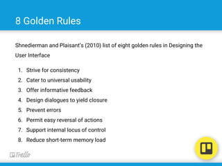

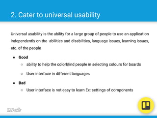


The document evaluates Trello, a web-based project management tool, highlighting its features, user interface design principles, and common usability issues. It references Ben Shneiderman's eight golden rules of user interface design, assessing Trello based on these criteria with examples of both strengths and weaknesses. The analysis provides insights into how Trello can improve its user experience and interface consistency.


