Download as PDF, PPTX
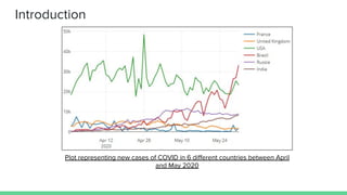
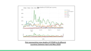
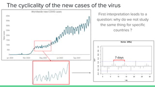
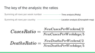

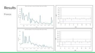
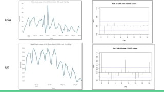
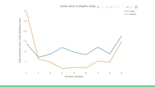


This document analyzes COVID-19 case and death data from April and May 2020 in 6 countries. It presents plots of new cases and deaths over time. It discusses differences between countries in total population, measures taken, testing levels, culture and HDI that influence case and death rates. It also examines differences over time, finding the US peak was much higher than UK and France in late March and lockdowns reduced cyclicality of French data versus UK data. The document concludes there are numerous differences between countries and over time and puts forth some hypotheses for these differences.


![[L mooc] présentation](https://cdn.slidesharecdn.com/ss_thumbnails/l-moocprsentation-130602124311-phpapp01-thumbnail.jpg?width=640&height=640&fit=bounds)


