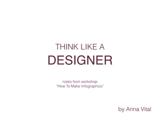
Think Like a Designer - How To Make Infographics
•
5 likes•1,858 views

Start creating infographics with choosing a visual analogy. Use less text, don't create sections, unless it's part of grid. Create literal icons. Make your data meaningful. From the workshop: "How To Make Infographics"
Report
Share
Report
Share
Download to read offline

Recommended
Как Сделать Инфографику - Киев, Атмасфера 360
Данна презентация объясняет основные принципы построения инфографики и знакомит с основами информационного дизайна.
Инфографики представленные в презентации находятся на сайте: http://ru.fundersandfounders.com/
Транскрипт лекции:
Хорошая инфографика должна:
- доносить смысл
- выражать сложное явление просто
- все гафические элементы на одном холсте
- напоминать виденное ранее, знакомое, потому должна содержать аналогии
- по порядку представления образов быть похожа на историю жизни, расказывать её, так легче запоминаются факты
- содержать минимум слов, понятия стараться выражать пиктограммами, значками, иконками; количество чего-либо или его соотношение отображать не цифрой а количеством графических объектов.
- быть удобной в пользовании, навигации. Например, при взгляде на инфографическую карту сразу должно становиться ясно откуда её читать.
- быть фрактальной, содержать 3 уровня масштаба объектов; группы объектов разделять свободным пространством, так легче отделить главное от второстепенного, выделить главные объекты.
- быть расцвечена правильно подобранными цветовыми гаммами
- выражать эмоции через рисунок и способ отображения
- использовать не более 2х сочетаемых между собой видов шрифтов
- содержать сведенния и факты (Например, если инфографика о компании, то это могут быть факты из истории компании, о её деятельности)
- основываться только на достоверных, проверенных источниках
ЭТАПЫ СОЗДАНИЯ ИНФОГРАФИКИ
- сначала решить какой смысл мы хотим донести людям
- выбрать предмет или явление, которое лучше всего подходит для несения этого смысла
- найти сведения о предмете или явлении, которое станет объектом нашей инфографики
- т.к. сведений множество, то выбрать из найденых те, которые лучше всего, на наш взгляд, смогли бы выразить исходный смысл
- прописать сценарий, как должна развёртываться картина, какой образ за каким должен следовать
- как они совмещаются, "рассказывают" историю
- прикидываем в уме (визуализируем) конечный результат
- выбраем стиль графики
- сначала рисуем на бумаге (скетч)
- упрощаем нарисованное, выделяя главное
- создаём изображения на компьютере
- тестируем полученное на всевозможных девайсах - ноутбуках, планшетах, см
Funding ideas in a globally connected world – a social approach
A keynote given in the Seminars on Software Engineering & Information Systems
Meet-Beat Your Way To Sales Growth and Productivity Improvement
If you would like a FREE copy of this book email me with "Send Book' to george.evans@thepdfchef.com
Part 1 of The Executive Summary shows you a technique that will have you smashing targets like an adrenalin fueled downhill ride and not an uphill struggle.
LawRD(PortuguêS)
O LawRD é uma aplicação web para a gestão de escritórios de advogados. Concebida para possibilitar o acesso imediato, a toda a informação relacionada, em qualquer altura e em qualquer lugar.
EFConsulting Empresas Familiares 30 anos Cenfim
Algumas particularidades das empresas familiares, nomeadamente caraterização, sucessão da liderança e propriedade, apresentada no 30º aniversário do CENFIM de Oliveira de Azeméis em 04/12/2015
Cidadania20
Cidadania 2.0 - A visão de um informático... e como convencer um leigo de que isto pode ser uma boa ideia
Leadership Step-by-Step #1
"If you talk, you don't listen;
if you don't listen, you're alone;
if you are alone, you aren't a leader;
if you aren't a leader, you don't leverage;
if you don't leverage you do not have impact!
conclusion: If you talk you do not have impact!"
This presentations does not teach you about Leadership, but gives you some small steps so you can become a better leader.
You cannot learn how to be a good Leader in just one presentation, or in one workshop, or in one week or even one month. Leadership is like Friendship we know when we have it, but not one knows how to get it. So the best approach is to to step-by-step!
A collection of insights about how to be a better leader gathered from experience, reflection, discussions and extensive reading.
Comments and Shares are welcomed!
Didgeridoo and Education
The slides from my TEDxKids@Vilnius presentation on January 10th , 2015.
In this presentation I talk about how the didgeridoo saved my life after a series of events including bullying and deviant behavior and why I believe it is important to facilitate the access to different experiences in education.
Besides the talk I also lead a workshop with kids that resulted in a presentation in the end of the event.
You can see both videos at http://www.thewalkaboutfamily.com/2015/01/videos-from-tedxkidsvilnius/
Business Model Canvas at Fim de semana de empreendedorismo AEFEUP
Workshop sobre o Business Model Canvas no fim de semana de empreendedorismo promovido pela AEFEUP. April 28, 2013
Evolução modelos de negócio na internet.
Evolução modelos de negócio na internet.
Cadeira: Comunicação Técnica e Científica
Autor: Ricardo Pinto
Delivering presentations - dicas de apresentação (not!)
This is a presentation on some techniques on how (not) to do presentations.
It helps one getting more aware of how ridiculous one can be when making a presentations. It also provides the most naif ones with some tips on how to detect professional bullshiters and no make a fool of oneself (one, one, zero, one).
Use with caution and, above all, don't try this at work.
TEDxMatosinhos - À Bolina
O primeiro TEDx "after-hours" realizou-se em Matosinhos, no dia 4 de Outubro.
"À bolina, cruzando os mares, contra tudo e contra todos! Vamos alargar horizontes!"
Launching tech products
Everyone has had an idea for a tech company. Building products is getting easier and easier. But most still make the same mistakes when developing a new product.
This presentation is a collection of best practices for going from idea to launch, specially for non-engineers.
How to Keep Your Nonprofit Mission Relevant
How to keep your nonprofit's mission relevant and what to do when it's not. We'll cover how to use data and how to ensure that you are 'constituent-led'.
Enhancing Financial Data with Infographics
2016 Minnesota Nonprofit Finance Conference presentation. How do you make your outcome story more compelling to your constituents? Adding financial data to a story creates a more concrete and actionable message. We will pick 2 examples of infographics with program outcomes and work through how you can add financial information in a meaningful way. In addition we will walk through what financial data you will need to collect, how to collect it and how to use it. Understanding financial information is no longer for just the accountants, we all have a responsibility to be fiscally informed and responsible.
Case Studies in Design: How Good Design Supports Good Research
Case studies in research report design, based on nonprofit reports archived in the IssueLab collection.
Information Architecture of the Mundane
Considering “masterwork” through its opposite, in an attempt to understand what "good" is in the domain of strategic Information Architecture.
Everything you ever wanted to know about Google Analytics, but were afraid to...
Event: SoCal UX Camp 2016
Presented by: David LaFontaine
This is a hands-on exploration on how to move beyond the basics with Google Analytics. Why should designers have to deal with all these confusing spreadsheets, numbers, charts and graphs?
Well, without at least a decent grasp of how to read web analytics, creative professionals are going to continue to lose control of their creations, because to decision-makers, the charts and graphs and spreadsheets seem to be the very essence of unassailable logic. Worse,designers will lose out on the opportunity to make what their sites better, by gaining insights into the needs, desires and motivations of their users.
Too many digital experiences are being carefully crafted by UX Designers to "surprise and delight" users -- only to lose that human essence at the end, when final decisions are made, based solely upon surface-level analysis of audience behavior.
It need not be so. In fact, we desperately need to start putting the "human touch" back into what we create. Because the alternative is just so much over-processed brainmush. Slideshows, listicles and clickbait are not what we were put on this earth to create nor consume.
Data Con LA 2018 - Best Practices in Data Visualization by Shilpa Balan
Data Con LA 2018 - Best Practices in Data Visualization by Shilpa Balan, Assistant Professor, California State University-Los Angeles
Visualizations are an effective way to communicate information. Visuals make it easy to spot patterns. Visualizing data leads to better data enlightenment. A good visualization should tell the story in seconds. Data visualizations are a medium to present interesting analysis and findings. Good visuals consider both user needs and business needs. Many data analysts are not experts in communicating or presenting the insights effectively. This could result in several insights being lost in the presentation. A data analyst should be able to present the insights to the end users. Data can be worthy only if the end users can understand it. Thus, the goal of data visualization is to use images to improve the user's understanding of the data. The aim of this presentation is to discuss the best practices of data visualization and how data analysts can use these techniques to communicate their results and findings effectively to the end users.
More Related Content
Viewers also liked
Cidadania20
Cidadania 2.0 - A visão de um informático... e como convencer um leigo de que isto pode ser uma boa ideia
Leadership Step-by-Step #1
"If you talk, you don't listen;
if you don't listen, you're alone;
if you are alone, you aren't a leader;
if you aren't a leader, you don't leverage;
if you don't leverage you do not have impact!
conclusion: If you talk you do not have impact!"
This presentations does not teach you about Leadership, but gives you some small steps so you can become a better leader.
You cannot learn how to be a good Leader in just one presentation, or in one workshop, or in one week or even one month. Leadership is like Friendship we know when we have it, but not one knows how to get it. So the best approach is to to step-by-step!
A collection of insights about how to be a better leader gathered from experience, reflection, discussions and extensive reading.
Comments and Shares are welcomed!
Didgeridoo and Education
The slides from my TEDxKids@Vilnius presentation on January 10th , 2015.
In this presentation I talk about how the didgeridoo saved my life after a series of events including bullying and deviant behavior and why I believe it is important to facilitate the access to different experiences in education.
Besides the talk I also lead a workshop with kids that resulted in a presentation in the end of the event.
You can see both videos at http://www.thewalkaboutfamily.com/2015/01/videos-from-tedxkidsvilnius/
Business Model Canvas at Fim de semana de empreendedorismo AEFEUP
Workshop sobre o Business Model Canvas no fim de semana de empreendedorismo promovido pela AEFEUP. April 28, 2013
Evolução modelos de negócio na internet.
Evolução modelos de negócio na internet.
Cadeira: Comunicação Técnica e Científica
Autor: Ricardo Pinto
Delivering presentations - dicas de apresentação (not!)
This is a presentation on some techniques on how (not) to do presentations.
It helps one getting more aware of how ridiculous one can be when making a presentations. It also provides the most naif ones with some tips on how to detect professional bullshiters and no make a fool of oneself (one, one, zero, one).
Use with caution and, above all, don't try this at work.
TEDxMatosinhos - À Bolina
O primeiro TEDx "after-hours" realizou-se em Matosinhos, no dia 4 de Outubro.
"À bolina, cruzando os mares, contra tudo e contra todos! Vamos alargar horizontes!"
Launching tech products
Everyone has had an idea for a tech company. Building products is getting easier and easier. But most still make the same mistakes when developing a new product.
This presentation is a collection of best practices for going from idea to launch, specially for non-engineers.
Viewers also liked (15)
Barriers to the diffusion of the VSM (Nuno Rosa, 2016)
Barriers to the diffusion of the VSM (Nuno Rosa, 2016)
Business Model Canvas at Fim de semana de empreendedorismo AEFEUP
Business Model Canvas at Fim de semana de empreendedorismo AEFEUP
Delivering presentations - dicas de apresentação (not!)
Delivering presentations - dicas de apresentação (not!)
Similar to Think Like a Designer - How To Make Infographics
How to Keep Your Nonprofit Mission Relevant
How to keep your nonprofit's mission relevant and what to do when it's not. We'll cover how to use data and how to ensure that you are 'constituent-led'.
Enhancing Financial Data with Infographics
2016 Minnesota Nonprofit Finance Conference presentation. How do you make your outcome story more compelling to your constituents? Adding financial data to a story creates a more concrete and actionable message. We will pick 2 examples of infographics with program outcomes and work through how you can add financial information in a meaningful way. In addition we will walk through what financial data you will need to collect, how to collect it and how to use it. Understanding financial information is no longer for just the accountants, we all have a responsibility to be fiscally informed and responsible.
Case Studies in Design: How Good Design Supports Good Research
Case studies in research report design, based on nonprofit reports archived in the IssueLab collection.
Information Architecture of the Mundane
Considering “masterwork” through its opposite, in an attempt to understand what "good" is in the domain of strategic Information Architecture.
Everything you ever wanted to know about Google Analytics, but were afraid to...
Event: SoCal UX Camp 2016
Presented by: David LaFontaine
This is a hands-on exploration on how to move beyond the basics with Google Analytics. Why should designers have to deal with all these confusing spreadsheets, numbers, charts and graphs?
Well, without at least a decent grasp of how to read web analytics, creative professionals are going to continue to lose control of their creations, because to decision-makers, the charts and graphs and spreadsheets seem to be the very essence of unassailable logic. Worse,designers will lose out on the opportunity to make what their sites better, by gaining insights into the needs, desires and motivations of their users.
Too many digital experiences are being carefully crafted by UX Designers to "surprise and delight" users -- only to lose that human essence at the end, when final decisions are made, based solely upon surface-level analysis of audience behavior.
It need not be so. In fact, we desperately need to start putting the "human touch" back into what we create. Because the alternative is just so much over-processed brainmush. Slideshows, listicles and clickbait are not what we were put on this earth to create nor consume.
Data Con LA 2018 - Best Practices in Data Visualization by Shilpa Balan
Data Con LA 2018 - Best Practices in Data Visualization by Shilpa Balan, Assistant Professor, California State University-Los Angeles
Visualizations are an effective way to communicate information. Visuals make it easy to spot patterns. Visualizing data leads to better data enlightenment. A good visualization should tell the story in seconds. Data visualizations are a medium to present interesting analysis and findings. Good visuals consider both user needs and business needs. Many data analysts are not experts in communicating or presenting the insights effectively. This could result in several insights being lost in the presentation. A data analyst should be able to present the insights to the end users. Data can be worthy only if the end users can understand it. Thus, the goal of data visualization is to use images to improve the user's understanding of the data. The aim of this presentation is to discuss the best practices of data visualization and how data analysts can use these techniques to communicate their results and findings effectively to the end users.
Austin TUG May 2023 | Finding Your Professional Niche in the Data Industry
Speaker: Eva Murray - Lead Evangelist at Snowflake
Presentation: "Finding Your Professional Niche in the Data Industry"
Similar to Think Like a Designer - How To Make Infographics (8)
Case Studies in Design: How Good Design Supports Good Research
Case Studies in Design: How Good Design Supports Good Research
Everything you ever wanted to know about Google Analytics, but were afraid to...
Everything you ever wanted to know about Google Analytics, but were afraid to...
Data Con LA 2018 - Best Practices in Data Visualization by Shilpa Balan
Data Con LA 2018 - Best Practices in Data Visualization by Shilpa Balan
Austin TUG May 2023 | Finding Your Professional Niche in the Data Industry
Austin TUG May 2023 | Finding Your Professional Niche in the Data Industry
Recently uploaded
一比一原版(RHUL毕业证书)伦敦大学皇家霍洛威学院毕业证如何办理
学校原件一模一样【微信:6496090 】【(RHUL毕业证书)伦敦大学皇家霍洛威学院毕业证成绩单】【微信:6496090 】学位证,留信认证(真实可查,永久存档)原件一模一样纸张工艺/offer、雅思、外壳等材料/诚信可靠,可直接看成品样本,帮您解决无法毕业带来的各种难题!外壳,原版制作,诚信可靠,可直接看成品样本。行业标杆!精益求精,诚心合作,真诚制作!多年品质 ,按需精细制作,24小时接单,全套进口原装设备。十五年致力于帮助留学生解决难题,包您满意。
本公司拥有海外各大学样板无数,能完美还原。
1:1完美还原海外各大学毕业材料上的工艺:水印,阴影底纹,钢印LOGO烫金烫银,LOGO烫金烫银复合重叠。文字图案浮雕、激光镭射、紫外荧光、温感、复印防伪等防伪工艺。材料咨询办理、认证咨询办理请加学历顾问Q/微6496090
【主营项目】
一.毕业证【q微6496090】成绩单、使馆认证、教育部认证、雅思托福成绩单、学生卡等!
二.真实使馆公证(即留学回国人员证明,不成功不收费)
三.真实教育部学历学位认证(教育部存档!教育部留服网站永久可查)
四.办理各国各大学文凭(一对一专业服务,可全程监控跟踪进度)
如果您处于以下几种情况:
◇在校期间,因各种原因未能顺利毕业……拿不到官方毕业证【q/微6496090】
◇面对父母的压力,希望尽快拿到;
◇不清楚认证流程以及材料该如何准备;
◇回国时间很长,忘记办理;
◇回国马上就要找工作,办给用人单位看;
◇企事业单位必须要求办理的
◇需要报考公务员、购买免税车、落转户口
◇申请留学生创业基金
留信网认证的作用:
1:该专业认证可证明留学生真实身份
2:同时对留学生所学专业登记给予评定
3:国家专业人才认证中心颁发入库证书
4:这个认证书并且可以归档倒地方
5:凡事获得留信网入网的信息将会逐步更新到个人身份内,将在公安局网内查询个人身份证信息后,同步读取人才网入库信息
6:个人职称评审加20分
7:个人信誉贷款加10分
8:在国家人才网主办的国家网络招聘大会中纳入资料,供国家高端企业选择人才
办理(RHUL毕业证书)伦敦大学皇家霍洛威学院毕业证【微信:6496090 】外观非常简单,由纸质材料制成,上面印有校徽、校名、毕业生姓名、专业等信息。
办理(RHUL毕业证书)伦敦大学皇家霍洛威学院毕业证【微信:6496090 】格式相对统一,各专业都有相应的模板。通常包括以下部分:
校徽:象征着学校的荣誉和传承。
校名:学校英文全称
授予学位:本部分将注明获得的具体学位名称。
毕业生姓名:这是最重要的信息之一,标志着该证书是由特定人员获得的。
颁发日期:这是毕业正式生效的时间,也代表着毕业生学业的结束。
其他信息:根据不同的专业和学位,可能会有一些特定的信息或章节。
办理(RHUL毕业证书)伦敦大学皇家霍洛威学院毕业证【微信:6496090 】价值很高,需要妥善保管。一般来说,应放置在安全、干燥、防潮的地方,避免长时间暴露在阳光下。如需使用,最好使用复印件而不是原件,以免丢失。
综上所述,办理(RHUL毕业证书)伦敦大学皇家霍洛威学院毕业证【微信:6496090 】是证明身份和学历的高价值文件。外观简单庄重,格式统一,包括重要的个人信息和发布日期。对持有人来说,妥善保管是非常重要的。
Let's Summon Demons Shirt Let's Summon Demons Shirt
Unleash Your Inner Demon with the "Let's Summon Demons" T-Shirt. Calling all fans of dark humor and edgy fashion! The "Let's Summon Demons" t-shirt is a unique way to express yourself and turn heads.
https://dribbble.com/shots/24253051-Let-s-Summon-Demons-Shirt
Design Thinking Design thinking Design thinking
https://www.google.com/maps/d/view?mid=1GLIP8ROi4pdWoJ20H59hiDkXGn_aau0&ll=22.396537375469673%2C114.10949749999997&z=11
https://www.google.com/maps/d/view?mid=1VqNLpP6H4bXwKQoiq7ctlJ6hV6Rf7bU&ll=22.396537375469673%2C114.10949749999997&z=11
https://www.google.com/maps/d/view?mid=1P9FRl4ZIqXk8l_6Q3BzRa-6I-m5dSMw&ll=22.396537375469673%2C114.10949749999997&z=11
https://www.google.com/maps/d/view?mid=1S47yy5qCcoQnEIj8-8VWfFP3KF8F5dE&ll=22.396537375469673%2C114.10949749999997&z=11
https://www.google.com/maps/d/view?mid=1GjI1ThsmUCrOPcnT5LeAzdNFxVigfG8&ll=22.396537375469673%2C114.10949749999997&z=11
https://www.google.com/maps/d/view?mid=1jaCJIVbvR0eIjwaQTzCl4todLsfxCYY&ll=22.396537375469673%2C114.10949749999997&z=11
https://www.google.com/maps/d/view?mid=19cUdSW_Zt7BZnwBX5owfJfjSL9X5nFU&ll=22.396537375469673%2C114.10949749999997&z=11
https://www.google.com/maps/d/view?mid=1VZdW6ZnJJLMNqRa0x_dYPVgQ5aEvgnc&ll=22.396537375469673%2C114.10949749999997&z=11
https://www.google.com/maps/d/view?mid=1wJYkMPkdjK0D8PYQeKQCPR5vbnfJSfo&ll=22.396537375469673%2C114.10949749999997&z=11
https://www.google.com/maps/d/view?mid=1WeIHKG9Zhi_JaLfqSC845HAeS65f894&ll=22.396537375469673%2C114.10949749999997&z=11
https://www.google.com/maps/d/view?mid=15LiUYaeD2uCOeHMKvn9tQ6tLCOsxcv0&ll=22.396537375469673%2C114.10949749999997&z=11
https://www.google.com/maps/d/view?mid=1iLLsh30u99WyTc8rRXL4wUUsSp5MnJk&ll=22.396537375469673%2C114.10949749999997&z=11
https://www.google.com/maps/d/view?mid=1S03vvWWj_n6xBxG8SKepMSOj7wrfHRQ&ll=22.396537375469673%2C114.10949749999997&z=11
https://www.google.com/maps/d/view?mid=1tn4RiW3Skp5YCJ_a-GlA7TJub2Ia7Oc&ll=22.396537375469673%2C114.10949749999997&z=11
https://www.google.com/maps/d/view?mid=1HafSOZ3MkJGTXBeI_L_t5lKjxZ6XayE&ll=22.396537375469673%2C114.10949749999997&z=11
https://www.google.com/maps/d/view?mid=19tqnZi3jiWXyBjrt0EL5C3_h_RW2dII&ll=22.396537375469673%2C114.10949749999997&z=11
https://www.google.com/maps/d/view?mid=1pj59fnGHnUAEdsdwfba4GdR9R-FsSfc&ll=22.396537375469673%2C114.10949749999997&z=11
https://www.google.com/maps/d/view?mid=1jH7Mh5Qc0cGsM7tNjApTN5mn5sr3sWA&ll=22.396537375469673%2C114.10949749999997&z=11
https://www.google.com/maps/d/view?mid=192sbDAjg_ufyPg3gOa-QPLaQe4Teb9s&ll=22.396537375469673%2C114.10949749999997&z=11
https://www.google.com/maps/d/view?mid=1O7GD4hBEOg-BVrdKpqYQhMAl-wUU4Go&ll=22.396537375469673%2C114.10949749999997&z=11
https://www.google.com/maps/d/view?mid=13ViiBwWTWravc5uHEmkyPyzVgbNAIu4&ll=22.396537375469673%2C114.10949749999997&z=11
Can AI do good? at 'offtheCanvas' India HCI prelude
Invited talk at 'offtheCanvas' IndiaHCI prelude, 29th June 2024.
https://www.alandix.com/academic/talks/offtheCanvas-IndiaHCI2024/
The world is being changed fundamentally by AI and we are constantly faced with newspaper headlines about its harmful effects. However, there is also the potential to both ameliorate theses harms and use the new abilities of AI to transform society for the good. Can you make the difference?
Between Filth and Fortune- Urban Cattle Foraging Realities by Devi S Nair, An...
This study examines cattle rearing in urban and rural settings, focusing on milk production and consumption. By exploring a case in Ahmedabad, it highlights the challenges and processes in dairy farming across different environments, emphasising the need for sustainable practices and the essential role of milk in daily consumption.
一比一原版(Bristol毕业证书)布里斯托大学毕业证成绩单如何办理
原件一模一样【微信:6496090 】【(Bristol毕业证书)布里斯托大学毕业证成绩单】【微信:6496090 】学位证,留信认证(真实可查,永久存档)offer、雅思、外壳等材料/诚信可靠,可直接看成品样本,帮您解决无法毕业带来的各种难题!外壳,原版制作,诚信可靠,可直接看成品样本。行业标杆!精益求精,诚心合作,真诚制作!多年品质 ,按需精细制作,24小时接单,全套进口原装设备。十五年致力于帮助留学生解决难题,包您满意。
本公司拥有海外各大学样板无数,能完美还原。
1:1完美还原海外各大学毕业材料上的工艺:水印,阴影底纹,钢印LOGO烫金烫银,LOGO烫金烫银复合重叠。文字图案浮雕、激光镭射、紫外荧光、温感、复印防伪等防伪工艺。材料咨询办理、认证咨询办理请加学历顾问Q/微6496090
【主营项目】
一.毕业证【q微6496090】成绩单、使馆认证、教育部认证、雅思托福成绩单、学生卡等!
二.真实使馆公证(即留学回国人员证明,不成功不收费)
三.真实教育部学历学位认证(教育部存档!教育部留服网站永久可查)
四.办理各国各大学文凭(一对一专业服务,可全程监控跟踪进度)
如果您处于以下几种情况:
◇在校期间,因各种原因未能顺利毕业……拿不到官方毕业证【q/微6496090】
◇面对父母的压力,希望尽快拿到;
◇不清楚认证流程以及材料该如何准备;
◇回国时间很长,忘记办理;
◇回国马上就要找工作,办给用人单位看;
◇企事业单位必须要求办理的
◇需要报考公务员、购买免税车、落转户口
◇申请留学生创业基金
留信网认证的作用:
1:该专业认证可证明留学生真实身份
2:同时对留学生所学专业登记给予评定
3:国家专业人才认证中心颁发入库证书
4:这个认证书并且可以归档倒地方
5:凡事获得留信网入网的信息将会逐步更新到个人身份内,将在公安局网内查询个人身份证信息后,同步读取人才网入库信息
6:个人职称评审加20分
7:个人信誉贷款加10分
8:在国家人才网主办的国家网络招聘大会中纳入资料,供国家高端企业选择人才
Transforming Brand Perception and Boosting Profitability
In today's digital era, the dynamics of brand perception, consumer behavior, and profitability have been profoundly reshaped by the synergy of branding, social media, and website design. This research paper investigates the transformative power of these elements in influencing how individuals perceive brands and products and how this transformation can be harnessed to drive sales and profitability for businesses.
Through an exploration of brand psychology and consumer behavior, this study sheds light on the intricate ways in which effective branding strategies, strategic social media engagement, and user-centric website design contribute to altering consumers' perceptions. We delve into the principles that underlie successful brand transformations, examining how visual identity, messaging, and storytelling can captivate and resonate with target audiences.
Methodologically, this research employs a comprehensive approach, combining qualitative and quantitative analyses. Real-world case studies illustrate the impact of branding, social media campaigns, and website redesigns on consumer perception, sales figures, and profitability. We assess the various metrics, including brand awareness, customer engagement, conversion rates, and revenue growth, to measure the effectiveness of these strategies.
The results underscore the pivotal role of cohesive branding, social media influence, and website usability in shaping positive brand perceptions, influencing consumer decisions, and ultimately bolstering sales and profitability. This paper provides actionable insights and strategic recommendations for businesses seeking to leverage branding, social media, and website design as potent tools to enhance their market position and financial success.
一比一原版(BU毕业证书)伯恩茅斯大学毕业证成绩单如何办理
原件一模一样【微信:6496090 】【(BU毕业证书)伯恩茅斯大学毕业证成绩单】【微信:6496090 】学位证,留信认证(真实可查,永久存档)offer、雅思、外壳等材料/诚信可靠,可直接看成品样本,帮您解决无法毕业带来的各种难题!外壳,原版制作,诚信可靠,可直接看成品样本。行业标杆!精益求精,诚心合作,真诚制作!多年品质 ,按需精细制作,24小时接单,全套进口原装设备。十五年致力于帮助留学生解决难题,包您满意。
本公司拥有海外各大学样板无数,能完美还原。
1:1完美还原海外各大学毕业材料上的工艺:水印,阴影底纹,钢印LOGO烫金烫银,LOGO烫金烫银复合重叠。文字图案浮雕、激光镭射、紫外荧光、温感、复印防伪等防伪工艺。材料咨询办理、认证咨询办理请加学历顾问Q/微6496090
【主营项目】
一.毕业证【q微6496090】成绩单、使馆认证、教育部认证、雅思托福成绩单、学生卡等!
二.真实使馆公证(即留学回国人员证明,不成功不收费)
三.真实教育部学历学位认证(教育部存档!教育部留服网站永久可查)
四.办理各国各大学文凭(一对一专业服务,可全程监控跟踪进度)
如果您处于以下几种情况:
◇在校期间,因各种原因未能顺利毕业……拿不到官方毕业证【q/微6496090】
◇面对父母的压力,希望尽快拿到;
◇不清楚认证流程以及材料该如何准备;
◇回国时间很长,忘记办理;
◇回国马上就要找工作,办给用人单位看;
◇企事业单位必须要求办理的
◇需要报考公务员、购买免税车、落转户口
◇申请留学生创业基金
留信网认证的作用:
1:该专业认证可证明留学生真实身份
2:同时对留学生所学专业登记给予评定
3:国家专业人才认证中心颁发入库证书
4:这个认证书并且可以归档倒地方
5:凡事获得留信网入网的信息将会逐步更新到个人身份内,将在公安局网内查询个人身份证信息后,同步读取人才网入库信息
6:个人职称评审加20分
7:个人信誉贷款加10分
8:在国家人才网主办的国家网络招聘大会中纳入资料,供国家高端企业选择人才
Mohannad Abdullah portfolio _ V2 _22-24
Mohannad Abdullah
Architecture | Interior Design
portoflio_V2_22-24
一比一原版(UNUK毕业证书)诺丁汉大学毕业证如何办理
学校原件一模一样【微信:6496090 】【(UNUK毕业证书)诺丁汉大学毕业证成绩单】【微信:6496090 】学位证,留信认证(真实可查,永久存档)原件一模一样纸张工艺/offer、雅思、外壳等材料/诚信可靠,可直接看成品样本,帮您解决无法毕业带来的各种难题!外壳,原版制作,诚信可靠,可直接看成品样本。行业标杆!精益求精,诚心合作,真诚制作!多年品质 ,按需精细制作,24小时接单,全套进口原装设备。十五年致力于帮助留学生解决难题,包您满意。
本公司拥有海外各大学样板无数,能完美还原。
1:1完美还原海外各大学毕业材料上的工艺:水印,阴影底纹,钢印LOGO烫金烫银,LOGO烫金烫银复合重叠。文字图案浮雕、激光镭射、紫外荧光、温感、复印防伪等防伪工艺。材料咨询办理、认证咨询办理请加学历顾问Q/微6496090
【主营项目】
一.毕业证【q微6496090】成绩单、使馆认证、教育部认证、雅思托福成绩单、学生卡等!
二.真实使馆公证(即留学回国人员证明,不成功不收费)
三.真实教育部学历学位认证(教育部存档!教育部留服网站永久可查)
四.办理各国各大学文凭(一对一专业服务,可全程监控跟踪进度)
如果您处于以下几种情况:
◇在校期间,因各种原因未能顺利毕业……拿不到官方毕业证【q/微6496090】
◇面对父母的压力,希望尽快拿到;
◇不清楚认证流程以及材料该如何准备;
◇回国时间很长,忘记办理;
◇回国马上就要找工作,办给用人单位看;
◇企事业单位必须要求办理的
◇需要报考公务员、购买免税车、落转户口
◇申请留学生创业基金
留信网认证的作用:
1:该专业认证可证明留学生真实身份
2:同时对留学生所学专业登记给予评定
3:国家专业人才认证中心颁发入库证书
4:这个认证书并且可以归档倒地方
5:凡事获得留信网入网的信息将会逐步更新到个人身份内,将在公安局网内查询个人身份证信息后,同步读取人才网入库信息
6:个人职称评审加20分
7:个人信誉贷款加10分
8:在国家人才网主办的国家网络招聘大会中纳入资料,供国家高端企业选择人才
办理(UNUK毕业证书)诺丁汉大学毕业证【微信:6496090 】外观非常简单,由纸质材料制成,上面印有校徽、校名、毕业生姓名、专业等信息。
办理(UNUK毕业证书)诺丁汉大学毕业证【微信:6496090 】格式相对统一,各专业都有相应的模板。通常包括以下部分:
校徽:象征着学校的荣誉和传承。
校名:学校英文全称
授予学位:本部分将注明获得的具体学位名称。
毕业生姓名:这是最重要的信息之一,标志着该证书是由特定人员获得的。
颁发日期:这是毕业正式生效的时间,也代表着毕业生学业的结束。
其他信息:根据不同的专业和学位,可能会有一些特定的信息或章节。
办理(UNUK毕业证书)诺丁汉大学毕业证【微信:6496090 】价值很高,需要妥善保管。一般来说,应放置在安全、干燥、防潮的地方,避免长时间暴露在阳光下。如需使用,最好使用复印件而不是原件,以免丢失。
综上所述,办理(UNUK毕业证书)诺丁汉大学毕业证【微信:6496090 】是证明身份和学历的高价值文件。外观简单庄重,格式统一,包括重要的个人信息和发布日期。对持有人来说,妥善保管是非常重要的。
一比一原版(LSE毕业证书)伦敦政治经济学院毕业证成绩单如何办理
原件一模一样【微信:6496090 】【(LSE毕业证书)伦敦政治经济学院毕业证成绩单】【微信:6496090 】学位证,留信认证(真实可查,永久存档)offer、雅思、外壳等材料/诚信可靠,可直接看成品样本,帮您解决无法毕业带来的各种难题!外壳,原版制作,诚信可靠,可直接看成品样本。行业标杆!精益求精,诚心合作,真诚制作!多年品质 ,按需精细制作,24小时接单,全套进口原装设备。十五年致力于帮助留学生解决难题,包您满意。
本公司拥有海外各大学样板无数,能完美还原。
1:1完美还原海外各大学毕业材料上的工艺:水印,阴影底纹,钢印LOGO烫金烫银,LOGO烫金烫银复合重叠。文字图案浮雕、激光镭射、紫外荧光、温感、复印防伪等防伪工艺。材料咨询办理、认证咨询办理请加学历顾问Q/微6496090
【主营项目】
一.毕业证【q微6496090】成绩单、使馆认证、教育部认证、雅思托福成绩单、学生卡等!
二.真实使馆公证(即留学回国人员证明,不成功不收费)
三.真实教育部学历学位认证(教育部存档!教育部留服网站永久可查)
四.办理各国各大学文凭(一对一专业服务,可全程监控跟踪进度)
如果您处于以下几种情况:
◇在校期间,因各种原因未能顺利毕业……拿不到官方毕业证【q/微6496090】
◇面对父母的压力,希望尽快拿到;
◇不清楚认证流程以及材料该如何准备;
◇回国时间很长,忘记办理;
◇回国马上就要找工作,办给用人单位看;
◇企事业单位必须要求办理的
◇需要报考公务员、购买免税车、落转户口
◇申请留学生创业基金
留信网认证的作用:
1:该专业认证可证明留学生真实身份
2:同时对留学生所学专业登记给予评定
3:国家专业人才认证中心颁发入库证书
4:这个认证书并且可以归档倒地方
5:凡事获得留信网入网的信息将会逐步更新到个人身份内,将在公安局网内查询个人身份证信息后,同步读取人才网入库信息
6:个人职称评审加20分
7:个人信誉贷款加10分
8:在国家人才网主办的国家网络招聘大会中纳入资料,供国家高端企业选择人才
一比一原版(Bolton毕业证书)博尔顿大学毕业证成绩单如何办理
原件一模一样【微信:6496090 】【(Bolton毕业证书)博尔顿大学毕业证成绩单】【微信:6496090 】学位证,留信认证(真实可查,永久存档)offer、雅思、外壳等材料/诚信可靠,可直接看成品样本,帮您解决无法毕业带来的各种难题!外壳,原版制作,诚信可靠,可直接看成品样本。行业标杆!精益求精,诚心合作,真诚制作!多年品质 ,按需精细制作,24小时接单,全套进口原装设备。十五年致力于帮助留学生解决难题,包您满意。
本公司拥有海外各大学样板无数,能完美还原。
1:1完美还原海外各大学毕业材料上的工艺:水印,阴影底纹,钢印LOGO烫金烫银,LOGO烫金烫银复合重叠。文字图案浮雕、激光镭射、紫外荧光、温感、复印防伪等防伪工艺。材料咨询办理、认证咨询办理请加学历顾问Q/微6496090
【主营项目】
一.毕业证【q微6496090】成绩单、使馆认证、教育部认证、雅思托福成绩单、学生卡等!
二.真实使馆公证(即留学回国人员证明,不成功不收费)
三.真实教育部学历学位认证(教育部存档!教育部留服网站永久可查)
四.办理各国各大学文凭(一对一专业服务,可全程监控跟踪进度)
如果您处于以下几种情况:
◇在校期间,因各种原因未能顺利毕业……拿不到官方毕业证【q/微6496090】
◇面对父母的压力,希望尽快拿到;
◇不清楚认证流程以及材料该如何准备;
◇回国时间很长,忘记办理;
◇回国马上就要找工作,办给用人单位看;
◇企事业单位必须要求办理的
◇需要报考公务员、购买免税车、落转户口
◇申请留学生创业基金
留信网认证的作用:
1:该专业认证可证明留学生真实身份
2:同时对留学生所学专业登记给予评定
3:国家专业人才认证中心颁发入库证书
4:这个认证书并且可以归档倒地方
5:凡事获得留信网入网的信息将会逐步更新到个人身份内,将在公安局网内查询个人身份证信息后,同步读取人才网入库信息
6:个人职称评审加20分
7:个人信誉贷款加10分
8:在国家人才网主办的国家网络招聘大会中纳入资料,供国家高端企业选择人才
Book Formatting: Quality Control Checks for Designers
This presentation was made to help designers who work in publishing houses or format books for printing ensure quality.
Quality control is vital to every industry. This is why every department in a company need create a method they use in ensuring quality. This, perhaps, will not only improve the quality of products and bring errors to the barest minimum, but take it to a near perfect finish.
It is beyond a moot point that a good book will somewhat be judged by its cover, but the content of the book remains king. No matter how beautiful the cover, if the quality of writing or presentation is off, that will be a reason for readers not to come back to the book or recommend it.
So, this presentation points designers to some important things that may be missed by an editor that they could eventually discover and call the attention of the editor.
Exploring the Future of Smart Garages.pdf
Dive into the innovative world of smart garages with our insightful presentation, "Exploring the Future of Smart Garages." This comprehensive guide covers the latest advancements in garage technology, including automated systems, smart security features, energy efficiency solutions, and seamless integration with smart home ecosystems. Learn how these technologies are transforming traditional garages into high-tech, efficient spaces that enhance convenience, safety, and sustainability.
Ideal for homeowners, tech enthusiasts, and industry professionals, this presentation provides valuable insights into the trends, benefits, and future developments in smart garage technology. Stay ahead of the curve with our expert analysis and practical tips on implementing smart garage solutions.
一比一原版(MMU毕业证书)曼彻斯特城市大学毕业证成绩单如何办理
学校原件一模一样【微信:6496090 】【(MMU毕业证书)曼彻斯特城市大学毕业证成绩单】【微信:6496090 】学位证,留信认证(真实可查,永久存档)原件一模一样纸张工艺/offer、雅思、外壳等材料/诚信可靠,可直接看成品样本,帮您解决无法毕业带来的各种难题!外壳,原版制作,诚信可靠,可直接看成品样本。行业标杆!精益求精,诚心合作,真诚制作!多年品质 ,按需精细制作,24小时接单,全套进口原装设备。十五年致力于帮助留学生解决难题,包您满意。
本公司拥有海外各大学样板无数,能完美还原。
1:1完美还原海外各大学毕业材料上的工艺:水印,阴影底纹,钢印LOGO烫金烫银,LOGO烫金烫银复合重叠。文字图案浮雕、激光镭射、紫外荧光、温感、复印防伪等防伪工艺。材料咨询办理、认证咨询办理请加学历顾问Q/微6496090
【主营项目】
一.毕业证【q微6496090】成绩单、使馆认证、教育部认证、雅思托福成绩单、学生卡等!
二.真实使馆公证(即留学回国人员证明,不成功不收费)
三.真实教育部学历学位认证(教育部存档!教育部留服网站永久可查)
四.办理各国各大学文凭(一对一专业服务,可全程监控跟踪进度)
如果您处于以下几种情况:
◇在校期间,因各种原因未能顺利毕业……拿不到官方毕业证【q/微6496090】
◇面对父母的压力,希望尽快拿到;
◇不清楚认证流程以及材料该如何准备;
◇回国时间很长,忘记办理;
◇回国马上就要找工作,办给用人单位看;
◇企事业单位必须要求办理的
◇需要报考公务员、购买免税车、落转户口
◇申请留学生创业基金
留信网认证的作用:
1:该专业认证可证明留学生真实身份
2:同时对留学生所学专业登记给予评定
3:国家专业人才认证中心颁发入库证书
4:这个认证书并且可以归档倒地方
5:凡事获得留信网入网的信息将会逐步更新到个人身份内,将在公安局网内查询个人身份证信息后,同步读取人才网入库信息
6:个人职称评审加20分
7:个人信誉贷款加10分
8:在国家人才网主办的国家网络招聘大会中纳入资料,供国家高端企业选择人才
办理(MMU毕业证书)曼彻斯特城市大学毕业证【微信:6496090 】外观非常简单,由纸质材料制成,上面印有校徽、校名、毕业生姓名、专业等信息。
办理(MMU毕业证书)曼彻斯特城市大学毕业证【微信:6496090 】格式相对统一,各专业都有相应的模板。通常包括以下部分:
校徽:象征着学校的荣誉和传承。
校名:学校英文全称
授予学位:本部分将注明获得的具体学位名称。
毕业生姓名:这是最重要的信息之一,标志着该证书是由特定人员获得的。
颁发日期:这是毕业正式生效的时间,也代表着毕业生学业的结束。
其他信息:根据不同的专业和学位,可能会有一些特定的信息或章节。
办理(MMU毕业证书)曼彻斯特城市大学毕业证【微信:6496090 】价值很高,需要妥善保管。一般来说,应放置在安全、干燥、防潮的地方,避免长时间暴露在阳光下。如需使用,最好使用复印件而不是原件,以免丢失。
综上所述,办理(MMU毕业证书)曼彻斯特城市大学毕业证【微信:6496090 】是证明身份和学历的高价值文件。外观简单庄重,格式统一,包括重要的个人信息和发布日期。对持有人来说,妥善保管是非常重要的。
Design Thinking Design thinking Design thinking
https://www.google.com/maps/d/view?mid=1deXTRaa0CGg1QvFHlnVvmlnp4FPtZ10&ll=22.396537375469673%2C114.10949749999997&z=11
https://www.google.com/maps/d/view?mid=1BHv3gx5ZJJH3inU343hkNLpPQCv6KPo&ll=22.396537375469673%2C114.10949749999997&z=11
https://www.google.com/maps/d/view?mid=1AfH4_M3zoT6_s93ASy0CeE8jovcHgik&ll=22.396537375469673%2C114.10949749999997&z=11
https://www.google.com/maps/d/view?mid=19QktXHVSUwDqMFK3CcLocgXQ6bPz5b8&ll=22.396537375469673%2C114.10949749999997&z=11
https://www.google.com/maps/d/view?mid=1w11lKJgVGX6rOP4J7J1PCJie86IWQVM&ll=22.396537375469673%2C114.10949749999997&z=11
https://www.google.com/maps/d/view?mid=1kVcrH9p-f2MJdJ6voQGvC1P35jx-QZ8&ll=22.396537375469673%2C114.10949749999997&z=11
https://www.google.com/maps/d/view?mid=149RlyyVXCaY65ql-dLC2eZ1fsP01JN8&vomp=1&cid=mp&cv=RgEAcd5aUzg.en.
https://www.google.com/maps/d/view?mid=1jtRQWjvBCrEFjsvsEIDLcLy-VAyeVHY&vomp=1&cid=mp&cv=RgEAcd5aUzg.en.
https://www.google.com/maps/d/view?mid=1L5nx5uSpbzk3VDdxpuIX8TzOM2ZUA4E&vomp=1&cid=mp&cv=RgEAcd5aUzg.en.
https://www.google.com/maps/d/view?mid=1L5nx5uSpbzk3VDdxpuIX8TzOM2ZUA4E&vomp=1&cid=mp&cv=RgEAcd5aUzg.en.
https://www.google.com/maps/d/view?mid=1SudZO_xD1NsTUsnvMCZtPgAHMpZCIaI&ll=22.39653737546966%2C114.10949749999997&z=12
https://www.google.com/maps/d/view?mid=1xl8SHD1eLjf4PbIhmeodTYJF4dPX4oo&ll=22.39653737546966%2C114.10949749999997&z=12
https://www.google.com/maps/d/view?mid=1LikThZPD8S6wG37Lnt1VWYWjBZ4IL_0&ll=22.39653737546966%2C114.10949749999997&z=12
https://www.google.com/maps/d/view?mid=1xl8SHD1eLjf4PbIhmeodTYJF4dPX4oo&ll=22.39653737546966%2C114.10949749999997&z=12
https://www.google.com/maps/d/view?mid=149RlyyVXCaY65ql-dLC2eZ1fsP01JN8&ll=22.396537375469673%2C114.10949749999997&z=11
https://www.google.com/maps/d/viewer?mid=1m72ggtGeWoLJnHpU_3f7LZ-HUQv2Mzk&ll=22.396537375469673%2C114.10949749999997&z=11
https://www.google.com/maps/d/viewer?mid=1F2NYKICN0Wb27ewNUsrV2BB18wvP7GQ&ll=22.396537375469673%2C114.10949749999997&z=11
https://www.google.com/maps/d/viewer?mid=1eKeVRSRhyfqRrG0F9kQiD5yp0cGt4WQ&ll=22.396537375469673%2C114.10949749999997&z=11
https://www.google.com/maps/d/viewer?mid=1g6bB3w3qRleJoX2Psz1zPggAUxwnCdU&ll=22.396537375469673%2C114.10949749999997&z=11
https://www.google.com/maps/d/viewer?mid=1sGPo5jqk_loy-a1es93BLxTKvRXmxt4&ll=22.396537375469673%2C114.10949749999997&z=11
https://www.google.com/maps/d/viewer?mid=1vaAt-Vy9I85rMukOc65MQmt3SoNBpNQ&ll=22.396537375469673%2C114.10949749999997&z=11
https://www.google.com/maps/d/viewer?mid=1r62eAttQMFxuaZeIVC_YF_aqPADXnf8&ll=22.396537375469673%2C114.10949749999997&z=11
Recently uploaded (20)
Let's Summon Demons Shirt Let's Summon Demons Shirt
Let's Summon Demons Shirt Let's Summon Demons Shirt
Can AI do good? at 'offtheCanvas' India HCI prelude
Can AI do good? at 'offtheCanvas' India HCI prelude
Between Filth and Fortune- Urban Cattle Foraging Realities by Devi S Nair, An...
Between Filth and Fortune- Urban Cattle Foraging Realities by Devi S Nair, An...
Transforming Brand Perception and Boosting Profitability
Transforming Brand Perception and Boosting Profitability
Book Formatting: Quality Control Checks for Designers
Book Formatting: Quality Control Checks for Designers
vernacular architecture in response to climate.pdf
vernacular architecture in response to climate.pdf
Коричневый и Кремовый Деликатный Органический Копирайтер Фрилансер Марке...
Коричневый и Кремовый Деликатный Органический Копирайтер Фрилансер Марке...
Think Like a Designer - How To Make Infographics
- 1. THINK LIKE A DESIGNER by Anna Vital notes from workshop “How To Make Infographics”
- 6. The Key Use analogies Write less text Make literal icons Make data meaningful
- 8. How to find the data? Ask precise questions.
- 9. How to ask precise questions? Predict the answer.
- 10. No, really, how to find data? (Ask for it.) (Then ask again.) source: Funders and Founders (Leverage what you got.)
- 11. What if the data is a secret? (Find a paradigm case.) (And put your a** on the line.) source: Funders and Founders
- 12. Why is the data not in one place? source: Funders and Founders
- 13. Good data is about grouping. source: Funders and Founders
- 15. How to sort messy data? (Ask the data guy.)
- 17. what do people care about?
- 18. not numbers
- 19. not design
- 20. meaning
- 28. source: space.com sections are not an infographic layout
- 29. Being a Designer
- 30. Where to start? with the analogy with the layout with graphs with icons
- 32. Example 2: illustrating behance.net Example 1: sketching behance.net Example 3: details behance.net