The Multi-Layered iPad
       a tale by Matt Jacobs
What’s on the Table

- Consuming media (text, mostly)
- Where the problems lie
- How the tablet can solve them
Where I’m Coming From


- Work at Six Apart
- Decablogger
- I’m a tinkerer
A Story about Reading
My used text book
What We’ve Got

- Content in disparate locations
- Source text, your notes, footnotes,
  endnotes, sidenotes
What I Want


- Content that is presented simply
- Ancillary data at my fingertips
Our Challenges

- Lots of space allows for lots of information
- Not very portable
- So we have to adjust
Design Differently


256x256    16x16     16x16
                    Upscaled
Organize and Limit
Layers of Data

Printed Text       Single layer, multiple objects


Web                Capable of multi-layer, but
                   primarily single layer


Multitouch         Very well suited for multi-
                   layer
The Web Brings Us
     Closer
Highlighted Definition
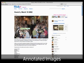
Annotated Images
Layer Hides on Blur
Contextual Comments
Map Overlays
TOOOOOO MUCH
It works, but...

- Multi-layered data is possible, but is limited
  in most contexts
- UI conventions are well-established and can
  be tough to break
The Kindle

- Stores 1,000s of
  books

- No Multi-touch

- Only two data
  layers (definitions)
How Jori Studies
iPad Textbook


The contents should
first be presented as a
clean slate.
iPad Textbook


When you want to
highlight something,
select text and a
modal dialogue
appears.
iPad Textbook


After highlighting, you
see a notes view.

Bubbles show
additional notes.
iPad Textbook


Clicking a bubble lets
you edit. Selecting
public lets classmates
see your notes.
iPad Textbook


You can view all public
notes, with different
markers based on the
source of the content.
iPad Textbook


For studying, there is a
view of just notes.
Clicking one takes you
back to the relevant
paragraph.
Further Examples
A Book Club

- Discussion questions at relevant points
- Notes from your book club members
- Author’s Commentary
Movies

- Tap on someone’s face for name and
  recent films
- Discovery mode, where ancillary data
  appears at relevant moments
- Choose from several commentaries
Tablets are the Best!


- Single application means more focus
- Touch interface enables modal dialogs
Tablets are the Best!


- Don’t sacrifice accessibility for portability
- Unlike eReaders, tablets do multimedia
Linkblog
- iPad and Books
  http://craigmod.com/journal/ipad_and_books/

- iPad Application Design
  http://mattgemmell.com/2010/03/05/ipad-application-design


- iPad UI Conventions
  http://www.flickr.com/photos/fraserspeirs/sets/72157623224262135/


- iPad PSD Elements
  http://www.teehanlax.com/blog/2010/02/01/ipad-gui-psd/
Thanks!

 @capndesign
capndesign.com

             CAPN DESIGN

The Multi-Layered iPad

Editor's Notes

  • #6 * Hard to read * Not useful for studying * But random guy’s notes might come in handy
  • #10 When you’re designing for smaller spaces, you need to present information differently.
  • #11 When transporting study materials, you can’t bring everything and you want it easily accessible
  • #14 Click on a word, the definition pops up.
  • #15 Add annotated text on top of an image
  • #16 But it hides when the image loses focus
  • #17 At djangobook.com, you can leave comments on a paragraph
  • #18 GMaps overlays streets, transit, etc.
  • #19 As we discussed before, you’ll have to limit what you present on the screen.
  • #21 The joystick is a bit awkward to use; takes you out of the moment.
  • #22 So how can the iPad help us. Let’s look at how my wife studies... book, notebook, flash cads, study guide, etc. EVERYTHING here, including the light, can be replaced by an iPad.