The document discusses conventions used in a music video and related media products to promote a fictional indie rock band. Specifically, it discusses using:
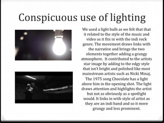
- Close ups and a "grungy" style to promote the band's image through their performance in the music video.
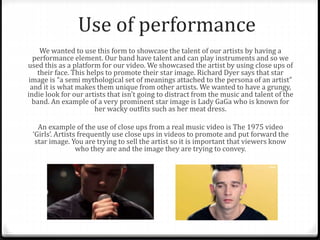
- A narrative element involving a fight scene to engage audiences and create an image of the band as "rebellious" and "dangerous."
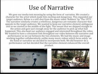
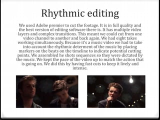
- Artistic camera techniques like handheld shots to match the style of similar indie bands.
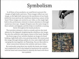
- Symbolism using light bulbs and trees throughout the video and other products to represent the band's quirky and mysterious nature.
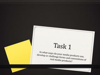
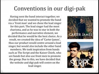
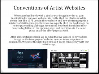
- A lead singer as the "front man" in the video, website


![SecurityBoat_Service_Pitch_Deck[24158].pdf](https://cdn.slidesharecdn.com/ss_thumbnails/securityboatservicepitchdeck24158-260121113056-452683e3-thumbnail.jpg?width=640&height=640&fit=bounds)


