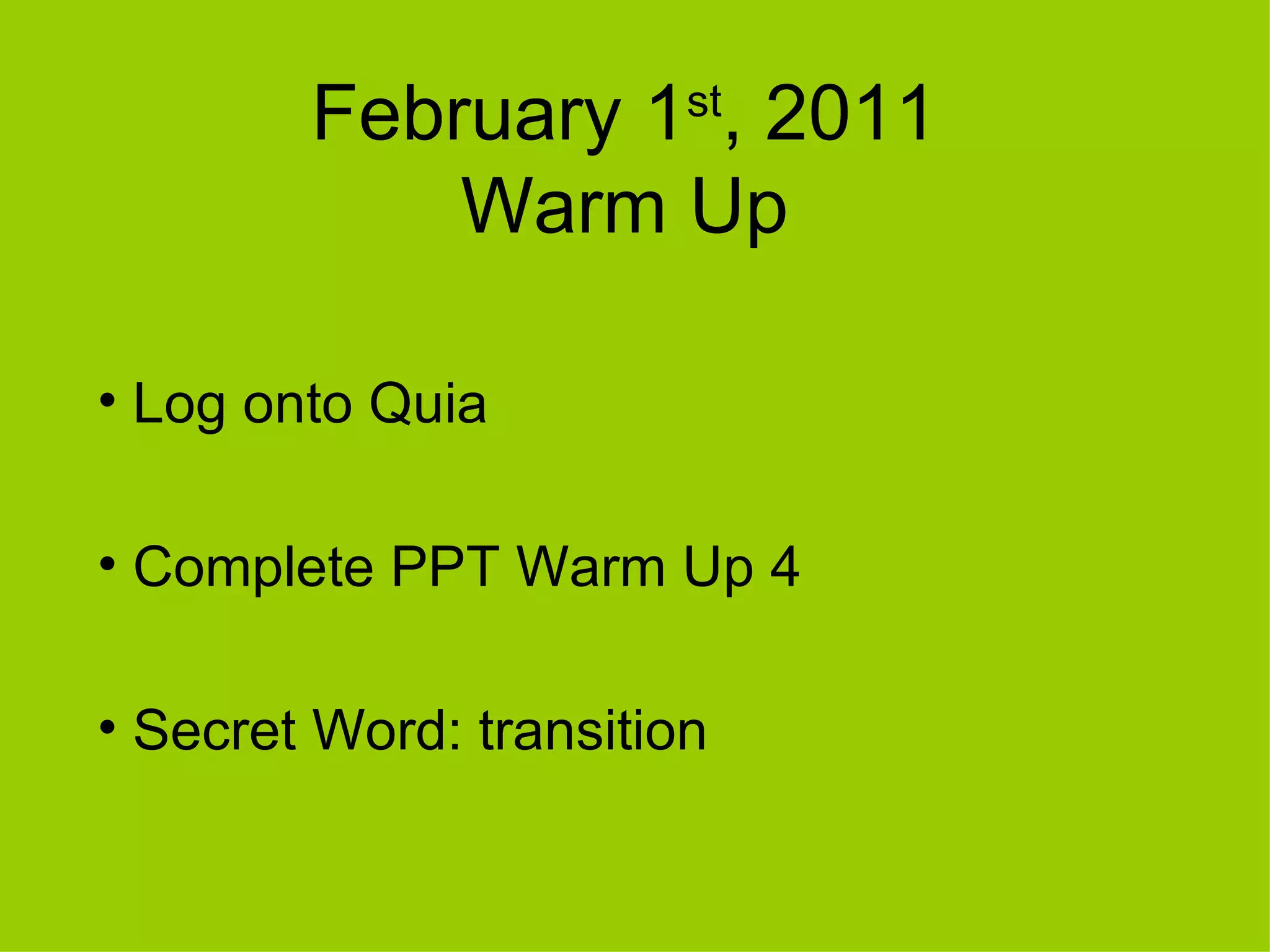
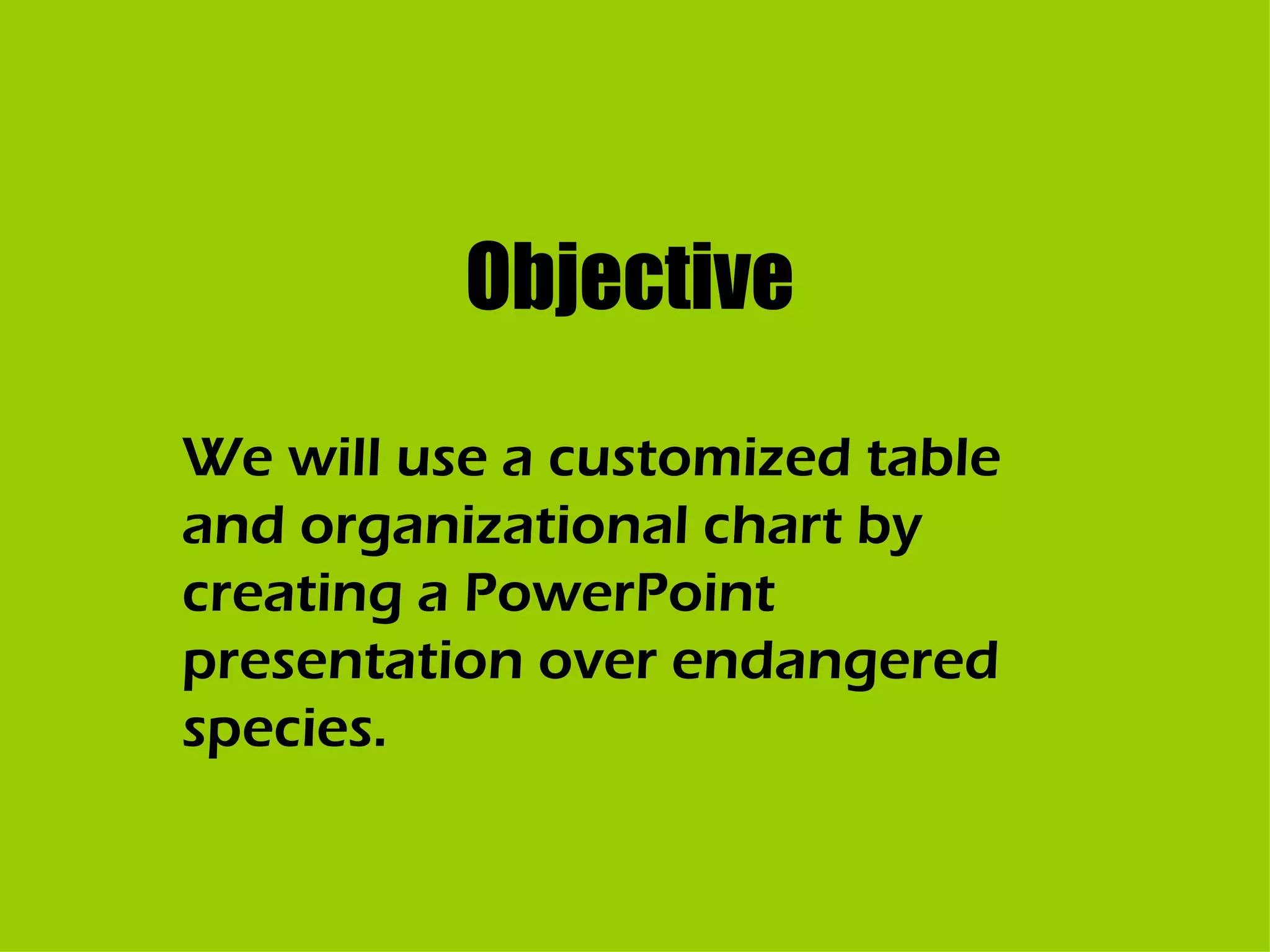
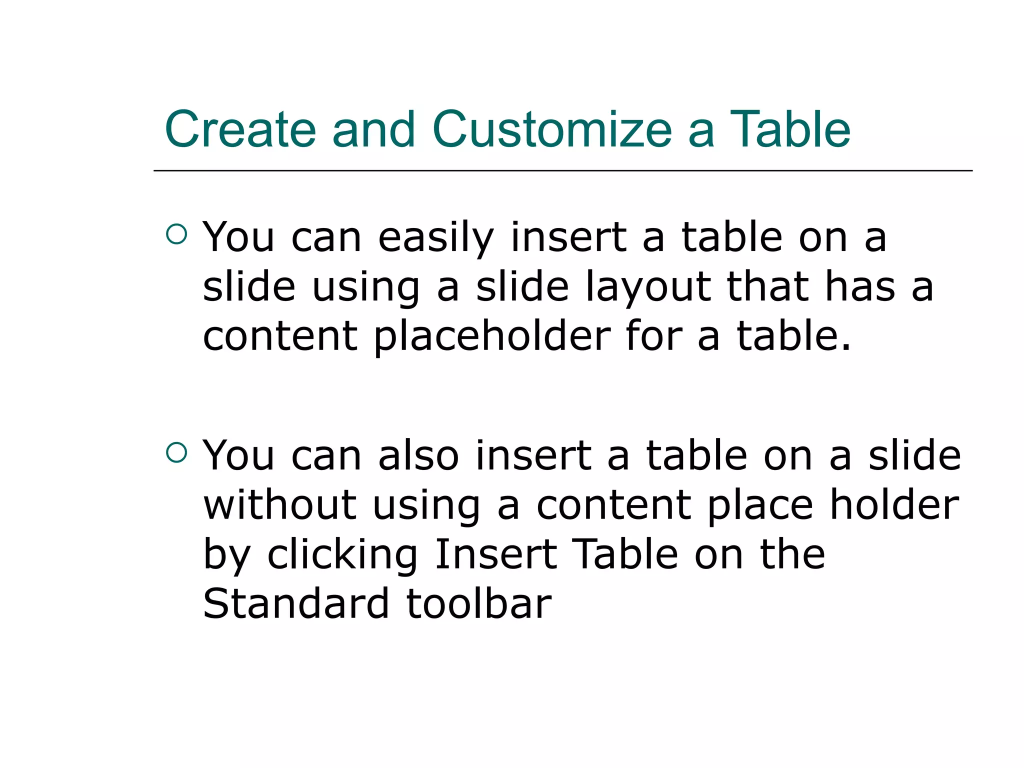
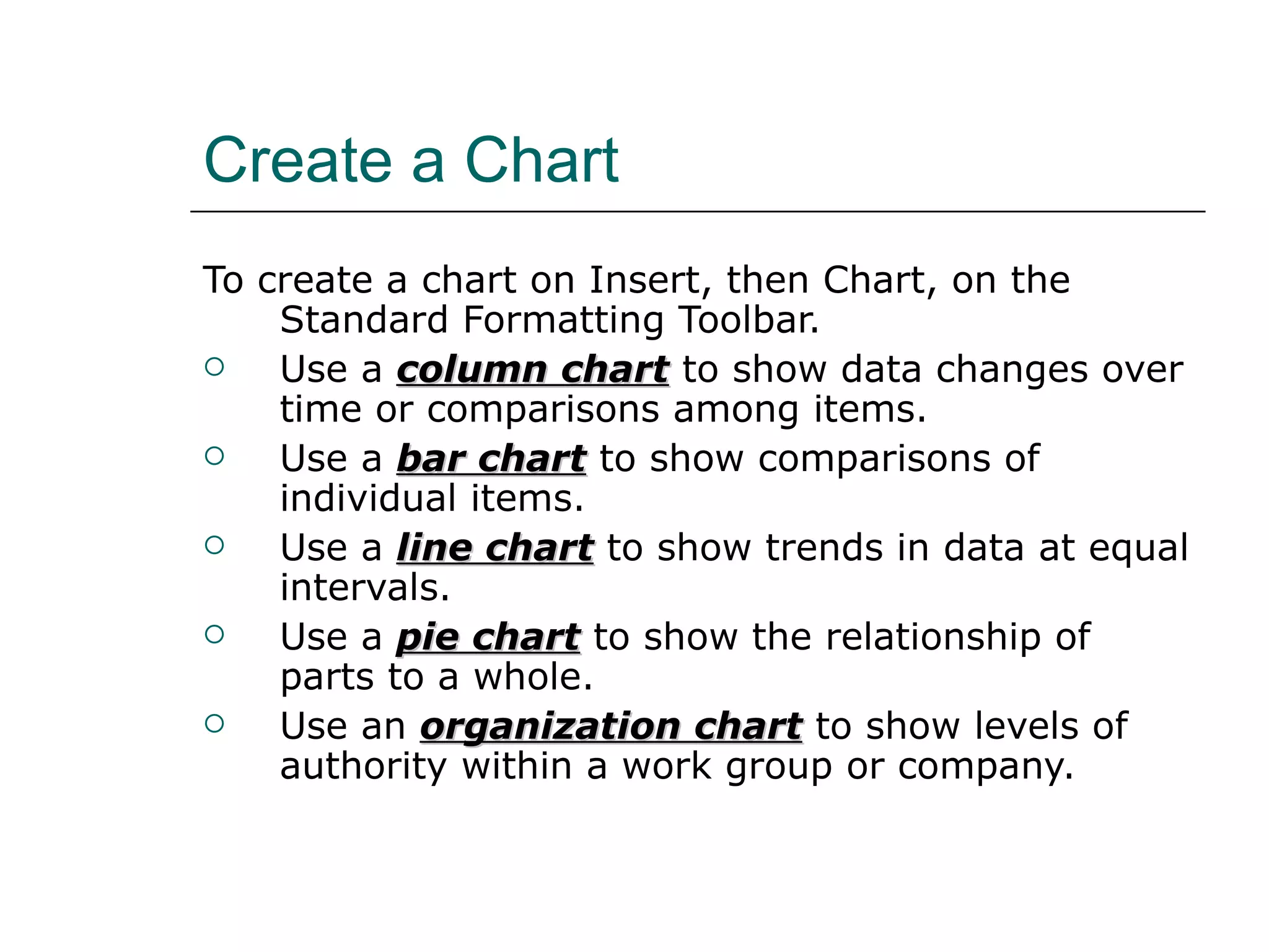
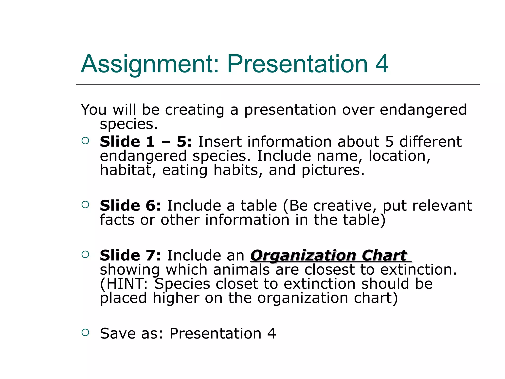
February 1 st , 2011 Warm Up Log onto Quia Complete PPT Warm Up 4 Secret Word: transition
Objective We will use a customized table and organizational chart by creating a PowerPoint presentation over endangered species.
Create and Customize a Table You can easily insert a table on a slide using a slide layout that has a content placeholder for a table.  You can also insert a table on a slide without using a content place holder by clicking Insert Table on the Standard toolbar
Create a Chart To create a chart on Insert, then Chart, on the Standard Formatting Toolbar.  Use a  column chart  to show data changes over time or comparisons among items. Use a  bar chart  to show comparisons of individual items. Use a  line chart  to show trends in data at equal intervals. Use a  pie chart  to show the relationship of parts to a whole. Use an  organization chart  to show levels of authority within a work group or company.
Assignment: Presentation 4 You will be creating a presentation over endangered species. Slide 1 – 5:  Insert information about 5 different endangered species. Include name, location, habitat, eating habits, and pictures. Slide 6:  Include a table (Be creative, put relevant facts or other information in the table) Slide 7:  Include an  Organization Chart  showing which animals are closest to extinction. (HINT: Species closet to extinction should be placed higher on the organization chart) Save as: Presentation 4

Tables

  • 1.
    February 1 st, 2011 Warm Up Log onto Quia Complete PPT Warm Up 4 Secret Word: transition
  • 2.
    Objective We willuse a customized table and organizational chart by creating a PowerPoint presentation over endangered species.
  • 3.
    Create and Customizea Table You can easily insert a table on a slide using a slide layout that has a content placeholder for a table. You can also insert a table on a slide without using a content place holder by clicking Insert Table on the Standard toolbar
  • 4.
    Create a ChartTo create a chart on Insert, then Chart, on the Standard Formatting Toolbar. Use a column chart to show data changes over time or comparisons among items. Use a bar chart to show comparisons of individual items. Use a line chart to show trends in data at equal intervals. Use a pie chart to show the relationship of parts to a whole. Use an organization chart to show levels of authority within a work group or company.
  • 5.
    Assignment: Presentation 4You will be creating a presentation over endangered species. Slide 1 – 5: Insert information about 5 different endangered species. Include name, location, habitat, eating habits, and pictures. Slide 6: Include a table (Be creative, put relevant facts or other information in the table) Slide 7: Include an Organization Chart showing which animals are closest to extinction. (HINT: Species closet to extinction should be placed higher on the organization chart) Save as: Presentation 4