This dashboard combines earthquake and tsunami data from two sources and allows users to explore the data in three interactive charts. Users can select the year to update all charts, choose a country to filter the other charts to that country's data, and compare earthquake data to a standard deviation metric over the past 100 years. Additional parameters allow selecting the data measure displayed and grouping in charts by continent. A bubble chart shows average tsunami water heights by continent with a reference line for comparison over time.
The IB Geography syllabus specifies several skills that should be mastered during the course. The skills are not assessed explicitly in external exams but they are assessed implicitly via data response questions and the expectations of quality essays. The internal assessment based on geographic fieldwork and geography extended essays are the main ways that students have opportunity to demonstrate their geographic skills.
United Kingdom (U.K.) Airports:
A Short term forecast by setting a new rules for defining targets
Annually Forecast (LHR): The best way to set up annual target and minimize the data discrepancy is to address the data by two trend models using the concept of 12 rolling months. We implement two trend models by using Add a trend line in XLS sheet
Factors affecting monsoon precipitation in NepalSagar Parajuli
I did a brief study about the factors affecting monsoon precipitation in Nepal few months ago for a class project. I am sharing the slides as it is relevant to the recent flooding in north India and Nepal.
Architecting Dynamics of Net-Zero Roadmap
Transformation of Net-Zero Governance Strategy and Structural Change Dynamics of the Energy Value Chains
Governance Dynamics at Two Levels:
• Level 1: Mapping Causal Baseline of GHG Emissions: Governance of net-zero strategy requires exhaustive mapping of GHG emissions sources to the corresponding dynamics of socio-economic growth, all in greater narrative of structural reform in each sector and industry. Electricity and transportation are leading causes of GHG emissions from example of the U.S., but substantive net-zero impact only comes together on a broad-based mitigation approach, addressable across the entire emissions chains (inspecting the chart from left to right as depicted), all on the premise of whole-of-nation integrated strategy.
• Level 2: Shifting Mix of Demand-Supply Dynamics: What's critical in this greater context is however also an energy transition roadmap that translates chain of GHG emissions from the first level to substantive reform strategy that directly influences choices of primary and secondary energy sources (supply mix on the left), but also consequential impact to market and policy dynamics in each specific sector (sectoral demand on the right). In this sense, structural shift of the energy equilibrium must be the focus, considering short- and long-run change dynamics that engage rational choice in the economy and society, especially that makes sense of growth and security but also sustainability and resilience — all in the same narrative of change (see example of U.S. energy landscape considering particularly conducive roles of gas and electrification).
SharePoint, совместная работа в проектах, управление строительной организацией, отчетность, 1С, физ. объём, план-фактный анализ, портал, HR культура, управление проектами
Training materials developed with peers at Columbia University for Google, Inc. These materials illustrate methods to incorporate JavaScript into Google Earth Engine to generate relevant products for stakeholders using climate data.
EEAUS is a visual analytics application for analysis and inspection of the "Energy-Census-and-Economic-Data-US-2010-2014" dataset. It is realized by using web technologies as D3.js, jQuery.js.
Robert Muir Extreme Rainfall Trends - NRC Workshop on urban rural storm flood...Robert Muir
The National Research Council's Workshop on adaptation to climate change impact on Urban / rural storm flooding February 27, 2018. Presentation on: National, regional, local IDF trend
analysis & hyetograph selection to
define risks and system stresses
Robert J. Muir, M.A.Sc., P.Eng.
Manager, Stormwater, City of Markham
Carbon viz – a web based data visualization for carbon dioxide emissionAman Tewary
CarbonViz is a web-based data visualization for monitoring CO2 Emissions, Emissions Per Capita and Emissions Per Dollar of GDP from year 1990 to 2011 and to provide its user with a comprehensive understanding of the change occurred across the globe.
Summary: The province of Mendoza can administrate water using digital tools that are used for the Science of Earth, and that way to optimize the use of resource, with an intrinsic impact on Economic Science, it is said projections on its productive array. Thus, early development of abilities on this kind of tools that takes part of the so-called Administration 4.0, allows to the professional future of Economic Science and more specifically to the Public Administrators, being more competitive, keeping up online with the new demands that visualize by the digital revolution that are undertaking.
Rajshahi Krishi Unnayan Bank is playing a vital role in the economic development of Bangladesh, especially in supporting farmers in sixteen districts of Rajshahi and Rangpur divisions. Agriculture is the foremost important part of the Bangladeshi economy.
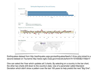
1. Earthquakes dataset from http://earthquake.usgs.gov/earthquakes/feed/v1.0/csv.php joined to a
second dataset on Tsunamis http://www.ngdc.noaa.gov/nndc/struts/form?t=101650&s=70&d=7
One can select the Year which updates all 3 charts. By selecting on a country in the bar chart,
the other two charts drill down to the country’s data. Use of a parameter called Standard
Deviation which didn't show a pattern over the last 100 years to help predict the next "Big One".
2. This chart demonstrates the grouped countries by Continent and the selected parameter measure.
This dashboard includes a second parameter called ‘Display Measure’. By selecting a Display Measure, both
barcharts update to reflect the measure chosen. The titles also update to explain what is being measured.
3.
4. The bubble chart groups by continents and shows the average water heights since
1900. The YouTube video is a url link to compelling stories on Tsunamis. A reference
line shows the average along time and reveals the extreme events of our time.