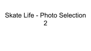
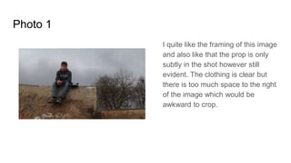
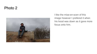
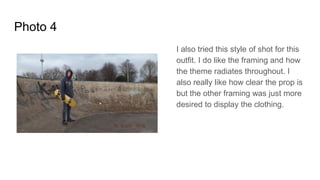
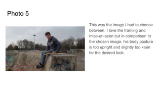
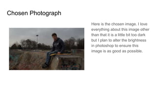
Skate Life - Photo Selection
2
Photo 1
I quite like the framing of this image
and also like that the prop is only
subtly in the shot however still
evident. The clothing is clear but
there is too much space to the right
of the image which would be
awkward to crop.
Photo 2
I like the mise-en-scen of this
image however I prefered it when
his hood was down as it gave more
focus onto him.
Photo 3
I love the framing of this image
and also the prop placement.
Unfortunately this image is
slightly out of focus on the model
and is mainly focused on his
shoes and the ramp, which was
unintentional.
Photo 4
I also tried this style of shot for this
outfit. I do like the framing and how
the theme radiates throughout. I
also really like how clear the prop is
but the other framing was just more
desired to display the clothing.
Photo 5
This was the image I had to choose
between. I love the framing and
mise-en-scen but in comparison to
the chosen image, his body posture
is too upright and slightly too keen
for the desired look.
Chosen Photograph
Here is the chosen image. I love
everything about this image other
than that it is a little bit too dark
but I plan to alter the brightness
in photoshop to ensure this
image is as good as possible.

Skate life photo selection 2

  • 1.
    Skate Life -Photo Selection 2
  • 2.
    Photo 1 I quitelike the framing of this image and also like that the prop is only subtly in the shot however still evident. The clothing is clear but there is too much space to the right of the image which would be awkward to crop.
  • 3.
    Photo 2 I likethe mise-en-scen of this image however I prefered it when his hood was down as it gave more focus onto him.
  • 4.
    Photo 3 I lovethe framing of this image and also the prop placement. Unfortunately this image is slightly out of focus on the model and is mainly focused on his shoes and the ramp, which was unintentional.
  • 5.
    Photo 4 I alsotried this style of shot for this outfit. I do like the framing and how the theme radiates throughout. I also really like how clear the prop is but the other framing was just more desired to display the clothing.
  • 6.
    Photo 5 This wasthe image I had to choose between. I love the framing and mise-en-scen but in comparison to the chosen image, his body posture is too upright and slightly too keen for the desired look.
  • 7.
    Chosen Photograph Here isthe chosen image. I love everything about this image other than that it is a little bit too dark but I plan to alter the brightness in photoshop to ensure this image is as good as possible.