
Recommended
More Related Content
What's hot
What's hot (20)
Similar to Signage study IIT GANDHINAGAR
Similar to Signage study IIT GANDHINAGAR (20)
Recently uploaded
Recently uploaded (20)
Signage study IIT GANDHINAGAR
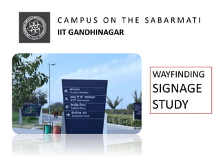
- 1. C A M P U S O N T H E S A B A R M AT I IIT GANDHINAGAR WAYFINDING SIGNAGE STUDY
- 2. GRIHA 5 STAR RATED CAMPUS
- 4. THE WAYFINDING STRATEGY The basic process of wayfinding involves four stages—orientation, route decision, route monitoring and destination recognition. The campus is a web of internal paths, perimeter and loop roads that connect the key facilities on campus. This interlinking pattern of roads creates many nodes that are the decisionmaking points in the wayfinding. THE CONCEPT The four concepts presented were: Path to Glory (Zero to Infinity); The Gujarat Connection; Rivers and Ravines; and Touch of Technology. Each concept was presented initially in terms of principles embodied in the design as well as the inferences and design approach for each.
- 5. KEY FEATURES OF THE SIGNS The consultants and the IITGN community specified characteristics important in the construction and maintenance of the signage. These included: • Weatherproof, long lasting materials • Modularity in structural support as well as the face of the sign • Easy and affordable to replace content • Uniformity in sign design language • Value engineering • Simple construction methods
- 7. ARRAY OF CONCEPTS Concept 1: Path of Glory (Zero to Infinity) The basic principles that embody this concept are listed here and illustrated in FIGURE. The Learning Path • Wayfinding system that inspires • Promotes interaction between faculty and students • Inculcates the spirit of IIT in students
- 8. The inferences and design approach, with associated words and ideas, are shown in Figures :
- 9. Design Approach for the Path of Glory
- 10. Some of the images and ideas from the inference and design approach were then used in the initial sketches for the signage for this concept . Below figures shows the initial visualisations of the signage for this concept.
- 11. Concept 2 : the gujarat connection ARRAY OF CONCEPTS Age-old glory of Gujarat • The effervescent architecture and the romance with colours. • Narrow shaded lanes and the surprise element of open community spaces. • Internal courtyards and terraces. • Common facilities and landscapes act as interaction points. Concept 2: Option 1 This option takes inspiration from the heritage architecture, colorful textiles and rich handicraft traditions in Gujarat state.
- 12. Inferences for The Gujarat Connection :
- 13. Design Approach for The Gujarat Connection :
- 14. Further development of the images and ideas from the inference and design approach resulted in the initial sketches for the signage for this concept, as illustrated in Figure 14. The initial visualisations of the signage for this concept are shown in Figure 15.
- 15. Concept 2: Option 2 The Gujarat Connection was modified in a second option, taking its inspiration from the very famous stepwells found in Ahmedabad as well as throughout Gujarat. Figures 16 and 17 show initial sketches and visualisations.
- 16. Concept 3: Rivers and Ravines The River and Ravines concept was the third concept explored by the consultants, taking inspiration from the curvy terrain that a river creates along its course. The basic principles exemplified by this concept are listed here and illustrated in Figure 18: Elixir of Human Civilisation : • River has always inspired creativity • The geography of the campus is defined by the Sabarmati • River and ravines are part of the Masterplan The curvilinear lines of a river were further developed into sign panel textures (Figure 21). Figure 22 shows the sign structures family that would result with this option.
- 18. Concept 4 : Touch of Technology The fourth concept explored by the consultants was one they entitled Touch of Technology. The basic principles that embody this concept are illustrated in Figure 23 and listed here: The Fuel to Modern Times • Catalyst to an easy and comfortable life • Keeping you up-to-date • Promotes Interaction between user and the sign Some of the initial sketches for this concept and the sign structure family associated with the concept are illustrated in Figures 26 and 27.
- 20. To assist in visualising how the signage might look, different types of signs from these two concepts were placed in photos of the campus :
- 21. After further discussion and meetings with the IITGN community, the Path of Glory was selected as the wayfinding concept to use for the new campus. The concept revolves around the hard path taken up by IIT students to achieve their goals in life. IIT is all about hard work, dedication and innovation. The mjourney at IITGN starts with the zero and takes one to infinity. The Path to Glory concept can be thought of as a derivative of the journey that each student undergoes in the process of learning. As mentioned earlier, the inferences that speak about the concept are – Journey, Grand, Legacy, Leadership and inspiring. Figure 34 shows some of the initial sketches developed for this concept, while Figure 35 shows how some of these sketch shapes are further developed in the design. Figure 36 then shows how the concept evolves into signs.
- 24. The evolution of the signage forms against the skyline is based on the idea of converging to a point and representing the perspective seen every day. To complement the exposed infrastructure, concrete is used as an accent material throughout the signage. Use of black as a base/primary colour is essential to ensure readability in the bright sunny environment without being harsh on the eyes of the onlookers. A sharp form in the signage accentuates the idea of convergence and perspective throughout the entire Skyline. DESIGN APPLICATION
- 25. Scaled-down paper models were made before finalising the form to test readability and the overall feel that the signs create in a three dimensional space.
- 26. All the icons used in the signage were developed keeping in mind the theme and using similar converging lines with a sharp overall form.
- 27. The consultant and the IITGN community specified characteristics important in the construction and maintenance of the signage. • Weatherproof with long lasting materials for the harsh outdoor environment • Modularity in structural support as well as the face of the sign • Easy and affordable to replace content • Uniformity in sign design language • Value engineering • Simple construction methods
- 28. MATERIALS Exposed concrete and sheet aluminium are the two main materials used in the entire range of signs. Exposed concrete represents the harsh ambience and complements the exposed infrastructure of the campus. Concrete in its raw state is resistant to abrasion and gives a timeless look aesthetically. Sheet aluminium, the other material on the signs, is easy to bend and manufacture and also is corrosionresistant, thus making it an appropriate choice of material.
- 29. CONSTRUCTION TECHNIQUES All signs have been designed in a way that they can be constructed off-site thus avoiding any disturbances due to construction activities on campus. Aluminium panels have been fixed on the concrete structures using washers and are completely modular, making it easy to remove, change and maintain, if needed. Binding three individual concrete structures together with an aluminium sheet while making the structure seamless was a major challenge that was achieved with the use of tie members passing through the structure. In addition, the unusal shapes of the signs presented some challenges for the sign makers who are not used to working in concrete. Samples were taken from several different signage companies, and even after one was selected several iterations were required before the signs met IITGN standards of quality.
- 30. COLOUR CODING Black is the primary colour used in all the signage placed outside to neutralise the bright sunny ambience, making it easily readable and soothing to look at throughout the day. Colour coding of signage inside various building blocks is directly inspired from the accent colours of the buildings and has been changed accordingly in different blocks
- 31. MESSAGING For the entire range of signage, a messaging hierarchy has been followed. Directional messages are of key importance. The design and placement of icons and text for directional messages is done in a way that makes it easy to understand and guides the user appropriately. Arrows indicating left direction are placed on the left side of the text and similarly arrows indicating right direction are placed towards the right of the text, reducing confusion while reading the entire board.
- 32. A class of signs has been developed by IITGN to highlight some of the unique features on the campus. These are informational signs that explain a technology being used on campus (confined masonry or solar panels), or that explain a feature, such as the Jal Mandaps.
- 34. HOUSING AND HOSTEL SIGNAGE SYSTEM Initially, preliminary signage design for hostels and housing areas was submitted by the individual architectural firms who designed the hostels and housing, respectively. However, after the academic area signage and the overall campus signage was executed, it was felt that it would be desirable to follow a uniform signage system through the campus and hence it was collectively decided to adopt the Path of Glory signage system in the housing and hostels as well. However, Tata Elxsi in discussion with IITGN proposed a different colour scheme for the signages in these residential areas to help set them apart from the academic area and the rest for the campus signages. Different colour schemes were chosen based on the existing building colour schemes in the hostels and housing. There were also a few items that required fresh consideration in the housing and hostel signage systems. Such items as signs for room numbers in hostels and housing and their placement, signages for housing parking, and the need for a building directory had to be considered. Another interesting aspect in the Housing area door signages were the personalisations that were possible. The Institute procured the signage for the Housing area and the faculty offices, and then allowed for personalisation. The residents were encouraged to choose personalised text on their front door name plate and as a result a number of residents chose to include names of other family members including children in their front door signage. Other residents chose to list their names in Hindi.
- 38. This is perhaps the first time that such a project regarding wayfinding signage has been taken up by an IIT, with a focus on developing a specific design that uniquely represents the campus. The entire signage system resulted from multiple design discussions and debates among the consultant and the IITGN community. The project was undertaken in various stages, starting with the Academic Complex and then moving on to other areas of the campus, including housing and the hostels. At each stage the focus was to create synergy among the signage used in the different sections of the campus (See examples on following pages). This was achieved in the overall form, play of colour, and other specific details in the signs. The use of concrete in the campus signage is the first of its kind at such a scale in any signage system, and represented a challenge in the construction. It is hoped that describing this level of detail in the decision-making process may prove useful to other universities and institutions. CONCLUDING REMARKS