2. Hello.
Chris Clarke
@mr_mr
UX and product on guardian football
Sport fanatic
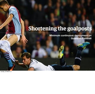
Sunday, 23 March 14
Hello. My name’s Chris, I’m a UX architect at the Guardian working on Football. I’m part of
what’s called the Next Gen Web team. We’re looking at the next iteration of the Guardian
from a responsive web design POV.
4. Sunday, 23 March 14
So anyone can access what we’re working on simply by clicking on the blue button on the current .com site.
We’ve built this from the ground up, starting mobile first and expanding up to desktop.
5. Sunday, 23 March 14
TA DA. The plan is this will switched over around May-June.
6. Sunday, 23 March 14
And I work on all things football from this side of the site.
7. Look at an
existing page
Highlight what needs to
be changed in build
Build it
<..>
<..>
Sunday, 23 March 14
We had a lot existing pages (fixtures, tables, match pages) that were quickly built as filler
during the initial mobile build last year, we re-worked all of them, sketching, prototyping and
designing all updates. Everything seemed to be going swimmingly.
8. Workshops Diary study Dive into data
Sunday, 23 March 14
We held workshops with the editors, ran diary studies and sieved through mountains of data,
all to get better ideas of what worked, where our users were going, how they were getting
there, and how to keep them there.
9. 1
We weren’t using
our API’s as much
as we should
2
We aren’t
perceived well at
being a ‘live’ site
3
We needed to be
doing better on
mobile
An Intelligent
use of data
Proper
scores, more
immediate
information
Fully embrace
RWD
Sunday, 23 March 14
1. We pay a lot for our 3rd party API, and it doesn’t show. As a result our pages weren’t
showing simple information. We weren’t telling good enough stories from them either, and
we saw good opportunity to set ourselves apart from our competitors.
2. We don’t shout as much as we’d like about our live content, many users weren’t even
aware of it. Users would look for specific information first, and we weren’t showing it. We
were also slow. We needed to change.
3. From our studies users were looking to us for our analysis, then having to venture to other
sites to get the rest of their info (stats, tables) We had these, we just didn’t shout about them
enough on mobile
10. Sunday, 23 March 14
We spent 2 weeks sketching up all the ideas we had from those workshops, 1 week rough
where every idea was possible and then a 2nd refining those ideas, throwing out the
unfeasible ones.
11. Sunday, 23 March 14
I then create a lot of html prototypes, to prove our interaction ideas are valid, using a
framework of codekit and SASS I can manage to produce a lot in a very short space of time,
and depending on the quality we even put it front of users.
12. Sunday, 23 March 14
Our designer then designs the hell out of it.
13. Sunday, 23 March 14
And we tested our match pages and football landing pages in our lab for a day or 2 depending on
outcomes.
14. However...
Thanks! @funnyjunk.com
Sunday, 23 March 14
The honeymoon period was soon over, once we sat and really looked at what had been built
previously, things were going to take longer than we thought. This was all in light of only
having February and March to do all this.
15. how many weeks
to build each bit?
Sunday, 23 March 14
Stakeholders were happy, we had goals from our users.
3 weeks passed and not a huge amount complete. It was taking us too long to create items, we
needed to change how we were delivering!
17. The initial plan Component plan Minimum deployment plan
0 2 0 2 0 2 0 2
Sunday, 23 March 14
We took the initial plan we had, and broke it down into components, a table, a fixture. Then we removed any
extras that would hinder us from releasing extremely quickly. There were then clear goals for us to achieve.
18. 1 to 2 weeks
Badges were an unknown
Sunday, 23 March 14
Example: Designed parts had to take a hit, our API was patchy with badges and would take us
too long to figure out. There was big unknown and it would hinder us from releasing, so we
dropped it. We did put it in, but at that point the live score was visible and that’s whats
important.
19. Sunday, 23 March 14
And just this past week we’ve updated with the badges. We had engagement before we added
badges, and less after. So it goes to show that sometimes the design isn’t always the most
important part. But they do look nice :)
20. Deployment 1 Deployment 2 Deployment 3
Sunday, 23 March 14
Example 2: We had a stats page already, we stuck in team colors and one small tweak, and
we have a goal for the end. So we’re halfway there.
21. How did we get like this?
Thanks! @football-trolling.tumblr.com
Sunday, 23 March 14
So how come we were so easily able to change how we worked?
22. 1
We were a
small team
2
We cut our
chunks into
smaller
chunks
3
We were honest
about what we
could achieve
Sunday, 23 March 14
We were a small team (5), working quickly improved everyone’s moods and made us look truly agile to the
teams around us. We were able to release a lot because we focussed on small problems, and the solved those
(maybe part of a bigger problem, doesn’t matter) We looked at what we could do with the man-power we had,
as soon as we did that, we were able to release more.
23. So what’s next?
Thanks! @football-trolling.tumblr.com
Sunday, 23 March 14
We’re looking deeper into mobile, a majority portion of our traffic is on mobile generally and
increases at the weekend. We want to make sure the experience is equal to that of mobile but
not overwhelming.
24. Mobile.
Sunday, 23 March 14
We’re putting a lot of effort into improving our match pages, we have a lot of rich information
that isn’t surfaced and we want to change that. We wanted our match pages on mobile to be
very scannable. We want to increase engagment and return visits, we think these changes are
the key.
25. User testing.
Page Landing Information scale
General info
Score, who scored, any
bookings, red cards
Specific info
Written blog, specific
to their team
Supporting info
match stats, live scores
20
Sunday, 23 March 14
From our testing we learned how users want to scan our live blog pages, how and when they
want information and how often.
26. Live blog truncation.
2020
Sunday, 23 March 14
From our testing we learned how users want to scan our live blog pages, how and when they
want information and how often. So we’re looking at truncating our live blogs to see how that
changes user’s engagement.
27. live blog
User
User interaction.
3pm 4:30pm
onwards
Sunday, 23 March 14
Users weren’t watching live blogs constantly, they would drop in and out over time, so would
only want to see parts of a live blog, but get an overall sense of how a match was going.
28. Editorial stat tool
Sunday, 23 March 14
We’re creating a tool for the editors to drop elements into their match reports and live blogs
as they’re writing. The editors have such incredible knowledge these embeds needed good
context it would be foolish of us to set these automatically. Interestingly when we tested
these in our lab, users thought the match reports were shorter and preferred having large
blocks of text broken up.
29. Player cards Decent match
previews
Moar stats
Sunday, 23 March 14
We’ll be extending this to player cards, match previews and match stats.
30. Sunday, 23 March 14
Personlisation - Every user we interviewed wanted their team news first (what ever that was)
then all info from teams near them in the league then the league news itself. So there was a
clear scale for us to work to. We’re currently experimenting with what personlisation will
mean on Guardian football.
31. I can see the carrot at
the end of the tunnel.
Stuart Pierce
Thanks! @liquid football
Sunday, 23 March 14
And I’ll leave you with this. It’s the most groundbreaking stuff in the world, but it’s important
to a lot of people and we’re doing the best we can. We can see a niche in mobile and we’re
excited for everyone to see all the work we’ve done up until now.