Risk Management KPI Dashboard Showing Cost Of Control And Risk Score
•
0 likes•12 views

"You can download this product from SlideTeam.net" Presenting this set of slides with name Risk Management Kpi Dashboard Showing Cost Of Control And Risk Score. This is a five stage process. The stages in this process are Risk Management, Risk Assessment, Project Risk. https://bit.ly/3qRuWWB
Report
Share
Report
Share
Download to read offline

Recommended
Recommended
More Related Content
Similar to Risk Management KPI Dashboard Showing Cost Of Control And Risk Score
Similar to Risk Management KPI Dashboard Showing Cost Of Control And Risk Score (20)
Information Technology KPI Dashboard Showing Incident Target Summary Trend
Information Technology KPI Dashboard Showing Incident Target Summary Trend
Risk Management KPI Dashboard Showing Risk Heat Map And Control Rate By Period
Risk Management KPI Dashboard Showing Risk Heat Map And Control Rate By Period
Manufacturing KPI Dashboard Showing Production Rate And Lost Units
Manufacturing KPI Dashboard Showing Production Rate And Lost Units
KPI Dashboard Showing Employee Churn Key Metrics And Open Positions
KPI Dashboard Showing Employee Churn Key Metrics And Open Positions
Call Center KPI Dashboard Showing Total Calls Average Answer Speed Abandon Rate
Call Center KPI Dashboard Showing Total Calls Average Answer Speed Abandon Rate
Project Name Status Schedule And Management Dashboard
Project Name Status Schedule And Management Dashboard
Marketing KPI Dashboard Showing Lead Funnel Traffic Sources Key Metrics
Marketing KPI Dashboard Showing Lead Funnel Traffic Sources Key Metrics
Recruitment Funnel And Application Source Dashboard
Recruitment Funnel And Application Source Dashboard
Project Dashboard With KPI Status Risks Project Area Issues
Project Dashboard With KPI Status Risks Project Area Issues
Quality Control KPI Dashboard Showing Defects And Downtime
Quality Control KPI Dashboard Showing Defects And Downtime
business_kpi_dashboard_showing_revenue_and_customer_lifetime_value_wd.pptx
business_kpi_dashboard_showing_revenue_and_customer_lifetime_value_wd.pptx
More from SlideTeam
More from SlideTeam (20)
Customer Support And Services Guide Powerpoint Presentation Slides
Customer Support And Services Guide Powerpoint Presentation Slides
Word Of Mouth WOM Marketing Strategies To Build Brand Awareness Powerpoint Pr...
Word Of Mouth WOM Marketing Strategies To Build Brand Awareness Powerpoint Pr...
Strategic Staff Engagement Action Plan Powerpoint Presentation Slides
Strategic Staff Engagement Action Plan Powerpoint Presentation Slides
Traditional Marketing Channel Analysis Powerpoint Presentation Slides Mkt Cd
Traditional Marketing Channel Analysis Powerpoint Presentation Slides Mkt Cd
Integrating Asset Tracking System To Enhance Operational Effectiveness Comple...
Integrating Asset Tracking System To Enhance Operational Effectiveness Comple...
Designing And Implementing Brand Leadership Strategy Powerpoint Presentation ...
Designing And Implementing Brand Leadership Strategy Powerpoint Presentation ...
How Amazon Generates Revenues Across Globe Powerpoint Presentation Slides Str...
How Amazon Generates Revenues Across Globe Powerpoint Presentation Slides Str...
Guide For Effective Event Marketing Powerpoint Presentation Slides Mkt Cd
Guide For Effective Event Marketing Powerpoint Presentation Slides Mkt Cd
Managing Business Customers Technology Powerpoint Presentation Slides
Managing Business Customers Technology Powerpoint Presentation Slides
Unearthing Apples Billion Dollar Branding Secret Powerpoint Presentation Slid...
Unearthing Apples Billion Dollar Branding Secret Powerpoint Presentation Slid...
Developing Flexible Working Practices To Improve Employee Engagement Powerpoi...
Developing Flexible Working Practices To Improve Employee Engagement Powerpoi...
Product Corporate And Umbrella Branding Powerpoint Presentation Slides Brandi...
Product Corporate And Umbrella Branding Powerpoint Presentation Slides Brandi...
Communication Channels And Strategies For Shareholder Engagement Powerpoint P...
Communication Channels And Strategies For Shareholder Engagement Powerpoint P...
Responsible Tech Playbook To Leverage Business Ethics Powerpoint Presentation...
Responsible Tech Playbook To Leverage Business Ethics Powerpoint Presentation...
Generating Leads Through Targeted Digital Marketing Campaign Powerpoint Prese...
Generating Leads Through Targeted Digital Marketing Campaign Powerpoint Prese...
Boosting Profits With New And Effective Sales Strategic Plan Powerpoint Prese...
Boosting Profits With New And Effective Sales Strategic Plan Powerpoint Prese...
Methods To Implement Traditional Marketing Powerpoint Presentation Slides Mkt Cd
Methods To Implement Traditional Marketing Powerpoint Presentation Slides Mkt Cd
Comprehensive Guide To Sports Marketing Strategy Powerpoint Presentation Slid...
Comprehensive Guide To Sports Marketing Strategy Powerpoint Presentation Slid...
Global Shift Towards Flexible Working Powerpoint Presentation Slides
Global Shift Towards Flexible Working Powerpoint Presentation Slides
Recently uploaded
Booking open Available Pune Call Girls Nanded City 6297143586 Call Hot Indian Girls Waiting For You To Fuck
Booking Contact Details
WhatsApp Chat: +91-6297143586
pune Escort Service includes providing maximum physical satisfaction to their clients as well as engaging conversation that keeps your time enjoyable and entertaining. Plus they look fabulously elegant; making an impressionable.
Independent Escorts pune understands the value of confidentiality and discretion - they will go the extra mile to meet your needs. Simply contact them via text messaging or through their online profiles; they'd be more than delighted to accommodate any request or arrange a romantic date or fun-filled night together.
We provide -
01-may-2024(v.n)
Booking open Available Pune Call Girls Nanded City 6297143586 Call Hot India...
Booking open Available Pune Call Girls Nanded City 6297143586 Call Hot India...Call Girls in Nagpur High Profile
Recently uploaded (20)
call girls in Vasundhra (Ghaziabad) 🔝 >༒8448380779 🔝 genuine Escort Service 🔝...
call girls in Vasundhra (Ghaziabad) 🔝 >༒8448380779 🔝 genuine Escort Service 🔝...
UI:UX Design and Empowerment Strategies for Underprivileged Transgender Indiv...
UI:UX Design and Empowerment Strategies for Underprivileged Transgender Indiv...
RT Nagar Call Girls Service: 🍓 7737669865 🍓 High Profile Model Escorts | Bang...
RT Nagar Call Girls Service: 🍓 7737669865 🍓 High Profile Model Escorts | Bang...
Call Girls Jalgaon Just Call 8617370543Top Class Call Girl Service Available
Call Girls Jalgaon Just Call 8617370543Top Class Call Girl Service Available
Booking open Available Pune Call Girls Nanded City 6297143586 Call Hot India...
Booking open Available Pune Call Girls Nanded City 6297143586 Call Hot India...
Escorts Service Basapura ☎ 7737669865☎ Book Your One night Stand (Bangalore)
Escorts Service Basapura ☎ 7737669865☎ Book Your One night Stand (Bangalore)
Abortion pill for sale in Muscat (+918761049707)) Get Cytotec Cash on deliver...
Abortion pill for sale in Muscat (+918761049707)) Get Cytotec Cash on deliver...
Call Girls Basavanagudi Just Call 👗 7737669865 👗 Top Class Call Girl Service ...
Call Girls Basavanagudi Just Call 👗 7737669865 👗 Top Class Call Girl Service ...
FULL ENJOY Call Girls In Mahipalpur Delhi Contact Us 8377877756
FULL ENJOY Call Girls In Mahipalpur Delhi Contact Us 8377877756
➥🔝 7737669865 🔝▻ Bokaro Call-girls in Women Seeking Men 🔝Bokaro🔝 Escorts S...
➥🔝 7737669865 🔝▻ Bokaro Call-girls in Women Seeking Men 🔝Bokaro🔝 Escorts S...
👉 Call Girls Service Amritsar 👉📞 6367187148 👉📞 Just📲 Call Ruhi Call Girl Agen...
👉 Call Girls Service Amritsar 👉📞 6367187148 👉📞 Just📲 Call Ruhi Call Girl Agen...
Escorts Service Nagavara ☎ 7737669865☎ Book Your One night Stand (Bangalore)
Escorts Service Nagavara ☎ 7737669865☎ Book Your One night Stand (Bangalore)
➥🔝 7737669865 🔝▻ jhansi Call-girls in Women Seeking Men 🔝jhansi🔝 Escorts S...
➥🔝 7737669865 🔝▻ jhansi Call-girls in Women Seeking Men 🔝jhansi🔝 Escorts S...
Anamika Escorts Service Darbhanga ❣️ 7014168258 ❣️ High Cost Unlimited Hard ...
Anamika Escorts Service Darbhanga ❣️ 7014168258 ❣️ High Cost Unlimited Hard ...
➥🔝 7737669865 🔝▻ dehradun Call-girls in Women Seeking Men 🔝dehradun🔝 Escor...
➥🔝 7737669865 🔝▻ dehradun Call-girls in Women Seeking Men 🔝dehradun🔝 Escor...
💫✅jodhpur 24×7 BEST GENUINE PERSON LOW PRICE CALL GIRL SERVICE FULL SATISFACT...
💫✅jodhpur 24×7 BEST GENUINE PERSON LOW PRICE CALL GIRL SERVICE FULL SATISFACT...
Risk Management KPI Dashboard Showing Cost Of Control And Risk Score
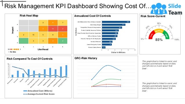
- 1. Risk Heat Map 6 3 5 7 3 3 10 3 2 2 15 5 8 2 3 3 3 4 2 2 1 4 6 9 Risk Management KPI Dashboard Showing Cost Of… Impact Likelihood No Data 13 1 This graph/chart is linked to excel, and changes automatically based on data. Just left click on it and select “Edit Data”. This graph/chart is linked to excel, and changes automatically based on data. Just left click on it and select “Edit Data”. GRC-Risk History 0 1 2 3 4 5 6 7 8 9 10 Risk Compared To Cost Of Controls Annualized Cost (Milions) Average Current Risk Score 1.1 3 3.2 4.2 4.7 4.9 5.1 6.1 7.1 8.5 0 2 4 6 8 10 Product Safety Review Create Emergency Funds Increase Reserves Security Training For All Employees GPS on Delivery Trucks Cloud Provider Data Protection Specialists Product Liability Insurance Policies Competitive Financial Compensation Advertising Budget Anti-Malware/Anti-Virus Software Installed Dollar In Millions In Dollars Annualized Cost Of Controls Risk Score-Current 0% 50% 100% 85%
- 2. Instructions To Edit This Slide This slide has been made in PowerPoint using basic PowerPoint shapes, and all graphics are 100% editable in PowerPoint. You can change color, size and orientation of any element to your liking, and add/edit any piece of text anywhere.
- 3. All images are 100% editable in PowerPoint Change color, size and orientation of any icon to your liking”
- 4. 1. Select the Graph and right click -> Select "Edit Data" 2. An excel matrix will automatically show up 3. Enter the values based on your requirements and hit enter 4. The Graph/Chart shape will automatically adjust according to your data, and anytime you can go and change the value again Edit Excel-linked Chart This is a Data Driven Chart/Graph and the shape automatically adjusts according to your data 1 2 3
- 5. Edit Color 1. Select the shape to change the color and Right click the object( click any object which you want to change color) 2. Choose Format Data Series in the dialog box. 3. Choose “Fill” in the Format Shape box then “Solid” or “Gradient” depending on the appearance of the object. Change colour as shown in the picture. 1 2 3
- 6. Select From Thousands Of Editable Icons On Every Topic These icons are available at the Icons section on www.slideteam.net