Risk Management Kpi Dashboard Showing Open Issues And Control Performance
•
1 like•1,376 views

Presenting this set of slides with name Risk Management Kpi Dashboard Showing Open Issues And Control Performance. This is a five stage process. The stages in this process are Risk Management, Risk Assessment, Project Risk. https://bit.ly/3zcAkpR

Recommended
Recommended
More Related Content
What's hot
What's hot (20)
Similar to Risk Management Kpi Dashboard Showing Open Issues And Control Performance
Similar to Risk Management Kpi Dashboard Showing Open Issues And Control Performance (20)
More from SlideTeam
More from SlideTeam (20)
Recently uploaded
Recently uploaded (20)
Risk Management Kpi Dashboard Showing Open Issues And Control Performance
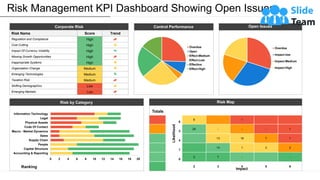
- 1. Corporate Risk Risk Name Score Trend Regulation and Compliance High Cost Cutting High Impact Of Currency Volatility High Missing Growth Opportunities High Inappropriate Systems High Organization Change Medium Emerging Technologies Medium Taxation Risk Medium Shifting Demographics Low Emerging Markets Low Totals 6 8 - 1 - 3 24 - - - 1 4 13 16 ? 1 1 13 1 3 2 0 3 7 - - 2 3 4 5 6 Risk Management KPI Dashboard Showing Open Issues… This graph/chart is linked to excel, and changes automatically based on data. Just left click on it and select “Edit Data”. Impact Likelihood Overdue Open Effect-Medium Effect-Low Effective Effect-High Control Performance Overdue Impact-low Impact-Medium Impact-High Open Issues Risk Map 0 2 4 6 8 10 12 14 16 18 20 Accounting & Reporting Capital Structure People Supply Chain Sales Macro - Market Dynamics Code Of Contact Physical Assets Legal Information Technology Ranking Risk by Category
- 2. Instructions To Edit This Slide This slide has been made in PowerPoint using basic PowerPoint shapes, and all graphics are 100% editable in PowerPoint. You can change color, size and orientation of any element to your liking, and add/edit any piece of text anywhere.
- 3. All images are 100% editable in PowerPoint Change color, size and orientation of any icon to your liking”
- 4. 1. Select the Graph and right click -> Select "Edit Data" 2. An excel matrix will automatically show up 3. Enter the values based on your requirements and hit enter 4. The Graph/Chart shape will automatically adjust according to your data, and anytime you can go and change the value again Edit Excel-linked Chart This is a Data Driven Chart/Graph and the shape automatically adjusts according to your data 1 2 3
- 5. Edit Color 1. Select the shape to change the color and Right click the object( click any object which you want to change color) 2. Choose Format Data Series in the dialog box. 3. Choose “Fill” in the Format Shape box then “Solid” or “Gradient” depending on the appearance of the object. Change colour as shown in the picture. 1 2 3
- 6. Select From Thousands Of Editable Icons On Every Topic These icons are available at the Icons section on www.slideteam.net