
Recommended
Recommended
More Related Content
Similar to Revenue of Indian Companies
Similar to Revenue of Indian Companies (18)
More from lenorajohnson
More from lenorajohnson (12)
Recently uploaded
Recently uploaded (20)
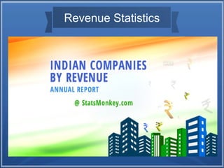
Revenue of Indian Companies
- 2. New Graphical Charts We have created a new category in our website to get Revenue Statistics of all the Indian Companies... Here you can see five charts where in each details the revenue, growth, profit margin, profit and loss history, expenditure, net profit etc., Here let me show the annual revenue of Asian Paints Limited as an example.
- 3. Chart 1 Annual Report & Revenue Growth of a Company : ● First chart shows the Annual Report and Revenue Growth of a Company in a multiple pie chart. Every year revenue, expenditure, tax and depreciation are shown as a slide show in graphical representation. Click on a specific year to check the values of different year.
- 4. Chart 1
- 5. Chart 2 Earnings, Revenue, Expenditure Per Year : ● Second chart displays the revenue, expenditure , other income, tax and depreciation in a bar chart. Every year the values of the company changes which is easy to grab the difference in report. Positive values are shown in blue and negative values are shown in red.
- 6. Chart 2
- 7. Chart 3 Profit Margin History : ● Third chart graphical explains the profin margin history of the company. Netprofit, revenue and expenditure is shown in various colors to point out the difference in values using line chart. Place the cursor on the point in line chart to get the exact value of the variable in that particular year.
- 8. Chart 3
- 9. Chart 4 Profit and Loss, Revenue Report in Table : ● Fourth is the table in which the revenue, expenditure and net profit is shown in table format, The values are displayed clearly for every year. Here the profit are shown in green where as the loss values are shown in red.
- 10. Chart 4
- 11. Chart 5 Revenue Per Month, Day, Hour, Minute, Second : ● The fifth chart is also a table with the graphical representation of bar chart in the background. It is easy to grab the revenue report of a company for every month, day, hour, minute and even second. Get each values for each year.
- 12. Chart 5
- 13. Thank You !! I hope you will find it useful for any research analysis or surveys on Growth of Indian Companies. Source - StatsMonkey