SlideShare a Scribd company logo
1 of 14
Download to read offline
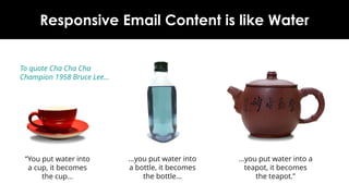
Why Responsive Email Content is like Water
“You put water into a
cup, it becomes the
cup…
…you put water into a
teapot, it becomes the
teapot.”
…you put water into a
bottle, it becomes the
bottle…
To quote 1958 Cha Cha
Champion Bruce Lee…
www.newzapp.com
Why Build Responsively?
The days of designing just for desktop
clients are past
Similarly we cannot just design for
mobile devices
The typical email audience opens
them on a mixture of the two
Responsive email building allows
emails to change to a layout and size
that suits the email reader
Main types of Responsive Email Structure
Fluid Adaptive Hybrid
Pros Cons
Fluid
 Simplest to build and proof
 No CSS needed in <head>
 Works cross platform
 No restriction on layout width
 Not very controllable
 Not the best for wider screens
Adaptive
 CSS and @media queries in <head> mean
greater control over layout
 Wider and narrower screens catered for
 More complicated to build and proof
 Not suitable for Gmail App on Mobile (which
ignores CSS and @media queries)
Hybrid
 Doesn’t rely on CSS or @media queries
 Can still create layouts to suit wider and
narrower screens…
 ...including Gmail App on mobile
 A bit more complicated to build and proof
 Depends on MSO code for Outlook
 Left and right aligned tables can be flaky in
some desktop readers
Which Method Should We Use?
Fluid
One of the earliest forms of
Responsive techniques
All table widths are set as
percentages
This works best for very simple
layouts
No CSS is required in <head>
<table> and image elements
expand to fit the screen’s width
Fluid
Expansion works great for
narrower screens…
Images set to scale with the email
can become fuzzy and pixelated
…but on wider screens this can
lead to layout problems
Elements can be stretched too
wide or move too far apart
Adaptive
The next development of
Responsive building
Fixed-width <table> elements with
multiple columns ensures a stable
layout for wider screens
Works well on desktop readers like
Outlook , Gmail and Mac Mail
This caters for wider and narrower
screens by targeting them
separately
Adaptive
Fixed-width <table> elements given
Fluid-style percentage-widths on
narrower screens
CSS and Media Queries in <head> of
email will target narrower screens
<table> column cells become CSS
block elements which allows them
to ‘stack’ over each other
Any CSS in the <head> of an email is
ignored by most desktop clients
Adaptive
Unfortunately, the Gmail App on
mobile devices ignores CSS and
Media Queries in <head>
A broken version of the desktop
layout is shown instead
Hybrid
Uses Fluid layout for narrow
screens, not CSS or Media Queries
in the <head>
Developed to address the issues in
Gmail App on mobile
‘Floating’ single-cell <table>s with
left and right alignment allow
‘stacking’ on narrower screens
Hybrid
On wider screens, the left and right
aligned <table>s ‘unstack’ and sit in
a single row
Inline CSS style ‘max-width’ on
<table> stops expansion at a set
point
Works well for most mobile and
desktop devices…
Hybrid
…except the Outlook email reader,
which ignores the ‘max-width’
inline style
MSO-specific code is needed to
create ‘ghost’ multi-column <table>s
with fixed widths to prevent over-
expansion
These ‘ghost’ <table>s are only
active in the Outlook email client –
all other email readers ignore them
Remember – Content Needs Room…
www.newzapp.com

More Related Content

Similar to Why Responsive Email Content is like Water

33 "Must-Do" Tips to Improve HTML Email Design
33 "Must-Do" Tips to Improve HTML Email Design33 "Must-Do" Tips to Improve HTML Email Design
33 "Must-Do" Tips to Improve HTML Email DesignPinpointe On-Demand
 
Few techniques of responsive web design
Few techniques of responsive web designFew techniques of responsive web design
Few techniques of responsive web designFigola David
 
Adapting to a Responsive Design at Untangle the Web on 29th July 2013
Adapting to a Responsive Design at Untangle the Web on 29th July 2013Adapting to a Responsive Design at Untangle the Web on 29th July 2013
Adapting to a Responsive Design at Untangle the Web on 29th July 2013Matt Gibson
 
The Growing Adoption of Mobile-Friendly Email Design #Infographic
The Growing Adoption of Mobile-Friendly Email Design #InfographicThe Growing Adoption of Mobile-Friendly Email Design #Infographic
The Growing Adoption of Mobile-Friendly Email Design #InfographicSalesforce Marketing Cloud
 
Email for Mobile Devices | Stream:20 Best Practice
Email for Mobile Devices | Stream:20 Best PracticeEmail for Mobile Devices | Stream:20 Best Practice
Email for Mobile Devices | Stream:20 Best PracticeStream20consultants
 
Responsive Design Webinar
Responsive Design WebinarResponsive Design Webinar
Responsive Design WebinarInformz
 
Samples - web design, blog posts, and infographics
Samples - web design, blog posts, and infographicsSamples - web design, blog posts, and infographics
Samples - web design, blog posts, and infographicsErik Boman
 
Responsive Web Design (April 18th, Los Angeles)
Responsive Web Design (April 18th, Los Angeles)Responsive Web Design (April 18th, Los Angeles)
Responsive Web Design (April 18th, Los Angeles)Thinkful
 
Optimizing HTML Email for Mobile | WDYK
Optimizing HTML Email for Mobile | WDYKOptimizing HTML Email for Mobile | WDYK
Optimizing HTML Email for Mobile | WDYKRos Hodgekiss
 
Pure360 Creative Guidelines for Email Marketing
Pure360 Creative Guidelines for Email MarketingPure360 Creative Guidelines for Email Marketing
Pure360 Creative Guidelines for Email MarketingPure360
 
Responsive design lunch and learn
Responsive design lunch and learnResponsive design lunch and learn
Responsive design lunch and learnRicardo Queiroz
 
Thriving in the Chaotic World of Email Design
Thriving in the Chaotic World of Email DesignThriving in the Chaotic World of Email Design
Thriving in the Chaotic World of Email DesignVivastream
 
CSS Tableless Vs Table Layouts
CSS Tableless Vs Table LayoutsCSS Tableless Vs Table Layouts
CSS Tableless Vs Table Layoutskrishsadasivam
 
Responsive Design & SharePoint - Is it right for you?
Responsive Design & SharePoint - Is it right for you?Responsive Design & SharePoint - Is it right for you?
Responsive Design & SharePoint - Is it right for you?D'arce Hess
 
Windows SharePoint Master Class: Tutorials
Windows SharePoint Master Class: TutorialsWindows SharePoint Master Class: Tutorials
Windows SharePoint Master Class: TutorialsRobert Crane
 
Intro To Twitter Bootstrap
Intro To Twitter BootstrapIntro To Twitter Bootstrap
Intro To Twitter BootstrapAhmed Haque
 

Similar to Why Responsive Email Content is like Water (20)

33 "Must-Do" Tips to Improve HTML Email Design
33 "Must-Do" Tips to Improve HTML Email Design33 "Must-Do" Tips to Improve HTML Email Design
33 "Must-Do" Tips to Improve HTML Email Design
 
Few techniques of responsive web design
Few techniques of responsive web designFew techniques of responsive web design
Few techniques of responsive web design
 
Aaug sample slides
Aaug sample slidesAaug sample slides
Aaug sample slides
 
Adapting to a Responsive Design at Untangle the Web on 29th July 2013
Adapting to a Responsive Design at Untangle the Web on 29th July 2013Adapting to a Responsive Design at Untangle the Web on 29th July 2013
Adapting to a Responsive Design at Untangle the Web on 29th July 2013
 
Creative Guidelines
Creative GuidelinesCreative Guidelines
Creative Guidelines
 
The Growing Adoption of Mobile-Friendly Email Design #Infographic
The Growing Adoption of Mobile-Friendly Email Design #InfographicThe Growing Adoption of Mobile-Friendly Email Design #Infographic
The Growing Adoption of Mobile-Friendly Email Design #Infographic
 
Email for Mobile Devices | Stream:20 Best Practice
Email for Mobile Devices | Stream:20 Best PracticeEmail for Mobile Devices | Stream:20 Best Practice
Email for Mobile Devices | Stream:20 Best Practice
 
Responsive Design Webinar
Responsive Design WebinarResponsive Design Webinar
Responsive Design Webinar
 
Samples - web design, blog posts, and infographics
Samples - web design, blog posts, and infographicsSamples - web design, blog posts, and infographics
Samples - web design, blog posts, and infographics
 
Responsive Web Design (April 18th, Los Angeles)
Responsive Web Design (April 18th, Los Angeles)Responsive Web Design (April 18th, Los Angeles)
Responsive Web Design (April 18th, Los Angeles)
 
Optimizing HTML Email for Mobile | WDYK
Optimizing HTML Email for Mobile | WDYKOptimizing HTML Email for Mobile | WDYK
Optimizing HTML Email for Mobile | WDYK
 
Pure360 Creative Guidelines for Email Marketing
Pure360 Creative Guidelines for Email MarketingPure360 Creative Guidelines for Email Marketing
Pure360 Creative Guidelines for Email Marketing
 
Responsive design lunch and learn
Responsive design lunch and learnResponsive design lunch and learn
Responsive design lunch and learn
 
Thriving in the Chaotic World of Email Design
Thriving in the Chaotic World of Email DesignThriving in the Chaotic World of Email Design
Thriving in the Chaotic World of Email Design
 
CSS Tableless Vs Table Layouts
CSS Tableless Vs Table LayoutsCSS Tableless Vs Table Layouts
CSS Tableless Vs Table Layouts
 
Responsive Design & SharePoint - Is it right for you?
Responsive Design & SharePoint - Is it right for you?Responsive Design & SharePoint - Is it right for you?
Responsive Design & SharePoint - Is it right for you?
 
Windows SharePoint Master Class: Tutorials
Windows SharePoint Master Class: TutorialsWindows SharePoint Master Class: Tutorials
Windows SharePoint Master Class: Tutorials
 
Intro To Twitter Bootstrap
Intro To Twitter BootstrapIntro To Twitter Bootstrap
Intro To Twitter Bootstrap
 
Fewd week7 slides
Fewd week7 slidesFewd week7 slides
Fewd week7 slides
 
ashish ppt webd.pptx
ashish ppt webd.pptxashish ppt webd.pptx
ashish ppt webd.pptx
 

More from VRAMP Employee Engagement

More from VRAMP Employee Engagement (6)

VRAMP Employee Engagement
VRAMP Employee EngagementVRAMP Employee Engagement
VRAMP Employee Engagement
 
NewZapp-Factsheet-NewZapp-vs-MailChimp
NewZapp-Factsheet-NewZapp-vs-MailChimpNewZapp-Factsheet-NewZapp-vs-MailChimp
NewZapp-Factsheet-NewZapp-vs-MailChimp
 
NewZapp-Factsheet-What-is-NewZapp
NewZapp-Factsheet-What-is-NewZappNewZapp-Factsheet-What-is-NewZapp
NewZapp-Factsheet-What-is-NewZapp
 
Email building best practice - a guide for designers
Email building best practice - a guide for designersEmail building best practice - a guide for designers
Email building best practice - a guide for designers
 
3 Killer Secrets of Email Marketing
3 Killer Secrets of Email Marketing3 Killer Secrets of Email Marketing
3 Killer Secrets of Email Marketing
 
Making the most of Email Marketing
Making the most of Email MarketingMaking the most of Email Marketing
Making the most of Email Marketing
 

Recently uploaded

Call Us ✡️97111⇛47426⇛Call In girls Vasant Vihar༒(Delhi)
Call Us ✡️97111⇛47426⇛Call In girls Vasant Vihar༒(Delhi)Call Us ✡️97111⇛47426⇛Call In girls Vasant Vihar༒(Delhi)
Call Us ✡️97111⇛47426⇛Call In girls Vasant Vihar༒(Delhi)jennyeacort
 
shot list for my tv series two steps back
shot list for my tv series two steps backshot list for my tv series two steps back
shot list for my tv series two steps back17lcow074
 
在线办理ohio毕业证俄亥俄大学毕业证成绩单留信学历认证
在线办理ohio毕业证俄亥俄大学毕业证成绩单留信学历认证在线办理ohio毕业证俄亥俄大学毕业证成绩单留信学历认证
在线办理ohio毕业证俄亥俄大学毕业证成绩单留信学历认证nhjeo1gg
 
VIP Call Girls Service Bhagyanagar Hyderabad Call +91-8250192130
VIP Call Girls Service Bhagyanagar Hyderabad Call +91-8250192130VIP Call Girls Service Bhagyanagar Hyderabad Call +91-8250192130
VIP Call Girls Service Bhagyanagar Hyderabad Call +91-8250192130Suhani Kapoor
 
Design Portfolio - 2024 - William Vickery
Design Portfolio - 2024 - William VickeryDesign Portfolio - 2024 - William Vickery
Design Portfolio - 2024 - William VickeryWilliamVickery6
 
Call Girls Meghani Nagar 7397865700 Independent Call Girls
Call Girls Meghani Nagar 7397865700  Independent Call GirlsCall Girls Meghani Nagar 7397865700  Independent Call Girls
Call Girls Meghani Nagar 7397865700 Independent Call Girlsssuser7cb4ff
 
Revit Understanding Reference Planes and Reference lines in Revit for Family ...
Revit Understanding Reference Planes and Reference lines in Revit for Family ...Revit Understanding Reference Planes and Reference lines in Revit for Family ...
Revit Understanding Reference Planes and Reference lines in Revit for Family ...Narsimha murthy
 
PORTFOLIO DE ARQUITECTURA CRISTOBAL HERAUD 2024
PORTFOLIO DE ARQUITECTURA CRISTOBAL HERAUD 2024PORTFOLIO DE ARQUITECTURA CRISTOBAL HERAUD 2024
PORTFOLIO DE ARQUITECTURA CRISTOBAL HERAUD 2024CristobalHeraud
 
8377877756 Full Enjoy @24/7 Call Girls in Nirman Vihar Delhi NCR
8377877756 Full Enjoy @24/7 Call Girls in Nirman Vihar Delhi NCR8377877756 Full Enjoy @24/7 Call Girls in Nirman Vihar Delhi NCR
8377877756 Full Enjoy @24/7 Call Girls in Nirman Vihar Delhi NCRdollysharma2066
 
办理学位证(NTU证书)新加坡南洋理工大学毕业证成绩单原版一比一
办理学位证(NTU证书)新加坡南洋理工大学毕业证成绩单原版一比一办理学位证(NTU证书)新加坡南洋理工大学毕业证成绩单原版一比一
办理学位证(NTU证书)新加坡南洋理工大学毕业证成绩单原版一比一A SSS
 
办理(宾州州立毕业证书)美国宾夕法尼亚州立大学毕业证成绩单原版一比一
办理(宾州州立毕业证书)美国宾夕法尼亚州立大学毕业证成绩单原版一比一办理(宾州州立毕业证书)美国宾夕法尼亚州立大学毕业证成绩单原版一比一
办理(宾州州立毕业证书)美国宾夕法尼亚州立大学毕业证成绩单原版一比一F La
 
Architecture case study India Habitat Centre, Delhi.pdf
Architecture case study India Habitat Centre, Delhi.pdfArchitecture case study India Habitat Centre, Delhi.pdf
Architecture case study India Habitat Centre, Delhi.pdfSumit Lathwal
 
Untitled presedddddddddddddddddntation (1).pptx
Untitled presedddddddddddddddddntation (1).pptxUntitled presedddddddddddddddddntation (1).pptx
Untitled presedddddddddddddddddntation (1).pptxmapanig881
 
Call Girls Satellite 7397865700 Ridhima Hire Me Full Night
Call Girls Satellite 7397865700 Ridhima Hire Me Full NightCall Girls Satellite 7397865700 Ridhima Hire Me Full Night
Call Girls Satellite 7397865700 Ridhima Hire Me Full Nightssuser7cb4ff
 
办理学位证(TheAuckland证书)新西兰奥克兰大学毕业证成绩单原版一比一
办理学位证(TheAuckland证书)新西兰奥克兰大学毕业证成绩单原版一比一办理学位证(TheAuckland证书)新西兰奥克兰大学毕业证成绩单原版一比一
办理学位证(TheAuckland证书)新西兰奥克兰大学毕业证成绩单原版一比一Fi L
 
Introduction-to-Canva-and-Graphic-Design-Basics.pptx
Introduction-to-Canva-and-Graphic-Design-Basics.pptxIntroduction-to-Canva-and-Graphic-Design-Basics.pptx
Introduction-to-Canva-and-Graphic-Design-Basics.pptxnewslab143
 
Housewife Call Girls NRI Layout - Call 7001305949 Rs-3500 with A/C Room Cash ...
Housewife Call Girls NRI Layout - Call 7001305949 Rs-3500 with A/C Room Cash ...Housewife Call Girls NRI Layout - Call 7001305949 Rs-3500 with A/C Room Cash ...
Housewife Call Girls NRI Layout - Call 7001305949 Rs-3500 with A/C Room Cash ...narwatsonia7
 
Call Girls Aslali 7397865700 Ridhima Hire Me Full Night
Call Girls Aslali 7397865700 Ridhima Hire Me Full NightCall Girls Aslali 7397865700 Ridhima Hire Me Full Night
Call Girls Aslali 7397865700 Ridhima Hire Me Full Nightssuser7cb4ff
 
办理(UC毕业证书)查尔斯顿大学毕业证成绩单原版一比一
办理(UC毕业证书)查尔斯顿大学毕业证成绩单原版一比一办理(UC毕业证书)查尔斯顿大学毕业证成绩单原版一比一
办理(UC毕业证书)查尔斯顿大学毕业证成绩单原版一比一z xss
 

Recently uploaded (20)

Call Us ✡️97111⇛47426⇛Call In girls Vasant Vihar༒(Delhi)
Call Us ✡️97111⇛47426⇛Call In girls Vasant Vihar༒(Delhi)Call Us ✡️97111⇛47426⇛Call In girls Vasant Vihar༒(Delhi)
Call Us ✡️97111⇛47426⇛Call In girls Vasant Vihar༒(Delhi)
 
shot list for my tv series two steps back
shot list for my tv series two steps backshot list for my tv series two steps back
shot list for my tv series two steps back
 
Cheap Rate ➥8448380779 ▻Call Girls In Iffco Chowk Gurgaon
Cheap Rate ➥8448380779 ▻Call Girls In Iffco Chowk GurgaonCheap Rate ➥8448380779 ▻Call Girls In Iffco Chowk Gurgaon
Cheap Rate ➥8448380779 ▻Call Girls In Iffco Chowk Gurgaon
 
在线办理ohio毕业证俄亥俄大学毕业证成绩单留信学历认证
在线办理ohio毕业证俄亥俄大学毕业证成绩单留信学历认证在线办理ohio毕业证俄亥俄大学毕业证成绩单留信学历认证
在线办理ohio毕业证俄亥俄大学毕业证成绩单留信学历认证
 
VIP Call Girls Service Bhagyanagar Hyderabad Call +91-8250192130
VIP Call Girls Service Bhagyanagar Hyderabad Call +91-8250192130VIP Call Girls Service Bhagyanagar Hyderabad Call +91-8250192130
VIP Call Girls Service Bhagyanagar Hyderabad Call +91-8250192130
 
Design Portfolio - 2024 - William Vickery
Design Portfolio - 2024 - William VickeryDesign Portfolio - 2024 - William Vickery
Design Portfolio - 2024 - William Vickery
 
Call Girls Meghani Nagar 7397865700 Independent Call Girls
Call Girls Meghani Nagar 7397865700  Independent Call GirlsCall Girls Meghani Nagar 7397865700  Independent Call Girls
Call Girls Meghani Nagar 7397865700 Independent Call Girls
 
Revit Understanding Reference Planes and Reference lines in Revit for Family ...
Revit Understanding Reference Planes and Reference lines in Revit for Family ...Revit Understanding Reference Planes and Reference lines in Revit for Family ...
Revit Understanding Reference Planes and Reference lines in Revit for Family ...
 
PORTFOLIO DE ARQUITECTURA CRISTOBAL HERAUD 2024
PORTFOLIO DE ARQUITECTURA CRISTOBAL HERAUD 2024PORTFOLIO DE ARQUITECTURA CRISTOBAL HERAUD 2024
PORTFOLIO DE ARQUITECTURA CRISTOBAL HERAUD 2024
 
8377877756 Full Enjoy @24/7 Call Girls in Nirman Vihar Delhi NCR
8377877756 Full Enjoy @24/7 Call Girls in Nirman Vihar Delhi NCR8377877756 Full Enjoy @24/7 Call Girls in Nirman Vihar Delhi NCR
8377877756 Full Enjoy @24/7 Call Girls in Nirman Vihar Delhi NCR
 
办理学位证(NTU证书)新加坡南洋理工大学毕业证成绩单原版一比一
办理学位证(NTU证书)新加坡南洋理工大学毕业证成绩单原版一比一办理学位证(NTU证书)新加坡南洋理工大学毕业证成绩单原版一比一
办理学位证(NTU证书)新加坡南洋理工大学毕业证成绩单原版一比一
 
办理(宾州州立毕业证书)美国宾夕法尼亚州立大学毕业证成绩单原版一比一
办理(宾州州立毕业证书)美国宾夕法尼亚州立大学毕业证成绩单原版一比一办理(宾州州立毕业证书)美国宾夕法尼亚州立大学毕业证成绩单原版一比一
办理(宾州州立毕业证书)美国宾夕法尼亚州立大学毕业证成绩单原版一比一
 
Architecture case study India Habitat Centre, Delhi.pdf
Architecture case study India Habitat Centre, Delhi.pdfArchitecture case study India Habitat Centre, Delhi.pdf
Architecture case study India Habitat Centre, Delhi.pdf
 
Untitled presedddddddddddddddddntation (1).pptx
Untitled presedddddddddddddddddntation (1).pptxUntitled presedddddddddddddddddntation (1).pptx
Untitled presedddddddddddddddddntation (1).pptx
 
Call Girls Satellite 7397865700 Ridhima Hire Me Full Night
Call Girls Satellite 7397865700 Ridhima Hire Me Full NightCall Girls Satellite 7397865700 Ridhima Hire Me Full Night
Call Girls Satellite 7397865700 Ridhima Hire Me Full Night
 
办理学位证(TheAuckland证书)新西兰奥克兰大学毕业证成绩单原版一比一
办理学位证(TheAuckland证书)新西兰奥克兰大学毕业证成绩单原版一比一办理学位证(TheAuckland证书)新西兰奥克兰大学毕业证成绩单原版一比一
办理学位证(TheAuckland证书)新西兰奥克兰大学毕业证成绩单原版一比一
 
Introduction-to-Canva-and-Graphic-Design-Basics.pptx
Introduction-to-Canva-and-Graphic-Design-Basics.pptxIntroduction-to-Canva-and-Graphic-Design-Basics.pptx
Introduction-to-Canva-and-Graphic-Design-Basics.pptx
 
Housewife Call Girls NRI Layout - Call 7001305949 Rs-3500 with A/C Room Cash ...
Housewife Call Girls NRI Layout - Call 7001305949 Rs-3500 with A/C Room Cash ...Housewife Call Girls NRI Layout - Call 7001305949 Rs-3500 with A/C Room Cash ...
Housewife Call Girls NRI Layout - Call 7001305949 Rs-3500 with A/C Room Cash ...
 
Call Girls Aslali 7397865700 Ridhima Hire Me Full Night
Call Girls Aslali 7397865700 Ridhima Hire Me Full NightCall Girls Aslali 7397865700 Ridhima Hire Me Full Night
Call Girls Aslali 7397865700 Ridhima Hire Me Full Night
 
办理(UC毕业证书)查尔斯顿大学毕业证成绩单原版一比一
办理(UC毕业证书)查尔斯顿大学毕业证成绩单原版一比一办理(UC毕业证书)查尔斯顿大学毕业证成绩单原版一比一
办理(UC毕业证书)查尔斯顿大学毕业证成绩单原版一比一
 

Why Responsive Email Content is like Water

  • 1. Why Responsive Email Content is like Water “You put water into a cup, it becomes the cup… …you put water into a teapot, it becomes the teapot.” …you put water into a bottle, it becomes the bottle… To quote 1958 Cha Cha Champion Bruce Lee… www.newzapp.com
  • 2. Why Build Responsively? The days of designing just for desktop clients are past Similarly we cannot just design for mobile devices The typical email audience opens them on a mixture of the two Responsive email building allows emails to change to a layout and size that suits the email reader
  • 3. Main types of Responsive Email Structure Fluid Adaptive Hybrid
  • 4. Pros Cons Fluid  Simplest to build and proof  No CSS needed in <head>  Works cross platform  No restriction on layout width  Not very controllable  Not the best for wider screens Adaptive  CSS and @media queries in <head> mean greater control over layout  Wider and narrower screens catered for  More complicated to build and proof  Not suitable for Gmail App on Mobile (which ignores CSS and @media queries) Hybrid  Doesn’t rely on CSS or @media queries  Can still create layouts to suit wider and narrower screens…  ...including Gmail App on mobile  A bit more complicated to build and proof  Depends on MSO code for Outlook  Left and right aligned tables can be flaky in some desktop readers Which Method Should We Use?
  • 5. Fluid One of the earliest forms of Responsive techniques All table widths are set as percentages This works best for very simple layouts No CSS is required in <head> <table> and image elements expand to fit the screen’s width
  • 6. Fluid Expansion works great for narrower screens… Images set to scale with the email can become fuzzy and pixelated …but on wider screens this can lead to layout problems Elements can be stretched too wide or move too far apart
  • 7. Adaptive The next development of Responsive building Fixed-width <table> elements with multiple columns ensures a stable layout for wider screens Works well on desktop readers like Outlook , Gmail and Mac Mail This caters for wider and narrower screens by targeting them separately
  • 8. Adaptive Fixed-width <table> elements given Fluid-style percentage-widths on narrower screens CSS and Media Queries in <head> of email will target narrower screens <table> column cells become CSS block elements which allows them to ‘stack’ over each other Any CSS in the <head> of an email is ignored by most desktop clients
  • 9. Adaptive Unfortunately, the Gmail App on mobile devices ignores CSS and Media Queries in <head> A broken version of the desktop layout is shown instead
  • 10. Hybrid Uses Fluid layout for narrow screens, not CSS or Media Queries in the <head> Developed to address the issues in Gmail App on mobile ‘Floating’ single-cell <table>s with left and right alignment allow ‘stacking’ on narrower screens
  • 11. Hybrid On wider screens, the left and right aligned <table>s ‘unstack’ and sit in a single row Inline CSS style ‘max-width’ on <table> stops expansion at a set point Works well for most mobile and desktop devices…
  • 12. Hybrid …except the Outlook email reader, which ignores the ‘max-width’ inline style MSO-specific code is needed to create ‘ghost’ multi-column <table>s with fixed widths to prevent over- expansion These ‘ghost’ <table>s are only active in the Outlook email client – all other email readers ignore them
  • 13. Remember – Content Needs Room…